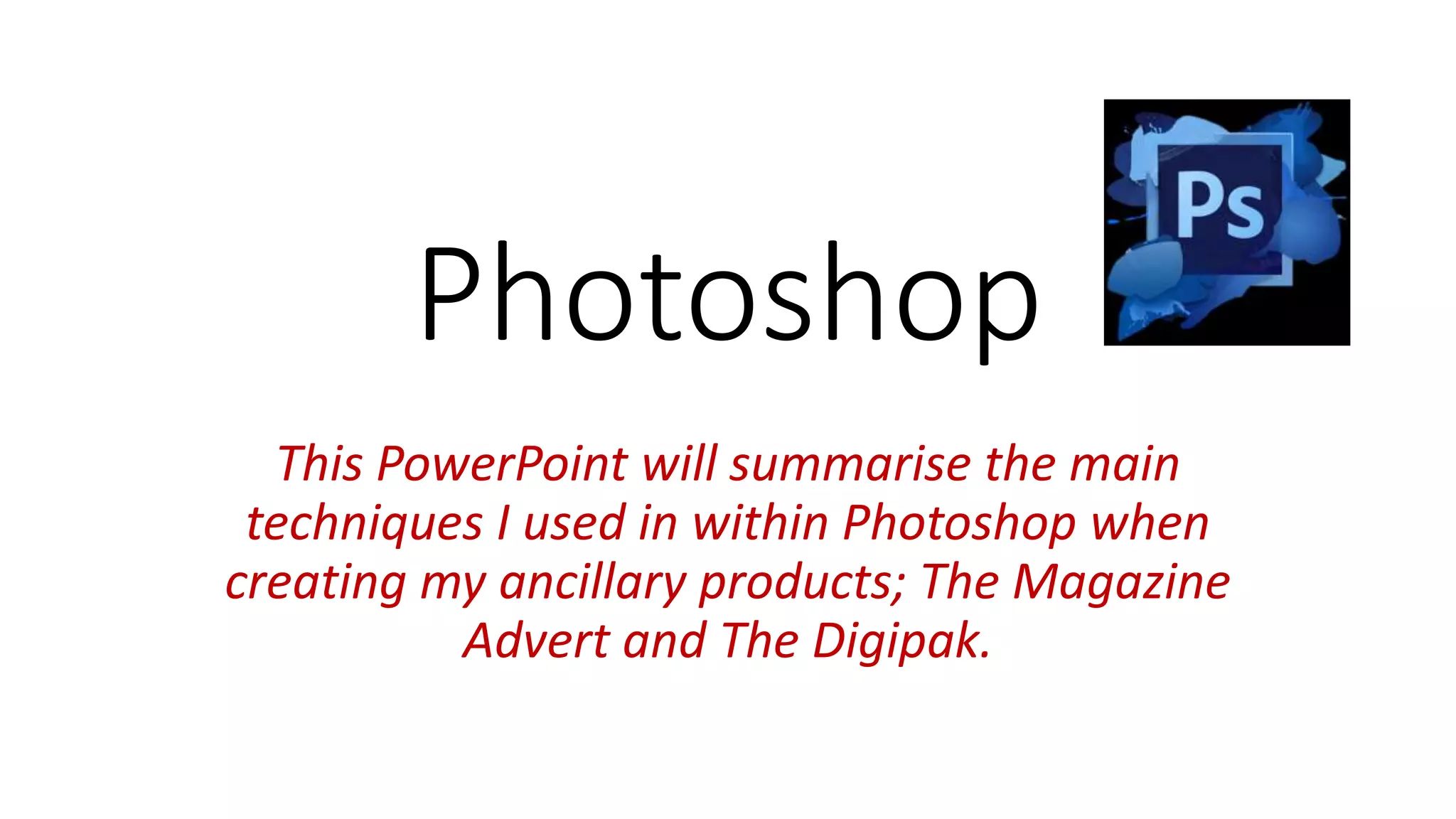
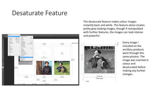
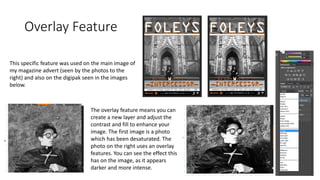
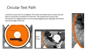
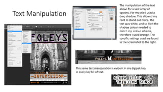
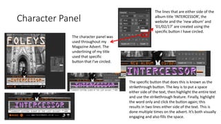
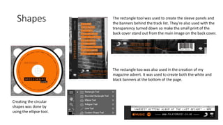
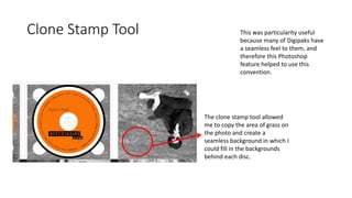
Photoshop
This PowerPoint will summarise the main
techniques I used in within Photoshop when
creating my ancillary products; The Magazine
Advert and The Digipak.
Desaturate Feature
The desaturate feature makes colour images
instantly back and white. This feature alone creates
pretty grey looking images, though if manipulated
with further features, the images can look intense
and powerful.
Every image I
included on the
ancillary products
went through this
same process. The
image was inserted in
colour and
desaturated before
making any further
changes.
Overlay Feature
The overlay feature means you can
create a new layer and adjust the
contrast and fill to enhance your
image. The first image is a photo
which has been desaturated. The
photo on the right uses an overlay
features. You can see the effect this
has on the image, as it appears
darker and more intense.
This specific feature was used on the main image of
my magazine advert (seen by the photos to the
right) and also on the digipak seen in the images
below.
Circular Text Path
I used the circular tool on my digipak. The circular tool allows you to create text and
place it around the circumference of the disc. This allowed me to stick to the
conventions of a digipak better, as most existing digipaks place copyright information
around the edge of the disc.
Text Manipulation
The manipulation of the text
allows for a vast array of
options. For my title I used a
drop shadow. This allowed my
Font to stand out more. The
text was white, and so I felt the
shadow colour needed to
match my colour scheme,
therefore I used orange. The
specific settings used are found
in the screenshot to the right.
This same text manipulation is evident in my digipak too,
in every key bit of text.
Character Panel
The character panel was
used throughout my
Magazine Advert. The
underlining of my title
used that specific
button that I’ve circled.
The lines that are either side of the
album title ‘INTERCESSOR’, the
website and the ‘new album’ and
‘01/02/17’ are created using the
specific button I have circled.
The specific button that does this is known as the
strikethrough button. The key is to put a space
either side of the text, then highlight the entire text
and use the strikethrough feature. Finally, highlight
the word only and click the button again; this
results in two lines either side of the text. This is
done multiple times on the advert. It’s both visually
engaging and also fills the space.
Shapes
Creating the circular
shapes was done by
using the ellipse tool.
The rectangle tool was used to create the sleeve panels and
the banners behind the track list. They’re also used with the
transparency turned down so make the small print of the
back cover stand out from the main image on the back cover.
The rectangle too was also used in the creation of my
magazine advert. It was used to create both the white and
black banners at the bottom of the page.
Clone Stamp Tool
The clone stamp tool allowed
me to copy the area of grass on
the photo and create a
seamless background in which I
could fill in the backgrounds
behind each disc.
This was particularity useful
because many of Digipaks have
a seamless feel to them, and
therefore this Photoshop
feature helped to use this
convention.

Photoshop Feature Guide

  • 1.
    Photoshop This PowerPoint willsummarise the main techniques I used in within Photoshop when creating my ancillary products; The Magazine Advert and The Digipak.
  • 2.
    Desaturate Feature The desaturatefeature makes colour images instantly back and white. This feature alone creates pretty grey looking images, though if manipulated with further features, the images can look intense and powerful. Every image I included on the ancillary products went through this same process. The image was inserted in colour and desaturated before making any further changes.
  • 3.
    Overlay Feature The overlayfeature means you can create a new layer and adjust the contrast and fill to enhance your image. The first image is a photo which has been desaturated. The photo on the right uses an overlay features. You can see the effect this has on the image, as it appears darker and more intense. This specific feature was used on the main image of my magazine advert (seen by the photos to the right) and also on the digipak seen in the images below.
  • 4.
    Circular Text Path Iused the circular tool on my digipak. The circular tool allows you to create text and place it around the circumference of the disc. This allowed me to stick to the conventions of a digipak better, as most existing digipaks place copyright information around the edge of the disc.
  • 5.
    Text Manipulation The manipulationof the text allows for a vast array of options. For my title I used a drop shadow. This allowed my Font to stand out more. The text was white, and so I felt the shadow colour needed to match my colour scheme, therefore I used orange. The specific settings used are found in the screenshot to the right. This same text manipulation is evident in my digipak too, in every key bit of text.
  • 6.
    Character Panel The characterpanel was used throughout my Magazine Advert. The underlining of my title used that specific button that I’ve circled. The lines that are either side of the album title ‘INTERCESSOR’, the website and the ‘new album’ and ‘01/02/17’ are created using the specific button I have circled. The specific button that does this is known as the strikethrough button. The key is to put a space either side of the text, then highlight the entire text and use the strikethrough feature. Finally, highlight the word only and click the button again; this results in two lines either side of the text. This is done multiple times on the advert. It’s both visually engaging and also fills the space.
  • 7.
    Shapes Creating the circular shapeswas done by using the ellipse tool. The rectangle tool was used to create the sleeve panels and the banners behind the track list. They’re also used with the transparency turned down so make the small print of the back cover stand out from the main image on the back cover. The rectangle too was also used in the creation of my magazine advert. It was used to create both the white and black banners at the bottom of the page.
  • 8.
    Clone Stamp Tool Theclone stamp tool allowed me to copy the area of grass on the photo and create a seamless background in which I could fill in the backgrounds behind each disc. This was particularity useful because many of Digipaks have a seamless feel to them, and therefore this Photoshop feature helped to use this convention.