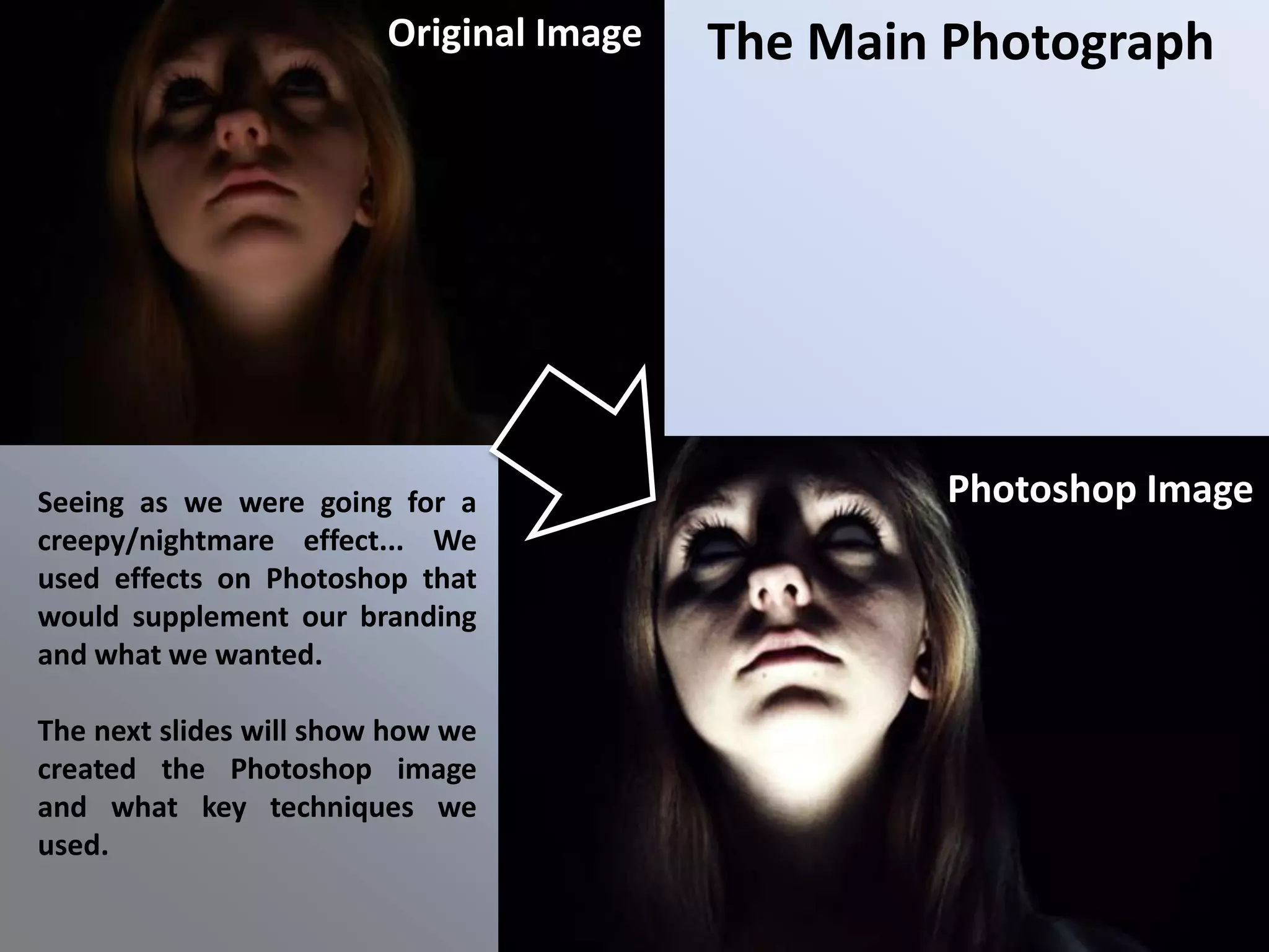
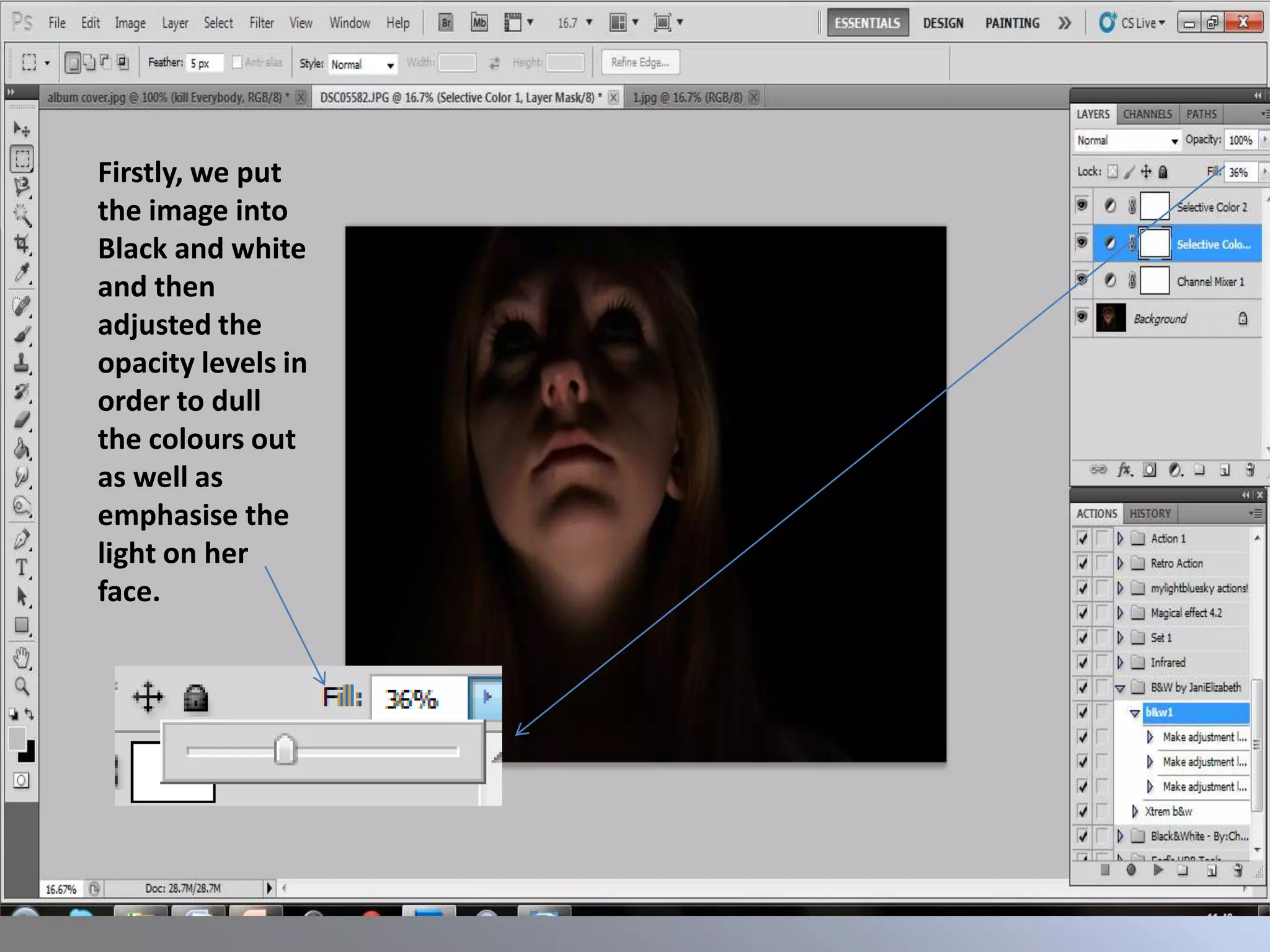
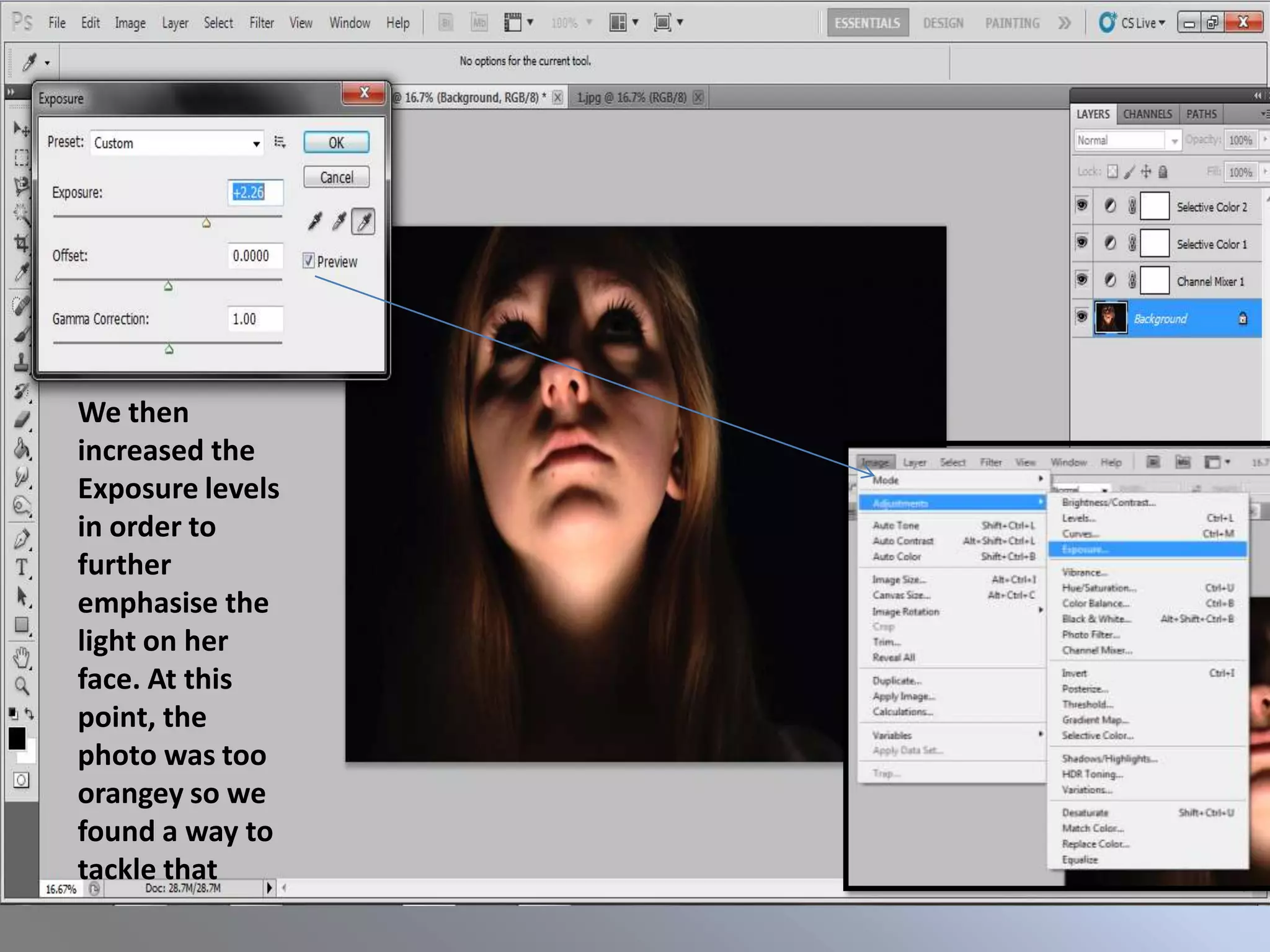
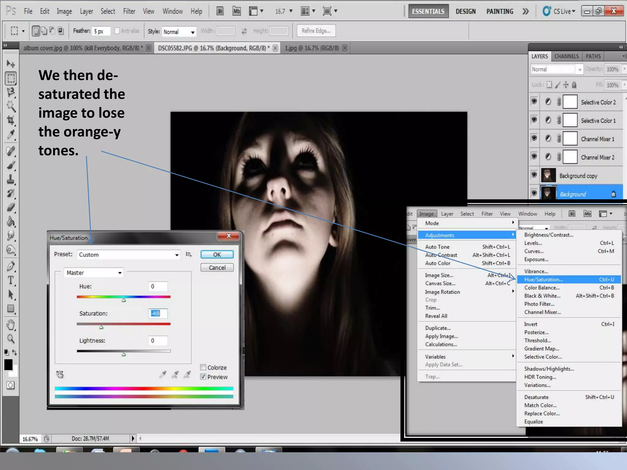
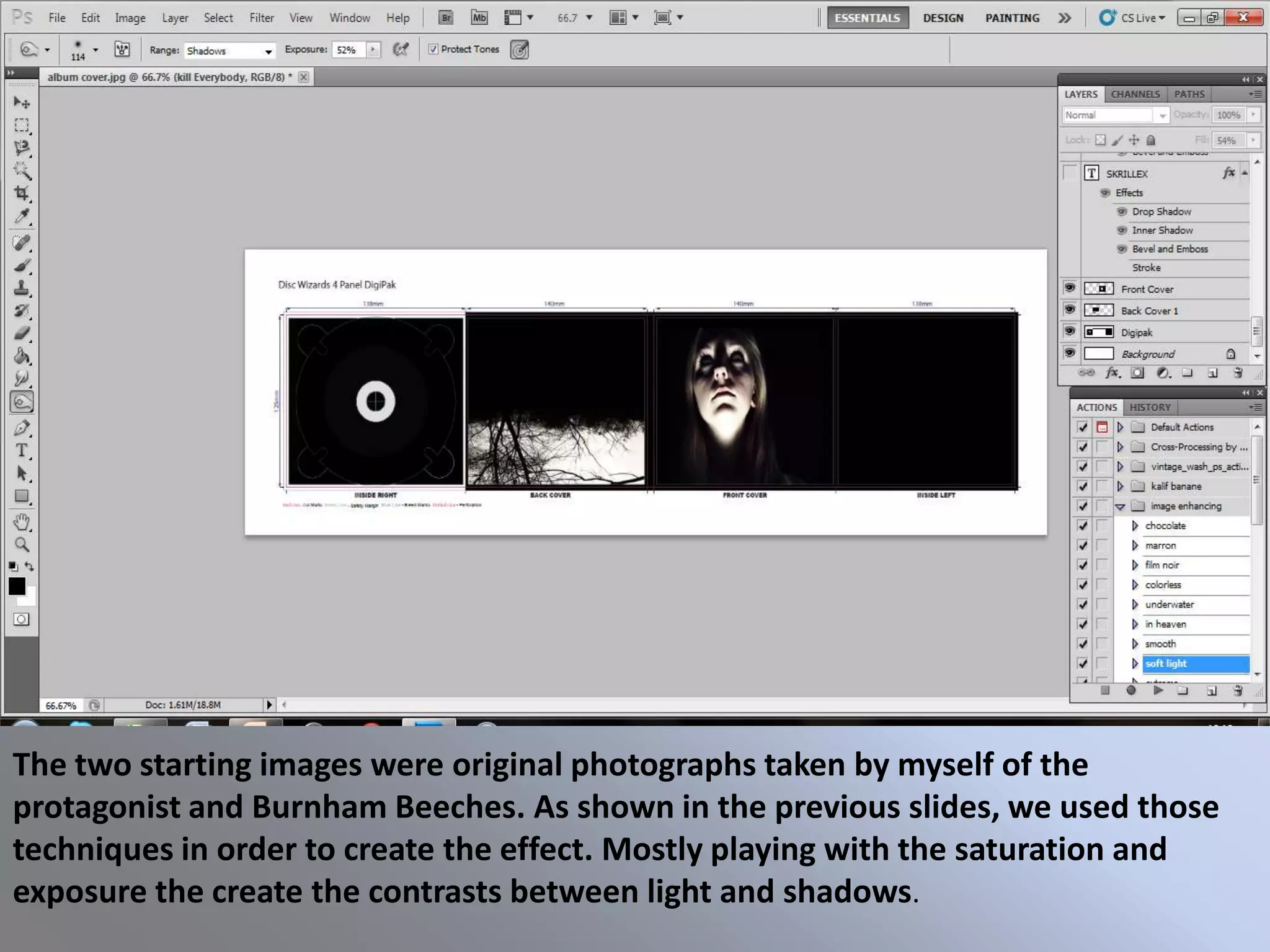
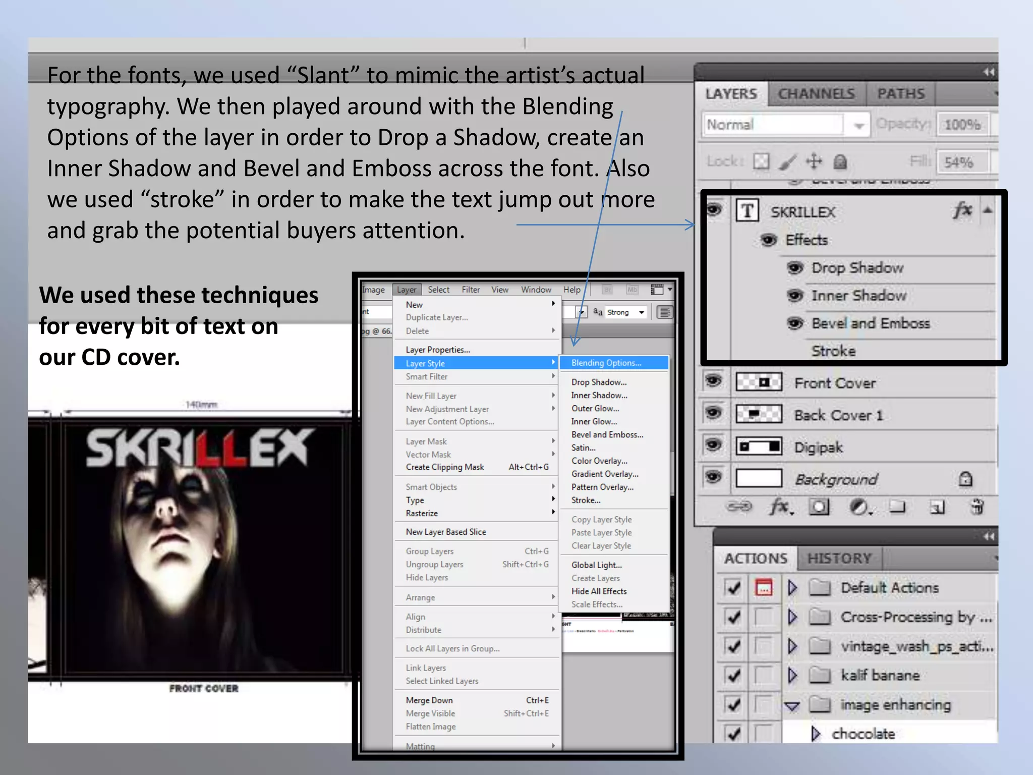
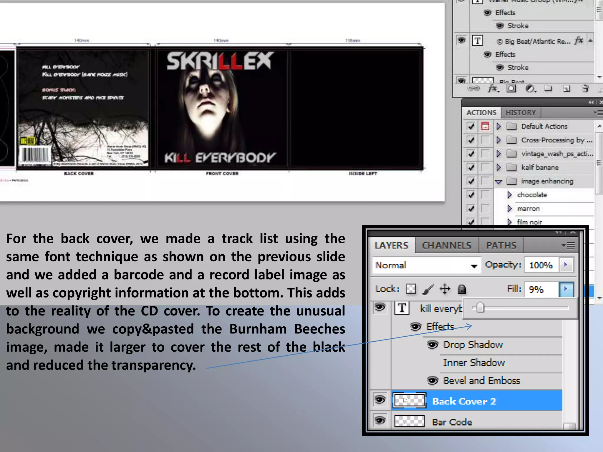
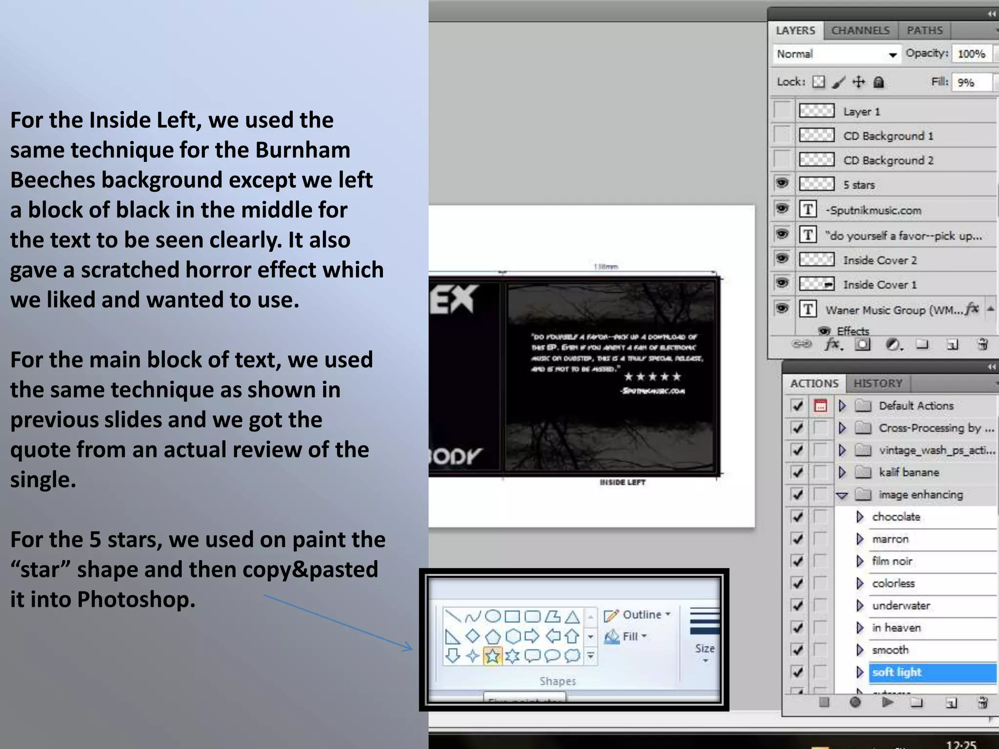
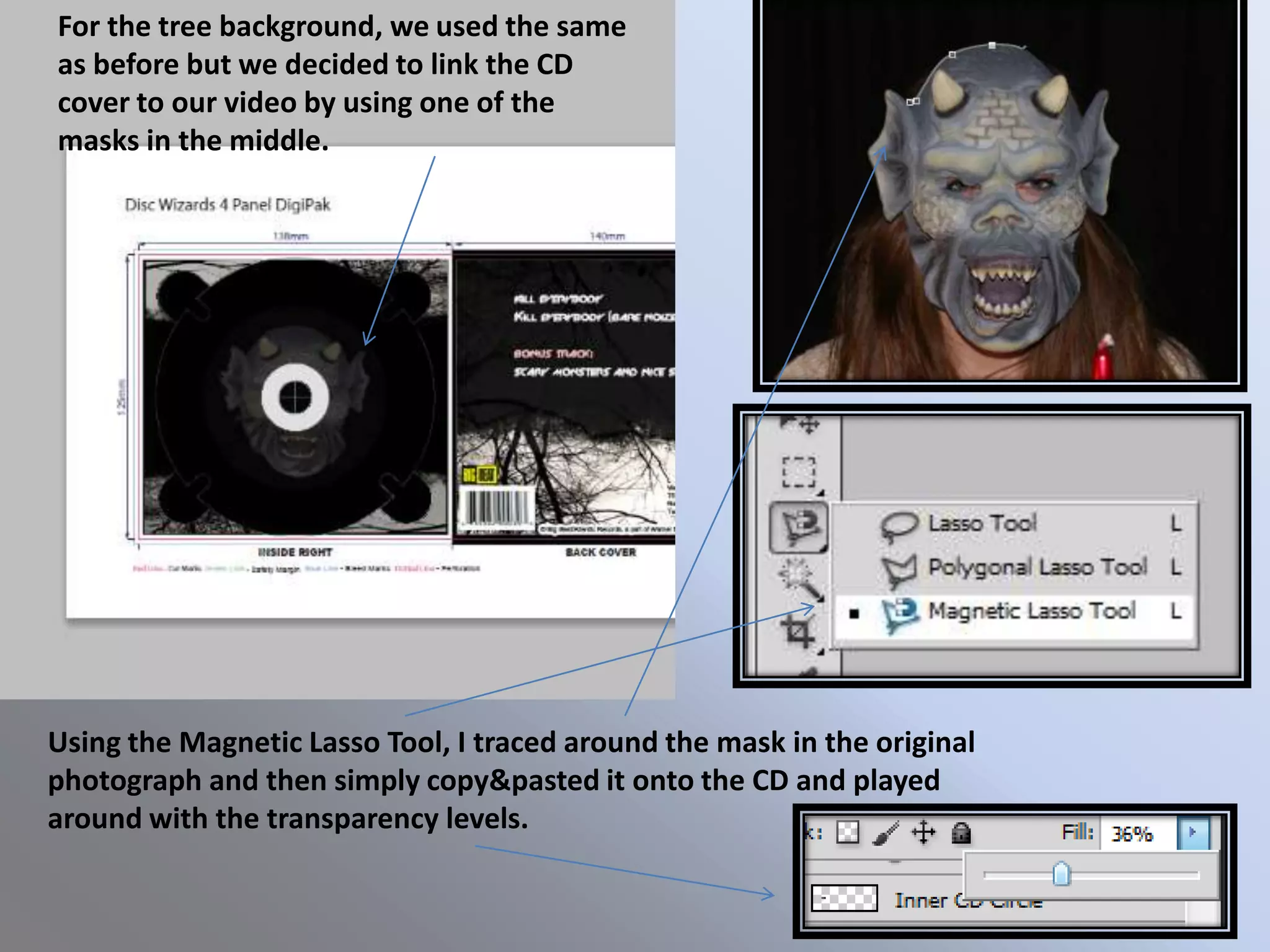
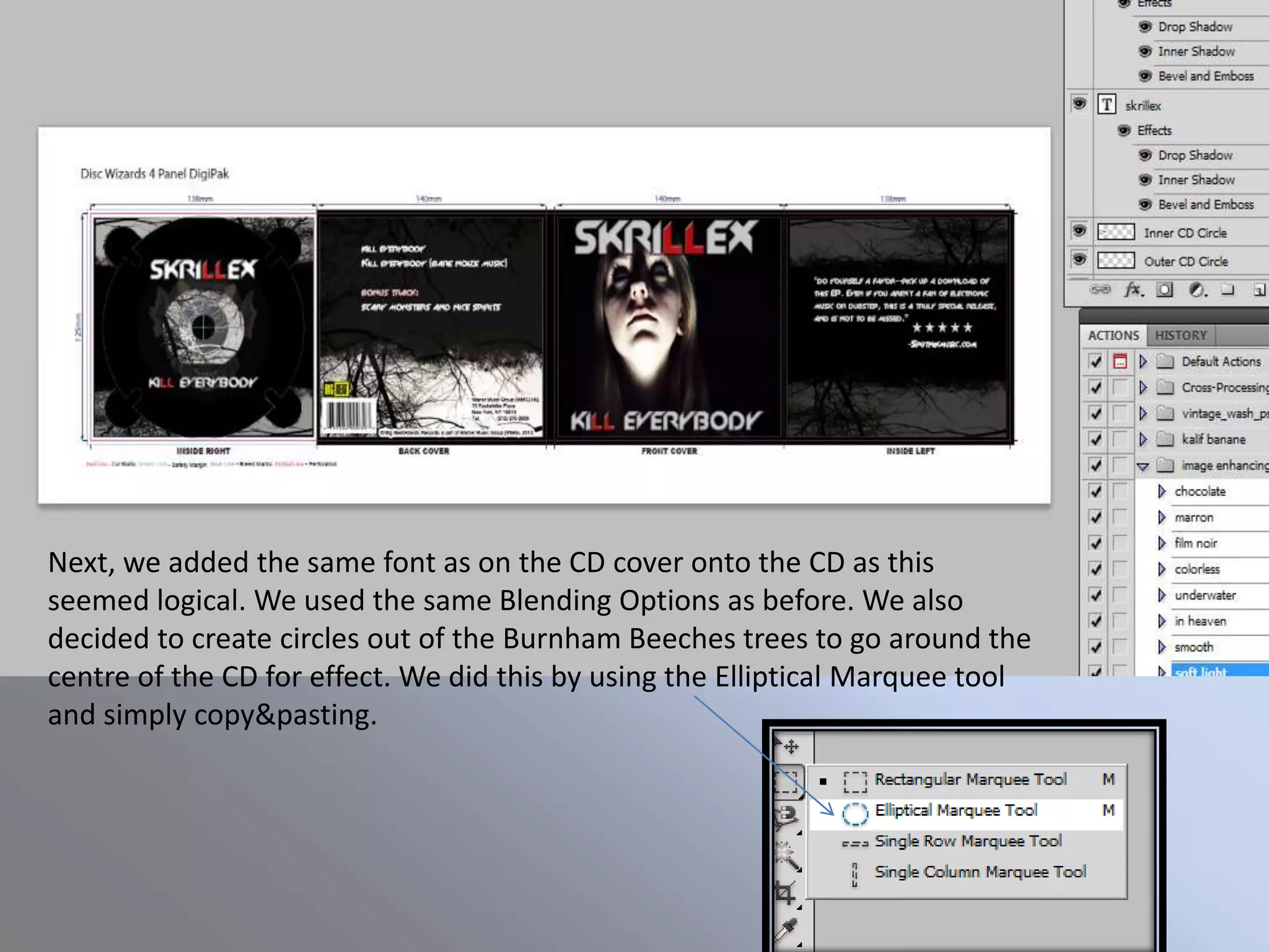
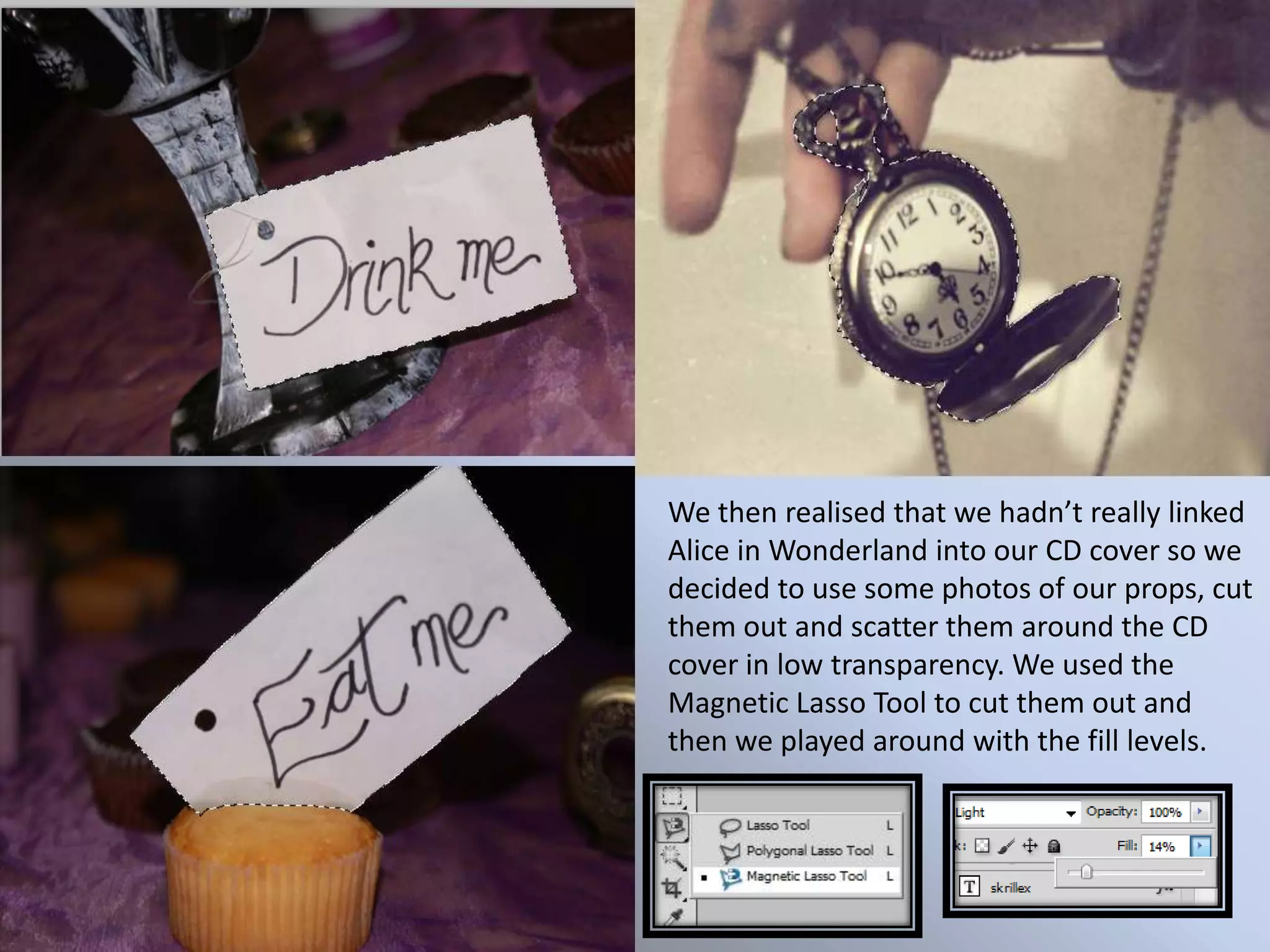
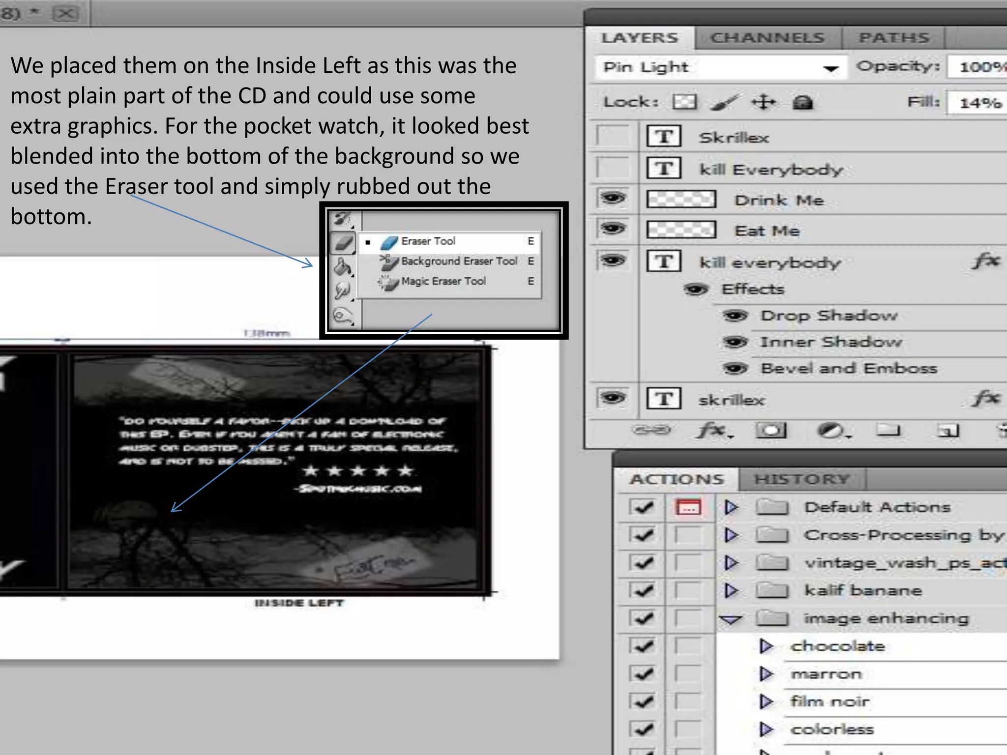
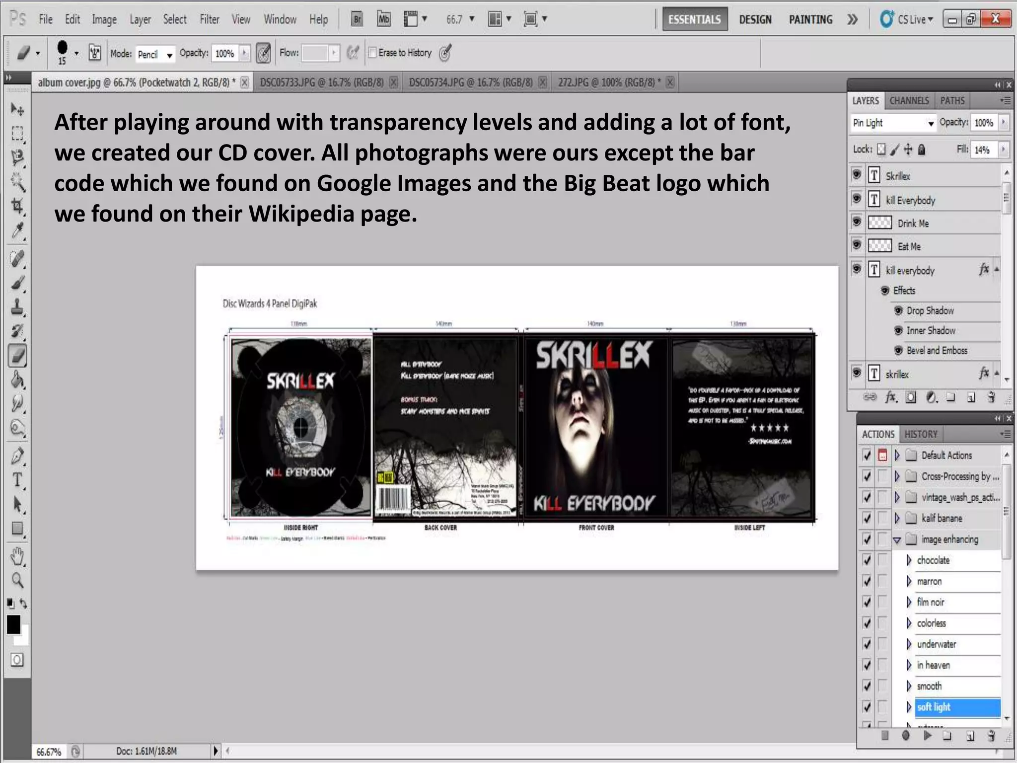
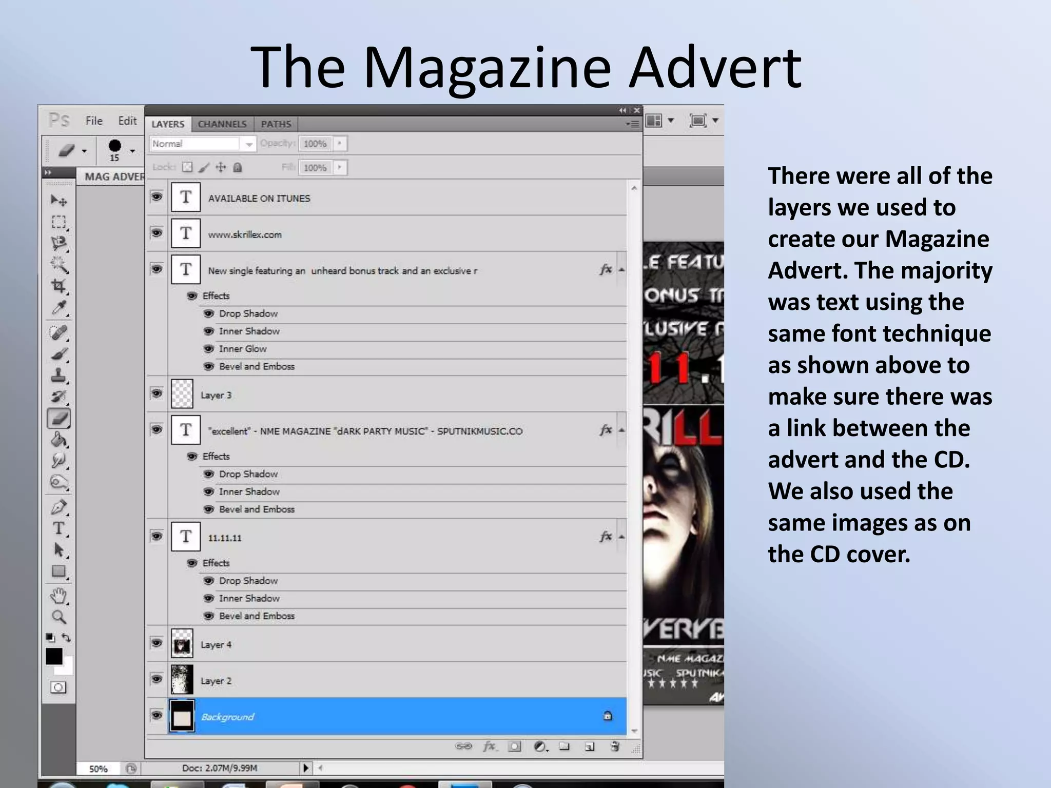
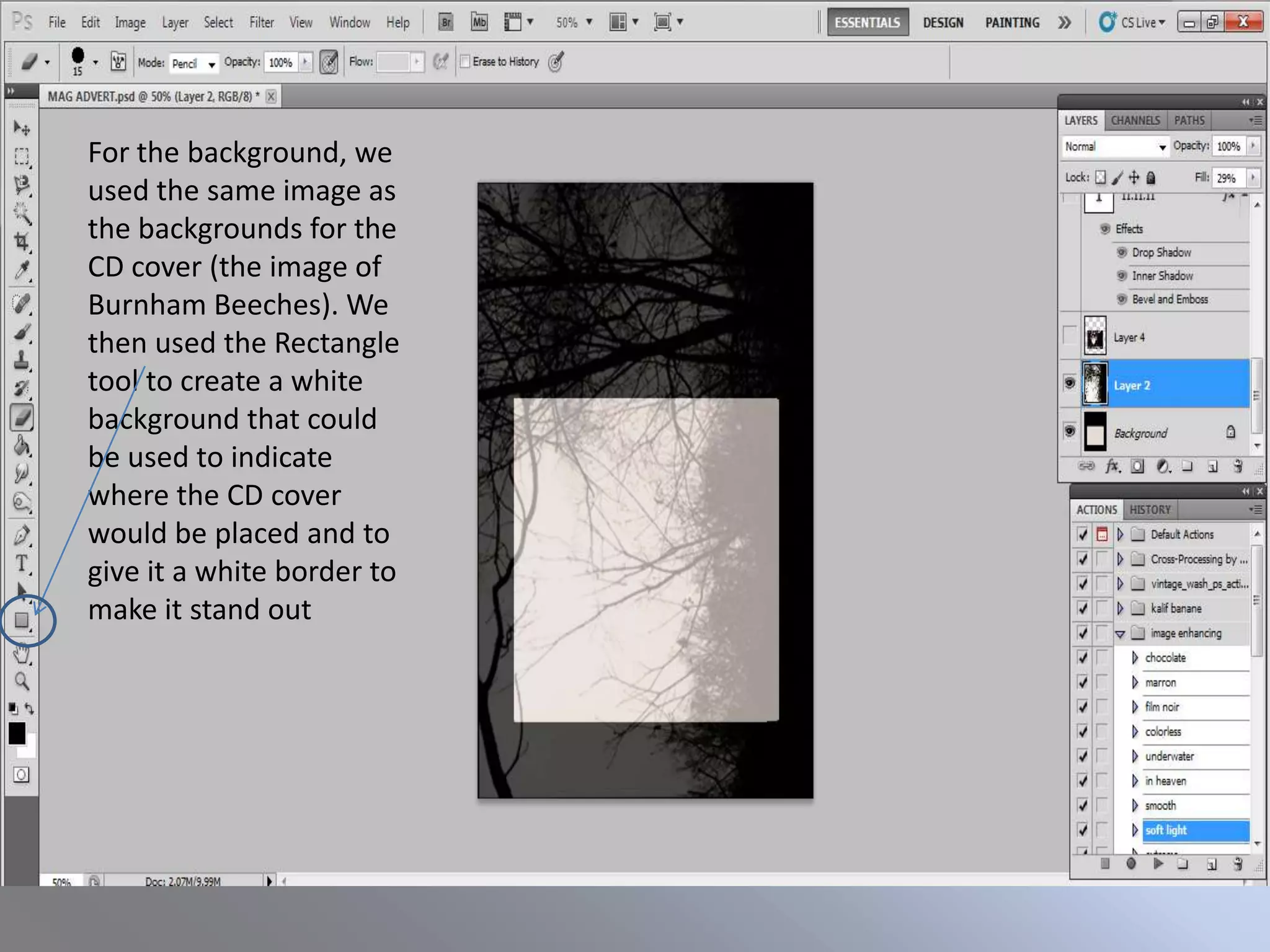
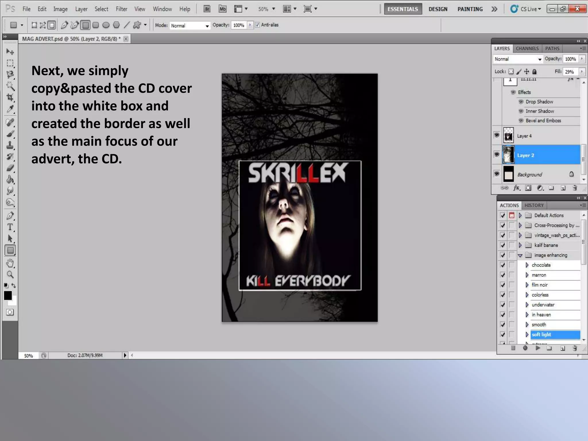
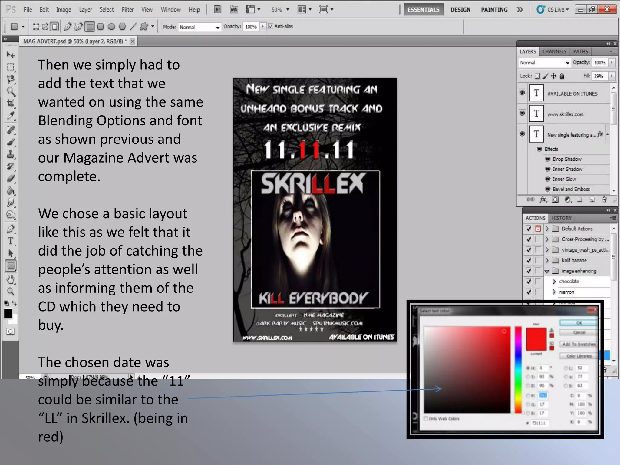
Original Image   The Main Photograph


Seeing as we were going for a                     Photoshop Image
creepy/nightmare effect... We
used effects on Photoshop that
would supplement our branding
and what we wanted.

The next slides will show how we
created the Photoshop image
and what key techniques we
used.
Firstly, we put
the image into
Black and white
and then
adjusted the
opacity levels in
order to dull
the colours out
as well as
emphasise the
light on her
face.
We then
increased the
Exposure levels
in order to
further
emphasise the
light on her
face. At this
point, the
photo was too
orangey so we
found a way to
tackle that
We then de-
saturated the
image to lose
the orange-y
tones.
We then needed to make the eyes all white as this would
increase the nightmare aspect of the photo. To do this, we
used the blur tool and simply blurred the white into the
pupils.
Finally, we again
played with the
Exposure tool
and used the
“Burn” tool to
darken the
shadows seen on
the face.
The CD Cover
               There were all of the
               layers used to create
               out CD cover. It
               mostly consisted of
               playing with the
               transparency and the
               fonts in order to
               create the desired
               outcome. I will show
               you the key
               techniques used on
               our CD cover.
The two starting images were original photographs taken by myself of the
protagonist and Burnham Beeches. As shown in the previous slides, we used those
techniques in order to create the effect. Mostly playing with the saturation and
exposure the create the contrasts between light and shadows.
For the fonts, we used “Slant” to mimic the artist’s actual
typography. We then played around with the Blending
Options of the layer in order to Drop a Shadow, create an
Inner Shadow and Bevel and Emboss across the font. Also
we used “stroke” in order to make the text jump out more
and grab the potential buyers attention.

We used these techniques
for every bit of text on
our CD cover.
For the back cover, we made a track list using the
same font technique as shown on the previous slide
and we added a barcode and a record label image as
well as copyright information at the bottom. This adds
to the reality of the CD cover. To create the unusual
background we copy&pasted the Burnham Beeches
image, made it larger to cover the rest of the black
and reduced the transparency.
For the Inside Left, we used the
same technique for the Burnham
Beeches background except we left
a block of black in the middle for
the text to be seen clearly. It also
gave a scratched horror effect which
we liked and wanted to use.

For the main block of text, we used
the same technique as shown in
previous slides and we got the
quote from an actual review of the
single.

For the 5 stars, we used on paint the
“star” shape and then copy&pasted
it into Photoshop.
For the tree background, we used the same
as before but we decided to link the CD
cover to our video by using one of the
masks in the middle.


Using the Magnetic Lasso Tool, I traced around the mask in the original
photograph and then simply copy&pasted it onto the CD and played
around with the transparency levels.
Next, we added the same font as on the CD cover onto the CD as this
seemed logical. We used the same Blending Options as before. We also
decided to create circles out of the Burnham Beeches trees to go around the
centre of the CD for effect. We did this by using the Elliptical Marquee tool
and simply copy&pasting.
We then realised that we hadn’t really linked
Alice in Wonderland into our CD cover so we
decided to use some photos of our props, cut
them out and scatter them around the CD
cover in low transparency. We used the
Magnetic Lasso Tool to cut them out and
then we played around with the fill levels.
We placed them on the Inside Left as this was the
most plain part of the CD and could use some
extra graphics. For the pocket watch, it looked best
blended into the bottom of the background so we
used the Eraser tool and simply rubbed out the
bottom.
After playing around with transparency levels and adding a lot of font,
we created our CD cover. All photographs were ours except the bar
code which we found on Google Images and the Big Beat logo which
we found on their Wikipedia page.
The Magazine Advert
                 There were all of the
                 layers we used to
                 create our Magazine
                 Advert. The majority
                 was text using the
                 same font technique
                 as shown above to
                 make sure there was
                 a link between the
                 advert and the CD.
                 We also used the
                 same images as on
                 the CD cover.
For the background, we
used the same image as
the backgrounds for the
CD cover (the image of
Burnham Beeches). We
then used the Rectangle
tool to create a white
background that could
be used to indicate
where the CD cover
would be placed and to
give it a white border to
make it stand out
Next, we simply
copy&pasted the CD cover
into the white box and
created the border as well
as the main focus of our
advert, the CD.
Then we simply had to
add the text that we
wanted on using the same
Blending Options and font
as shown previous and
our Magazine Advert was
complete.

We chose a basic layout
like this as we felt that it
did the job of catching the
people’s attention as well
as informing them of the
CD which they need to
buy.

The chosen date was
simply because the “11”
could be similar to the
“LL” in Skrillex. (being in
red)

The Design Process

  • 1.
    Original Image The Main Photograph Seeing as we were going for a Photoshop Image creepy/nightmare effect... We used effects on Photoshop that would supplement our branding and what we wanted. The next slides will show how we created the Photoshop image and what key techniques we used.
  • 2.
    Firstly, we put theimage into Black and white and then adjusted the opacity levels in order to dull the colours out as well as emphasise the light on her face.
  • 3.
    We then increased the Exposurelevels in order to further emphasise the light on her face. At this point, the photo was too orangey so we found a way to tackle that
  • 4.
    We then de- saturatedthe image to lose the orange-y tones.
  • 5.
    We then neededto make the eyes all white as this would increase the nightmare aspect of the photo. To do this, we used the blur tool and simply blurred the white into the pupils.
  • 6.
    Finally, we again playedwith the Exposure tool and used the “Burn” tool to darken the shadows seen on the face.
  • 7.
    The CD Cover There were all of the layers used to create out CD cover. It mostly consisted of playing with the transparency and the fonts in order to create the desired outcome. I will show you the key techniques used on our CD cover.
  • 8.
    The two startingimages were original photographs taken by myself of the protagonist and Burnham Beeches. As shown in the previous slides, we used those techniques in order to create the effect. Mostly playing with the saturation and exposure the create the contrasts between light and shadows.
  • 9.
    For the fonts,we used “Slant” to mimic the artist’s actual typography. We then played around with the Blending Options of the layer in order to Drop a Shadow, create an Inner Shadow and Bevel and Emboss across the font. Also we used “stroke” in order to make the text jump out more and grab the potential buyers attention. We used these techniques for every bit of text on our CD cover.
  • 10.
    For the backcover, we made a track list using the same font technique as shown on the previous slide and we added a barcode and a record label image as well as copyright information at the bottom. This adds to the reality of the CD cover. To create the unusual background we copy&pasted the Burnham Beeches image, made it larger to cover the rest of the black and reduced the transparency.
  • 11.
    For the InsideLeft, we used the same technique for the Burnham Beeches background except we left a block of black in the middle for the text to be seen clearly. It also gave a scratched horror effect which we liked and wanted to use. For the main block of text, we used the same technique as shown in previous slides and we got the quote from an actual review of the single. For the 5 stars, we used on paint the “star” shape and then copy&pasted it into Photoshop.
  • 12.
    For the treebackground, we used the same as before but we decided to link the CD cover to our video by using one of the masks in the middle. Using the Magnetic Lasso Tool, I traced around the mask in the original photograph and then simply copy&pasted it onto the CD and played around with the transparency levels.
  • 13.
    Next, we addedthe same font as on the CD cover onto the CD as this seemed logical. We used the same Blending Options as before. We also decided to create circles out of the Burnham Beeches trees to go around the centre of the CD for effect. We did this by using the Elliptical Marquee tool and simply copy&pasting.
  • 14.
    We then realisedthat we hadn’t really linked Alice in Wonderland into our CD cover so we decided to use some photos of our props, cut them out and scatter them around the CD cover in low transparency. We used the Magnetic Lasso Tool to cut them out and then we played around with the fill levels.
  • 15.
    We placed themon the Inside Left as this was the most plain part of the CD and could use some extra graphics. For the pocket watch, it looked best blended into the bottom of the background so we used the Eraser tool and simply rubbed out the bottom.
  • 16.
    After playing aroundwith transparency levels and adding a lot of font, we created our CD cover. All photographs were ours except the bar code which we found on Google Images and the Big Beat logo which we found on their Wikipedia page.
  • 17.
    The Magazine Advert There were all of the layers we used to create our Magazine Advert. The majority was text using the same font technique as shown above to make sure there was a link between the advert and the CD. We also used the same images as on the CD cover.
  • 18.
    For the background,we used the same image as the backgrounds for the CD cover (the image of Burnham Beeches). We then used the Rectangle tool to create a white background that could be used to indicate where the CD cover would be placed and to give it a white border to make it stand out
  • 19.
    Next, we simply copy&pastedthe CD cover into the white box and created the border as well as the main focus of our advert, the CD.
  • 20.
    Then we simplyhad to add the text that we wanted on using the same Blending Options and font as shown previous and our Magazine Advert was complete. We chose a basic layout like this as we felt that it did the job of catching the people’s attention as well as informing them of the CD which they need to buy. The chosen date was simply because the “11” could be similar to the “LL” in Skrillex. (being in red)