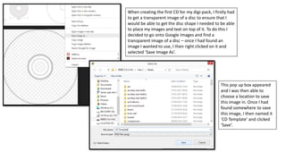
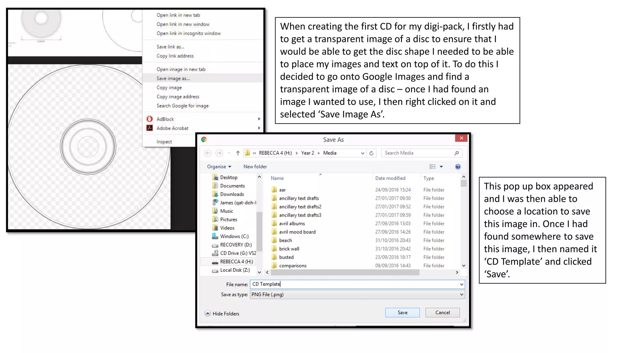
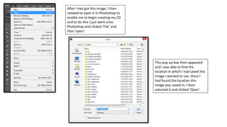
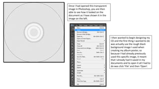
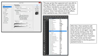
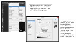
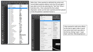
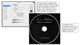
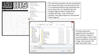
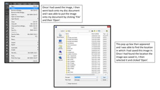
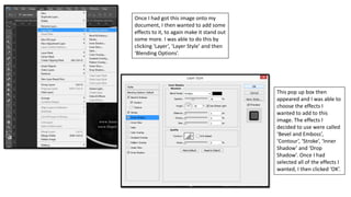
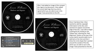
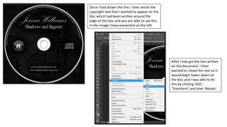
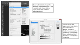
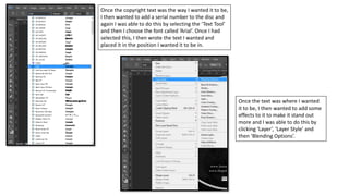
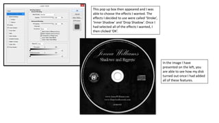
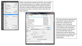
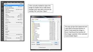
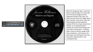
The document describes the process of creating a CD design in Photoshop. It involves finding a transparent disc image template, opening it in Photoshop. Elements like the artist name, album title and logo are added along with effects. The copyright text is wrapped around the edge and rotated. Once complete, it is saved as a JPEG to remove the black background and leave just the disc shape.
The Art Pastor's Guide to Sabbath | Steve Thomason
Cd 1 process
1. When creating the first CD for my digi-pack, I firstly had
to get a transparent image of a disc to ensure that I
would be able to get the disc shape I needed to be able
to place my images and text on top of it. To do this I
decided to go onto Google Images and find a
transparent image of a disc – once I had found an
image I wanted to use, I then right clicked on it and
selected ‘Save Image As’.
This pop up box appeared
and I was then able to
choose a location to save
this image in. Once I had
found somewhere to save
this image, I then named it
‘CD Template’ and clicked
‘Save’.
2. After I had got this image, I then
needed to open it in Photoshop to
enable me to begin creating my CD
and to do this I just went onto
Photoshop and clicked ‘File’ and
then ‘open’.
This pop up box then appeared
and I was able to find the
location in which I had saved the
image I wanted to use. Once I
had found the location this
image was saved in, I then
selected it and clicked ‘Open’.
3. Once I had opened this transparent
image in Photoshop, you are then
able to see how it looked on the
document as I have shown it in the
image on the left.
I then wanted to begin designing my
CD and the first thing I wanted to do
was actually use the rough black
background image I used when
creating my album poster, so
because I had already previously
used this specific image, it meant
that I already had it saved in my
documents and to open it all I had to
do was click ‘File’ and then ‘Open’.
4. This pop up box appeared and I was
then able to find the location in which
the image I wanted to use was saved
in. Once I had found the location of
the image I wanted, I then selected it
and clicked ‘Open’.
When I had eventually got the
image I wanted onto this
document, I then needed to
resize the image to ensure that it
would fit on my CD document, so
to do this I just had to click ‘Edit’,
‘Transform’ and then ‘Scale’.
5. After I had changed the size of the
image, I then wanted to change the
colour of the image to make it a little
bit darker and I was able to do this
by clicking ‘Image’, ‘Adjustments’
and then ‘Brightness/Contrast’.
This pop up box then appeared
and I was able to change the
settings for the brightness and
contrast of the image. Once I
had changed the settings to
what I wanted them to be, I
then clicked ‘OK’.
6. After I had done that, I then
wanted to add a circle shape in
the centre of the disc to make the
image look more like a disc from
an album and I was able to do
this by clicking on the ‘Ellipse
Tool’ and then creating the circle
in the position I wanted it to be in
on the document. Once I had
created this circle, you are then
able to see how my disc was
turning out as I have presented it
in an image on the left.
7. Once the background of the disc was looking the way I wanted it, I
then wanted to add some text to the disc. The first thing I decided to
create was the artists name and I was able to do this by selecting the
‘Text Tool’ and then choosing the font called ‘Palace Script MT’. Once I
had selected this, I then wrote out the text I wanted and placed it into
the position I wanted it to be in.
After that, I then wanted to add
some effects to the text to
make it stand out more and I
was able to do this by clicking
‘Layer’, ‘Layer Style’ and then
‘Blending Options’.
8. This pop up box then appeared and I was able to
choose the effects I wanted to add to this text.
The effects I decided to use were called ‘Bevel
and Emboss’, Stroke’, ‘Inner Shadow’ and ‘Drop
Shadow’. Once I had selected all of the effects
that I wanted to use, I then clicked ‘OK’.
After that, I then wanted to add
some text which would have the
album name on and again I was able
to do this by clicking on the ‘Text
Tool’ and then I selected the font
called ‘Fairydust8’. Once I had done
this, I then wrote out the text I
wanted and put it into the position I
wanted it to be in.
9. I then wanted to add some effects to this
text to make it stand out more and I was
able to do this by clicking ‘Layer’, ‘Layer
Style’ and then ‘Blending Options’.
This pop up box then
appeared and I was able to
choose the effects I
wanted. The effects I
decided to use were called
‘Bevel and Emboss’,
‘Contour’, ‘Stroke’, ‘Inner
Shadow’ and ‘Drop
Shadow’. Once I had
selected all of the effects I
wanted, I then clicked ‘OK’.
10. After that, I then wanted to add both the artists and
record labels website address onto the CD and again I
was able to do this by selecting the ‘Text Tool’. Once I
had done this, I then selected the font called
‘Aparajita’, wrote out the text I wanted and then placed
it into the position I wanted it to be in.
I then wanted to add some effects
to the text to again make it stand
out some more and I was able to
do this by clicking ‘Layer’, ‘Layer
Style’ and then ‘Blending Options’.
11. This pop up box then appeared and I
was able to choose the effects I wanted.
The effects I decided to use were called
‘Stroke’, ‘Inner Shadow’ and ‘Drop
Shadow’. Once I had chosen all of the
effects I wanted, I then clicked ‘OK’.
In the image I have
presented on the left, you
are able to see how my disc
began to look once I had
added all of this text.
12. The next thing I wanted to do was actually add
the compact disc logo to my document as this
is a conventional feature that is generally seen
on an album disc. So I decided to go onto
Google Images and get an image of the
compact disc logo – once I found one I
wanted, I then right clicked on it and selected
‘Save Image As’.
This pop up box then
appeared and I was able to
find a location in which to
save this image in. Once I had
found somewhere to save this
image, I then named it ‘CD
logo’ and clicked ‘Save’.
13. Once I had saved the image, I then
went back onto my disc document
and I was able to put the image
onto my document by clicking ‘File’
and then ‘Open’.
This pop up box then appeared
and I was able to find the location
in which I had saved this image in.
Once I had found the location the
image was saved in, I then
selected it and clicked ‘Open’.
14. Once I had got this image onto my
document, I then wanted to add some
effects to it, to again make it stand out
some more. I was able to do this by
clicking ‘Layer’, ‘Layer Style’ and then
‘Blending Options’.
This pop up box then
appeared and I was able to
choose the effects I
wanted to add to this
image. The effects I
decided to use were called
‘Bevel and Emboss’,
‘Contour’, ‘Stroke’, ‘Inner
Shadow’ and ‘Drop
Shadow’. Once I had
selected all of the effects I
wanted, I then clicked ‘OK’.
15. After I had added an image of the compact
disc logo to my document, I then added
the record label logo that my artist is
signed which you are able to see in the
image I have presented on the left.
Once I had done that, I then
wanted to add the copyright
information to the disc and I
wanted it to appear around the
edge of the disc. I was able to begin
creating this by clicking on the
‘Ellipse Tool’, selecting the ‘Path
Alignment’ button at the top of the
screen (which would enable me to
add text on the line) and then I
drew the circle shape that I wanted
around the outside of the disc
which you are able to see in the
image I have presented on the left.
16. Once I had drawn the line, I then wrote the
copyright text that I wanted to appear on the
disc which had been written around the
edge of the disc and you are able to see this
in the image I have presented on the left.
After I had got the text written
on the document, I then
wanted to rotate the text so it
would begin lower down on
the disc and I was able to do
this by clicking ‘Edit’,
‘Transform’ and then ‘Rotate’.
17. Once I had rotated the text, I then
wanted to add some effects to it and
I was able to do this by clicking
‘Layer’, ‘Layer Style’ and then
‘Blending Options’.
This pop up box then
appeared and I was able to
choose the effects I
wanted. The effects I
decided to use were called
‘Stroke’ and ‘Drop Shadow’.
Once I had selected all of
the effects I wanted, I then
clicked ‘OK’.
18. Once the copyright text was the way I wanted it to be,
I then wanted to add a serial number to the disc and
again I was able to do this by selecting the ‘Text Tool’
and then I choose the font called ‘Arial’. Once I had
selected this, I then wrote the text I wanted and
placed it in the position I wanted it to be in.
Once the text was where I wanted
it to be, I then wanted to add some
effects to it to make it stand out
more and I was able to do this by
clicking ‘Layer’, ‘Layer Style’ and
then ‘Blending Options’.
19. This pop up box then appeared and I was
able to choose the effects I wanted. The
effects I decided to use were called ‘Stroke’,
‘Inner Shadow’ and ‘Drop Shadow’. Once I
had selected all of the effects I wanted, I
then clicked ‘OK’.
In the image I have
presented on the left, you
are able to see how my disk
turned out once I had added
all of these features.
20. When I had finished creating my first disk, I then needed
to save the document as an image so I would be able to
get rid of the black background that appears outside of
the disk to make the disk look more like one that would
be found in an album. To do this I had to click ‘File’ and
then ‘Save As’.
This pop up box then appeared and
I was able to save the document
where ever I wanted on the
computer. Once I had found
somewhere to save the document,
I then clicked on the drop down
box next to where it says ‘Format’
and I selected ‘JPEG’ and this
would ensure that the document
would be saved as an image. Once I
had made these changes, I then
clicked ‘Save’.
21. I then actually needed to open this
image to enable me to make these
changes and I was able to do this by
clicking ‘File’ and then ‘Open’.
This pop up box then appeared and
I was able to find the location in
which I had saved the image in.
Once I had found the location of
the image I wanted, I then selected
it and clicked ‘Open’.
22. Once the image was open, I was then
able to make changes to it and to get
rid of the black background that
appeared outside of the circle, all I
had to do was select the ‘Magic Wand
Tool’ and then I just had to select the
black background that appeared
outside of the disc shape and pressed
‘Delete’ on my keyboard which
deleted this excess black background
and made it transparent – meaning,
when I want to put this image of the
disk somewhere, I will have just the
disk shape and nothing else that may
have been attached when I was
creating the disk.