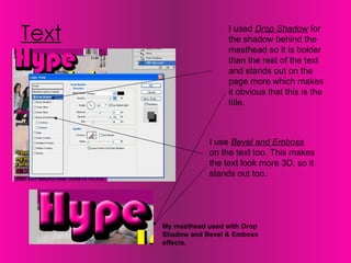
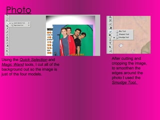
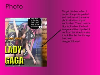
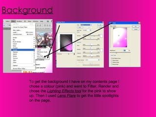
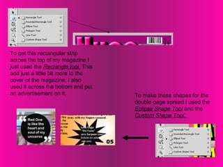
Music Magazine Photoshop  Screen Shots Brogan  Mitchell
Text I used  Drop Shadow  for the shadow behind the masthead so it is bolder than the rest of the text and stands out on the page more which makes it obvious that this is the title.  I use  Bevel and Emboss  on the text too. This makes the text look more 3D, so it stands out too.  My masthead used with Drop Shadow and Bevel & Emboss effects.
Using the  Quick Selection  and  Magic Wand  tools, I cut all of the background out so the image is just of the four models.  Photo After cutting and cropping the image, to smoothen the edges around the photo I used the  Smudge Tool.
Photo To get this blur affect I copied the photo pasted so I had two of the same photo stuck on top of each other. Then I used a blur tool to blur the back image and then I pulled it out from the side to make it look like the front image has been dragged/blurred.
Background To get the background I have on my contents page I chose a colour (pink) and went to Filter, Render and chose the  Lighting Effects tool  for the pink to show up. Then I used  Lens Flare  to get the little spotlights on the page.
To get this rectangular strip across the top of my magazine I just used the  Rectangle tool.  This add just a little bit more to the cover of the magazine. I also used it across the bottom and put an advertisement on it.  To make these shapes for the double page spread I used the  Eclipse Shape Tool  and the  Custom Shape Tool.

Screen shots

  • 1.
    Music Magazine Photoshop Screen Shots Brogan Mitchell
  • 2.
    Text I used Drop Shadow for the shadow behind the masthead so it is bolder than the rest of the text and stands out on the page more which makes it obvious that this is the title. I use Bevel and Emboss on the text too. This makes the text look more 3D, so it stands out too. My masthead used with Drop Shadow and Bevel & Emboss effects.
  • 3.
    Using the Quick Selection and Magic Wand tools, I cut all of the background out so the image is just of the four models. Photo After cutting and cropping the image, to smoothen the edges around the photo I used the Smudge Tool.
  • 4.
    Photo To getthis blur affect I copied the photo pasted so I had two of the same photo stuck on top of each other. Then I used a blur tool to blur the back image and then I pulled it out from the side to make it look like the front image has been dragged/blurred.
  • 5.
    Background To getthe background I have on my contents page I chose a colour (pink) and went to Filter, Render and chose the Lighting Effects tool for the pink to show up. Then I used Lens Flare to get the little spotlights on the page.
  • 6.
    To get thisrectangular strip across the top of my magazine I just used the Rectangle tool. This add just a little bit more to the cover of the magazine. I also used it across the bottom and put an advertisement on it. To make these shapes for the double page spread I used the Eclipse Shape Tool and the Custom Shape Tool.