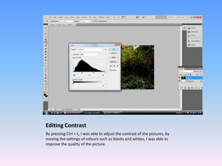
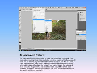
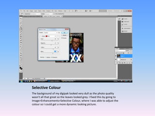
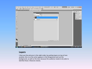
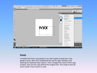
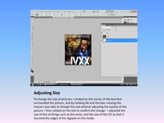
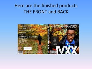
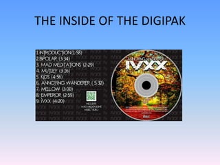
Using Photoshop to create
    ancillary products
     By Hasan Mahmood
Programmes that were used
• I made my ancillary products using two
  programmes.
• Photoshop CS5 and Photoshop Elements
• In my opinion CS5 is better than elements
  because CS5 offers a wider variety of tools for
  editing.
How it was used
In this slideshow, I will talk about how I used Photoshop to create the
ancillary products. I used the same techniques for all 3 products.
Cutting artist out
I selected the artist using the Pen Tool by pressing P on the keyboard and
then drew around the artist, the pen tool had a magnetic feature so it
attached to the artist and not the background unlike the wand tool which
I was going to use. After the artist was selected, I then copied an pasted
him into the background of my digipak.
Editing Contrast
By pressing Ctrl + L, I was able to adjust the contrast of the pictures, by
moving the settings of colours such as blacks and whites, I was able to
improve the quality of the picture.
Displacement feature
For my original design, I was going to cover my artists face in artwork. This
involved me cutting the artist and placing him onto a plain white background, I
then had to remove any colour from the artist, so I could use this as a base. I
then got the digipak open, then clicked on the Displacement feature, then
selected the base. After I got the artwork and placed it over the artist, and
then using the image mask, I was able to wrap it around the artists face.
However in the end, it was hard to identify the artist properly so I ended up
going with a different approach.
Selective Colour
The background of my digipak looked very dull as the photo quality
wasn't all that great so the leaves looked grey. I fixed this by going to
Image>Enhancements>Selective Colour, where I was able to adjust the
colour so I could get a more dynamic looking picture.
Layers
I then put the pictures in the right order, by putting layers on top of one
another, this is so the artist appears in the foreground and not the
background, as well as the text, because the audience needs to be able to
identify those 2 features clearly.
Fonts
I Installed the fonts I was going to use, then typed in what ever I was
going to write, after that I duplicated the text by right clicking it and
selecing the duplicate layer option, I then changed the colour of the copy
to black, then put the copy behind the original text. This made it look 3D
and it made it more easier to read.
Adjusting Size
To change the size of pictures, I clicked on the corner of the box that
surrounded the picture, and by holding Alt and the box, moving the
mouse I was able to change the size without adjusting the quality of the
picture. I then clicked on the tick to confirm the change. I adjusted the
size of lots of things such as the artist, and the size of the CD so that it
touched the edges of the digipak on the inside.
Here are the finished products
    THE FRONT and BACK
THE INSIDE OF THE DIGIPAK
AND THE ADVERT
Conclusion
• Photoshop was a difficult programme to use
  as first but with practice, I was able to
  improve.
• It also helped me develop my ideas thanks to
  the wide range of tools I could use.
• Overall I am satisfied with the end product.

Using photoshop to create ancillary products

  • 1.
    Using Photoshop tocreate ancillary products By Hasan Mahmood
  • 2.
    Programmes that wereused • I made my ancillary products using two programmes. • Photoshop CS5 and Photoshop Elements • In my opinion CS5 is better than elements because CS5 offers a wider variety of tools for editing.
  • 3.
    How it wasused In this slideshow, I will talk about how I used Photoshop to create the ancillary products. I used the same techniques for all 3 products.
  • 4.
    Cutting artist out Iselected the artist using the Pen Tool by pressing P on the keyboard and then drew around the artist, the pen tool had a magnetic feature so it attached to the artist and not the background unlike the wand tool which I was going to use. After the artist was selected, I then copied an pasted him into the background of my digipak.
  • 5.
    Editing Contrast By pressingCtrl + L, I was able to adjust the contrast of the pictures, by moving the settings of colours such as blacks and whites, I was able to improve the quality of the picture.
  • 6.
    Displacement feature For myoriginal design, I was going to cover my artists face in artwork. This involved me cutting the artist and placing him onto a plain white background, I then had to remove any colour from the artist, so I could use this as a base. I then got the digipak open, then clicked on the Displacement feature, then selected the base. After I got the artwork and placed it over the artist, and then using the image mask, I was able to wrap it around the artists face. However in the end, it was hard to identify the artist properly so I ended up going with a different approach.
  • 7.
    Selective Colour The backgroundof my digipak looked very dull as the photo quality wasn't all that great so the leaves looked grey. I fixed this by going to Image>Enhancements>Selective Colour, where I was able to adjust the colour so I could get a more dynamic looking picture.
  • 8.
    Layers I then putthe pictures in the right order, by putting layers on top of one another, this is so the artist appears in the foreground and not the background, as well as the text, because the audience needs to be able to identify those 2 features clearly.
  • 9.
    Fonts I Installed thefonts I was going to use, then typed in what ever I was going to write, after that I duplicated the text by right clicking it and selecing the duplicate layer option, I then changed the colour of the copy to black, then put the copy behind the original text. This made it look 3D and it made it more easier to read.
  • 10.
    Adjusting Size To changethe size of pictures, I clicked on the corner of the box that surrounded the picture, and by holding Alt and the box, moving the mouse I was able to change the size without adjusting the quality of the picture. I then clicked on the tick to confirm the change. I adjusted the size of lots of things such as the artist, and the size of the CD so that it touched the edges of the digipak on the inside.
  • 11.
    Here are thefinished products THE FRONT and BACK
  • 12.
    THE INSIDE OFTHE DIGIPAK
  • 13.
  • 14.
    Conclusion • Photoshop wasa difficult programme to use as first but with practice, I was able to improve. • It also helped me develop my ideas thanks to the wide range of tools I could use. • Overall I am satisfied with the end product.