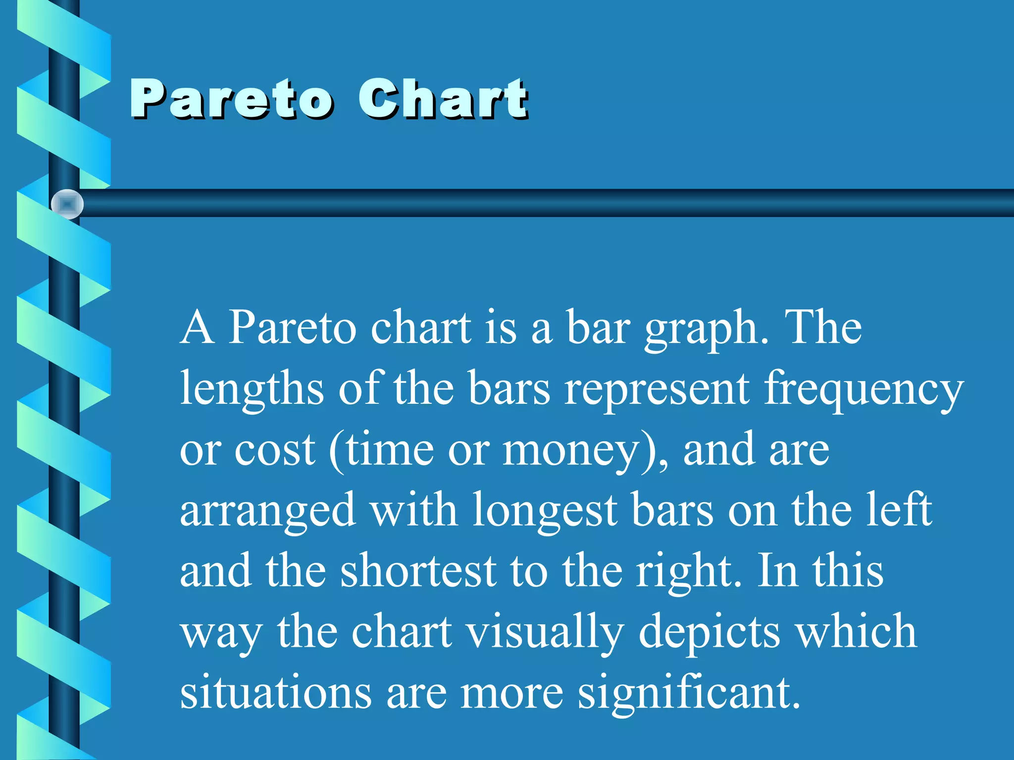
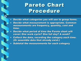
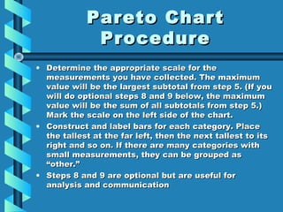
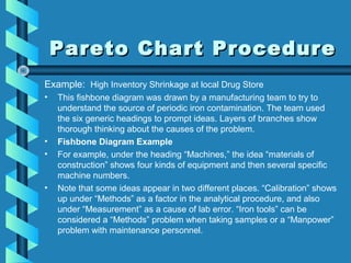
A Pareto chart is a type of bar graph that arranges data in descending order of frequency or cost, with the largest items on the left, to identify the most important issues. It involves collecting data on problems or causes, categorizing the data, calculating frequencies or costs for each category, and constructing bars to display the categories from largest to smallest. The chart is used to focus improvement efforts on addressing the major issues that have the greatest impact.
College Call Girls Nashik Nehal 7001305949 Independent Escort Service Nashik
Pareto
1. Pareto ChartPareto Chart
A Pareto chart is a bar graph. The
lengths of the bars represent frequency
or cost (time or money), and are
arranged with longest bars on the left
and the shortest to the right. In this
way the chart visually depicts which
situations are more significant.
2. • When analyzing data about the frequency
of problems or causes in a process.
• When there are many problems or causes
and you want to focus on the most
significant.
• When analyzing broad causes by looking
at their specific components.
• When communicating with others about
your data.
When to Use a Pareto Chart
3. Pareto ChartPareto Chart
ProcedureProcedure
• Decide what categories you will use to group items.Decide what categories you will use to group items.
• Decide what measurement is appropriate. CommonDecide what measurement is appropriate. Common
measurements are frequency, quantity, cost andmeasurements are frequency, quantity, cost and
time.time.
• Decide what period of time the Pareto chart willDecide what period of time the Pareto chart will
cover: One work cycle? One full day? A week?cover: One work cycle? One full day? A week?
• Collect the data, recording the category each time.Collect the data, recording the category each time.
(Or assemble data that already exist.)(Or assemble data that already exist.)
• Subtotal the measurements for each categorySubtotal the measurements for each category
4. Pareto ChartPareto Chart
ProcedureProcedure
• Determine the appropriate scale for theDetermine the appropriate scale for the
measurements you have collected. The maximummeasurements you have collected. The maximum
value will be the largest subtotal from step 5. (If youvalue will be the largest subtotal from step 5. (If you
will do optional steps 8 and 9 below, the maximumwill do optional steps 8 and 9 below, the maximum
value will be the sum of all subtotals from step 5.)value will be the sum of all subtotals from step 5.)
Mark the scale on the left side of the chart.Mark the scale on the left side of the chart.
• Construct and label bars for each category. PlaceConstruct and label bars for each category. Place
the tallest at the far left, then the next tallest to itsthe tallest at the far left, then the next tallest to its
right and so on. If there are many categories withright and so on. If there are many categories with
small measurements, they can be grouped assmall measurements, they can be grouped as
“other.”“other.”
• Steps 8 and 9 are optional but are useful forSteps 8 and 9 are optional but are useful for
analysis and communicationanalysis and communication
5. Pareto Chart ProcedurePareto Chart Procedure
Example: High Inventory Shrinkage at local Drug Store
• This fishbone diagram was drawn by a manufacturing team to try to
understand the source of periodic iron contamination. The team used
the six generic headings to prompt ideas. Layers of branches show
thorough thinking about the causes of the problem.
• Fishbone Diagram Example
• For example, under the heading “Machines,” the idea “materials of
construction” shows four kinds of equipment and then several specific
machine numbers.
• Note that some ideas appear in two different places. “Calibration” shows
up under “Methods” as a factor in the analytical procedure, and also
under “Measurement” as a cause of lab error. “Iron tools” can be
considered a “Methods” problem when taking samples or a “Manpower”
problem with maintenance personnel.
6. Create a FishboneCreate a Fishbone
DiagramDiagram
Analyze process dispersion with this
simple, visual tool. The resulting diagram
illustrates the main causes and subcauses
leading to an effect (symptom). Start
using Fish Bone Tool.
7. Create a FishboneCreate a Fishbone
DiagramDiagram
Analyze process dispersion with this
simple, visual tool. The resulting diagram
illustrates the main causes and subcauses
leading to an effect (symptom). Start
using Fish Bone Tool.
Editor's Notes
Also known as Ishikawa Diagrams and Cause and Effect Diagrams. By mapping out a company’s problem, new thoughts and ideas can arise to better the situation. Sheds light on situations.
Diagrams begin with the problem to be solved in a rectangle.
For the example Diagram, inventory shrinkage was used. This is a measure of the shoplifted, stolen, or broken goods at a store.
This is placed in a rectangle at the “head” of the fish.