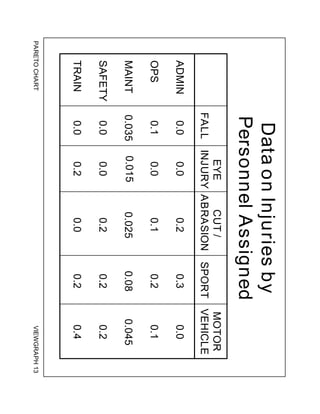
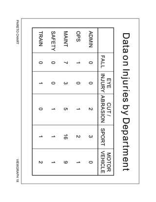
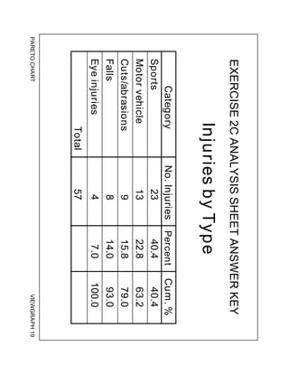
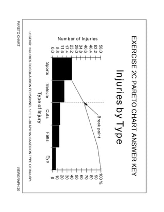
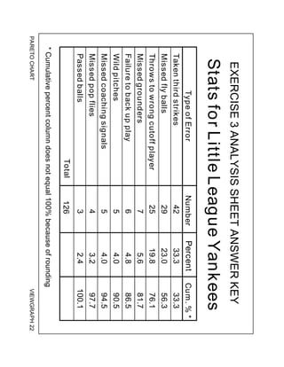
Basic Tools for Process Improvement
PARETO CHART 1
Module 8
PARETO CHART
Basic Tools for Process Improvement
2 PARETO CHART
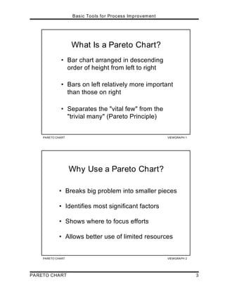
What is a Pareto Chart?
A Pareto Chart is “a series of bars whose heights reflect the frequency or impact of
problems. The bars are arranged in descending order of height from left to right.
This means the categories represented by the tall bars on the left are relatively more
significant than those on the right” [Ref. 5]. The chart gets its name from the Pareto
Principle, which postulates that 80 percent of the trouble comes from 20 percent of
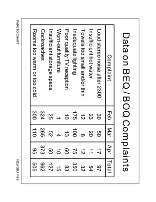
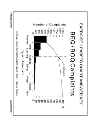
the problems. Viewgraph 1 highlights the elements of this definition.
Why should teams use Pareto Charts?
You can think of the benefits of using Pareto Charts in economic terms (Viewgraph
2). “A Pareto Chart breaks a big problem into smaller pieces (and) identifies the
biggest contributors. . . (It can) help us get the most improvement with the resources
available by showing where to focus efforts in order to maximize achievements. The
Pareto Principle states that a small number of causes accounts for most of the
problems. Focusing efforts on the ‘vital few’ causes is usually a better use of
valuable resources” [Ref. 1a].
When should we use a Pareto Chart?
A Pareto Chart is a good tool to use when the process you are investigating
produces data that are broken down into categories and you can count the number of
times each category occurs.
No matter where you are in your process improvement efforts, Pareto Charts can be
helpful, “. . . early on to identify which problem should be studied, later to narrow
down which causes of the problem to address first. Since they draw everyone's
attention to the ‘vital few’ important factors where the payback is likely to be greatest,
(they) can be used to build consensus. In general, teams should focus their attention
first on the biggest problems—those with the highest bars” [Ref. 5].
Making problem-solving decisions isn’t the only use of the Pareto Principle. Since
Pareto Charts convey information in a way that enables you to see clearly the
choices that should be made, they can be used to set priorities for many practical
applications in your command. Some examples are:
! Process improvement efforts for increased unit readiness
! Skills you want your division to have
! Customer needs
! Suppliers
! Investment opportunities
PARETO CHART VIEWGRAPH 1
What Is a Pareto Chart?
• Bar chart arranged in descending
order of height from left to right
• Bars on left relatively more important
than those on right
• Separates the "vital few" from the
"trivial many" (Pareto Principle)
PARETO CHART VIEWGRAPH 2
Why Use a Pareto Chart?
• Breaks big problem into smaller pieces
• Identifies most significant factors
• Shows where to focus efforts
• Allows better use of limited resources
Basic Tools for Process Improvement
PARETO CHART 3
Basic Tools for Process Improvement
4 PARETO CHART
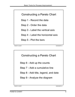
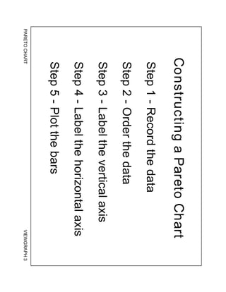
How is a Pareto Chart constructed?
To construct a Pareto Chart, you need to start with meaningful data which you have
collected and categorized. You may want to turn to the Data Collection module at
this point to review the process of collecting and categorizing data that you can chart.
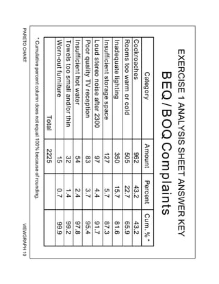
Now you’re ready to follow the steps for constructing a Pareto Chart (Viewgraphs 3
and 4). The steps below have been adapted from Joiner [Ref. 1b].
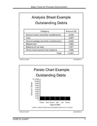
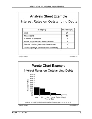
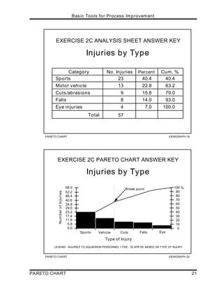
Step 1 - Record the raw data. List each category and its associated data count.
Step 2 - Order the data. Prepare an analysis sheet, putting the categories in order
and placing the one with the largest count first.
Step 3 - Label the left-hand vertical axis. Make sure the labels are spaced in
equal intervals from 0 to a round number equal to or just larger than the total of all
counts. Provide a caption to describe the unit of measurement being used.
Step 4 - Label the horizontal axis. Make the widths of all of the bars the same
and label the categories from largest to smallest. An "other" category can be
used last to capture several smaller sets of data. Provide a caption to describe
them. If the contributor names are long, label the axis A, B, C, etc. and provide a
key.
Step 5 - Plot a bar for each category. The height of each bar should equal the
count for that category. The widths of the bars should be identical.
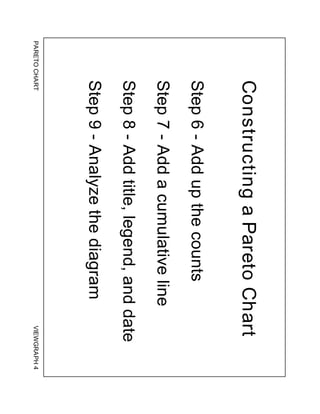
Step 6 - Find the cumulative counts. Each category's cumulative count is the
count for that category added to the counts for all larger categories.
Step 7 - Add a cumulative line. This is optional. Label the right axis from 0 to
100%, and line up the 100% with the grand total on the left axis. For each
category, put a dot as high as the cumulative total and in line with the right
edge of that category's bar. Connect all the dots with straight lines.
PARETO CHART VIEWGRAPH 3
Constructing a Pareto Chart
Step 1 - Record the data
Step 2 - Order the data
Step 3 - Label the vertical axis
Step 4 - Label the horizontal axis
Step 5 - Plot the bars
PARETO CHART VIEWGRAPH 4
Constructing a Pareto Chart
Step 6 - Add up the counts
Step 7 - Add a cumulative line
Step 8 - Add title, legend, and date
Step 9 - Analyze the diagram
Basic Tools for Process Improvement
PARETO CHART 5
Basic Tools for Process Improvement
6 PARETO CHART
Step 8 - Add title, legend, and date.
Step 9 - Analyze the diagram. Look for the break point on the cumulative
percent graph. It can be identified by a marked change in the slope of the graph
(see Viewgraph 11). This separates the significant few from the trivial many.
NOTE: The significant few-trivial many principle does not always hold. No matter
how many data are categorized, they can be ranked and made into a Pareto
diagram. But sometimes no single bar is dramatically different from the others, and
the Pareto Chart looks flat or gently sloping. To attack the tall bar in that situation is
no help. You need to look for another way to categorize the data.
Now let's look at an example to illustrate the Pareto Chart construction process:
You recently inherited $10,000 and would like to apply it to some of your
outstanding bills. Here is what you owe:
Home improvement loan balance $1,956
Visa $2,007
Mastercard $1,983
Church building fund pledge (monthly
installments of $83.33 for two years) $2,000
Balance of car loan $1,971
School tuition (monthly installments of
$169.17 for one year) $2,030
Viewgraphs 5 and 6 show how this would look when recorded on an analysis sheet
and plotted on a Pareto Chart.
PARETO CHART VIEWGRAPH 6
Pareto Chart Example
Outstanding Debts
LEGEND: AMOUNT OWED ON OUTSTANDING DEBTS AS OF 12 FEB 95.
0
1,200
2,400
3,600
4,800
6,000
7,200
8,400
9,600
10,800
12,000
Tuition Visa Church MC Car Home
Type of Debt
Amount
Owed
$
PARETO CHART VIEWGRAPH 5
Analysis Sheet Example
Outstanding Debts
Category Amount ($)
School tuition (monthly installments) 2,030
Visa 2,007
2,000
Church pledge (monthly installments)
1,983
Mastercard
Balance of car loan 1,971
Home improvement loan balance 1,956
Total 11,947
Basic Tools for Process Improvement
PARETO CHART 7
Basic Tools for Process Improvement
8 PARETO CHART
You probably noticed that no single bar is dramatically different from the others.
Looking at your outstanding debts in this way isn't much help. Is there a different way
the data could be categorized to make it more meaningful? What if you were to
consider the interest rates on your outstanding debts?
Viewgraphs 7 and 8 show what that would look like. A much clearer picture of your
outstanding debts now emerges, and you are able to make a better decision on how to
manage your money.
NOTE: In this example, we opted not to show a cumulative line (Step 7) on the right
side of the Pareto Chart because it might be confusing to create a percentage of
percentages.
How do we interpret a Pareto Chart?
When you look at a Pareto Chart, you can see break points in the heights of the bars
which indicate the most important categories. This information is useful when you are
establishing priorities.
As you can see in the example we've just looked at, you can detect two big breaks in
the heights of the bars when you categorize the data in a different way:
! The first break point is between the second and third bars. The difference
between these two bars is much more noticeable than the other differences.
This shows the relative importance of the first two bars in relation to the
others.
! The other break point occurs after the fourth bar. Addressing the third and
fourth bars will give a higher payoff than addressing the last two bars.
You will have an opportunity to develop your interpretation skills when you do the
practice exercises that follow.
PARETO CHART VIEWGRAPH 8
Pareto Chart Example
Interest Rates on Outstanding Debts
Type of Debt
0.0
5.7
11.4
17.1
22.8
28.5
34.2
39.9
45.6
51.3
57.0
Visa MC Car Home Tuition Church
Interest
Rates
LEGEND: INTEREST RATES CHARGED ON OUTSTANDING DEBTS AS OF 12 FEB 95.
PARETO CHART VIEWGRAPH 7
Analysis Sheet Example
Interest Rates on Outstanding Debts
Category Int. Rate (%)
Mastercard
Home improvement loan balance
School tuition (monthly installments)
Visa
Balance of car loan
21
18
9
2
Church pledge (monthly installments) 1
6
Basic Tools for Process Improvement
PARETO CHART 9
Basic Tools for Process Improvement
10 PARETO CHART
How can we practice what we’ve learned?
Now let's practice constructing and interpreting Pareto Charts using the data provided
for the scenario in each exercise. Analysis sheets and Pareto Charts are provided as
answer keys.
EXERCISE 1: You are part of a team responsible for the quality of the BEQ/BOQ.
You want to improve the service you provide but are not sure where to begin or where
to concentrate your efforts. You decide to keep track of the complaints received over
a three-month period. Viewgraph 9 records this data.
Rank order your data in an analysis sheet and draw a Pareto Chart.
Now answer the following questions:
1. Does the Pareto Principle apply?
2. Where should you concentrate your efforts?
3. Do your proposed efforts pass a sanity check? In other words, do the
top problems really stand out as most important to you and your
customers?
PARETO CHART VIEWGRAPH 9
Data on BEQ / BOQ Complaints
Complaint Feb Mar Apr Total
Loud stereo noise after 2300
Insufficient hot water
Towels too small and/or thin
Inadequate lighting
Poor quality TV reception
Worn-out furniture
Insufficient storage space
Cockroaches
Rooms too warm or too cold
30
23
12
175
10
1
25
324
300
50
20
8
100
13
4
52
265
110
17
11
12
75
60
10
50
373
95
97
54
32
350
83
15
127
962
505
Basic Tools for Process Improvement
PARETO CHART 11
Basic Tools for Process Improvement
12 PARETO CHART
Now let’s compare the analysis sheet and Pareto Chart you prepared for this exercise
with Viewgraphs 10 and 11.
Did you come up with the following points in discussing the questions?
1. In this problem, the Pareto Principle is very much in evidence. Notice the sharp
change of slope after the first three items. Most Pareto Charts will have such a
break point.
2. Attacking the problems to the left of the break point will have the greatest
payoff. In fact, if you solve these problems, you will have dealt with 81.7
percent of the deficiencies uncovered in your customer survey. Therefore, this
is where you should concentrate your initial efforts.
Later, you can do another Pareto analysis which will probably show some of the
lesser problems becoming more dominant.
3. How about your sanity check? Well, not only is the cockroach problem number
one in your survey, but from a health standpoint, it merits immediate action.
PARETO CHART VIEWGRAPH 11
EXERCISE 1 PARETO CHART ANSWER KEY
LEGEND: COMPLAINTS RECORDED IN BEQ / BOQ, 1 FEB - 30 APR 95.
BEQ / BOQ Complaints
Roaches
Temp
Lighting
Storage
Stereo
TV
Water
Towels
Furn
0
223
446
669
892
1115
1338
1561
1784
2007
Type of Complaint
Number
of
Complaints
0
10
20
30
40
50
60
70
80
90
100 %
2225
Break point
PARETO CHART VIEWGRAPH 10
EXERCISE 1 ANALYSIS SHEET ANSWER KEY
BEQ / BOQ Complaints
Category Amount Percent Cum. % *
962 43.2 43.2
505 22.7 65.9
350 15.7 81.6
127 5.7 87.3
54 2.4 97.8
32 1.4 99.2
Cockroaches
Rooms too warm or cold
Inadequate lighting
Insufficient storage space
97 4.4 91.7
Loud stereo noise after 2300
83 3.7 95.4
Poor quality TV reception
Insufficient hot water
Towels too small and/or thin
Worn-out furniture 15 0.7 99.9
Total 2225
* Cumulative percent column does not equal 100% because of rounding.
Basic Tools for Process Improvement
PARETO CHART 13
Basic Tools for Process Improvement
14 PARETO CHART
EXERCISE 2 - PART A: You are trying to improve safety in your unit. Lately, there
seems to be a rash of injuries in the Maintenance Department. You decide to check
out this perception by recording data by department for three months. Examining the
matrix in Viewgraph 12, it appears that your perception is correct.
Order your data in an analysis sheet and draw a Pareto Chart for total unit
injuries by department.
Now answer the following questions:
1. Does the Pareto Principle apply?
2. Where should you concentrate your efforts?
3. Do your proposed solutions pass a sanity check?
You can compare your analysis sheet and Pareto Chart with Viewgraphs 14 and 15.
Looking at your Pareto Chart, it appears that your suspicions are confirmed.
Maintenance has the most injuries. You're ready to focus on the safety problems in
that department. But wait a minute! What about that all-important sanity check?
EXERCISE 2 - PART B: What if you looked at the number of personnel assigned to
each department? Here are those numbers:
Maintenance 200
Operations 10
Administration 10
Safety 5
Training 5
Dividing injuries by personnel assigned, your matrix now looks like Viewgraph 13.
Prepare a new analysis sheet and draw a Pareto Chart using this new
information.
When you've completed it, see how it compares with Viewgraphs 16 and 17.
When the number of personnel in the various departments is considered, we can now
see that Maintenance has the lowest injury rates. Perhaps we should look at our data
from a different perspective. Any ideas?
PARETO CHART VIEWGRAPH 12
Data on Injuries by Department
FALL
EYE
INJURY
CUT /
ABRASION SPORT
MOTOR
VEHICLE
ADMIN 0 0 2 3 0
OPS 1 0 1 2 1
MAINT 7 3 5 16 9
SAFETY 0 0 1 1 1
TRAIN 0 1 0 1 2
PARETO CHART VIEWGRAPH 13
Data on Injuries by
Personnel Assigned
FALL
EYE
INJURY
CUT /
ABRASION SPORT
MOTOR
VEHICLE
0.0 0.0 0.2 0.3 0.0
0.1 0.0 0.1 0.2 0.1
0.035 0.015 0.025 0.08 0.045
0.0 0.0 0.2 0.2 0.2
ADMIN
OPS
MAINT
SAFETY
TRAIN 0.0 0.2 0.0 0.2 0.4
Basic Tools for Process Improvement
PARETO CHART 15
PARETO CHART VIEWGRAPH 15
EXERCISE 2A PARETO CHART ANSWER KEY
LEGEND: INJURIES TO SQUADRON PERSONNEL 1 FEB - 30 APR 95.
Injuries by Department
Department
0.0
5.7
11.4
17.1
22.8
28.5
34.2
39.9
45.6
51.3
57.0
Maint Ops Admin Trng Safety
Injuries
0
10
20
30
40
50
60
70
80
90
100 %
Break point
PARETO CHART VIEWGRAPH 14
EXERCISE 2A ANALYSIS SHEET ANSWER KEY
Injuries by Department
* Cumulative percent column does not equal 100% because of rounding.
Category Cum. % *
No. Injuries
Total
Maintenance
Operations
Admin
Training
Safety
70.2
87.8
94.8
79.0
100.1
57
40
5
4
5
3
70.2
8.8
7.0
8.8
5.3
Percent
Basic Tools for Process Improvement
16 PARETO CHART
PARETO CHART VIEWGRAPH 17
EXERCISE 2B PARETO CHART ANSWER KEY
Injuries by Personnel Assigned
LEGEND: INJURIES TO SQUADRON PERSONNEL 1 FEB - 30 APR 95.
BASED ON NUMBER OF PERSONNEL ASSIGNED.
Department
0.0
0.3
0.6
0.8
1.1
1.4
1.7
2.0
2.2
2.5
2.8
Safety Trng Admin Ops Maint
Injuries /
Personnel
Assigned
0
10
20
30
40
50
60
70
80
90
100 %
Break point
PARETO CHART VIEWGRAPH 16
EXERCISE 2B ANALYSIS SHEET ANSWER KEY
Injuries by Personnel Assigned
* Cumulative percent column does not equal 100% because of rounding.
Category Cum. % *
Training
Admin
Operations
Maintenance
Injury Rate
0.80
0.50
0.50
0.20
57.2
75.1
93.0
100.1
Total 2.80
Safety 0.80 28.6
28.6
28.6
17.9
17.9
7.1
Percent
Basic Tools for Process Improvement
PARETO CHART 17
Basic Tools for Process Improvement
18 PARETO CHART
EXERCISE 2 - PART C: One possibility is to explore the types of injuries.
Let's look at our first matrix again (Viewgraph 18).
Would the Pareto Principle apply if we analyzed our data based on the
vertical columns?
Prepare an analysis sheet and draw a Pareto Chart.
Does this chart tell you anything?
PARETO CHART VIEWGRAPH 18
Data on Injuries by Department
FALL
EYE
INJURY
CUT /
ABRASION SPORT
MOTOR
VEHICLE
ADMIN 0 0 2 3 0
OPS 1 0 1 2 1
MAINT 7 3 5 16 9
SAFETY 0 0 1 1 1
TRAIN 0 1 0 1 2
Basic Tools for Process Improvement
PARETO CHART 19
Basic Tools for Process Improvement
20 PARETO CHART
Compare your analysis sheet and Pareto Chart with Viewgraphs 19 and 20.
What you've probably noticed from the analysis is the impact of sports injuries on the
unit. This would be a good place to focus your efforts to improve safety.
The Pareto Principle allows you to pursue your search for the best application of your
time, energy, and dollars even further. For example, sports could be broken down
into:
> Types of sports
> Types of injuries (back, ankle, head; fracture, sprain, bruise)
> Age of persons injured
> Use of protective equipment
> Level of preparation (stretching)
> Level of training for the sport
With the knowledge you gain from a more detailed analysis, you now have even more
insight into how to solve a particular problem and what your focus should be.
PARETO CHART VIEWGRAPH 20
EXERCISE 2C PARETO CHART ANSWER KEY
Injuries by Type
LEGEND: INJURIES TO SQUADRON PERSONNEL 1 FEB - 30 APR 95. BASED ON TYPE OF INJURY.
5.8
17.4
0.0
29.0
40.6
46.4
11.6
23.2
34.8
52.2
58.0
Sports Vehicle Cuts Falls Eye
Type of Injury
Number
of
Injuries
0
10
20
30
40
50
60
70
80
90
100 %
Break point
PARETO CHART VIEWGRAPH 19
EXERCISE 2C ANALYSIS SHEET ANSWER KEY
Injuries by Type
Sports
Motor vehicle
Cuts/abrasions
Falls
Eye injuries
40.4
22.8
15.8
14.0
7.0
40.4
63.2
79.0
93.0
100.0
Total
23
13
9
8
4
57
Category No. Injuries Cum. %
Percent
Basic Tools for Process Improvement
PARETO CHART 21
Basic Tools for Process Improvement
22 PARETO CHART
EXERCISE 3: During your off-duty hours, you coach a little league team composed of
eleven- and twelve-year-olds. The team has lost a couple of close ball games
recently. You decide to look at the statistics from the games you have already played
and see whether you notice any areas that require attention in your next few practices.
Viewgraph 21 shows this data.
Order your data in an analysis sheet and create a Pareto Chart.
Now answer the following questions:
1. Does the Pareto Principle apply?
2. Where should you concentrate your efforts?
3. Do your proposed solutions pass a sanity check?
PARETO CHART VIEWGRAPH 21
Little League Yankees Stats
Type of Error Number
5
29
7
4
5
42
25
6
Wild pitch
Missed fly ball to the outfield
Missed grounder
Missed pop fly to the infield
Missed coaching signal
Taken third strike
Throw to wrong cutoff player
Failure to back up the play
Passed ball 3
Basic Tools for Process Improvement
PARETO CHART 23
Basic Tools for Process Improvement
24 PARETO CHART
Now let’s compare the analysis sheet and Pareto Chart you prepared with Viewgraphs
22 and 23.
Did analyzing your Pareto Chart show you some practical applications for the
information you gathered and ranked?
1. When you analyzed your Pareto Chart, you could easily see the break point
after the three items on the left, indicating that the Pareto Principle applies.
2. As a Little League coach, you can see the practical applications of this
information. You and your assistant coaches need to spend more time during
batting practice working on aggressively protecting the plate when there are two
strikes; hitting fly balls to the outfielders and coaching them on fielding
techniques; and teaching the outfielders to throw to the proper cutoff player.
3. Your Pareto Chart has given you reasonable answers. Based on the data,
emphasis on these three areas would be time well spent and could make the
difference in any future close ball games.
PARETO CHART VIEWGRAPH 23
EXERCISE 3 PARETO CHART ANSWER KEY
LEGEND: ERRORS COMMITTED DURING FIRST FIVE GAMES OF SPRING SEASON 1995.
0
14
28
42
56
70
84
98
112
126
Strike
FB
Throw
GB
Backup
WP
Signal
Pop fly
PB
Type of Error
Number
of
Errors
0
10
20
30
40
50
60
70
80
90
100 %
Stats for Little League Yankees
Break point
PARETO CHART VIEWGRAPH 22
EXERCISE 3 ANALYSIS SHEET ANSWER KEY
Stats for Little League Yankees
Type of Error Number Cum. % *
33.3 33.3
23.0 56.3
19.8 76.1
5.6 81.7
4.8 86.5
4.0 90.5
4.0 94.5
3.2 97.7
Taken third strikes
Missed fly balls
Throws to wrong cutoff player
Missed grounders
Failure to back up play
Wild pitches
Missed coaching signals
Missed pop flies
Passed balls 2.4 100.1
Total
42
29
25
7
6
5
5
4
3
126
Percent
* Cumulative percent column does not equal 100% because of rounding .
Basic Tools for Process Improvement
PARETO CHART 25
Basic Tools for Process Improvement
26 PARETO CHART
REFERENCES:
1. Basic Improvement Tools. Madison, WI: Joiner Associates.
a. Instructor Guide, p. 13.
b. Workbook, p. 60.
2. Department of the Navy (November 1992). Fundamentals of Total Quality
Leadership (Instructor Guide), pp. 6-35 - 6-42. San Diego, CA: Navy Personnel
Research and Development Center.
3. Department of the Navy (November 1992). Introduction to Total Quality
Leadership, pp. 6-18 - 6-19. Pensacola, FL: NET Program Management Support
Activity.
4. Department of the Navy (September 1993). Systems Approach to Process
Improvement (instructor Guide), pp. 4-26 - 4-39. San Diego, CA: OUSN Total
Quality Leadership Office and Navy Personnel Research and Development Center.
5. Scholtes, P.R. et al (1988). The Team Handbook, p. 2-25. Madison, WI: Joiner
Associates.
PARETO
CHART
VIEWGRAPH
1
What
Is
a
Pareto
Chart?
•
Bar
chart
arranged
in
descending
order
of
height
from
left
to
right
•
Bars
on
left
relatively
more
important
than
those
on
right
•
Separates
the
"vital
few"
from
the
"trivial
many"
(Pareto
Principle)
PARETO
CHART
VIEWGRAPH
2
Why
Use
a
Pareto
Chart?
•
Breaks
big
problem
into
smaller
pieces
•
Identifies
most
significant
factors
•
Shows
where
to
focus
efforts
•
Allows
better
use
of
limited
resources
PARETO
CHART
VIEWGRAPH
3
Constructing
a
Pareto
Chart
Step
1
-
Record
the
data
Step
2
-
Order
the
data
Step
3
-
Label
the
vertical
axis
Step
4
-
Label
the
horizontal
axis
Step
5
-
Plot
the
bars
PARETO
CHART
VIEWGRAPH
4
Constructing
a
Pareto
Chart
Step
6
-
Add
up
the
counts
Step
7
-
Add
a
cumulative
line
Step
8
-
Add
title,
legend,
and
date
Step
9
-
Analyze
the
diagram
PARETO
CHART
VIEWGRAPH
5
Analysis
Sheet
Example
Outstanding
Debts
Category
Amount
($)
School
tuition
(monthly
installments)
2,030
Visa
2,007
2,000
Church
pledge
(monthly
installments)
1,983
Mastercard
Balance
of
car
loan
1,971
Home
improvement
loan
balance
1,956
Total
11,947
PARETO
CHART
VIEWGRAPH
6
Pareto
Chart
Example
Outstanding
Debts
LEGEND:
AMOUNT
OWED
ON
OUTSTANDING
DEBTS
AS
OF
12
FEB
95.
0
1,200
2,400
3,600
4,800
6,000
7,200
8,400
9,600
10,800
12,000
Tuition
Visa
Church
MC
Car
Home
Type
of
Debt
Amount Owed
$
PARETO
CHART
VIEWGRAPH
7
Analysis
Sheet
Example
Interest
Rates
on
Outstanding
Debts
Category
Int.
Rate
(%)
Mastercard
Home
improvement
loan
balance
School
tuition
(monthly
installments)
Visa
Balance
of
car
loan
21
18
9
2
Church
pledge
(monthly
installments)
1
6
PARETO
CHART
VIEWGRAPH
8
Pareto
Chart
Example
Interest
Rates
on
Outstanding
Debts
Type
of
Debt
0.0
5.7
11.4
17.1
22.8
28.5
34.2
39.9
45.6
51.3
57.0
Visa
MC
Car
Home
Tuition
Church
Interest Rates
LEGEND:
INTEREST
RATES
CHARGED
ON
OUTSTANDING
DEBTS
AS
OF
12
FEB
95.
PARETO
CHART
VIEWGRAPH
9
Data
on
BEQ
/
BOQ
Complaints
Complaint
Feb
Mar
Apr
Total
Loud
stereo
noise
after
2300
Insufficient
hot
water
Towels
too
small
and/or
thin
Inadequate
lighting
Poor
quality
TV
reception
Worn-out
furniture
Insufficient
storage
space
Cockroaches
Rooms
too
warm
or
too
cold
30
23
12
175
10
1
25
324
300
50
20
8
100
13
4
52
265
110
17
11
12
75
60
10
50
373
95
97
54
32
350
83
15
127
962
505
PARETO
CHART
VIEWGRAPH
10
EXERCISE
1
ANALYSIS
SHEET
ANSWER
KEY
BEQ
/
BOQ
Complaints
Category
Amount
Percent
Cum.
%
*
962
43.2
43.2
505
22.7
65.9
350
15.7
81.6
127
5.7
87.3
54
2.4
97.8
32
1.4
99.2
Cockroaches
Rooms
too
warm
or
cold
Inadequate
lighting
Insufficient
storage
space
97
4.4
91.7
Loud
stereo
noise
after
2300
83
3.7
95.4
Poor
quality
TV
reception
Insufficient
hot
water
Towels
too
small
and/or
thin
Worn-out
furniture
15
0.7
99.9
Total
2225
*
Cumulative
percent
column
does
not
equal
100%
because
of
rounding.
PARETO
CHART
VIEWGRAPH
11
EXERCISE
1
PARETO
CHART
ANSWER
KEY
LEGEND:
COMPLAINTS
RECORDED
IN
BEQ
/
BOQ,
1
FEB
-
30
APR
95.
BEQ
/
BOQ
Complaints
Roaches
Temp
Lighting
Storage
Stereo
TV
Water
Towels
Furn
0
223
446
669
892
1115
1338
1561
1784
2007
Type
of
Complaint
Number of Complaints
0
10
20
30
40
50
60
70
80
90
100
%
2225
Break
point
PARETO
CHART
VIEWGRAPH
12
Data
on
Injuries
by
Department
FALL
EYE
INJURY
CUT
/
ABRASION
SPORT
MOTOR
VEHICLE
ADMIN
0
0
2
3
0
OPS
1
0
1
2
1
MAINT
7
3
5
16
9
SAFETY
0
0
1
1
1
TRAIN
0
1
0
1
2
PARETO
CHART
VIEWGRAPH
13
Data
on
Injuries
by
Personnel
Assigned
FALL
EYE
INJURY
CUT
/
ABRASION
SPORT
MOTOR
VEHICLE
0.0
0.0
0.2
0.3
0.0
0.1
0.0
0.1
0.2
0.1
0.035
0.015
0.025
0.08
0.045
0.0
0.0
0.2
0.2
0.2
ADMIN
OPS
MAINT
SAFETY
TRAIN
0.0
0.2
0.0
0.2
0.4
PARETO
CHART
VIEWGRAPH
14
EXERCISE
2A
ANALYSIS
SHEET
ANSWER
KEY
Injuries
by
Department
*
Cumulative
percent
column
does
not
equal
100%
because
of
rounding.
Category
Cum.
%
*
No.
Injuries
Total
Maintenance
Operations
Admin
Training
Safety
70.2
87.8
94.8
79.0
100.1
57
40
5
4
5
3
70.2
8.8
7.0
8.8
5.3
Percent
PARETO
CHART
VIEWGRAPH
15
EXERCISE
2A
PARETO
CHART
ANSWER
KEY
LEGEND:
INJURIES
TO
SQUADRON
PERSONNEL
1
FEB
-
30
APR
95.
Injuries
by
Department
Department
0.0
5.7
11.4
17.1
22.8
28.5
34.2
39.9
45.6
51.3
57.0
Maint
Ops
Admin
Trng
Safety Injuries
0
10
20
30
40
50
60
70
80
90
100
%
Break
point
PARETO
CHART
VIEWGRAPH
16
EXERCISE
2B
ANALYSIS
SHEET
ANSWER
KEY
Injuries
by
Personnel
Assigned
*
Cumulative
percent
column
does
not
equal
100%
because
of
rounding.
Category
Cum.
%
*
Training
Admin
Operations
Maintenance
Injury
Rate
0.80
0.50
0.50
0.20
57.2
75.1
93.0
100.1
Total
2.80
Safety
0.80
28.6
28.6
28.6
17.9
17.9
7.1
Percent
PARETO
CHART
VIEWGRAPH
17
EXERCISE
2B
PARETO
CHART
ANSWER
KEY
Injuries
by
Personnel
Assigned
LEGEND:
INJURIES
TO
SQUADRON
PERSONNEL
1
FEB
-
30
APR
95.
BASED
ON
NUMBER
OF
PERSONNEL
ASSIGNED.
Department
0.0
0.3
0.6
0.8
1.1
1.4
1.7
2.0
2.2
2.5
2.8
Safety
Trng
Admin
Ops
Maint
Injuries
/
Personnel
Assigned
0
10
20
30
40
50
60
70
80
90
100
%
Break
point
PARETO
CHART
VIEWGRAPH
18
Data
on
Injuries
by
Department
FALL
EYE
INJURY
CUT
/
ABRASION
SPORT
MOTOR
VEHICLE
ADMIN
0
0
2
3
0
OPS
1
0
1
2
1
MAINT
7
3
5
16
9
SAFETY
0
0
1
1
1
TRAIN
0
1
0
1
2
PARETO
CHART
VIEWGRAPH
19
EXERCISE
2C
ANALYSIS
SHEET
ANSWER
KEY
Injuries
by
Type
Sports
Motor
vehicle
Cuts/abrasions
Falls
Eye
injuries
40.4
22.8
15.8
14.0
7.0
40.4
63.2
79.0
93.0
100.0
Total
23
13
9
8
4
57
Category
No.
Injuries
Cum.
%
Percent
PARETO
CHART
VIEWGRAPH
20
EXERCISE
2C
PARETO
CHART
ANSWER
KEY
Injuries
by
Type
LEGEND:
INJURIES
TO
SQUADRON
PERSONNEL
1
FEB
-
30
APR
95.
BASED
ON
TYPE
OF
INJURY.
5.8
17.4
0.0
29.0
40.6
46.4
11.6
23.2
34.8
52.2
58.0
Sports
Vehicle
Cuts
Falls
Eye
Type
of
Injury Number of Injuries
0
10
20
30
40
50
60
70
80
90
100
%
Break
point
PARETO
CHART
VIEWGRAPH
21
Little
League
Yankees
Stats
Type
of
Error
Number
5
29
7
4
5
42
25
6
Wild
pitch
Missed
fly
ball
to
the
outfield
Missed
grounder
Missed
pop
fly
to
the
infield
Missed
coaching
signal
Taken
third
strike
Throw
to
wrong
cutoff
player
Failure
to
back
up
the
play
Passed
ball
3
PARETO
CHART
VIEWGRAPH
22
EXERCISE
3
ANALYSIS
SHEET
ANSWER
KEY
Stats
for
Little
League
Yankees
Type
of
Error
Number
Cum.
%
*
33.3
33.3
23.0
56.3
19.8
76.1
5.6
81.7
4.8
86.5
4.0
90.5
4.0
94.5
3.2
97.7
Taken
third
strikes
Missed
fly
balls
Throws
to
wrong
cutoff
player
Missed
grounders
Failure
to
back
up
play
Wild
pitches
Missed
coaching
signals
Missed
pop
flies
Passed
balls
2.4
100.1
Total
42
29
25
7
6
5
5
4
3
126
Percent
*
Cumulative
percent
column
does
not
equal
100%
because
of
rounding
.
PARETO
CHART
VIEWGRAPH
23
EXERCISE
3
PARETO
CHART
ANSWER
KEY
LEGEND:
ERRORS
COMMITTED
DURING
FIRST
FIVE
GAMES
OF
SPRING
SEASON
1995.
0
14
28
42
56
70
84
98
112
126
Strike
FB
Throw
GB
Backup
WP
Signal
Pop
fly
PB
Type
of
Error
Number of Errors
0
10
20
30
40
50
60
70
80
90
100
%
Stats
for
Little
League
Yankees
Break
point

pareto digram in computer science sybsc cs