Download as PDF, PPTX


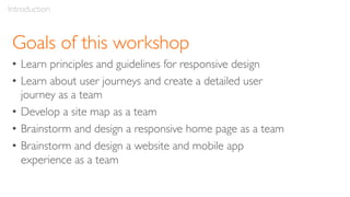


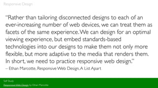

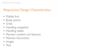


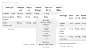
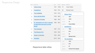
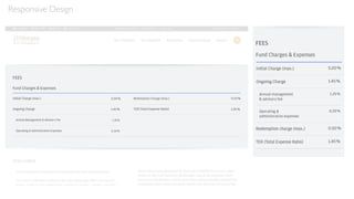
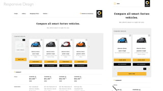


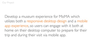
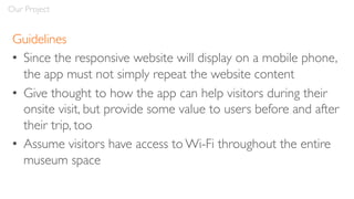

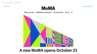

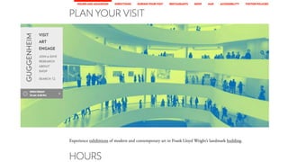
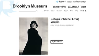


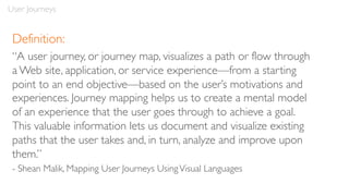
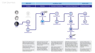


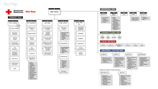
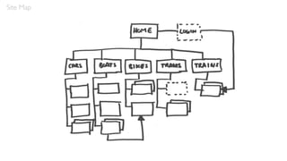


The document outlines a workshop on responsive UX design led by Robert Stribley, aimed at teaching participants the principles of responsive design, user journeys, and team collaboration to create web and mobile experiences. Key topics include mobile-first design, adaptive vs. responsive layouts, and the importance of maintaining content and hierarchies across devices. Participants will engage in exercises to develop a site map and design a responsive homepage and mobile app for a museum experience.


![Responsive Design Studio [Mountain View 2013]](https://cdn.slidesharecdn.com/ss_thumbnails/responsivedesignstudiomountainview-131018101452-phpapp01-thumbnail.jpg?width=640&height=640&fit=bounds)


