Download as PDF, PPTX


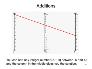
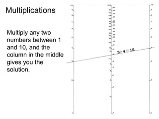
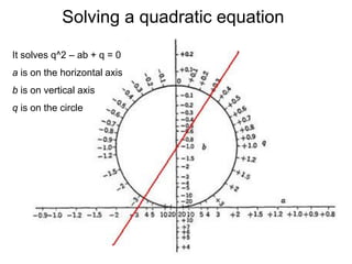
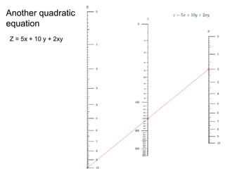
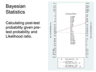
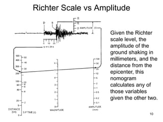
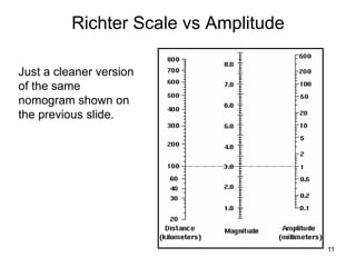
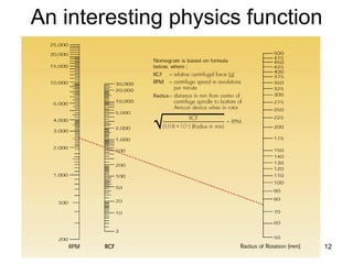
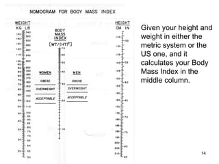
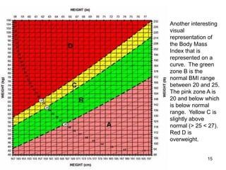
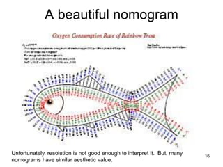

Nomograms are visual tools used for calculating equations in various fields such as math and medicine, known for their effectiveness and aesthetic qualities. The document illustrates different types of nomograms, including basic addition and multiplication, quadratic equations, and applications in statistics and physics. It also highlights their use in calculating body mass index and demonstrates the visual representation of this data.