Download to read offline

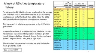
![45
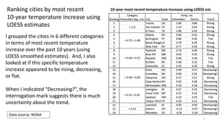
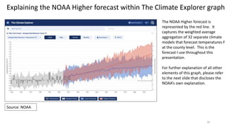
NOAA Model(s) Weaknesses continued
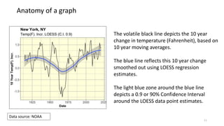
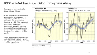
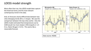
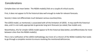
If you look closely at the historical visual data (for New York in
this specific case), the NOAA model does not appear to fit it
well. The NOAA does not disclose the weighted average
estimates during the history which should have been
represented by a black line.
The NOAA just showed the minimum and maximum of their
32 models.
If the NOAA model fit was good, the minimum and maximum estimates should be symmetric around the
historical temperature data points. They are often not [symmetric]. This is a reflection of a poor historical fit.
Source: NOAA](https://image.slidesharecdn.com/climatechangecities-220927001641-15d52191/85/Climate-Change-in-24-US-Cities-45-320.jpg)

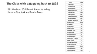
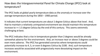
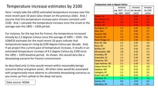
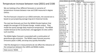
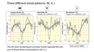
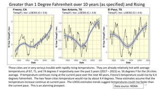
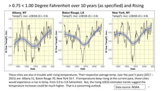
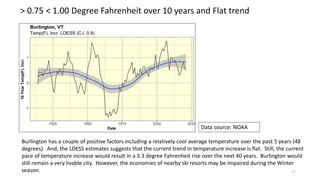
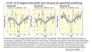
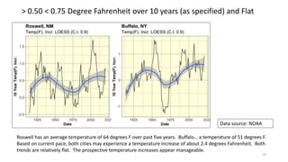
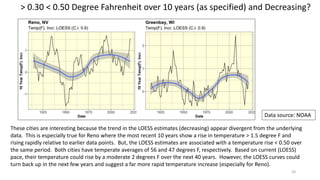
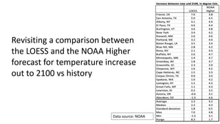
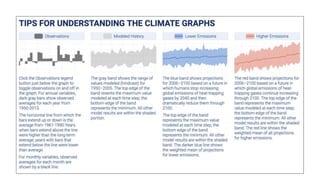
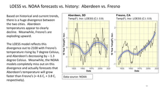
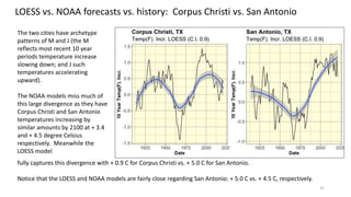
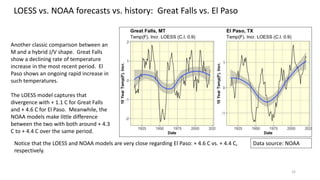
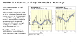
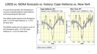
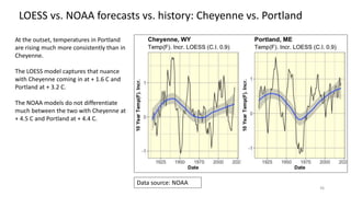
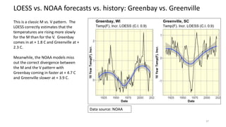
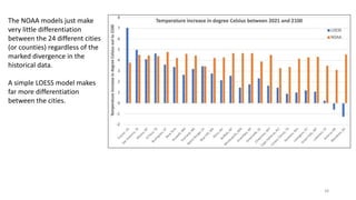
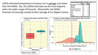
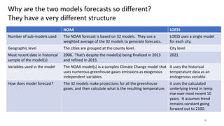
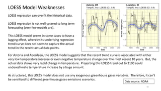
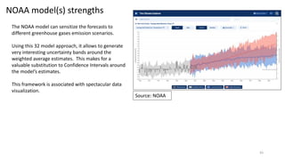
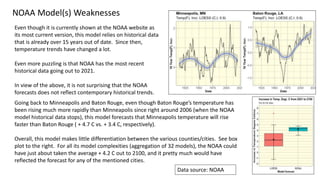
The document analyzes climate change impacts on 24 US cities by examining historical temperature records starting from 1895, revealing that many cities have already exceeded the IPCC's threshold of a 1.5 degree Celsius increase. Utilizing a loess regression approach, the analysis identifies concerning temperature trends, suggesting that if current patterns continue, cities like Fresno could face a devastating temperature rise by 2100. The data highlights significant discrepancies between loess estimates and NOAA climate models, indicating a need for more accurate projections of future climate scenarios.