Download to read offline

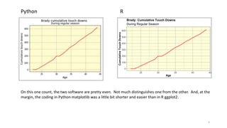

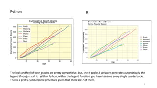
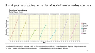

This document compares data visualization capabilities of Python matplotlib and R ggplot2 packages. It finds that while single and multiple time series graphs are comparable between the two, facet graphs are much easier to produce in R ggplot2. Facet graphs allow generating separate graphs for each variable (quarterback) on the same figure. The document shows examples of easy to produce and informative facet graphs in R, but very poor and difficult to produce facet graphs in Python matplotlib for time series data. It concludes that for facet time series graphs, R ggplot2 is clearly preferable over Python matplotlib.