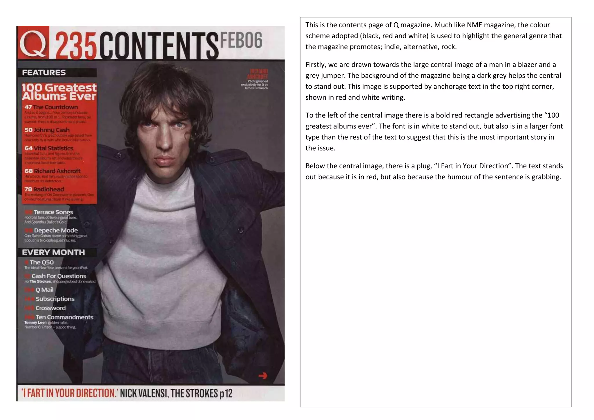
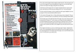
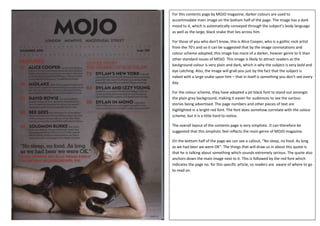
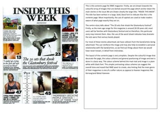
This is the contents page of Q magazine. Much like NME magazine, the colour
scheme adopted (black, red and white) is used to highlight the general genre that
the magazine promotes; indie, alternative, rock.

Firstly, we are drawn towards the large central image of a man in a blazer and a
grey jumper. The background of the magazine being a dark grey helps the central
to stand out. This image is supported by anchorage text in the top right corner,
shown in red and white writing.

To the left of the central image there is a bold red rectangle advertising the “100
greatest albums ever”. The font is in white to stand out, but also is in a larger font
type than the rest of the text to suggest that this is the most important story in
the issue.

Below the central image, there is a plug, “I Fart in Your Direction”. The text stands
out because it is in red, but also because the humour of the sentence is grabbing.
This is the contents page of metal magazine, Metal Hammer. The main genre and
tone of the magazine is clearly distinguished through the use of the bold, black
section to the right of the page, along with the red writing.

Scattered around the page, there are images of people dressed in typical metal
attire, with black hair, black face paint along with the ‘ImI’ rock hand symbol.

The font used for the page is a harsh, eroded font which again highlights the tone
and genre of the music provided by Metal Hammer.

In the centre of the page, there is a flash, advertising a story on page 16, “Pop up
your ass”. The flash has been surrounded by a red circle, imitating a blood spatter.

On the body copy on the right hand side of the page, we can see a drop cap used,
indicated by the large red ‘T’, which stands out amongst the black background.
The black background has been used to advertise an important story in this issue.
The text is also anchored by graphic features. Below this article, we can see a
tagline, which indicates the editor of the magazine, but also who wrote this short
story.

This magazine also gives us a clue as to what age range it targets. Judging by the
harsh, scary looking graphic features and eroded font around the page, as well as
the swearing gesture on the bottom left of the page, we can automatically assume
that it is for late teens up to adults (20+).
For this contents page by MOJO magazine, darker colours are used to
accommodate main image on the bottom half of the page. The image has a dark
mood to it, which is automatically conveyed through the subject’s body language
as well as the large, black snake that lies across him.

For those of you who don’t know, this is Alice Cooper, who is a gothic rock artist
from the 70’s and so it can be suggested that by the image connotations and
colour scheme adopted, this image has more of a darker, heavier genre to it than
other standard issues of MOJO. This image is likely to attract readers as the
background colour is very plain and dark, which is why the subject is very bold and
eye catching. Also, the image will grab you just by the fact that the subject is
naked with a large snake upon him – that in itself is something you don’t see every
day.

For the colour scheme, they have adopted a jet black font to stand out amongst
the plain grey background, making it easier for audiences to see the various
stories being advertised. The page numbers and other pieces of text are
highlighted in a bright red font. The font does somehow correlate with the colour
scheme, but it is a little hard to notice.

The overall layout of the contents page is very simplistic. It can therefore be
suggested that this simplistic feel reflects the main genre of MOJO magazine.

On the bottom half of the page we can see a callout, “No sleep, no food. As long
as we had beer we were OK”. The things that will draw us in about this quote is
that he is talking about something which sounds extremely serious. The quote also
anchors down the main image next to it. This is followed by the red font which
indicates the page no. for this specific article, so readers are aware of where to go
to read on.
This is the contents page for NME magazine. Firstly, we are drawn towards the
colourful array of images that are darted around the page which anchor down the
main stories in the issue.We are drawn closely the large title, “INSIDE THIS WEEK”.
The title has been written in a large, bold, black font to indicate that this is the
contents page. More importantly, the use of capitals are used to make readers
aware of what page exactly they are on.

The centre story talks about “The 20 sets that shook the Glastonbury Festival”.
Firstly, as the main age range for this magazine is around 18-30 years old, most
users will be familiar with Glastonbury festival and so therefore, this particular
story may interest them. Also, the use of the word shook indicates how dramatic
the sets were that various bands played.

For most of these stories advertised, we have callouts from the band/artists being
advertised. This can reinforce the image and may also help to establish a personal
relationship with the band/artists, as we find out things about them we would
have never known, in detail from interviews.

The layout of the contents page is very simplistic. Despite the colourful image that
decorate the page, the colour scheme and general positioning of image and text is
done in a basic way. The colour scheme behind the main text and image is a plain
white with black font. This simple contrasting colour scheme can suggest the
overall tone and mood that NME want to create, also hinting that the main genre
of their magazines is one of a softer nature as oppose to heavier magazines like
Kerrang!and Metal Hammer.
This is the Kerrang! Magazine contents page. This can be clearly established
through the consistent use of the black background and jagged font, which
again, can be argued, determines the heaviness of the rock/metal genre.

The contents title on this page, is in a clear, bright yellow font to contrast the
black, making it clear to readers as to what page they are on.

The top half of the page features a central image of popular rock guitarist slash.
The artist is dressed in all black, keeping the colour scheme running consistently.

For a majority of the cover lines featured on the bottom half of the page, there
are graphic features to anchor down the text, to reinforce the story being
advertised.

The contents page layout has been segregated into two separate stores. The top
half being the more important stories featured; in this case, there are two DPS’s
about “School of Rock” and “Bullet for my Valentine”. These stories are
extremely relevant to the generic content that is featured in each issue of
Kerrang! therefore, most readers are inclined to head for those pages. Behind
these two DPS advertisements, there is a large image of rock artist ‘Slash’. The
image is much larger and more prominent than the other images featured on the
contents page. This suggests that this is THE most important story in the whole
of the issue. The page number is highlighted clearly in a contrasting font, so
readers know exactly where to go to read about him.

On the bottom half, we have the typical contents page layout, with all the other
stories advertised. These stories are in smaller font and have no graphic feature
to anchor the text. This suggests that they are not as important as the stories
featured in the top half.

To the left of the stories on the bottom half, we can see a brief introduction to a
short article, which is then followed by a tagline (author’s name printed at the
end of a short article) to allow audiences to understand who wrote the piece.

Contents page analysis

  • 1.
    This is thecontents page of Q magazine. Much like NME magazine, the colour scheme adopted (black, red and white) is used to highlight the general genre that the magazine promotes; indie, alternative, rock. Firstly, we are drawn towards the large central image of a man in a blazer and a grey jumper. The background of the magazine being a dark grey helps the central to stand out. This image is supported by anchorage text in the top right corner, shown in red and white writing. To the left of the central image there is a bold red rectangle advertising the “100 greatest albums ever”. The font is in white to stand out, but also is in a larger font type than the rest of the text to suggest that this is the most important story in the issue. Below the central image, there is a plug, “I Fart in Your Direction”. The text stands out because it is in red, but also because the humour of the sentence is grabbing.
  • 2.
    This is thecontents page of metal magazine, Metal Hammer. The main genre and tone of the magazine is clearly distinguished through the use of the bold, black section to the right of the page, along with the red writing. Scattered around the page, there are images of people dressed in typical metal attire, with black hair, black face paint along with the ‘ImI’ rock hand symbol. The font used for the page is a harsh, eroded font which again highlights the tone and genre of the music provided by Metal Hammer. In the centre of the page, there is a flash, advertising a story on page 16, “Pop up your ass”. The flash has been surrounded by a red circle, imitating a blood spatter. On the body copy on the right hand side of the page, we can see a drop cap used, indicated by the large red ‘T’, which stands out amongst the black background. The black background has been used to advertise an important story in this issue. The text is also anchored by graphic features. Below this article, we can see a tagline, which indicates the editor of the magazine, but also who wrote this short story. This magazine also gives us a clue as to what age range it targets. Judging by the harsh, scary looking graphic features and eroded font around the page, as well as the swearing gesture on the bottom left of the page, we can automatically assume that it is for late teens up to adults (20+).
  • 3.
    For this contentspage by MOJO magazine, darker colours are used to accommodate main image on the bottom half of the page. The image has a dark mood to it, which is automatically conveyed through the subject’s body language as well as the large, black snake that lies across him. For those of you who don’t know, this is Alice Cooper, who is a gothic rock artist from the 70’s and so it can be suggested that by the image connotations and colour scheme adopted, this image has more of a darker, heavier genre to it than other standard issues of MOJO. This image is likely to attract readers as the background colour is very plain and dark, which is why the subject is very bold and eye catching. Also, the image will grab you just by the fact that the subject is naked with a large snake upon him – that in itself is something you don’t see every day. For the colour scheme, they have adopted a jet black font to stand out amongst the plain grey background, making it easier for audiences to see the various stories being advertised. The page numbers and other pieces of text are highlighted in a bright red font. The font does somehow correlate with the colour scheme, but it is a little hard to notice. The overall layout of the contents page is very simplistic. It can therefore be suggested that this simplistic feel reflects the main genre of MOJO magazine. On the bottom half of the page we can see a callout, “No sleep, no food. As long as we had beer we were OK”. The things that will draw us in about this quote is that he is talking about something which sounds extremely serious. The quote also anchors down the main image next to it. This is followed by the red font which indicates the page no. for this specific article, so readers are aware of where to go to read on.
  • 4.
    This is thecontents page for NME magazine. Firstly, we are drawn towards the colourful array of images that are darted around the page which anchor down the main stories in the issue.We are drawn closely the large title, “INSIDE THIS WEEK”. The title has been written in a large, bold, black font to indicate that this is the contents page. More importantly, the use of capitals are used to make readers aware of what page exactly they are on. The centre story talks about “The 20 sets that shook the Glastonbury Festival”. Firstly, as the main age range for this magazine is around 18-30 years old, most users will be familiar with Glastonbury festival and so therefore, this particular story may interest them. Also, the use of the word shook indicates how dramatic the sets were that various bands played. For most of these stories advertised, we have callouts from the band/artists being advertised. This can reinforce the image and may also help to establish a personal relationship with the band/artists, as we find out things about them we would have never known, in detail from interviews. The layout of the contents page is very simplistic. Despite the colourful image that decorate the page, the colour scheme and general positioning of image and text is done in a basic way. The colour scheme behind the main text and image is a plain white with black font. This simple contrasting colour scheme can suggest the overall tone and mood that NME want to create, also hinting that the main genre of their magazines is one of a softer nature as oppose to heavier magazines like Kerrang!and Metal Hammer.
  • 5.
    This is theKerrang! Magazine contents page. This can be clearly established through the consistent use of the black background and jagged font, which again, can be argued, determines the heaviness of the rock/metal genre. The contents title on this page, is in a clear, bright yellow font to contrast the black, making it clear to readers as to what page they are on. The top half of the page features a central image of popular rock guitarist slash. The artist is dressed in all black, keeping the colour scheme running consistently. For a majority of the cover lines featured on the bottom half of the page, there are graphic features to anchor down the text, to reinforce the story being advertised. The contents page layout has been segregated into two separate stores. The top half being the more important stories featured; in this case, there are two DPS’s about “School of Rock” and “Bullet for my Valentine”. These stories are extremely relevant to the generic content that is featured in each issue of Kerrang! therefore, most readers are inclined to head for those pages. Behind these two DPS advertisements, there is a large image of rock artist ‘Slash’. The image is much larger and more prominent than the other images featured on the contents page. This suggests that this is THE most important story in the whole of the issue. The page number is highlighted clearly in a contrasting font, so readers know exactly where to go to read about him. On the bottom half, we have the typical contents page layout, with all the other stories advertised. These stories are in smaller font and have no graphic feature to anchor the text. This suggests that they are not as important as the stories featured in the top half. To the left of the stories on the bottom half, we can see a brief introduction to a short article, which is then followed by a tagline (author’s name printed at the end of a short article) to allow audiences to understand who wrote the piece.