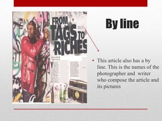
Task 2c double page spread
LayoutThe way the two pages have been layed out makes
the magazine easier to read for the target audience.
The target audience for this magazine is straight,
,British, teenage, lower and lower middle class
males. The magzine4 is aimed at all ethnicity but
the audience is usually predominately white.
Some ways in which the layout is suited to this
audience is need is though there use of space. The
page contains little text and the typography of this
text makes it small and thin, this alone with the fact
that the lines are closely leaded and the columns in
the grid have little in-between space. And the hot
spot lines seem to intersect mainly the main cover
line and the images (e.g. the bottle) instead of text,
this shows that the editors wanted the page to
contain mainly images.
This links to the audience as younger people of a
lower class stereotypical would not like reading, so
they magazine has tried to convey most of there
message though pictures and have down sized the
text so even before the audience start to read they
are under the impression that there is not much
text.
The is very little dead space and text in this article
that tells me that the mode of address is though
images
Main image
• The main image yet again contains the artist from
the front cover (this anchors the article to him).
• One of the most interesting points in the mise-en-
scene if this image is the use of colour in the
provisos shoot of the artist he was not wearing a red
jacket. All though red was used a lot in the cover
this is the first time it is directly linked to the artist.
This shows us he is involved with the violent and
dangerous life style that the colour connotes. This
would be appealing to males as they are
stereotypical more interested in conflicted or
violence. This image is again reflected by the
graffiti.
• As well as showing the views and stereotypes
relating to the genre the colour read also helps
maintain the magazines house style as the masthead
and colour scheme on the contents page both
contained this shade of red. This has been reused to
remind us which magazine we are reading and to
establish branding.
Other images
• At the bottom of the page we
see an assortment of bottles.
This has the denotation of
parting and drinking. Theses
are two concepts that would
be appealing to a young male
audience so there inclusion
makes the reader think this
magazine is specify to there
interests. This may encore
them to buy it again.
Drop cap
• This is were the first letter of the
first paragraph is made larger than
the other letters. This makes the it
clear where the article starts and
draws the readers attention. It also
sets the scene for the article e.g. this
article is call from tags to riches and
the drop cap is black which is a
colour that has negative
connotations. At the end of the
article there is a yellow smiley face
sticker on a boom box this denotes
happiness. The use of these to
colours in both the image and the
drop cap represents the artists rise to
fame.
language
• In the main cover line a pun is used. The
use of the pun shows the magazine to be
more jokey and informal, this would
appeal to the teenage and young adult
target audience as they would mostly
likely be bored with long formal text. The
word tags used in the pun is a slang word
for graffiti this is the magazine sway of
linking with the teenagers, by using there
language…
• The texts canted stile also reinforces of the
idea of the magazine not being boring and
proper that was presented on the cover
again by titling the text. The idea is again
shown on this double page spread thought
the used of the paint splatter back round.
This would be relatable to teenagers male
as they are stereotypically less tidy
• Interestingly no grab quotes have been
used. This may have been done because its
to formal and conventional and this
magazine wants to brake the rules or
because it would have made the page too
cramped if they were used.
Dead space
• In the top right corner the
is dead space (a place
where nothing is) this may
have been used to make
the article look smaller as
a young target audience
would not like to read a
lot or it may have been
left blank so nothing is
there that can detract from
the title.
By line
• This article also has a by
line. This is the names of the
photographer and writer
who compose the article and
its pictures

Task 2c double page spread

  • 1.
    Task 2c doublepage spread
  • 2.
    LayoutThe way thetwo pages have been layed out makes the magazine easier to read for the target audience. The target audience for this magazine is straight, ,British, teenage, lower and lower middle class males. The magzine4 is aimed at all ethnicity but the audience is usually predominately white. Some ways in which the layout is suited to this audience is need is though there use of space. The page contains little text and the typography of this text makes it small and thin, this alone with the fact that the lines are closely leaded and the columns in the grid have little in-between space. And the hot spot lines seem to intersect mainly the main cover line and the images (e.g. the bottle) instead of text, this shows that the editors wanted the page to contain mainly images. This links to the audience as younger people of a lower class stereotypical would not like reading, so they magazine has tried to convey most of there message though pictures and have down sized the text so even before the audience start to read they are under the impression that there is not much text. The is very little dead space and text in this article that tells me that the mode of address is though images
  • 3.
    Main image • Themain image yet again contains the artist from the front cover (this anchors the article to him). • One of the most interesting points in the mise-en- scene if this image is the use of colour in the provisos shoot of the artist he was not wearing a red jacket. All though red was used a lot in the cover this is the first time it is directly linked to the artist. This shows us he is involved with the violent and dangerous life style that the colour connotes. This would be appealing to males as they are stereotypical more interested in conflicted or violence. This image is again reflected by the graffiti. • As well as showing the views and stereotypes relating to the genre the colour read also helps maintain the magazines house style as the masthead and colour scheme on the contents page both contained this shade of red. This has been reused to remind us which magazine we are reading and to establish branding.
  • 4.
    Other images • Atthe bottom of the page we see an assortment of bottles. This has the denotation of parting and drinking. Theses are two concepts that would be appealing to a young male audience so there inclusion makes the reader think this magazine is specify to there interests. This may encore them to buy it again.
  • 5.
    Drop cap • Thisis were the first letter of the first paragraph is made larger than the other letters. This makes the it clear where the article starts and draws the readers attention. It also sets the scene for the article e.g. this article is call from tags to riches and the drop cap is black which is a colour that has negative connotations. At the end of the article there is a yellow smiley face sticker on a boom box this denotes happiness. The use of these to colours in both the image and the drop cap represents the artists rise to fame.
  • 6.
    language • In themain cover line a pun is used. The use of the pun shows the magazine to be more jokey and informal, this would appeal to the teenage and young adult target audience as they would mostly likely be bored with long formal text. The word tags used in the pun is a slang word for graffiti this is the magazine sway of linking with the teenagers, by using there language… • The texts canted stile also reinforces of the idea of the magazine not being boring and proper that was presented on the cover again by titling the text. The idea is again shown on this double page spread thought the used of the paint splatter back round. This would be relatable to teenagers male as they are stereotypically less tidy • Interestingly no grab quotes have been used. This may have been done because its to formal and conventional and this magazine wants to brake the rules or because it would have made the page too cramped if they were used.
  • 7.
    Dead space • Inthe top right corner the is dead space (a place where nothing is) this may have been used to make the article look smaller as a young target audience would not like to read a lot or it may have been left blank so nothing is there that can detract from the title.
  • 8.
    By line • Thisarticle also has a by line. This is the names of the photographer and writer who compose the article and its pictures