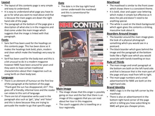
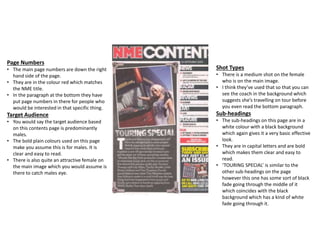
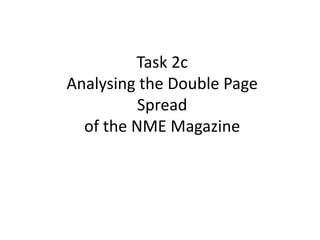
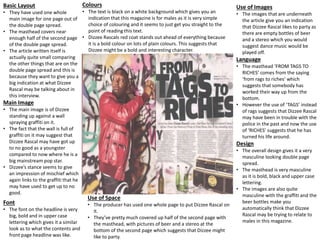
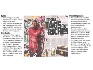
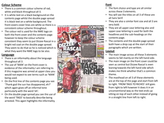
The document analyzes different elements of an NME magazine issue featuring Dizzee Rascal on the cover. It examines the front cover, contents page, and a double-page article spread. Some key connecting elements across these sections include: a consistent red, white, and black color scheme; informal language; similar bold sans serif fonts; and layouts that position major images and text on the left side. The analyses suggest these design choices aim to appeal to a predominantly young male audience through a masculine style.