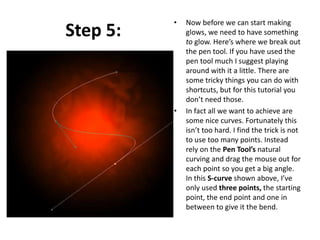
Дасгал ажил №5

NEON GLOW
Step 1:

• As with pretty much every
tutorial I’ve ever written, we
begin with a radial gradient.
This one is pretty harsh and
goes from a reddish brown
color to black. Here are the
exact color codes:
• Foreground color – #922f00
Background color – #000000
Step 2:

• In this tutorial, we actually need
a pretty intense center, so what
we’ll do is duplicate the layer we
just made and set the one above
to a blending mode of Color
Dodge. There are a few types of
blending modes, darkening
ones, lightening ones, colorizing
ones and inverting ones. Color
Dodge is probably the strongest
of the lightening ones. As you
can see in the screenshot, it
produces a pretty full-on center.
Step 3:
• Now in our glow effect, it helps
to have a nice textured
background. So we are going
to create a sort of smoky haze.
To do this, create a new
layer, then make sure you have
white, #ffffff, and
black, #000000, selected as
your background and
foreground colors.
• Then go to Filter > Render >
Clouds. This will give you the
same random cloud pattern as
above.
Step 4:

• Now set the opacity of your
layer to Overlay and 30%
transparency. In some instances
this would be enough, but for
our needs we want it even
smokier looking!
• So go to Filter > Sketch >
Chrome and use default settings
of 4 and 7 for detail and
smoothness respectively.
Actually you can probably mess
around with those if you
want, but the defaults seem to
be fine.
• When you’re done, the result
should look a lot smokier (once
its overlayed at 30%
transparency that is). You can
see the result in the background
of the next screenshot.
Step 5:

•

•

Now before we can start making
glows, we need to have something
to glow. Here’s where we break out
the pen tool. If you have used the
pen tool much I suggest playing
around with it a little. There are
some tricky things you can do with
shortcuts, but for this tutorial you
don’t need those.
In fact all we want to achieve are
some nice curves. Fortunately this
isn’t too hard. I find the trick is not
to use too many points. Instead
rely on the Pen Tool’s natural
curving and drag the mouse out for
each point so you get a big angle.
In this S-curve shown above, I’ve
only used three points, the starting
point, the end point and one in
between to give it the bend.
Step 6:

• Once you have a nice
curve, create a new
layer.
• Then click on the
Paintbrush Tool (B) and
choose a very thin, hard
brush. As you know, soft
brushes are the blurry
ones and hard brushes
are more solid. In this
case I suggest using a
thickness of 3.
• Note that you can have
any color selected as
your brush color because
we’ll go over it with a
layer style shortly.
Step 7:

• Now switch back to the
Pen Tool. You must
switch tools in order to
do this next bit.
• Then right-click and
select Stroke Path.
A little dialog box will
appear as in the
screenshot. Choose
Brush and make sure
there is a tick next to
Simulate ends which
will make it rock!
• Next right click again
and select Delete Path.
Step 8:
• You should
now have
something like
the above.
Just a
thin, cool
swishy thing.
• In a nutshell, I’ve added
two sets of glows. To do
this I first use Outer
Glow and then because I
want a second glow, I
change the Drop
Shadow settings so that
it becomes a glow (you
can do this by reducing
the Distance and
changing the blend
mode to something like
Color Dodge)
• Oh and also I’ve used a
Color Overlay to make
the item white so that
its like the center of an
intense glow.

Step 9:
Step 10:

• So now you have
the same line but
with a cool glow
coming off it. The
beauty of using a
layer style is that
you can copy and
paste it to other
layers. To do this
you just right-click
the layer and select
Copy Layer Style
then create a new
layer and right-click
and choose Paste
Layer Style.
Step 11:

• So now repeat the
same process a couple
of times to make
more squiggly lines.
• In this instance, I
made one a little
thicker by changing
the paint brush size
before I did the Stroke
Path bit of the
process. I also made a
third line and erased
part of it and sorta
made it join the other
two to look like a cool
triangular shape.
Step 12:

• Here I’ve added some text in and applied
the same layer style to the text layers.
• It’s important to pay lots of care and
attention to your text. When you’re first
starting out, use simple fonts and play
with spacing between letters, words and
sizes. You can achieve a lot with just some
small tricks. Here I’ve contrasted the three
words by making Glow a lot larger and in
regular casing, then made Advanced and
FX much smaller, with greater space
between the letters and all caps.
• You can control spacing with text using the
Character window. If it isn’t already open
go to Window > Character and it should
appear. Mess about with the different
settings until you learn what each
controls.
Step 13:

• Now we add some particles.
To do this, create a new
layer then select a tiny
paint brush – size 3 – and
just paint some dots on. It
helps if they are clustered
towards the center of the
glow so that it looks like
they are emanating from
there.
• You can make some of the
central ones larger by
doubling over on them with
a second paint brush dab.
• Then paste our Glow layer
style on to that layer too!
Step 14:

• Now that’s looking
pretty cool, but it
will look even cooler
if we give it some
subtle coloring
instead of this super
gaudy red.
• So create a new
layer, and using a
radial gradient, draw
a blue to white
gradient as shown.
Step 15:

• Then set that layer to a
blending mode of Color and
change the opacity to 50%.
• You’ll see that it turns the
image kind of bluish. I think
that’s looking much cooler
already, but just to go that
extra step I also created a
couple of extra layers, one
with some faint yellow and
one with faint purple. You
can see them in the
screenshot above.
• I set each layer to blending
mode of Color and thin
opacities so that they all fade
together.
Step 16:

• And there you have it:
advanced glow effects
with a cool color blend
and subtle smoky
background combined
make for a pretty great
effect.
• Just remember to
experiment with
settings and try
applying the glow to
different things to see
how it turns out. And
try different color
combinations, some
surprising combinations
turn out really
beautiful. Good luck!

Neon glow

  • 1.
  • 2.
    Step 1: • Aswith pretty much every tutorial I’ve ever written, we begin with a radial gradient. This one is pretty harsh and goes from a reddish brown color to black. Here are the exact color codes: • Foreground color – #922f00 Background color – #000000
  • 3.
    Step 2: • Inthis tutorial, we actually need a pretty intense center, so what we’ll do is duplicate the layer we just made and set the one above to a blending mode of Color Dodge. There are a few types of blending modes, darkening ones, lightening ones, colorizing ones and inverting ones. Color Dodge is probably the strongest of the lightening ones. As you can see in the screenshot, it produces a pretty full-on center.
  • 4.
    Step 3: • Nowin our glow effect, it helps to have a nice textured background. So we are going to create a sort of smoky haze. To do this, create a new layer, then make sure you have white, #ffffff, and black, #000000, selected as your background and foreground colors. • Then go to Filter > Render > Clouds. This will give you the same random cloud pattern as above.
  • 5.
    Step 4: • Nowset the opacity of your layer to Overlay and 30% transparency. In some instances this would be enough, but for our needs we want it even smokier looking! • So go to Filter > Sketch > Chrome and use default settings of 4 and 7 for detail and smoothness respectively. Actually you can probably mess around with those if you want, but the defaults seem to be fine. • When you’re done, the result should look a lot smokier (once its overlayed at 30% transparency that is). You can see the result in the background of the next screenshot.
  • 6.
    Step 5: • • Now beforewe can start making glows, we need to have something to glow. Here’s where we break out the pen tool. If you have used the pen tool much I suggest playing around with it a little. There are some tricky things you can do with shortcuts, but for this tutorial you don’t need those. In fact all we want to achieve are some nice curves. Fortunately this isn’t too hard. I find the trick is not to use too many points. Instead rely on the Pen Tool’s natural curving and drag the mouse out for each point so you get a big angle. In this S-curve shown above, I’ve only used three points, the starting point, the end point and one in between to give it the bend.
  • 7.
    Step 6: • Onceyou have a nice curve, create a new layer. • Then click on the Paintbrush Tool (B) and choose a very thin, hard brush. As you know, soft brushes are the blurry ones and hard brushes are more solid. In this case I suggest using a thickness of 3. • Note that you can have any color selected as your brush color because we’ll go over it with a layer style shortly.
  • 8.
    Step 7: • Nowswitch back to the Pen Tool. You must switch tools in order to do this next bit. • Then right-click and select Stroke Path. A little dialog box will appear as in the screenshot. Choose Brush and make sure there is a tick next to Simulate ends which will make it rock! • Next right click again and select Delete Path.
  • 9.
    Step 8: • Youshould now have something like the above. Just a thin, cool swishy thing.
  • 10.
    • In anutshell, I’ve added two sets of glows. To do this I first use Outer Glow and then because I want a second glow, I change the Drop Shadow settings so that it becomes a glow (you can do this by reducing the Distance and changing the blend mode to something like Color Dodge) • Oh and also I’ve used a Color Overlay to make the item white so that its like the center of an intense glow. Step 9:
  • 11.
    Step 10: • Sonow you have the same line but with a cool glow coming off it. The beauty of using a layer style is that you can copy and paste it to other layers. To do this you just right-click the layer and select Copy Layer Style then create a new layer and right-click and choose Paste Layer Style.
  • 12.
    Step 11: • Sonow repeat the same process a couple of times to make more squiggly lines. • In this instance, I made one a little thicker by changing the paint brush size before I did the Stroke Path bit of the process. I also made a third line and erased part of it and sorta made it join the other two to look like a cool triangular shape.
  • 13.
    Step 12: • HereI’ve added some text in and applied the same layer style to the text layers. • It’s important to pay lots of care and attention to your text. When you’re first starting out, use simple fonts and play with spacing between letters, words and sizes. You can achieve a lot with just some small tricks. Here I’ve contrasted the three words by making Glow a lot larger and in regular casing, then made Advanced and FX much smaller, with greater space between the letters and all caps. • You can control spacing with text using the Character window. If it isn’t already open go to Window > Character and it should appear. Mess about with the different settings until you learn what each controls.
  • 14.
    Step 13: • Nowwe add some particles. To do this, create a new layer then select a tiny paint brush – size 3 – and just paint some dots on. It helps if they are clustered towards the center of the glow so that it looks like they are emanating from there. • You can make some of the central ones larger by doubling over on them with a second paint brush dab. • Then paste our Glow layer style on to that layer too!
  • 15.
    Step 14: • Nowthat’s looking pretty cool, but it will look even cooler if we give it some subtle coloring instead of this super gaudy red. • So create a new layer, and using a radial gradient, draw a blue to white gradient as shown.
  • 16.
    Step 15: • Thenset that layer to a blending mode of Color and change the opacity to 50%. • You’ll see that it turns the image kind of bluish. I think that’s looking much cooler already, but just to go that extra step I also created a couple of extra layers, one with some faint yellow and one with faint purple. You can see them in the screenshot above. • I set each layer to blending mode of Color and thin opacities so that they all fade together.
  • 17.
    Step 16: • Andthere you have it: advanced glow effects with a cool color blend and subtle smoky background combined make for a pretty great effect. • Just remember to experiment with settings and try applying the glow to different things to see how it turns out. And try different color combinations, some surprising combinations turn out really beautiful. Good luck!