SlideShare a Scribd company logo
Here there is a section             The masthead and the
called “Features”. This has         entirety of the contents
8 headings that seem to             page incorporates the colour
be regular features of this         scheme of the magazine and
music magazine. This gives          the front cover. This is also
consistency to the                  another feature that adds
magazine and makes the              consistency to the magazine.
reader familiar with the
way the magazine is set             The main image on this
up.                                 contents page is a close-up
This section is one of              of a female artist, this photo
three: Features, Every              is very basic and this ties in
Month and Review. Having            with the composition of the
these sections on the               contents page which has
contents page makes it              very clean lines and is very
easier for the reader to            clean cut.
navigate through the page          There is a caption underneath
and through the                    the main image explaining the
magazine.                          significance of the artist
The contents page sees all         pictured within the magazine.
the features with intriguing       This is useful for the reader as
titles to make the reader          this artist is most probably on
want to know more such as          the front cover, and they can
‘cash for questions’               immediately see where the
The additional image of two        feature will be in the magazine.
men suggests they are a group     Next to this section we see the
and the way the photo has         phrase ‘The world’s biggest
been taken is typical for an      and best music guide’ which
image of an indie group. This     can be seen as a puff to
suggests the genre of the music   increase the reputation of the
magazine could be indie           magazine.
This contents page
consists of a main image
and other smaller
images, this makes the
large image stand out and
makes it seem more
important than the others
as it grabs the readers
attention


  The contents page
  attracts its audience                                                                  The text has sub-
  by having a main                                                                       headings before each
  image of two young                                                                     page, this is a really
  boys dressed in a                                                                      good layout as
  modern fashion way .                                                                   everything is in order
  This mainly gives                                                                      and it is very clear
  away who the target                                                                    which helps the reader.
  audience is and who
  they are trying to
  attract to read this
  magazine.


       The text fits in with the colour scheme of the pictures and have contrasting text colours to
       background text colours. This also has a small picture which uses the same colours that are used
       in the text which makes it fix into the page of the magazine.
This contents page is very
much the same as all of the
                               The females are both
other issues of the
                               dressed revealing body
magazine. Its has the same
                               parts, they are both in heels
font in all magazines where
                               and dresses and are
is says ‘contents’ and the
                               wearing big jewellery
word is broken down the
                               which stereotypes them.
same on every issue of the
                               Also shows the fact than an
magazine which is clear to
                               artist’s can dress like that
identify which magazine it
                               and its appropriate to their
belongs to.
                               music genre.


the contents page is split
into
sections, departments, se     The text is very well used.
en and style. This clearly    As the font is clear and
separates the sections        easy to read, also the fact
and makes it clear to the     the text is in black and the
audience what the             background is white/grey
magazine will consist of      which makes the text
and what page its on so       stand out, also the text fit
that its easier for the       with the colour scheme of
reader to find what they      the contents page.
are looking fore.
The main image in this                                                                                                   The masthead is a
double page spread is                                                                                                    pull quote which
of the group ‘MCR’                                                                                                       immediately grabs
who are seen to be                                                                                                       the readers
performing on stage at                                                                                                   attention and
a gig. Here we can see                                                                                                   makes them want
the lead singer with                                                                                                     to read on.
long black hair which
has connotations of                                                                                                      The font of the
the rock or punk                                                                                                         masthead is a text
genre. All of the                                                                                                        that looks cracked
images on this page                                                                                                      and seems quite
are in black and white                                                                                                   rugged, which
which also has                                                                                                           could suggest this
connotations of the                                                                                                      is similar to the
rock/punk genre.                                                                                                         group or their
                                                                                                                         music.


here is a puff saying
‘world exclusive’
which makes the                                                                                    The typography on this double page
reader feel like the                                                                               spread shows a black red and white colour
magazine has some                                                                                  scheme which typically represent the rock
prestige and that the                                                                              or punk genre which is the genre of the
group chose the                                                                                    magazine Kerrang! This double page
magazine specifically                                                                              spread is from.
                      The additional images show members
because of its
                      of the group in the recording studio         The red and white text contrasts with its black
reputation.
                      which suggests the band are all about        background which makes the text stand out which
                      their music and less about the fame          catches the attention of the reader when they go to
                      which is a trait that fans might like in a
                                                                   the page.
                      band.
There is a sub
  heading which
 quotes out what
the two pages will                                                                                                        Red black and
   be about, it                                                                                                         white have been
   quotes “the                                                                                                          used through the
queen of UK R&B”                                                                                                        two pages in the
  which tells the                                                                                                        magazine which
audience she is an                                                                                                       work very well
 important artist                                                                                                       together, there is
 and attracts the                                                                                                      also a background
   audience to                                                                                                         of a darker colour
 wanting to read                                                                                                       then to the colour
    about her                                                                                                           of the text which
                                                                                                                         work really well
                                                                                                                          because they
 The mast head                                                                                                          contrast and it is
  is made up of                                                                                                           easier for the
the main artists                                                                                                        audience to read
  name jamelia                                                                                                              the article.
  which is bold
    and has an
   outstanding                                                                                                        The font and layout
   effect to the                                                                                                      of the page reflects
  font so that it                                                                                                         to the artists
can stand out to                                                                                                      personality which if
  the audience                                                                                                         very effective and
 although there                                                                                                           engages the
is a main image                                                                                                         audience more
      behind                                                                                                            with the article
                                                                                                                        about the artist


                There is again a darker shade behind the text which       there are two main images in this double page spread which
                still fits in very nicely with the layout of the double              allows there to be more space for text.
                 page spread and matches the colour scheme as it
                       keeps the page together and not all over
The main
  imagine takes
   up the whole
    side on one
  page. This is a
                                                                                                                 The mast
 large image of
                                                                                                                head says
the artist which
                                                                                                                 lady gaga
clearly indicates
                                                                                                                which tell
to the audience
                                                                                                                     the
who this article
                                                                                                                 audience
   will be about
                                                                                                                right away
  and has an up
                                                                                                                  who the
 to date picture
                                                                                                                  article is
 of the artist to
                                                                                                                about and
   show off her
                                                                                                                 gaga is in
  new look and
                                                                                                                 capital so
        style.
                                                                                                                  that her
                                                                                                                name can
The image of lady                                                                                                stand out
  gaga has been                                                                                                 more than
 edited into black                                                                                              to the rest
and white, it could                                                                                                of the
   be to show a                                                                                                    article
 mood or add an
   effect to the
  picture or lady
 gaga herself. The
    picture also    There is a big S in capital to
  consists of her   start off a new topic on the                                                 There is a big red L on the
 upper half of her same page and make it clear       You can see a clear divide with both of     page which separates the
     body only                                       the two pages as the image stops right       colour scheme and adds
                     to the audience that its a
   covering her                                       in the middle of the page and the text     colour onto the page. Also
                           new paragraph
   breast which                                      is all on the right hand side of the page     the L stand out for lady
  shows her wild                                     which clearly shows the two pages are       gaga which is very obvious
    side to her                                          linked together but are separate.
     audience

More Related Content

What's hot

Analysis of magazine double page spreads
Analysis of magazine double page spreadsAnalysis of magazine double page spreads
Analysis of magazine double page spreadssarah123ashcroft
 
Conventions of rolling stones magazine
Conventions of rolling stones magazineConventions of rolling stones magazine
Conventions of rolling stones magazinevlorriman07
 
Double page spread
Double page spreadDouble page spread
Double page spreadmickyb96
 
Double page spread nm and lg
Double page spread   nm and lgDouble page spread   nm and lg
Double page spread nm and lgAlixKelly
 
Contents Analysis
Contents AnalysisContents Analysis
Contents Analysisjeevstar
 
Evaluation Question 1
Evaluation Question 1Evaluation Question 1
Evaluation Question 1asmediag12
 
As media studies evaluation
As media studies evaluationAs media studies evaluation
As media studies evaluationCharlie_pal
 
Music magazine reviews contents page
Music magazine reviews contents pageMusic magazine reviews contents page
Music magazine reviews contents pageTheSupaPablo
 
Media coursework content page analysis
Media coursework content page analysisMedia coursework content page analysis
Media coursework content page analysismattmosey1
 
Double page articles
Double page articlesDouble page articles
Double page articles014430
 
Analysing magazine features and connotations
Analysing magazine features and connotationsAnalysing magazine features and connotations
Analysing magazine features and connotationsJoshWilliamson14
 
Radial analysis
Radial analysisRadial analysis
Radial analysisnash001g
 
Evaluation q1
Evaluation q1Evaluation q1
Evaluation q1Ollie1994
 
Analysing music magazines
Analysing music magazinesAnalysing music magazines
Analysing music magazineshobleycar
 
Reserach and design layouts
Reserach and design   layoutsReserach and design   layouts
Reserach and design layoutscharlotteking94
 
AS Media Music Magazine Evaluation - Question 1
AS Media Music Magazine Evaluation - Question 1AS Media Music Magazine Evaluation - Question 1
AS Media Music Magazine Evaluation - Question 1jessssticle
 
As media studies evaluation (with word links)
As media studies evaluation (with word links)As media studies evaluation (with word links)
As media studies evaluation (with word links)Charlie_pal
 
As media studies evaluation (with word links)
As media studies evaluation (with word links)As media studies evaluation (with word links)
As media studies evaluation (with word links)Charlie_pal
 

What's hot (18)

Analysis of magazine double page spreads
Analysis of magazine double page spreadsAnalysis of magazine double page spreads
Analysis of magazine double page spreads
 
Conventions of rolling stones magazine
Conventions of rolling stones magazineConventions of rolling stones magazine
Conventions of rolling stones magazine
 
Double page spread
Double page spreadDouble page spread
Double page spread
 
Double page spread nm and lg
Double page spread   nm and lgDouble page spread   nm and lg
Double page spread nm and lg
 
Contents Analysis
Contents AnalysisContents Analysis
Contents Analysis
 
Evaluation Question 1
Evaluation Question 1Evaluation Question 1
Evaluation Question 1
 
As media studies evaluation
As media studies evaluationAs media studies evaluation
As media studies evaluation
 
Music magazine reviews contents page
Music magazine reviews contents pageMusic magazine reviews contents page
Music magazine reviews contents page
 
Media coursework content page analysis
Media coursework content page analysisMedia coursework content page analysis
Media coursework content page analysis
 
Double page articles
Double page articlesDouble page articles
Double page articles
 
Analysing magazine features and connotations
Analysing magazine features and connotationsAnalysing magazine features and connotations
Analysing magazine features and connotations
 
Radial analysis
Radial analysisRadial analysis
Radial analysis
 
Evaluation q1
Evaluation q1Evaluation q1
Evaluation q1
 
Analysing music magazines
Analysing music magazinesAnalysing music magazines
Analysing music magazines
 
Reserach and design layouts
Reserach and design   layoutsReserach and design   layouts
Reserach and design layouts
 
AS Media Music Magazine Evaluation - Question 1
AS Media Music Magazine Evaluation - Question 1AS Media Music Magazine Evaluation - Question 1
AS Media Music Magazine Evaluation - Question 1
 
As media studies evaluation (with word links)
As media studies evaluation (with word links)As media studies evaluation (with word links)
As media studies evaluation (with word links)
 
As media studies evaluation (with word links)
As media studies evaluation (with word links)As media studies evaluation (with word links)
As media studies evaluation (with word links)
 

Viewers also liked

Sleep image technical support overview spreecast
Sleep image technical support overview spreecastSleep image technical support overview spreecast
Sleep image technical support overview spreecastSleepImage
 
Question 2 media completed
Question 2 media completedQuestion 2 media completed
Question 2 media completedzire1
 
Parque Natural Cabo de Gata-Níjar
Parque Natural Cabo de Gata-NíjarParque Natural Cabo de Gata-Níjar
Parque Natural Cabo de Gata-Níjarblogceipconcordia2b
 
Oracle day 2012
Oracle day 2012Oracle day 2012
Oracle day 2012minovy
 
Tarea 1. Dibujamos nuestro pueblo
Tarea 1. Dibujamos nuestro puebloTarea 1. Dibujamos nuestro pueblo
Tarea 1. Dibujamos nuestro puebloblogceipconcordia2b
 
3 cd advertisements
3 cd advertisements3 cd advertisements
3 cd advertisementszire1
 
De novo assemble for NGS
De novo assemble for NGSDe novo assemble for NGS
De novo assemble for NGSlangkang
 

Viewers also liked (15)

Sleep image technical support overview spreecast
Sleep image technical support overview spreecastSleep image technical support overview spreecast
Sleep image technical support overview spreecast
 
Vinita sharma
Vinita sharmaVinita sharma
Vinita sharma
 
Final
FinalFinal
Final
 
Question 2 media completed
Question 2 media completedQuestion 2 media completed
Question 2 media completed
 
Parque Natural Cabo de Gata-Níjar
Parque Natural Cabo de Gata-NíjarParque Natural Cabo de Gata-Níjar
Parque Natural Cabo de Gata-Níjar
 
Oracle day 2012
Oracle day 2012Oracle day 2012
Oracle day 2012
 
Tarea 2.- Nuestros pueblos
Tarea 2.- Nuestros pueblosTarea 2.- Nuestros pueblos
Tarea 2.- Nuestros pueblos
 
Tarea 1. Dibujamos nuestro pueblo
Tarea 1. Dibujamos nuestro puebloTarea 1. Dibujamos nuestro pueblo
Tarea 1. Dibujamos nuestro pueblo
 
3 cd advertisements
3 cd advertisements3 cd advertisements
3 cd advertisements
 
Cartas a la seño Kayleigh
Cartas a la seño KayleighCartas a la seño Kayleigh
Cartas a la seño Kayleigh
 
Manners are important
Manners are importantManners are important
Manners are important
 
Healthy habits
Healthy habitsHealthy habits
Healthy habits
 
Manners are useless
Manners are uselessManners are useless
Manners are useless
 
De novo assemble for NGS
De novo assemble for NGSDe novo assemble for NGS
De novo assemble for NGS
 
Tipos de hackers
Tipos de hackersTipos de hackers
Tipos de hackers
 

Similar to my textual analysis of 3 contents page's and 3 double page spread's

15.03.12 new zire
15.03.12 new zire15.03.12 new zire
15.03.12 new zirezire1
 
Kerrang evaluation
Kerrang evaluationKerrang evaluation
Kerrang evaluationsophiex
 
Magazine contents pages analysis
Magazine contents pages analysisMagazine contents pages analysis
Magazine contents pages analysisHannahASmedia
 
Annotation of other magazines
Annotation of other magazines Annotation of other magazines
Annotation of other magazines chiquitahx
 
Nme magazine deconstruction
Nme magazine deconstructionNme magazine deconstruction
Nme magazine deconstructionchloeanne94
 
Analysis of nme magazine
Analysis of nme magazineAnalysis of nme magazine
Analysis of nme magazineasmediaf12
 
Double page spread analysis
Double page spread analysisDouble page spread analysis
Double page spread analysismwalker33
 
Kerrang! Magazine
Kerrang! MagazineKerrang! Magazine
Kerrang! Magazineharrywbfmv
 
Contents page analysis
Contents page analysisContents page analysis
Contents page analysisChrisDonnellan
 
Magazine contents page2
Magazine contents page2Magazine contents page2
Magazine contents page2UmaiyaKhawaja
 
Analysing Contents Pages
Analysing Contents PagesAnalysing Contents Pages
Analysing Contents Pageschloebolton_x
 
Analysis of contents pages
Analysis of contents pagesAnalysis of contents pages
Analysis of contents pageschloebolton_x
 
Contents page analysis
Contents page analysis Contents page analysis
Contents page analysis Ed Boon
 

Similar to my textual analysis of 3 contents page's and 3 double page spread's (20)

15.03.12 new zire
15.03.12 new zire15.03.12 new zire
15.03.12 new zire
 
Kerrang evaluation
Kerrang evaluationKerrang evaluation
Kerrang evaluation
 
Media
MediaMedia
Media
 
Magazine contents pages analysis
Magazine contents pages analysisMagazine contents pages analysis
Magazine contents pages analysis
 
Annotation of other magazines
Annotation of other magazines Annotation of other magazines
Annotation of other magazines
 
Nme magazine deconstruction
Nme magazine deconstructionNme magazine deconstruction
Nme magazine deconstruction
 
Analysis of nme magazine
Analysis of nme magazineAnalysis of nme magazine
Analysis of nme magazine
 
Double page spread analysis
Double page spread analysisDouble page spread analysis
Double page spread analysis
 
Task 1
Task 1Task 1
Task 1
 
Kerrang
KerrangKerrang
Kerrang
 
Nme complete
Nme completeNme complete
Nme complete
 
Nme complete
Nme completeNme complete
Nme complete
 
Kerrang! Magazine
Kerrang! MagazineKerrang! Magazine
Kerrang! Magazine
 
Media
MediaMedia
Media
 
Contents page analysis
Contents page analysisContents page analysis
Contents page analysis
 
Media mags
Media magsMedia mags
Media mags
 
Magazine contents page2
Magazine contents page2Magazine contents page2
Magazine contents page2
 
Analysing Contents Pages
Analysing Contents PagesAnalysing Contents Pages
Analysing Contents Pages
 
Analysis of contents pages
Analysis of contents pagesAnalysis of contents pages
Analysis of contents pages
 
Contents page analysis
Contents page analysis Contents page analysis
Contents page analysis
 

More from zire1

Question 3 completed
Question 3 completedQuestion 3 completed
Question 3 completedzire1
 
Media evaluation q1 zire complete
Media evaluation q1 zire completeMedia evaluation q1 zire complete
Media evaluation q1 zire completezire1
 
Postmodernism analysis of – lady gaga – paparazzi
Postmodernism analysis of – lady gaga – paparazziPostmodernism analysis of – lady gaga – paparazzi
Postmodernism analysis of – lady gaga – paparazzizire1
 
Media feminist and post feminist work
Media feminist and post feminist workMedia feminist and post feminist work
Media feminist and post feminist workzire1
 
3 cd album covers
3 cd album covers3 cd album covers
3 cd album coverszire1
 
Images that i did or didnt use
Images that i did or didnt useImages that i did or didnt use
Images that i did or didnt usezire1
 
Final evaluation
Final evaluationFinal evaluation
Final evaluationzire1
 
Final evaluation
Final evaluationFinal evaluation
Final evaluationzire1
 
Final cover page
Final cover pageFinal cover page
Final cover pagezire1
 
Final audience profile
Final audience profileFinal audience profile
Final audience profilezire1
 
Presentation questionaire zire results
Presentation questionaire zire resultsPresentation questionaire zire results
Presentation questionaire zire resultszire1
 

More from zire1 (11)

Question 3 completed
Question 3 completedQuestion 3 completed
Question 3 completed
 
Media evaluation q1 zire complete
Media evaluation q1 zire completeMedia evaluation q1 zire complete
Media evaluation q1 zire complete
 
Postmodernism analysis of – lady gaga – paparazzi
Postmodernism analysis of – lady gaga – paparazziPostmodernism analysis of – lady gaga – paparazzi
Postmodernism analysis of – lady gaga – paparazzi
 
Media feminist and post feminist work
Media feminist and post feminist workMedia feminist and post feminist work
Media feminist and post feminist work
 
3 cd album covers
3 cd album covers3 cd album covers
3 cd album covers
 
Images that i did or didnt use
Images that i did or didnt useImages that i did or didnt use
Images that i did or didnt use
 
Final evaluation
Final evaluationFinal evaluation
Final evaluation
 
Final evaluation
Final evaluationFinal evaluation
Final evaluation
 
Final cover page
Final cover pageFinal cover page
Final cover page
 
Final audience profile
Final audience profileFinal audience profile
Final audience profile
 
Presentation questionaire zire results
Presentation questionaire zire resultsPresentation questionaire zire results
Presentation questionaire zire results
 

my textual analysis of 3 contents page's and 3 double page spread's

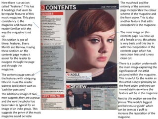
  • 1. Here there is a section The masthead and the called “Features”. This has entirety of the contents 8 headings that seem to page incorporates the colour be regular features of this scheme of the magazine and music magazine. This gives the front cover. This is also consistency to the another feature that adds magazine and makes the consistency to the magazine. reader familiar with the way the magazine is set The main image on this up. contents page is a close-up This section is one of of a female artist, this photo three: Features, Every is very basic and this ties in Month and Review. Having with the composition of the these sections on the contents page which has contents page makes it very clean lines and is very easier for the reader to clean cut. navigate through the page There is a caption underneath and through the the main image explaining the magazine. significance of the artist The contents page sees all pictured within the magazine. the features with intriguing This is useful for the reader as titles to make the reader this artist is most probably on want to know more such as the front cover, and they can ‘cash for questions’ immediately see where the The additional image of two feature will be in the magazine. men suggests they are a group Next to this section we see the and the way the photo has phrase ‘The world’s biggest been taken is typical for an and best music guide’ which image of an indie group. This can be seen as a puff to suggests the genre of the music increase the reputation of the magazine could be indie magazine.
  • 2. This contents page consists of a main image and other smaller images, this makes the large image stand out and makes it seem more important than the others as it grabs the readers attention The contents page attracts its audience The text has sub- by having a main headings before each image of two young page, this is a really boys dressed in a good layout as modern fashion way . everything is in order This mainly gives and it is very clear away who the target which helps the reader. audience is and who they are trying to attract to read this magazine. The text fits in with the colour scheme of the pictures and have contrasting text colours to background text colours. This also has a small picture which uses the same colours that are used in the text which makes it fix into the page of the magazine.
  • 3. This contents page is very much the same as all of the The females are both other issues of the dressed revealing body magazine. Its has the same parts, they are both in heels font in all magazines where and dresses and are is says ‘contents’ and the wearing big jewellery word is broken down the which stereotypes them. same on every issue of the Also shows the fact than an magazine which is clear to artist’s can dress like that identify which magazine it and its appropriate to their belongs to. music genre. the contents page is split into sections, departments, se The text is very well used. en and style. This clearly As the font is clear and separates the sections easy to read, also the fact and makes it clear to the the text is in black and the audience what the background is white/grey magazine will consist of which makes the text and what page its on so stand out, also the text fit that its easier for the with the colour scheme of reader to find what they the contents page. are looking fore.
  • 4. The main image in this The masthead is a double page spread is pull quote which of the group ‘MCR’ immediately grabs who are seen to be the readers performing on stage at attention and a gig. Here we can see makes them want the lead singer with to read on. long black hair which has connotations of The font of the the rock or punk masthead is a text genre. All of the that looks cracked images on this page and seems quite are in black and white rugged, which which also has could suggest this connotations of the is similar to the rock/punk genre. group or their music. here is a puff saying ‘world exclusive’ which makes the The typography on this double page reader feel like the spread shows a black red and white colour magazine has some scheme which typically represent the rock prestige and that the or punk genre which is the genre of the group chose the magazine Kerrang! This double page magazine specifically spread is from. The additional images show members because of its of the group in the recording studio The red and white text contrasts with its black reputation. which suggests the band are all about background which makes the text stand out which their music and less about the fame catches the attention of the reader when they go to which is a trait that fans might like in a the page. band.
  • 5. There is a sub heading which quotes out what the two pages will Red black and be about, it white have been quotes “the used through the queen of UK R&B” two pages in the which tells the magazine which audience she is an work very well important artist together, there is and attracts the also a background audience to of a darker colour wanting to read then to the colour about her of the text which work really well because they The mast head contrast and it is is made up of easier for the the main artists audience to read name jamelia the article. which is bold and has an outstanding The font and layout effect to the of the page reflects font so that it to the artists can stand out to personality which if the audience very effective and although there engages the is a main image audience more behind with the article about the artist There is again a darker shade behind the text which there are two main images in this double page spread which still fits in very nicely with the layout of the double allows there to be more space for text. page spread and matches the colour scheme as it keeps the page together and not all over
  • 6. The main imagine takes up the whole side on one page. This is a The mast large image of head says the artist which lady gaga clearly indicates which tell to the audience the who this article audience will be about right away and has an up who the to date picture article is of the artist to about and show off her gaga is in new look and capital so style. that her name can The image of lady stand out gaga has been more than edited into black to the rest and white, it could of the be to show a article mood or add an effect to the picture or lady gaga herself. The picture also There is a big S in capital to consists of her start off a new topic on the There is a big red L on the upper half of her same page and make it clear You can see a clear divide with both of page which separates the body only the two pages as the image stops right colour scheme and adds to the audience that its a covering her in the middle of the page and the text colour onto the page. Also new paragraph breast which is all on the right hand side of the page the L stand out for lady shows her wild which clearly shows the two pages are gaga which is very obvious side to her linked together but are separate. audience