
Recommended
More Related Content
What's hot
What's hot (18)
Viewers also liked
Similar to Radial analysis
Similar to Radial analysis (20)
More from nash001g
Recently uploaded
Recently uploaded (20)
Radial analysis
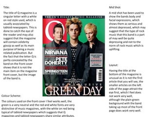
- 1. Title: Mid Shot: The title of Q magazine is a A mid shot has been used to singular letter with a white show the bands body and on red style used, which is facial expressions, which usually associated by shows them as serious and tabloid newspapers. This is almost depressed, which may done to catch the eye of suggest that the type of rock the reader and may also music that this band is a part suggest that the magazine of may well be quite will contain celebrity depressing and not to the gossip as well as its main norm of rock music which is purpose of being a music uplifting. related publication. But the fact that the letter Q is partly concealed by the band on the front cover Layout: shows that it is not the main item on the magazine Having the title at the front cover, but the image bottom of the magazine is of the band is. unusual as it is not the first article that you will see, the smaller articles on the left side of the page attract the eye first, which I feel does Colour Scheme: not work very well, although the plain green The colours used on the front cover I feel works well, the background with the band green is a very neutral and the red and white fonts are very taking up most of the front distinctive of music magazines, with the white on red being page does work very well. typical of tabloid newspapers which suggests that Q magazines and tabloid newspapers share similar attributes.
- 2. To keep the contents page similar in each Only one font has been issue of the magazine, Q have probably made used throughout the front a template, for the title and the Features page including the column, which will also speed up the process numbering and the title of of making the contents page. the contents page (not including the Q logo), although the spacing of the word “Contents” has had The layout of the contents page is the spacing between the dominated by imagery rather than letters changed to text, which I feel works very well for something like 1.5x a music magazine, as its target spacing or 2x spacing. “The audience of young people, will not Beatles” has also been put want lots of text to read through to into Italics which makes find the article that they want, they that article stand out from want simple headings which they the rest. can easily find the article they want. The images that have been used are varied in style of shot and persons Only three colours have been in them, and the layout of the two used in the contents page (not small images at the bottom of the including the photographs) contents page are similar to a which shows the simplicity of the sketchbook layout of photographs, contents page which does help also showing Q’s target audience of make the contents page look a wide age range. professional and not cluttered, with the red standing out the most, which does work well on a white background, and is symbolic of power which is common in the rock genre.
- 3. The colour scheme of the article is different from the colour scheme of the contents page and front page, with a turquoise font being used for the title and key quotes in the article, with a black front used for the rest. The only red on the double page spread is the Q logo and a small red dot at the end of the article, where as the contents page is dominated by red and the front cover also has a lot of red on it. The article has been made into a Question and answer type of layout, which enables the reader to The layout of the article with the Image taking up one find out the specific opinion or action taken by the page and the article taking up the other works well for interviewee. This is different to a typical style of the target audience of a wide age range around the article where a reporter writes an article using 18-40 range, which they may well be to busy to read a quotes from the person/group the article is about two page word intensive article, and also would and makes the article stand out from the rest in probably lose interest if there was no layout change of the magazine. imagery to break up the text.
- 4. The free posters in the top right The NME logo is very similar to the Q logo, as it is of the front cover shows that again very basic although the NME logo is similar NME includes rock music from to a bold Arial font, where as Q is similar to times all genres and also some music new roman, and also takes on a tabloid newspaper from other genres with the Sex style logo, where as NME is more contemporary. Pistols being a punk rock band from the 70s and Bob Marley is a reggae icon. The artists on the The layout of the front cover of front page are a much more NME has a lot of content on it and modern than the artists in the is almost cluttered, although the free posters such as Lana Del layout of the text on the front Rey and Pete Doherty being cover has been put into an angle, mainstream artists. which helps to keep the layout looking professional. The style of The image used on the front the font used is of a 1930s page is used as the background America style, which I feel works of the magazine cover, which I well with the blue, white and black think in this instance works colour scheme, as well as the better than the image being put American flag as the background. onto a coloured background, Also the “Plus” section at the because of the flag in the bottom of the front cover I think background works well with the differentiates the text layout of font and layout of the page. The NME to other music magazines shot of the artist is a mid shot, such as Q which uses a template which shows her body for its cover and manoeuvres the expression with her hands on image to fit around the text, her hips, and also shows her where as NME manoeuvres the facial expressions with here text to fit around the image. tongue out which works well with the quote “I’M A PSYCHO” above her name.
- 5. The title of the contents page “Inside this week” is a different way of saying “contents page” which I feel is a good idea, however, the Times New Roman font is a little to formal for a music magazine. This content page is very basic which is different from the front pages of NME Lots of imagery is used which are usually in the contents page, colourful and busy, which may be to make although I do like this up for the lack of contents page, I think colour otherwise in the that a bit more colour contents page, I also would work better feel that not having with the front cover the articles in than the plain colours chronological order is on this contents page. not the best of ideas, as the contents page should allow the reader to find specific articles quickly and not The subscription offer in having to read the the bottom left of the whole page to find it. page is a good way of NME getting more colour onto its contents page, as well as advertising is subscription offer, and the change of colour makes it catch peoples eye more than the rest of the page.
- 6. The layout of the double page spread with the image of the artist taking up the first page of the article helps to break up the text of the article, which helps keep the reader enticed in the article. Also with the stats column in between two columns of text helps to break up the text and adds colour to the page, which helps the appeal of the page to the reader. The title of the article uses two translucent colours, which helps with the art deco theme of the magazine, which is also kept with the black and white photograph and the American flag in the background. The colours of the title, orange and blue, are the only two colours used throughout the article which for the article works well. The layout is very similar to the double page spread of Q magazine, although The image used is a close up which has an enfaces on the artists there is no Q+A facial expressions, Which helps to keep the article different from a layout. plain article where a more serious pose may be used.
- 7. The layout of the magazine is a quite The main image on cluttered, with the page the front page is not split into two halves, with a photograph but a the computer generated computer image taking up most of generated image, the top half of the page, which is very and the bottom half uncharacteristic of containing a few music magazines. photographs, and small pieces of text. The photographs are two close ups of solo artists, showing them laid back and almost unconnected The colour scheme from reality, and the of black, white, photograph in the middle yellow and red is is a mid shot of a band very stereotypical of collecting an award, so it the Rock genre, is a little more formal. which also shows Also all of the font used is that the magazine is bold, which is the same a lot less formal than with the colours used other music throughout the front magazines such as Q, page. which is also suggested with the fonts used, which are almost energetic.
- 8. The layout of the The main picture of the contents page is contents page is of a band very similar to the member signing autographs front cover, with with another band member in the page being split the background. The fact that into two halves, the photograph used focused with the top half mainly on one band member being dominated with another in the by one picture, and background suggests that he the bottom will be the main focus in the containing the bulk article about that band, and of the contents of that he is probably the most the page, which I important member of the think works well for band. Kerrang! to attract its younger target audience. The sections of the The contents page contents page have been of Kerrang! Has a put into a more orderly note from the fashion than the rest of editor, which was the contents page or not used in Q front cover, with them magazine or NME, taking up four columns although a note and images have been from the editor is a used to break up the very common text, to keep the feature of contents page appealing, magazines in all otherwise the sections of genres, not just the contents page would music or rock music. look like a big block of text.
- 9. The double page spread has been split into one page contain A wide range of pictures has been used in the double images, and the other containing a few photographs and the page spread with mid shots of band members article, although surprisingly, the article in Kerrang! is more performing, a long shot of a crowd at one of there gigs, text heavy than the other two double page spreads in this and a long shot of them coming out of there own plane. radial analysis. The photographs on the page with the article These are used to back up the article showing how may have been better placed in the text to help break the text successful the band has become and that they are living up and making it more eye appealing than just a large block of the perceived “Rock and Roll” lifestyle. text with only one quote breaking up the text.