
Recommended
More Related Content
What's hot
What's hot (18)
Similar to Double page spread analysis
Similar to Double page spread analysis (20)
More from mwalker33
Double page spread analysis
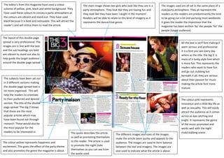
- 1. The editor’s from this magazine have used a colour The main image shows two girls who look like they are in a The images used are all set in the same place of a scheme of yellow, pink, black and white background. They party atmosphere. They look like they are having fun and club/party atmosphere. They all represent the have used these colours to convey a party atmosphere as they look like they have been ‘caught in the moment’. readers as the readers are predominantly the kind the colours are vibrant and stand out. They have used Readers will be able to relate to this kind of imagery as it to be going out a lot and partying most weekends. black because it is bold and noticeable. This will attract the represents the dance/club genre. It gives the reader the impression that the reader’s and will entice them to read the article. magazine has been written ‘by’ the people ‘for’ the people (target audience). The layout of this double page spread is very professional. The All the text is serif font making it images are in line with the text seem serious and professional. and the sub headings are bold It is a font you see every day are vibrant to stand out also to where as the title ‘the big 3’ is help guide the target audience more of a funky style font which around the double page spread. is more fun. This represents the readers who want to have fun and go out clubbing but beneath it all; they are serious The subjects have been set out about their passion for music in 3 different sections making making the article font more the double page spread look a mature. lot more organised. This will help the readers to orientate to their preferred and desired The colour pink represents section. The title of the double innocence and a child-like life as page spread ‘The big 3’shows well as sexuality. This will easily that these are the most attract the audience as it comes popular articles which may across as eye catching and have been found out through bright. It represents the genre research. These would also be of the music promoted and the most popular for the works well with the night readers to be interested in. The quote describes the article club/clubbing scene. The different images and sizes of the images as well as promoting themselves make the article seem quirky and appeals to the The colour yellow represents happiness and to the reader. The article is used audience. The images are used to form balance excitement. This gives the effect of the party theme to promote the night clubs between the text and imagery. The images are and also promotes the genre the magazine is about. themselves as you can see from also used to indicate what the article is about. the quote used.