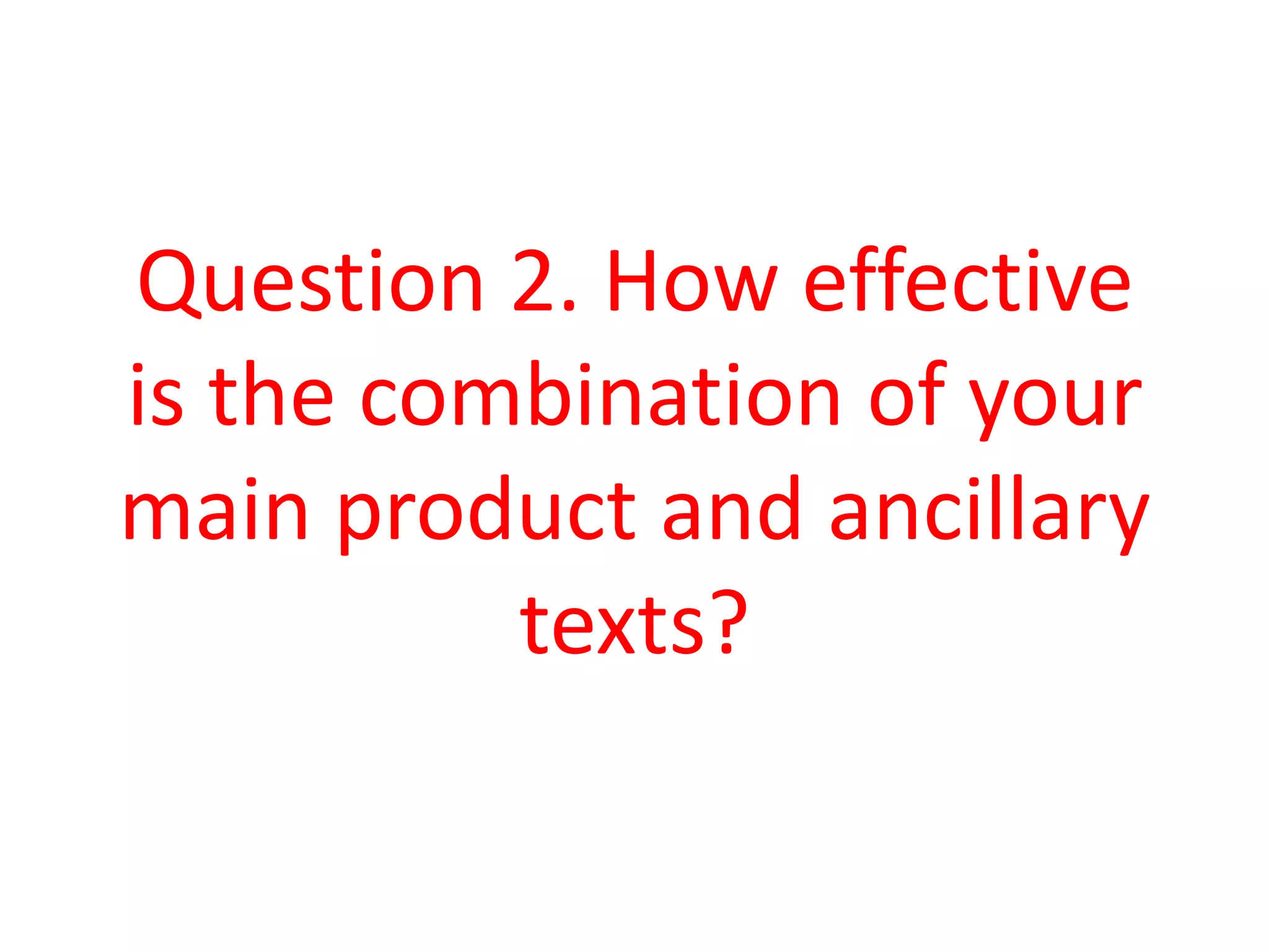
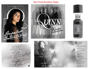
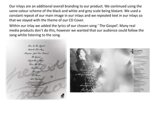
My main product was two ancillary texts: a poster and album cover for a music video. To make the products effective, I linked their designs. The music video featured a girl running from her past emotions. The poster showed her looking distressed from the corner of her eye while grabbing her hair, reinforcing this theme. The album cover then showed her distressed form, continuing the theme. We used a black and white color scheme matching the upsetting lyrics. Repeating the artist's image multiple times and in dark tones made the designs appealing and linked to the theme of confusion. The inlay continued this color scheme and repetition to stay consistent with the overall branding.