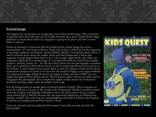
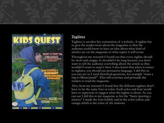
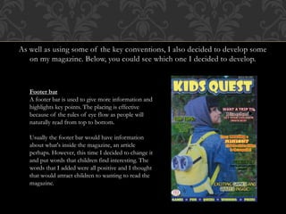
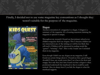
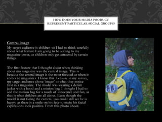
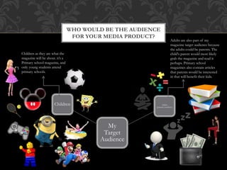
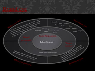
This document discusses how the media product, a magazine cover, represents its target audience of primary school children. It uses key conventions like a central image of a smiling boy, a bubbly masthead in bright colors, and short, simple taglines using fonts and colors related to their contents. The magazine cover aims to attract children visually with its bright, fun design elements and language they can easily understand. Overall, the cover is designed to appeal specifically to young children through its representation of them as the target audience.