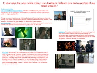
The music video uses conventions of indie music videos such as a narrative storyline, scenes of the band playing, and close-ups of band members and instruments. Locations include outdoor urban settings and costumes are casual clothes.
The digipak uses conventions like photos of band members against a nature backdrop, contrasting colors like blue, and a light, casual font style.
The poster displays the band name, album name and song titles, release date, tour dates, record label, and a small album cover image, following conventions to promote the band, album, and upcoming shows.
This is the comparison of digipak albums with similar artist- Deap Vally, and had the comparison in digipak design and finally state the effect of our design in marketing and building up the star images
This is the comparison of digipak albums with similar artist- Deap Vally, and had the comparison in digipak design and finally state the effect of our design in marketing and building up the star images
I found myself very discipline and committed in doing whatever task assigned. I am able to work independently and under minimum supervision. I am confident in whatever I do and will do whatever it takes to complete the task. I am able to cope and suit myself in new environment fast and always take challenge as platform to learn and to improve myself.
Asus mobility report 2014 - Hábitos de Movilidad de los Usuarios en MéxicoMedina Núñez
ASUS presentó los resultados del primer estudio ASUS Mobiity Report 2014, la Encuesta de Hábitos de Movilidad de los Usuarios en México que la compañía ha llevado a cabo con el objetivo de conocer de manera más certera las preferencias de los mexicanos en cuanto a sus dispositivos preferidos de cómputo y la forma en la que los utilizan.
Leveraging viral social network effects in your mobile application. An overview of all the integration points Facebook offers to native mobile app developers.
Details of HAQ: Centre for Child Rights's Annual Report Years 2005 - 2006.
HAQ: Center for Child Rights
B1/2, Ground Floor,
Malviya Nagar
New Delhi - 110017
Tel: +91-26677412,26673599
Fax: +91-26674688
Website: www.haqcrc.org
FaceBook Page: https://www.facebook.com/HaqCentreForChildRights
This is an answer to the evaluation question number one, titled "In what ways does your media product use, develop or challenge forms and conventions of real media products?"
1. In what ways does your media product use, develop or challenge form and convention of real
media products?
For the music video:
We used the following conventions: narrative scene, band scene, close up on band
members and on the instruments, locations which are urban and outdoor, and costumes
which are simple casual clothes.
Through our research we found out that indie band videos frequently have narratives and
having a band scenes. The narratives are often based on some personal issues between a boy
and a girl, therefore in our video is about the relationship of a girl and boy.
Use of close up: We used close ups of instruments and of band members as it creates band
identity and audience can recognise them, they are used to sell the band.
Locations: We used an outside location for our narrative part as in
most of indie videos the narratives a outside, however the
performance was indoor because while looking at different music
videos some of them had indoor performance especially on a white
background. Therefore we chose to do it indoor.
Costume: The costume’s the band is wearing are simple, casual clothes as from our
music video analysis we found out that a lot of indie bands i.e the Kooks, wear urban
clothes. This may be for the reason that through our questionnaire we learned that
majority of indie fans wear clothes which are urban and casual clothes nothing high
branded, meaning that it is a way to sell the band. We also slightly challenged this
convention as one band member is wearing a wig, and only in a few videos indie
band members wear a wig. This is as it presents indie in a quirky style and unusual
from the general indie style.
2. Digipak
We chose a Digipak with eight panels. The conventions we followed are:
Colour contrasting, photos of band members and nature, use of font.
Colour Contrasting: The colour theme we used is blue, as Indie genre
uses colours which connotes nature and goodness. Use of font: Through our Digipak research we found out that the
While looking at other Digipak images they also have similar colour themes. font is slightly contrasting with the background e.g. by looking at a
“the kooks” Digipak. Since our background is dark our font is a
Photos of band Members and nature:
lighter shade. The font style has to go with the style of the Digipak.
While looking at different Digipak we noticed that they contain images
Of Band Members, therefore we decided to include individual photos of As the Digipak is casual and simple the Font style is also light and
each band member, the colour scheme for those images is not blue but casual, relating the indie style.
instead in more brighter colours. This is so it creates a brighter effect and
allows recognition of band members which can help sell the band.
We also used images of nature, such as the wolf and the sunset, as indie
genre refers to nature and, additionally a special effect we used was the
stars dot to dot style for the band photo. The Dot to Dot style has been
applied for the reason that it displays the band members on the front cover
and in addition the stars expressing nature relating it to indie genre.
3. Poster
By looking at different Posters I found out that about each poster contains
the following conventions: Name of Band, Name of Album (including some song
names it contains), Release Date of the Album, Tour Date, Record Label, Colour
theme, a small image of album front cover.
Name of Band: This is a basic convention I used because without a name, the band
will not have a recognition making it difficult to sell the band. Additionally I noticed
by looking at a “Bleed From Within” poster that the band title is often at the top in
large prominent writing. Therefore I made the writing on our Poster in a light colour
which made it stand out from the background, the font size is large so someone
looking at the Poster straight away notices the band name and the font style is
chosen to be simple, but not too plain.
Name of Album: Apart from the band name, the name of the album is also shown
prominently. Similarly as the name of band is meant to give recognition, the name of
album is meant to give additional recognition of the band. Also displaying the name
of some songs the album has gives the audience more information about the band
and possible a certain song they look forward to. Which helps to sell the band.
Release Date of the Album: This convention is used for the audience to know when
the album will release and be available for them.
Tour Date; Tour Date's are a convention which help to sell the band, as if an audience
member particular likes the band, he or she will have something to look forward to.
Therefore it is displayed clearly in light coloured font striking out from the dark
background for fan to be read easily. Plus using the light coloured font suits the indie
genre.
Record Label: The record label is used to show which record label company is going to
sell our album. Which will increase recognition.
Colour theme: We used the convention throughout our products. Similarly to the
Digipak we used here the blue colour theme for the background, as indie genre often
matches with colours and nature. Additionally the songs emotion is not happy but
rather dejected, therefore the dark blue colour refers to the mood of the song.
Album front cover: During the research I found on the poster of “bleed form within”
that posters have a small image of their album front cover. We used this same
convention on our poster, hence the audience will know what the front cover will
look like.