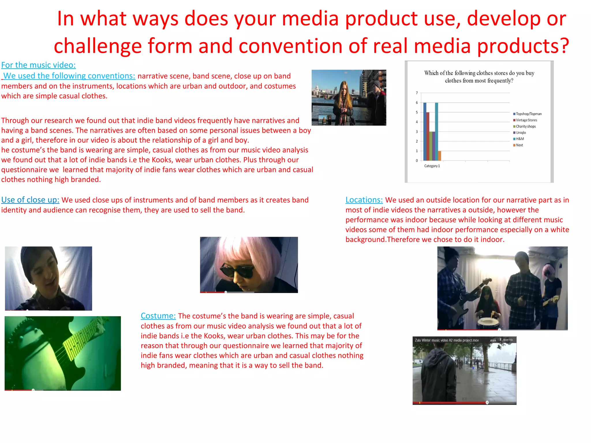
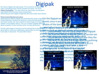
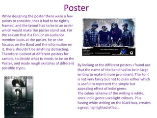
In what ways does your media product use, develop or
               challenge form and convention of real media products?
For the music video:
 We used the following conventions: narrative scene, band scene, close up on band
members and on the instruments, locations which are urban and outdoor, and costumes
which are simple casual clothes.


Through our research we found out that indie band videos frequently have narratives and
having a band scenes. The narratives are often based on some personal issues between a boy
and a girl, therefore in our video is about the relationship of a girl and boy.
he costume’s the band is wearing are simple, casual clothes as from our music video analysis
we found out that a lot of indie bands i.e the Kooks, wear urban clothes. Plus through our
questionnaire we learned that majority of indie fans wear clothes which are urban and casual
clothes nothing high branded.

Use of close up: We used close ups of instruments and of band members as it creates band              Locations: We used an outside location for our narrative part as in
identity and audience can recognise them, they are used to sell the band.                             most of indie videos the narratives a outside, however the
                                                                                                      performance was indoor because while looking at different music
                                                                                                      videos some of them had indoor performance especially on a white
                                                                                                      background.Therefore we chose to do it indoor.


                                         Costume: The costume’s the band is wearing are simple, casual
                                         clothes as from our music video analysis we found out that a lot of
                                         indie bands i.e the Kooks, wear urban clothes. This may be for the
                                         reason that through our questionnaire we learned that majority of
                                         indie fans wear clothes which are urban and casual clothes nothing
                                         high branded, meaning that it is a way to sell the band.
Digipak
We chose a Digipak with eight panels. The conventions we followed are:
Colour contrasting,photos of band members and nature, use of font.
Colour Contrasting: The colour theme we used is blue, as Indie genre
uses colours which connotes nature and goodness.
While looking at other Digipak images they also have similar colour themes.

Photos of band Members and nature:
While looking at different Digipak we noticed that they contain images For the Digipak we used one with eight
Of Band Members, therefore we decided to include individual photos of
each band member, the colour scheme for those images is not blue but   panels since it would have plenty of space for
instead in more brighter colours. This is so it creates a brighter effect and
allows recognition of band members which can help sell the band.       photos of the band members and to have
                                                                   For the Digipakimages relating to the indie
We also used images of nature,such as the wolf and the sunset,as indie
                                                                       some other we used one with eight
                                                                       genre. Such as shots of nature scenery etc. As
                                                                   panels since it would havethe front cover of the digipak
genre refers to nature and, additionally a special effect we used was is dot
to dot style of band photo. The stars effect make it                         Furthermore, for plenty of space for
                                                                   photos of the banddown to to andtherefore for
                                                                       Indie bands are members decide have
                                                                             we had two ideas, earth to the final version we
                                                                   some other images relatingato the with a dark they like
                                                                       the front cover we used our class which one
                                                                             asked people from wolf, indie
                                                                   genre. Such as shots thethe back of the Digipak outlining
                                                                       blue background. At nature scenery etc. As
                                                                             the best. In of end the image with the
                                                                   Indie bands we decided to use therefore for it of it is
                                                                       however are down to therefore we chose as
                                                                             was most liked, earth a simple image
                                                                   the frontmost appealing.a wolf, with a dark
                                                                       nature, which is used to creates pleasant
                                                                              cover we meant
                                                                   blue background. is not distracting as we had
                                                                       effect but also At the back of the Digipak
                                                                   however wetitles of the albumsimple image of
                                                                       the song decided to use a at the back of it.
                                                                   nature, which is meant to creates a pleasant
                                                                   effect but also is not distracting as we had
                                                                   the song titles of the album at the back of it.
Poster
While designing the poster there were a few
points to consider, that it had to be tightly
framed, and the layout had to be in an order
which would make the poster stand out. For
the reason that if a Fan, or an audience
member looks at the poster, he or she
focuses on the Band and the information on
it, there shouldn’t be anything distracting.
Therefore I looked at different posters for
sample, to decide what to needs to be on the
Poster, and made rough sketches of different By looking at the different posters I found out
possible styles.                              that the name of the band had to be in large
                                              writing to make it more prominent. The Font
                                              is not very fancy but not to plain either which
                                              is useful to represent the simple but
                                              appealing effect of indie genre.
                                              The colour scheme of the writing is white,
                                              since indie genre uses light colours. Plus
                                              having white writing on the black box, creates
                                              a great highlighted effect.

Mediaevaluation12

  • 1.
    In what waysdoes your media product use, develop or challenge form and convention of real media products? For the music video: We used the following conventions: narrative scene, band scene, close up on band members and on the instruments, locations which are urban and outdoor, and costumes which are simple casual clothes. Through our research we found out that indie band videos frequently have narratives and having a band scenes. The narratives are often based on some personal issues between a boy and a girl, therefore in our video is about the relationship of a girl and boy. he costume’s the band is wearing are simple, casual clothes as from our music video analysis we found out that a lot of indie bands i.e the Kooks, wear urban clothes. Plus through our questionnaire we learned that majority of indie fans wear clothes which are urban and casual clothes nothing high branded. Use of close up: We used close ups of instruments and of band members as it creates band Locations: We used an outside location for our narrative part as in identity and audience can recognise them, they are used to sell the band. most of indie videos the narratives a outside, however the performance was indoor because while looking at different music videos some of them had indoor performance especially on a white background.Therefore we chose to do it indoor. Costume: The costume’s the band is wearing are simple, casual clothes as from our music video analysis we found out that a lot of indie bands i.e the Kooks, wear urban clothes. This may be for the reason that through our questionnaire we learned that majority of indie fans wear clothes which are urban and casual clothes nothing high branded, meaning that it is a way to sell the band.
  • 2.
    Digipak We chose aDigipak with eight panels. The conventions we followed are: Colour contrasting,photos of band members and nature, use of font. Colour Contrasting: The colour theme we used is blue, as Indie genre uses colours which connotes nature and goodness. While looking at other Digipak images they also have similar colour themes. Photos of band Members and nature: While looking at different Digipak we noticed that they contain images For the Digipak we used one with eight Of Band Members, therefore we decided to include individual photos of each band member, the colour scheme for those images is not blue but panels since it would have plenty of space for instead in more brighter colours. This is so it creates a brighter effect and allows recognition of band members which can help sell the band. photos of the band members and to have For the Digipakimages relating to the indie We also used images of nature,such as the wolf and the sunset,as indie some other we used one with eight genre. Such as shots of nature scenery etc. As panels since it would havethe front cover of the digipak genre refers to nature and, additionally a special effect we used was is dot to dot style of band photo. The stars effect make it Furthermore, for plenty of space for photos of the banddown to to andtherefore for Indie bands are members decide have we had two ideas, earth to the final version we some other images relatingato the with a dark they like the front cover we used our class which one asked people from wolf, indie genre. Such as shots thethe back of the Digipak outlining blue background. At nature scenery etc. As the best. In of end the image with the Indie bands we decided to use therefore for it of it is however are down to therefore we chose as was most liked, earth a simple image the frontmost appealing.a wolf, with a dark nature, which is used to creates pleasant cover we meant blue background. is not distracting as we had effect but also At the back of the Digipak however wetitles of the albumsimple image of the song decided to use a at the back of it. nature, which is meant to creates a pleasant effect but also is not distracting as we had the song titles of the album at the back of it.
  • 3.
    Poster While designing theposter there were a few points to consider, that it had to be tightly framed, and the layout had to be in an order which would make the poster stand out. For the reason that if a Fan, or an audience member looks at the poster, he or she focuses on the Band and the information on it, there shouldn’t be anything distracting. Therefore I looked at different posters for sample, to decide what to needs to be on the Poster, and made rough sketches of different By looking at the different posters I found out possible styles. that the name of the band had to be in large writing to make it more prominent. The Font is not very fancy but not to plain either which is useful to represent the simple but appealing effect of indie genre. The colour scheme of the writing is white, since indie genre uses light colours. Plus having white writing on the black box, creates a great highlighted effect.