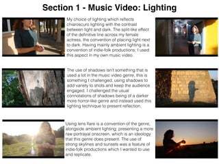
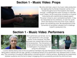
Question 1:
In what ways does your media product use,
develop or challenge forms and conventions of
real media products?
Section 1: Music Video
Focus on music video genre characteristics of locations, costume,
props, lighting, performers, sound, titles, use of colour, narrative
structure, recurring motif, intertextual references, conventions of
the medium and representations.
Section 2: Print Production
Focused on Digipak choices of layout, integration of text and
images, font style and size and panel conventions.
Additionally, analysing the magazine advertisement with
conventional layout.
Section 1 - Music Video: Conventions of the Medium
My use of using the whole track relates to the conventional aim of most music videos to market the track, so my
decision to use the whole track reflects this.
I needed to ensure my music video remains engaging throughout my 4 minute production; the genre
convention of shot variation through a narrative storyline is portrayed is a convention that I used. I also tried to
develop this with my own experimentation of storytelling.
I conformed to the conventions of the medium of a music video through the length of my production.
While creating my music video, I kept in mind the conventions of the medium, of a music video.
Usually, the aim of a music video is to market the artist or song to a potential audience. By the very nature of
music videos, they are an advertisement.
This is something I had to maintain a focus on when thinking about the portrayal and representation of my artist
through visuals and the relation to the lyrics.
My 4 minute long video conformed to the expected
conventions of length for a music video, ensuring it isn't
overly long and loses audience engagement.
I conformed to this marketing aim of music videos, illustrating lyrics with
visuals. Indie-folk music videos sometimes include a political statement;
this could be seen as a convention of this genre. The tone of my music
video could reflect that of an ecological perspective. Brining attention to
green issues, also focusing on greater awareness of environmental
factors. The political statement that may be interpreted from my
production is this enhancement of green issue awareness.
My music video being a production which markets Orla Gartland’s song ‘Roots’ alongside the possible
interpretations of a political message.
Section 1 - Music Video: Locations
The conventions of my music video as it is a British artist, is that of
representing British locations and images. Although this isn't a central
part of my production, the inclusive nature of British conventions this is
reflected in my use of Britishness. The British aspect of the train station
location represents the Britishness of my artists’ track. Using
recognisably British locations develops the conventions of actual British
music videos. This cultural signifier allowed me to reflect movement and
travelling, a theme of the production.
My track ‘Roots’ from Orla Gartland is from an indie-folk genre; the
locational conventions that link to this are the scenic locations I chose to
film at. Developing the notion of these nice landscapes, additionally the
possibly interpreted ideology of my production reflecting an ecological
political stance. My music video therefore, very focused on environments
and surroundings of the shoot that reflect a variety of positive environments.
My locations stemmed from the idea of my female character transporting
the sapling in her hands; the locations vary from beach to forest. But mainly
conform to the indie-folk conventions of natural spaces and scenic
surroundings. Nature being a rather substantial theme throughout my
production, which dictated aspects of my filling environment.
Indie-folk music video location conventions often include, as Ive previously
mentioned, natural settings. My scenes include being on location in a forest
reflect these very rural parts of Britain. This location conforms and develops
this convention of nature with the ideology of ecology and green issues that
may be one interpretation of my media text. It wasn't something I deliberately
encoded into the text, however, it is defiantly a possible conclusion to be
decoded from it (Stuart Hall).
Section 1 - Music Video: Lighting
Using lens flare is a convention of the genre,
alongside ambient lighting; presenting a more
raw portrayal onscreen, which is an ideology
that this genre does present. The use of
strong skylines and sunsets was a feature of
indie-folk productions which I wanted to use
and replicate.
The use of shadows isn't something that is
used a lot in the music video genre, this is
something I challenged, using shadows to
add variety to shots and keep the audience
engaged. I challenged the usual
connotations of shadows being of a darker
more horror-like genre and instead used this
lighting technique to present reflection.
My choice of lighting which reflects
chiaroscuro lighting with the contrast
between light and dark. The split-like effect
of the definitive line across my female
actress, the convention of placing light next
to dark. Having mainly ambient lighting is a
convention of indie-folk productions; I used
this aspect in my own music video.
Section 1 - Music Video: Props
Section 1 - Music Video: Performers
Both performers are female, but my
main performer is the younger
version of the character, the elder
portrayal only viewed right at the end
of the production. The convention of
female performers being objectified
is challenged in my production, not
using this stereotype.
My only, and main, prop in my music video production;
the sapling that my female character carries in her
hands throughout all of the locations she travels
through. I challenged the notion of props in indie-folk
music videos, as the usual prop convention is musical
instruments with a performance based aspect.
The prop I chose to use is somewhat symbolic; it may
be interpreted as her ambitions, or even her youth,
which she leaves at the end of the music video to
grown into something more. My development of the
convention of symbolism allowed me to challenge
myself in production this.
Lucan’s identity theory links to this as audience members may see themselves reflected in this media text.
Being able to identify with the age, gender or situational factors of my performers may represent them in some
way. This convention of audience relate-ability is something which I tried to achieve, developing the relationship
between audience and the text to keep it engaging and to successfully promote the artist and track.
Section 1 - Music Video: Sound
Section 1 - Music Video: Titles
The editing process of visuals included editing to incorporate the sound with what I had already filmed. This
stage was also present in my pre-production stage; I planned out visual aspects to match the track. So I
already had a rough plan for the editing process of timings alongside the track.
During the post-production stage one of my focuses was on ensuring that I edited the visuals in time with the
beat of the audio. The song definitely conforms to the acoustic like conventions of the indie-folk genre, I
reflects the genre conventions in my music video production with the ambient lighting, editing to the beat of
the music (Goodwin), shots of natural locations and a metaphorical narrative.
My use of title includes ‘Roots’ - the name of the track and ‘Orla Gartland’
- the artist of the song.
The authentic scripture hand-written like font references the generic
indie-folk convention of it being raw and natural; also present in the
acoustic sound of the track.
My choice of text placement at the start of the music video conforms to
the mediums conventions; being dominant and easily readable on
screen to achieve clear understanding.
Section 1 - Music Video: Costume
My choice of a minimal costume in its detail was something I deliberately chose so that there was not a focus
on the outfit of the female. I didn't want there to be much appreciation for the costume, not trying to
emphasise a female dressed-up stereotype like Mulvey’s male gaze theory.
The green top linking to connotations of environment and the green surroundings; something which conforms
to the convention of costume having a relation to the text. However, I challenged this idea with my costume
not being anti-establishment, the importance of the costume int that great in my production.
Section 1 - Music Video: Narrative Structure
My narrative structure may be perceived differently depending on the individuals interpretation; some may
see it as a chronological narrative where in the end there’s a time-jump to may years later of the female in
her elder years. Continuity being the same and using match-on-action in some scenes with the plot.
On the other hand, some may see the majority of my music video to be a flashback, the ending being
where the actual events took place in the memories of the older woman.
This idea of my production being interpreted differently from my perspective of the production. As I create
the music video, I am the encoder of the text. The audience are the decoders of the text, their perceptions
of the events and their meaning may differ from the creators and even other audience members (Claude
Levis Strauss).
I have conformed to the conventions of moving image storytelling in the editing and creation of a plot line.
However, I believe I have challenged the conventions of narrative structure with my montage-like style.
There isn't a clear or definite continuation in shots, it is left subjective whether this all occurs in one day, or
over a longer period of time. Usually, a music video depicts a specific moment in a characters life. The
somewhat linear narrative of my music video could be contradicted. Opposing this view as my music video
location ending loops back to where it began. This could be interpreted as a circular narrative structure,
The inability to categories easily the structure of my piece reflects the process of experimentation I used,
challenging the traditional conventions of the medium to a more contemporary audience.
Section 1 - Music Video: Use of Colour
These scenes dominated by the colour green;
connotations of nature, this also promoting the political
statement I address, the choice of this dominating
colour is also reflected in her green top.
The green coloration of the image that I created also
highlights her inclusive nature of being in this
environment, her position in the surrounding blends her
into the background.
Section 1 - Music Video: Representation
The representation of female gender; I have challenged the traditionally sexist portrayal of women. Promiscuity
and objectification isn't something that features in my music video, during the production of my much video, I
maintained awareness about Mulvey’s theory of the Male Gaze, at no point wanting to portray my female
character in a sexualised manner.
However, my incliner nature of traditional representation of femininity links to fertility with the metaphor of the
sapling. My performer connotes birth and growth which are feminine symbols, links to Neolithic prehistory and
evolution of humans.
Aspects of my production are associated with traditional feminine representations of nurturing and gentleness.
This female representation encompassing symbolic aspects of fertility and power are debatably seen in Eastern
Mediterranean Archaeological Relics. With woman seen as pure and central to life.
The young female in my music video being gentle and passive, suggesting pagan beliefs about women as
metaphors for fertility. These beliefs adopted by Christianity and portrayed in the images of the Virgin Mary. My
music video doesn't reflect religion, but my representation which is perpetuated by the sapling prop and the
journeying links back to our preindustrial past. With my iconography of green ideology and the overall political
message that I represent in my music video, with uncluttered landscapes and the beautifully strong sunsets.
The representation of age in my music video is mainly centred around female youth. The promise and ambitions
of the young woman, with a positive outlook on her future. The symbolic nature of preserving the sapling, the
nurturing nature of her actions, as she carries it around with her. As a young producer myself, being able to
create reliability to people my age was a lot easier, and made sense to have a young actress.
Youth representation in my music video production portrays the group as an indecent age category, a time of
journeying and exploration. The freedom and development that comes with the teenage years is often
romanticised in media.
The transition into the older female may represent the
fear and apprehension of growing old, the nerves and
risks that come with this. The Peter Pan ideology of
never growing old an unachievable wish; the
inevitable staging of ageing reflected in one transition
in my production, using a time-jump convention.
Section 2 - Print Production: Text Integration
The use of text on my print production panels and magazine advert
conform to the conventions of these pieces being an advertisement,
marketing the artist and tracks.
The text on my print production panels is incorporated alongside the
image; shaped in order to fit in with the visuals. Institutional and
necessary information is provided; which uses the conventions of the
medium in order to promote the artist and track.
The font type for my print
production panels 1 and 4 are
the same; ‘Luna’ font which is
easily readable in its large and
eye-catching size, but also fits
in with its colour to the image
itself. The colour contrast to
the background of the image;
for my magazine the bring
white font against the dark
background pulls attention to
the text and drawings.
The large font side conforms to
the convention of the digipak
and magazine advert, being a
promotional text. The font
placement of necessary text
being the largest and at the
top or bottom of the piece to
gain the most attention from
the audience.
Section 2 - Print Productions: Panel Format
I have conformed to the tradition print production conventions for my
first panel; indie-folk album covers are often minimalist yet powerful,
with only the necessary text information provided. Like I have done
with my titles, showing the information in a large and bold text,
highlighting the artist and track name in order to promote the EP as a
product.
Conventionally, the front panel has had some colour alterations, I
highlighted the colours of the sunset in order to create a bolder and
brighter image which allows more powerful and memorable visuals.
Advertising the artist, I used the conventions of marketing techniques
like the spaced layout. The right side covered by my female subject -
recognisable from the music video, known by a loyal audience. While
the left top half is where the text is; a suitable location for it to be clear.
This second panel of my digipak relates to my music video with the
photograph being taken on location of some railway tracks, relating
to the genre of British music with railway stations and tracks being
a locational convention of British productions, a symbol of cultural
heritage.
The conventions of the second panel that I used are integrating
themes of the overall digipak; thematic links of nature and my
female subject are incorporated.
This over-the-shoulder shot with the train tacks disappearing into
the distance creates a finishing point on the horizon. Although I did
edit the image in order for it to look sharper and with some slight
colour correction. I maintained the use of second panel digipak
conventions with keeping this panel minimalist in order to not
distract from the CD on panel 3.
Section 2 - Print Productions: Panel Format
My third digipak panel consists of a minimalist image, I chose this as
the image substance is located centrally; which is where the
placement of the CD is.
My third panel conforms to the conventions of a digipak with this panel
being where the physical CD is placed. My female character holding
the sapling and the train ticket in her hands is in the middle.
My choice to do this conforms to the marketing aim to draw attention
to the physical product, advertising to the consumer or purchaser.
I have used colour correction to this image to highlight and add
definition to make the visuals sharper.
This panel has a clear link to my music video production, a loyal
audience of my artist may recognise this reference. Connotation of
travelling, exploration and nature are running themes throughout both
my music video production and print production.
My design for panel 4 uses the expected final panel conventions of a
didfipak. Having necessary institutional information of production
company, artist name and the track list.
I chose a font which matches that of what is on panel 1, in order to
maintain this continuity and the overall themes spreads throughout the
whole digipak. Centrally positioned in order for the text to align with the
image of the tree trunk, additionally the off-white text colour blends
with the colour palette, yet still stands out.
My choice to include ‘Roots’ from the track listing in the image with
scrabble pieces against the tree somewhat challenges the
conventions of the back print production panel. I chose to do this to
add variation and experiment with the medium. Incorporating text of a
track into the image allows ‘Roots’ to appear as the stand out EP track,
which is the song used in my music video production.
Section 2 - Print Productions: Magazine Format
My magazine advert conforms to the conventions of
the medium in size of the text, displaying the artist and
her track as a professional purchase. This medium’s
aim is to advertise my artist, which I think it does
through genre characteristics like the inclusion of
natural imagery; the trees framing the background. As
well as the white drawing-style layer which is
foregrounded against the darker background, which
includes the outline of a woman’s face and her hands
holding the sapling. This references my music video,
but also conforms to the appealing convention of the
genre with my target audience predominantly being
young females who may have an interest or concern in
nature or environmental issues.
Additionally, my advertisement includes all of the
necessary institutional information information in the
form of the white coloured text. The font bold and
striking, the same colour as the drawing, allowing
them all to have relative connections visually.
The size of the text was also an important point of
reference from my text. The reviews of quality from
‘The Guardian’ and ‘NME’ being the smaller text. The
larger text includes the name of the artist and the track
which are the most important aspects to include for
the marketisation of the product.
An aspect of design that I challenged was the
magazine convention to include images of the artist;
instead my choice to have a focus on more detailed
visuals portraying themes of nature.
Section 2 - Print Productions: Intertextuality
Intertextually, my magazine advertisement links to the ‘Artic Monkeys’
with the dark background contrasting to the white foreground which
holds necessary information. However, I developed the conventional
background with my image having more detail, hopefully attracting
audience attention, the art being a more engaging piece.
My print production design intertextuality relates to the
conventions of The 1975’s CD cover with the minimalistic
presentation of needed information. Additionally, Daniel
Pearson’s album cover conforms to the same convention of
including the female character in the music video; appealing to
the potential loyal audience.
‘Imagine Dragons’ have used a similar
convention of the central positioning of
hands holding a relevant object to the
context. I developed this convention
by incorporating the CD into my
design, my visual layout designed
around CD positioning.
The back of Ed Sheeran’s
cover reflects the convention
of incorporating image to text.
Something I have tried to
replicate with my own design.
The text is stand-out different
from the background clolour,
something I also developed to
allow integration between
necessary text and visuals.
The use of intertextuality from my own productions to other
artists of similar genre has allowed me to develop
conventions and challenge what already exists.
My magazine also links to
Disclosure’s album art with the
white-line drawings. Conveying the shapes of
characters without having them actually visually
represented. I developed this convention to
include relevant props.

Question 1

  • 1.
    Question 1: In whatways does your media product use, develop or challenge forms and conventions of real media products? Section 1: Music Video Focus on music video genre characteristics of locations, costume, props, lighting, performers, sound, titles, use of colour, narrative structure, recurring motif, intertextual references, conventions of the medium and representations. Section 2: Print Production Focused on Digipak choices of layout, integration of text and images, font style and size and panel conventions. Additionally, analysing the magazine advertisement with conventional layout.
  • 2.
    Section 1 -Music Video: Conventions of the Medium My use of using the whole track relates to the conventional aim of most music videos to market the track, so my decision to use the whole track reflects this. I needed to ensure my music video remains engaging throughout my 4 minute production; the genre convention of shot variation through a narrative storyline is portrayed is a convention that I used. I also tried to develop this with my own experimentation of storytelling. I conformed to the conventions of the medium of a music video through the length of my production. While creating my music video, I kept in mind the conventions of the medium, of a music video. Usually, the aim of a music video is to market the artist or song to a potential audience. By the very nature of music videos, they are an advertisement. This is something I had to maintain a focus on when thinking about the portrayal and representation of my artist through visuals and the relation to the lyrics. My 4 minute long video conformed to the expected conventions of length for a music video, ensuring it isn't overly long and loses audience engagement. I conformed to this marketing aim of music videos, illustrating lyrics with visuals. Indie-folk music videos sometimes include a political statement; this could be seen as a convention of this genre. The tone of my music video could reflect that of an ecological perspective. Brining attention to green issues, also focusing on greater awareness of environmental factors. The political statement that may be interpreted from my production is this enhancement of green issue awareness. My music video being a production which markets Orla Gartland’s song ‘Roots’ alongside the possible interpretations of a political message.
  • 3.
    Section 1 -Music Video: Locations The conventions of my music video as it is a British artist, is that of representing British locations and images. Although this isn't a central part of my production, the inclusive nature of British conventions this is reflected in my use of Britishness. The British aspect of the train station location represents the Britishness of my artists’ track. Using recognisably British locations develops the conventions of actual British music videos. This cultural signifier allowed me to reflect movement and travelling, a theme of the production. My track ‘Roots’ from Orla Gartland is from an indie-folk genre; the locational conventions that link to this are the scenic locations I chose to film at. Developing the notion of these nice landscapes, additionally the possibly interpreted ideology of my production reflecting an ecological political stance. My music video therefore, very focused on environments and surroundings of the shoot that reflect a variety of positive environments. My locations stemmed from the idea of my female character transporting the sapling in her hands; the locations vary from beach to forest. But mainly conform to the indie-folk conventions of natural spaces and scenic surroundings. Nature being a rather substantial theme throughout my production, which dictated aspects of my filling environment. Indie-folk music video location conventions often include, as Ive previously mentioned, natural settings. My scenes include being on location in a forest reflect these very rural parts of Britain. This location conforms and develops this convention of nature with the ideology of ecology and green issues that may be one interpretation of my media text. It wasn't something I deliberately encoded into the text, however, it is defiantly a possible conclusion to be decoded from it (Stuart Hall).
  • 4.
    Section 1 -Music Video: Lighting Using lens flare is a convention of the genre, alongside ambient lighting; presenting a more raw portrayal onscreen, which is an ideology that this genre does present. The use of strong skylines and sunsets was a feature of indie-folk productions which I wanted to use and replicate. The use of shadows isn't something that is used a lot in the music video genre, this is something I challenged, using shadows to add variety to shots and keep the audience engaged. I challenged the usual connotations of shadows being of a darker more horror-like genre and instead used this lighting technique to present reflection. My choice of lighting which reflects chiaroscuro lighting with the contrast between light and dark. The split-like effect of the definitive line across my female actress, the convention of placing light next to dark. Having mainly ambient lighting is a convention of indie-folk productions; I used this aspect in my own music video.
  • 5.
    Section 1 -Music Video: Props Section 1 - Music Video: Performers Both performers are female, but my main performer is the younger version of the character, the elder portrayal only viewed right at the end of the production. The convention of female performers being objectified is challenged in my production, not using this stereotype. My only, and main, prop in my music video production; the sapling that my female character carries in her hands throughout all of the locations she travels through. I challenged the notion of props in indie-folk music videos, as the usual prop convention is musical instruments with a performance based aspect. The prop I chose to use is somewhat symbolic; it may be interpreted as her ambitions, or even her youth, which she leaves at the end of the music video to grown into something more. My development of the convention of symbolism allowed me to challenge myself in production this. Lucan’s identity theory links to this as audience members may see themselves reflected in this media text. Being able to identify with the age, gender or situational factors of my performers may represent them in some way. This convention of audience relate-ability is something which I tried to achieve, developing the relationship between audience and the text to keep it engaging and to successfully promote the artist and track.
  • 6.
    Section 1 -Music Video: Sound Section 1 - Music Video: Titles The editing process of visuals included editing to incorporate the sound with what I had already filmed. This stage was also present in my pre-production stage; I planned out visual aspects to match the track. So I already had a rough plan for the editing process of timings alongside the track. During the post-production stage one of my focuses was on ensuring that I edited the visuals in time with the beat of the audio. The song definitely conforms to the acoustic like conventions of the indie-folk genre, I reflects the genre conventions in my music video production with the ambient lighting, editing to the beat of the music (Goodwin), shots of natural locations and a metaphorical narrative. My use of title includes ‘Roots’ - the name of the track and ‘Orla Gartland’ - the artist of the song. The authentic scripture hand-written like font references the generic indie-folk convention of it being raw and natural; also present in the acoustic sound of the track. My choice of text placement at the start of the music video conforms to the mediums conventions; being dominant and easily readable on screen to achieve clear understanding. Section 1 - Music Video: Costume My choice of a minimal costume in its detail was something I deliberately chose so that there was not a focus on the outfit of the female. I didn't want there to be much appreciation for the costume, not trying to emphasise a female dressed-up stereotype like Mulvey’s male gaze theory. The green top linking to connotations of environment and the green surroundings; something which conforms to the convention of costume having a relation to the text. However, I challenged this idea with my costume not being anti-establishment, the importance of the costume int that great in my production.
  • 7.
    Section 1 -Music Video: Narrative Structure My narrative structure may be perceived differently depending on the individuals interpretation; some may see it as a chronological narrative where in the end there’s a time-jump to may years later of the female in her elder years. Continuity being the same and using match-on-action in some scenes with the plot. On the other hand, some may see the majority of my music video to be a flashback, the ending being where the actual events took place in the memories of the older woman. This idea of my production being interpreted differently from my perspective of the production. As I create the music video, I am the encoder of the text. The audience are the decoders of the text, their perceptions of the events and their meaning may differ from the creators and even other audience members (Claude Levis Strauss). I have conformed to the conventions of moving image storytelling in the editing and creation of a plot line. However, I believe I have challenged the conventions of narrative structure with my montage-like style. There isn't a clear or definite continuation in shots, it is left subjective whether this all occurs in one day, or over a longer period of time. Usually, a music video depicts a specific moment in a characters life. The somewhat linear narrative of my music video could be contradicted. Opposing this view as my music video location ending loops back to where it began. This could be interpreted as a circular narrative structure, The inability to categories easily the structure of my piece reflects the process of experimentation I used, challenging the traditional conventions of the medium to a more contemporary audience. Section 1 - Music Video: Use of Colour These scenes dominated by the colour green; connotations of nature, this also promoting the political statement I address, the choice of this dominating colour is also reflected in her green top. The green coloration of the image that I created also highlights her inclusive nature of being in this environment, her position in the surrounding blends her into the background.
  • 8.
    Section 1 -Music Video: Representation The representation of female gender; I have challenged the traditionally sexist portrayal of women. Promiscuity and objectification isn't something that features in my music video, during the production of my much video, I maintained awareness about Mulvey’s theory of the Male Gaze, at no point wanting to portray my female character in a sexualised manner. However, my incliner nature of traditional representation of femininity links to fertility with the metaphor of the sapling. My performer connotes birth and growth which are feminine symbols, links to Neolithic prehistory and evolution of humans. Aspects of my production are associated with traditional feminine representations of nurturing and gentleness. This female representation encompassing symbolic aspects of fertility and power are debatably seen in Eastern Mediterranean Archaeological Relics. With woman seen as pure and central to life. The young female in my music video being gentle and passive, suggesting pagan beliefs about women as metaphors for fertility. These beliefs adopted by Christianity and portrayed in the images of the Virgin Mary. My music video doesn't reflect religion, but my representation which is perpetuated by the sapling prop and the journeying links back to our preindustrial past. With my iconography of green ideology and the overall political message that I represent in my music video, with uncluttered landscapes and the beautifully strong sunsets. The representation of age in my music video is mainly centred around female youth. The promise and ambitions of the young woman, with a positive outlook on her future. The symbolic nature of preserving the sapling, the nurturing nature of her actions, as she carries it around with her. As a young producer myself, being able to create reliability to people my age was a lot easier, and made sense to have a young actress. Youth representation in my music video production portrays the group as an indecent age category, a time of journeying and exploration. The freedom and development that comes with the teenage years is often romanticised in media. The transition into the older female may represent the fear and apprehension of growing old, the nerves and risks that come with this. The Peter Pan ideology of never growing old an unachievable wish; the inevitable staging of ageing reflected in one transition in my production, using a time-jump convention.
  • 9.
    Section 2 -Print Production: Text Integration The use of text on my print production panels and magazine advert conform to the conventions of these pieces being an advertisement, marketing the artist and tracks. The text on my print production panels is incorporated alongside the image; shaped in order to fit in with the visuals. Institutional and necessary information is provided; which uses the conventions of the medium in order to promote the artist and track. The font type for my print production panels 1 and 4 are the same; ‘Luna’ font which is easily readable in its large and eye-catching size, but also fits in with its colour to the image itself. The colour contrast to the background of the image; for my magazine the bring white font against the dark background pulls attention to the text and drawings. The large font side conforms to the convention of the digipak and magazine advert, being a promotional text. The font placement of necessary text being the largest and at the top or bottom of the piece to gain the most attention from the audience.
  • 10.
    Section 2 -Print Productions: Panel Format I have conformed to the tradition print production conventions for my first panel; indie-folk album covers are often minimalist yet powerful, with only the necessary text information provided. Like I have done with my titles, showing the information in a large and bold text, highlighting the artist and track name in order to promote the EP as a product. Conventionally, the front panel has had some colour alterations, I highlighted the colours of the sunset in order to create a bolder and brighter image which allows more powerful and memorable visuals. Advertising the artist, I used the conventions of marketing techniques like the spaced layout. The right side covered by my female subject - recognisable from the music video, known by a loyal audience. While the left top half is where the text is; a suitable location for it to be clear. This second panel of my digipak relates to my music video with the photograph being taken on location of some railway tracks, relating to the genre of British music with railway stations and tracks being a locational convention of British productions, a symbol of cultural heritage. The conventions of the second panel that I used are integrating themes of the overall digipak; thematic links of nature and my female subject are incorporated. This over-the-shoulder shot with the train tacks disappearing into the distance creates a finishing point on the horizon. Although I did edit the image in order for it to look sharper and with some slight colour correction. I maintained the use of second panel digipak conventions with keeping this panel minimalist in order to not distract from the CD on panel 3.
  • 11.
    Section 2 -Print Productions: Panel Format My third digipak panel consists of a minimalist image, I chose this as the image substance is located centrally; which is where the placement of the CD is. My third panel conforms to the conventions of a digipak with this panel being where the physical CD is placed. My female character holding the sapling and the train ticket in her hands is in the middle. My choice to do this conforms to the marketing aim to draw attention to the physical product, advertising to the consumer or purchaser. I have used colour correction to this image to highlight and add definition to make the visuals sharper. This panel has a clear link to my music video production, a loyal audience of my artist may recognise this reference. Connotation of travelling, exploration and nature are running themes throughout both my music video production and print production. My design for panel 4 uses the expected final panel conventions of a didfipak. Having necessary institutional information of production company, artist name and the track list. I chose a font which matches that of what is on panel 1, in order to maintain this continuity and the overall themes spreads throughout the whole digipak. Centrally positioned in order for the text to align with the image of the tree trunk, additionally the off-white text colour blends with the colour palette, yet still stands out. My choice to include ‘Roots’ from the track listing in the image with scrabble pieces against the tree somewhat challenges the conventions of the back print production panel. I chose to do this to add variation and experiment with the medium. Incorporating text of a track into the image allows ‘Roots’ to appear as the stand out EP track, which is the song used in my music video production.
  • 12.
    Section 2 -Print Productions: Magazine Format My magazine advert conforms to the conventions of the medium in size of the text, displaying the artist and her track as a professional purchase. This medium’s aim is to advertise my artist, which I think it does through genre characteristics like the inclusion of natural imagery; the trees framing the background. As well as the white drawing-style layer which is foregrounded against the darker background, which includes the outline of a woman’s face and her hands holding the sapling. This references my music video, but also conforms to the appealing convention of the genre with my target audience predominantly being young females who may have an interest or concern in nature or environmental issues. Additionally, my advertisement includes all of the necessary institutional information information in the form of the white coloured text. The font bold and striking, the same colour as the drawing, allowing them all to have relative connections visually. The size of the text was also an important point of reference from my text. The reviews of quality from ‘The Guardian’ and ‘NME’ being the smaller text. The larger text includes the name of the artist and the track which are the most important aspects to include for the marketisation of the product. An aspect of design that I challenged was the magazine convention to include images of the artist; instead my choice to have a focus on more detailed visuals portraying themes of nature.
  • 13.
    Section 2 -Print Productions: Intertextuality Intertextually, my magazine advertisement links to the ‘Artic Monkeys’ with the dark background contrasting to the white foreground which holds necessary information. However, I developed the conventional background with my image having more detail, hopefully attracting audience attention, the art being a more engaging piece. My print production design intertextuality relates to the conventions of The 1975’s CD cover with the minimalistic presentation of needed information. Additionally, Daniel Pearson’s album cover conforms to the same convention of including the female character in the music video; appealing to the potential loyal audience. ‘Imagine Dragons’ have used a similar convention of the central positioning of hands holding a relevant object to the context. I developed this convention by incorporating the CD into my design, my visual layout designed around CD positioning. The back of Ed Sheeran’s cover reflects the convention of incorporating image to text. Something I have tried to replicate with my own design. The text is stand-out different from the background clolour, something I also developed to allow integration between necessary text and visuals. The use of intertextuality from my own productions to other artists of similar genre has allowed me to develop conventions and challenge what already exists. My magazine also links to Disclosure’s album art with the white-line drawings. Conveying the shapes of characters without having them actually visually represented. I developed this convention to include relevant props.