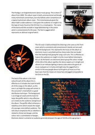
The Prodigy is an Englishelectronic dance music group. This is there 5th
album from 2009. This album cover is both unconventional and breaks
many mainstream conventions, but also follows other conventions of
a typical mainstream album cover. This instantaneously gives the
album both a wide audience. It also gives the audience an insight in to
the type of music found on the CD that it is a mixed genre. The name
of the band and title are both in large bold lettering in the centre
which is conventional of a CD cover. The font is jagged which
represents an abstract original look it.


                                  The CD cover is bold and black the lettering is the same as the front
                                  cover which is consistent and conventional it stands out very well
                                  from the background. This represents the music on the album as
                                  electronic music is very bold and has sharp notes that are louder
                                  than the backing track giving the song a set tune. This is effective as
                                  it gives the audience an insight in to the music before listening to
                                  the cd. As the band is an electronic dance group the colour orange
                                  of the title of the album signifies the dance aspect as it is bright and
                                  vibrant it can indicate lighting in dance clubs where this genre of
                                  music is played as it is lively and bright also the jagged font is
                                  similar to the way people dance to this genre of music as it has
                                  been seen that the moves are sharp fast and jagged comparable to
                                  the font on the CD.

The back of the album is the most
colourful part of the album this is
effective as it includes the track list with
all of the songs on the album, as this
area is so bright the songs will remain in
the consumer’s mind which is a good
distribution technique. The background
is an image of a wall and the track list
looks like graffiti which is also effective
as it relates to the audience and genre of
the album. The graffiti effect enhances a
rebellious tone which reveals the target
of a younger more defiant audience. The
red colours emphasise this as rebellion is
related to threat and danger and the
colour red is a connotation of danger,
Electronic dance is aimed at an audience generally between the ages of 18-28 as this age group is
the majority of people to go to nightclubs and
electronic music is played here.

Daft Punk is an electronic music duo Homework is the
debut studio album released on January 20, 1997. The
music on this album includesa post-disco boogie bass
line, a simple scattering of synthetic keyboard melody
and a single, with insistent hook line. The front cover
of the album is conventional of the electro as the
majority of albums fitting in to this genre do not use
the artist on the front cover as alternative abstract
images are used. Here daft punks albums uses images
of smoke this effective as electronic music is related
with young people in clubs and can be presented here
as either smoke in a night club or cigarette smoke as smoking is known as an insubordinate thing to
do as a disobedient youth. This instantly targets a younger audience around the ages 16-28. The
lettering is large bold and red the font is very casual and looks rough around the edges this again can
be related to the attitude of the young people listening to this genre of music for example rough
around the ages would imply a care free sense of style and
attitude that a young person would have being in a nightclub
listening to electronic music. The background is black which is
effective as the image and artist name stands out greatly
grabbing the audience’s attention.

The CD uses a different coloured font which is unconventional
of a CD digi pack as usually the layout and house style is usually
consistent throughout the CD. This method of challenging the
conventions of a standard CD digi pack is operative as it again
indicates the rebellious attitude electronic music is reflected to
have on the genre and audience. However they have used a
black background and the same font which is consistent as not
to confuse the audience, this results in the audience being able
to relate the CD to the front cover.

The back of the CD (track list) uses both conventional and unconventional methods in its design. It
uses the same smoke effect on the image the same as
the front cover this is conventional as it is consistent
similar to mainstream CD digi packs. However the use of
the different font colour and style is unconventional as It
isn’t consistent it is conversely effective the stitching
effect is useful as it stands out from the rest of the text
which defines the title which makes it memorable to the
audience. Also the track list is in simple white text but
the font is quite elegant and can relate to the abstract
smoke images this is effective as consistency is created in
an intangible way which relates to electronic music as it too is
                                        abstract and distinct.

                                          Deadmau5 is a Canadianelectro-house music producer and
                                          performer based in Toronto. Random Album Title is the third
                                          studio album by house producer deadmau5. The front cover
                                          includes an image of the mask that Joel Thomas Zimmerman
                                          the artist wears when he is on stage. This is effective as the
                                          audience can recognize the artist immediately. The name
                                          "deadmau5" originated when Zimmerman claimed to have
                                          found a dead mouse in his computer while replacing his video
                                          card. The mask of the mouse head that he originally created
                                          while learning to use a 3D program. The artist’s image mainly
consists of his experiences with electronic equipment which relates to his genre electro-house as all
his music is produced electronically. By having the main image as the artist logo large in the middle
of the page it is very significant to the audience to relate the artist to the genre of music being
produced. The artist name and title are very bold and as the text is white it stands out on the black
background which is very effective as it draws the attention of the audience. The use of the colour
red on the front cover gives connotations of danger and warning, which is
relevant to the genre of electro-house music as it is related to drugs
alcohol and rebellion due to audience’s reactions to listening to
this genre of music and the stereotype of this particular
audience.

The CD itself is conventional of a CD digi pack as it has been
consistent with the colour scheme and fonts which is
effective again because the audience can relate the look of
the CD to the artist. Although keeping the initial colours and
fonts consistent they have opposed the layout of the
colours having the CD red and the text a combination of
white and black this is effective as although being consistent
has made the CD look professional by altering the CD slightly it
keeps the CD interesting holding the audiences attention. The font
has a curved effect which is stylish however could be difficult to read to
by having the title and album name in bold writing and large size text on it this
                                                       aids the audience in reading the curved text.

                                                     Again with the back cover of the CD digi pack has
                                                     kept to the conventions of a CD case in relation
                                                     to the colour scheme and use of font. It has a
                                                     track list in a simple list which makes it easy for
                                                     the audience to read. The title of the album and
                                                     artist name has been printed sideways down the
                                                     left hand side of the CD and mirrored on the
                                                     opposite side which is effective as it is repeated
                                                     keeping the name of the artist and album in the
audiences head. Which is an effective technique used by a producer to target an audience.

Cds

  • 1.
    The Prodigy isan Englishelectronic dance music group. This is there 5th album from 2009. This album cover is both unconventional and breaks many mainstream conventions, but also follows other conventions of a typical mainstream album cover. This instantaneously gives the album both a wide audience. It also gives the audience an insight in to the type of music found on the CD that it is a mixed genre. The name of the band and title are both in large bold lettering in the centre which is conventional of a CD cover. The font is jagged which represents an abstract original look it. The CD cover is bold and black the lettering is the same as the front cover which is consistent and conventional it stands out very well from the background. This represents the music on the album as electronic music is very bold and has sharp notes that are louder than the backing track giving the song a set tune. This is effective as it gives the audience an insight in to the music before listening to the cd. As the band is an electronic dance group the colour orange of the title of the album signifies the dance aspect as it is bright and vibrant it can indicate lighting in dance clubs where this genre of music is played as it is lively and bright also the jagged font is similar to the way people dance to this genre of music as it has been seen that the moves are sharp fast and jagged comparable to the font on the CD. The back of the album is the most colourful part of the album this is effective as it includes the track list with all of the songs on the album, as this area is so bright the songs will remain in the consumer’s mind which is a good distribution technique. The background is an image of a wall and the track list looks like graffiti which is also effective as it relates to the audience and genre of the album. The graffiti effect enhances a rebellious tone which reveals the target of a younger more defiant audience. The red colours emphasise this as rebellion is related to threat and danger and the colour red is a connotation of danger, Electronic dance is aimed at an audience generally between the ages of 18-28 as this age group is
  • 2.
    the majority ofpeople to go to nightclubs and electronic music is played here. Daft Punk is an electronic music duo Homework is the debut studio album released on January 20, 1997. The music on this album includesa post-disco boogie bass line, a simple scattering of synthetic keyboard melody and a single, with insistent hook line. The front cover of the album is conventional of the electro as the majority of albums fitting in to this genre do not use the artist on the front cover as alternative abstract images are used. Here daft punks albums uses images of smoke this effective as electronic music is related with young people in clubs and can be presented here as either smoke in a night club or cigarette smoke as smoking is known as an insubordinate thing to do as a disobedient youth. This instantly targets a younger audience around the ages 16-28. The lettering is large bold and red the font is very casual and looks rough around the edges this again can be related to the attitude of the young people listening to this genre of music for example rough around the ages would imply a care free sense of style and attitude that a young person would have being in a nightclub listening to electronic music. The background is black which is effective as the image and artist name stands out greatly grabbing the audience’s attention. The CD uses a different coloured font which is unconventional of a CD digi pack as usually the layout and house style is usually consistent throughout the CD. This method of challenging the conventions of a standard CD digi pack is operative as it again indicates the rebellious attitude electronic music is reflected to have on the genre and audience. However they have used a black background and the same font which is consistent as not to confuse the audience, this results in the audience being able to relate the CD to the front cover. The back of the CD (track list) uses both conventional and unconventional methods in its design. It uses the same smoke effect on the image the same as the front cover this is conventional as it is consistent similar to mainstream CD digi packs. However the use of the different font colour and style is unconventional as It isn’t consistent it is conversely effective the stitching effect is useful as it stands out from the rest of the text which defines the title which makes it memorable to the audience. Also the track list is in simple white text but the font is quite elegant and can relate to the abstract smoke images this is effective as consistency is created in
  • 3.
    an intangible waywhich relates to electronic music as it too is abstract and distinct. Deadmau5 is a Canadianelectro-house music producer and performer based in Toronto. Random Album Title is the third studio album by house producer deadmau5. The front cover includes an image of the mask that Joel Thomas Zimmerman the artist wears when he is on stage. This is effective as the audience can recognize the artist immediately. The name "deadmau5" originated when Zimmerman claimed to have found a dead mouse in his computer while replacing his video card. The mask of the mouse head that he originally created while learning to use a 3D program. The artist’s image mainly consists of his experiences with electronic equipment which relates to his genre electro-house as all his music is produced electronically. By having the main image as the artist logo large in the middle of the page it is very significant to the audience to relate the artist to the genre of music being produced. The artist name and title are very bold and as the text is white it stands out on the black background which is very effective as it draws the attention of the audience. The use of the colour red on the front cover gives connotations of danger and warning, which is relevant to the genre of electro-house music as it is related to drugs alcohol and rebellion due to audience’s reactions to listening to this genre of music and the stereotype of this particular audience. The CD itself is conventional of a CD digi pack as it has been consistent with the colour scheme and fonts which is effective again because the audience can relate the look of the CD to the artist. Although keeping the initial colours and fonts consistent they have opposed the layout of the colours having the CD red and the text a combination of white and black this is effective as although being consistent has made the CD look professional by altering the CD slightly it keeps the CD interesting holding the audiences attention. The font has a curved effect which is stylish however could be difficult to read to by having the title and album name in bold writing and large size text on it this aids the audience in reading the curved text. Again with the back cover of the CD digi pack has kept to the conventions of a CD case in relation to the colour scheme and use of font. It has a track list in a simple list which makes it easy for the audience to read. The title of the album and artist name has been printed sideways down the left hand side of the CD and mirrored on the opposite side which is effective as it is repeated keeping the name of the artist and album in the
  • 4.
    audiences head. Whichis an effective technique used by a producer to target an audience.