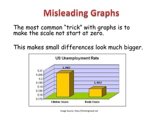
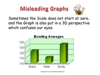
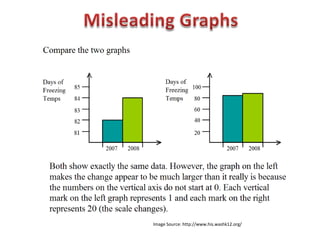
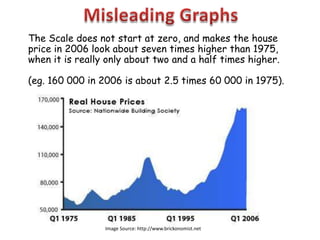
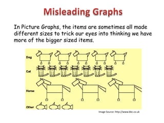
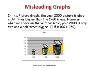
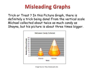
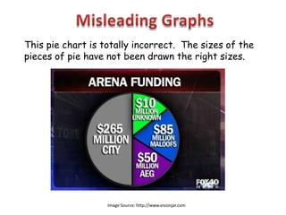
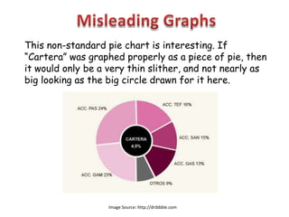
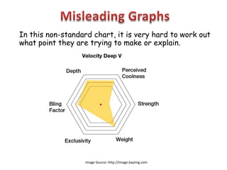
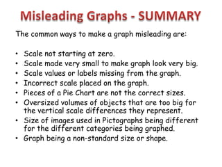
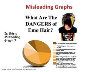
Image Source: http://www2.fiu.edu
The most common “trick” with graphs is to
make the scale not start at zero.

This makes small differences look much bigger.


                Image Source: http://thinkingmeat.net
Sometimes the Scale does not start at zero,
and the Graph is also put in a 3D perspective
which confuses our eyes.


                 Image Source: http://www.math6.org
Image Source: http://www.his.washk12.org/
The Scale does not start at zero, and makes the house
price in 2006 look about seven times higher than 1975,
when it is really only about two and a half times higher.

(eg. 160 000 in 2006 is about 2.5 times 60 000 in 1975).


                 Image Source: http://www.brickonomist.net
In Picture Graphs, the items are sometimes all made
different sizes to trick our eyes into thinking we have
more of the bigger sized items.


                                 Image Source: http://www.bbc.co.uk
In this Picture Graph, the year 2000 picture is about
eight times bigger than the 1960 image. However
when we check on the vertical scale, year 2000 is only
two and a half times bigger. (2.5 x 100 = 250).


                 Image Source: http://www.yale.edu
Trick or Treat ? In this Picture Graph, there is
definitely a trick being done! From the vertical scale
Michael collected about twice as much candy as
Shayna, but his picture is about three times bigger.


                   Image Source: http://www.yale.edu
This pie chart is totally incorrect. The sizes of the
pieces of pie have not been drawn the right sizes.


                   Image Source: http://www.visionjar.com
This non-standard pie chart is interesting. If
“Cartera” was graphed properly as a piece of pie, then
it would only be a very thin slither, and not nearly as
big looking as the big circle drawn for it here.


                   Image Source: http://dribbble.com
In this non-standard chart, it is very hard to work out
what point they are trying to make or explain.


                   Image Source: http://image.bayimg.com
The common ways to make a graph misleading are:

• Scale not starting at zero.
• Scale made very small to make graph look very big.
• Scale values or labels missing from the graph.
• Incorrect scale placed on the graph.
• Pieces of a Pie Chart are not the correct sizes.
• Oversized volumes of objects that are too big for
  the vertical scale differences they represent.
• Size of images used in Pictographs being different
  for the different categories being graphed.
• Graph being a non-standard size or shape.
Is this a
   Misleading
   Graph ?


Image Source: http://mathspig.files.wordpress.com
http://passyworldofmathematics.com/

Misleading Graphs

  • 1.
  • 2.
    The most common“trick” with graphs is to make the scale not start at zero. This makes small differences look much bigger. Image Source: http://thinkingmeat.net
  • 3.
    Sometimes the Scaledoes not start at zero, and the Graph is also put in a 3D perspective which confuses our eyes. Image Source: http://www.math6.org
  • 4.
  • 5.
    The Scale doesnot start at zero, and makes the house price in 2006 look about seven times higher than 1975, when it is really only about two and a half times higher. (eg. 160 000 in 2006 is about 2.5 times 60 000 in 1975). Image Source: http://www.brickonomist.net
  • 6.
    In Picture Graphs,the items are sometimes all made different sizes to trick our eyes into thinking we have more of the bigger sized items. Image Source: http://www.bbc.co.uk
  • 7.
    In this PictureGraph, the year 2000 picture is about eight times bigger than the 1960 image. However when we check on the vertical scale, year 2000 is only two and a half times bigger. (2.5 x 100 = 250). Image Source: http://www.yale.edu
  • 8.
    Trick or Treat? In this Picture Graph, there is definitely a trick being done! From the vertical scale Michael collected about twice as much candy as Shayna, but his picture is about three times bigger. Image Source: http://www.yale.edu
  • 9.
    This pie chartis totally incorrect. The sizes of the pieces of pie have not been drawn the right sizes. Image Source: http://www.visionjar.com
  • 10.
    This non-standard piechart is interesting. If “Cartera” was graphed properly as a piece of pie, then it would only be a very thin slither, and not nearly as big looking as the big circle drawn for it here. Image Source: http://dribbble.com
  • 11.
    In this non-standardchart, it is very hard to work out what point they are trying to make or explain. Image Source: http://image.bayimg.com
  • 12.
    The common waysto make a graph misleading are: • Scale not starting at zero. • Scale made very small to make graph look very big. • Scale values or labels missing from the graph. • Incorrect scale placed on the graph. • Pieces of a Pie Chart are not the correct sizes. • Oversized volumes of objects that are too big for the vertical scale differences they represent. • Size of images used in Pictographs being different for the different categories being graphed. • Graph being a non-standard size or shape.
  • 13.
    Is this a Misleading Graph ? Image Source: http://mathspig.files.wordpress.com
  • 14.