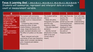
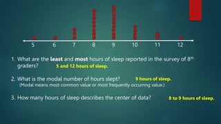
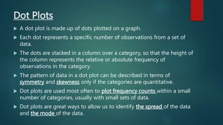
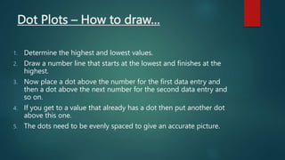
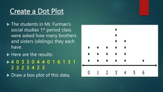
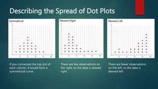
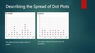
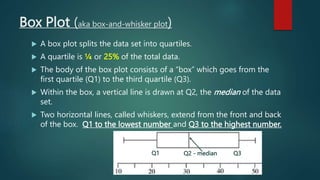
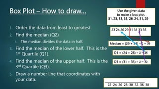
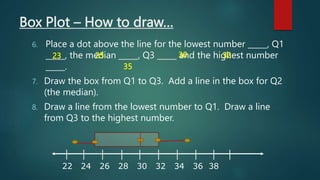
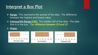
Dot Plots & Box
Plots
ANALYZE DATA
4 3 2 1 0
In addition to level 3.0
and above and
beyond what was
taught in class, the
student may:
· Make connection
with other concepts in
math
· Make connection
with other content
areas.
The student will summarize,
represent, and interpret data on
a single count or measurement
variable.
- Comparing data includes
analyzing center of data
(mean/median), interquartile
range, shape distribution of a
graph, standard deviation and
the effect of outliers on the data
set.
- Read, interpret and write
summaries of two-way frequency
tables which includes calculating
joint, marginal and relative
frequencies.
The student will be
able to:
- Make dot plots,
histograms, box plots
and two-way
frequency tables.
- Calculate standard
deviation.
- Identify normal
distribution of data
(bell curve) and
convey what it
means.
With help from the
teacher, the
student has
partial success with
summarizing and
interpreting data
displayed in a dot
plot, histogram,
box plot or
frequency table.
Even with help,
the student has
no success
understanding
statistical data.
Focus 6 Learning Goal – (HS.S-ID.A.1, HS.S-ID.A.2, HS.S-ID.A.3, HS.S-ID.B.5) =
Students will summarize, represent and interpret data on a single
count or measurement variable.
Hours of Sleep
 Casey, an 8th grader at Aprende Middle School, usually goes to
bed around 10:00 PM and gets up around 6:00 AM to get ready
for school. That means he gets about 8 hours of sleep on a
school night.
 He decided to investigate the statistical question, “How many
hours per night do 8th graders usually sleep when they have
school the next day?”
 Casey took a survey of 29 eighth graders and collected the
following data to answer the question:
 7 8 5 9 9 9 7 7 10 10 11 9 8 8 8 12 6 11 10 8 8 9 9 9 8 10 9 9 8
7 8 5 9 9 9 7 7 10 10 11 9 8 8 8 12 6
11 10 8 8 9 9 9 8 10 9 9 8
 Casey decided to make a dot plot of the data to help him
answer his statistical question. He first drew a number line
and labeled it from 5 to 12 to match the lowest and highest
number of hours slept.
 He then placed a dot above 7 for the first piece of data he
collected. He continued to place dots above a number until
each number was represented by a dot.
5 6 7 8 9 10 11 12
Please finish
making
Casey’s dot
plot.
5 6 7 8 9 10 11 12
1. What are the least and most hours of sleep reported in the survey of 8th
graders?
2. What is the modal number of hours slept?
(Modal means most common value or most frequently occurring value.)
3. How many hours of sleep describes the center of data?
5 and 12 hours of sleep.
9 hours of sleep.
8 to 9 hours of sleep.
Dot Plots
 A dot plot is made up of dots plotted on a graph.
 Each dot represents a specific number of observations from a set of
data.
 The dots are stacked in a column over a category, so that the height of
the column represents the relative or absolute frequency of
observations in the category.
 The pattern of data in a dot plot can be described in terms of
symmetry and skewness only if the categories are quantitative.
 Dot plots are used most often to plot frequency counts within a small
number of categories, usually with small sets of data.
 Dot plots are great ways to allow us to identify the spread of the data
and the mode of the data.
Dot Plots – How to draw…
1. Determine the highest and lowest values.
2. Draw a number line that starts at the lowest and finishes at the
highest.
3. Now place a dot above the number for the first data entry and
then a dot above the next number for the second data entry and
so on.
4. If you get to a value that already has a dot then put another dot
above this one.
5. The dots need to be evenly spaced to give an accurate picture.
Create a Dot Plot
 The students in Mr. Furman’s
social studies 1st period class
were asked how many brothers
and sisters (siblings) they each
have.
 Here are the results:
 4 0 3 3 0 4 4 0 1 6 1 3 1
2 3 2 3 4 2 3
 Draw a box plot of this data.
Describing the Spread of Dot Plots
If you connected the top dot of
each column, it would form a
symmetrical curve.
There are few observations on
the right, so the data is skewed
right.
There are fewer observations
on the left, so the data is
skewed left.
Describing the Spread of Dot Plots
The data has two areas where it
peaks.
The data is about the same for all
numbers.
Box Plot (aka box-and-whisker plot)
 A box plot splits the data set into quartiles.
 A quartile is ¼ or 25% of the total data.
 The body of the box plot consists of a “box” which goes from the
first quartile (Q1) to the third quartile (Q3).
 Within the box, a vertical line is drawn at Q2, the median of the data
set.
 Two horizontal lines, called whiskers, extend from the front and back
of the box. Q1 to the lowest number and Q3 to the highest number.
Q2 - median Q3
Q1
Box Plot – How to draw…
1. Order the data from least to greatest.
2. Find the median (Q2)
1. The median divides the data in half.
3. Find the median of the lower half. This is the
1st Quartile (Q1).
4. Find the median of the upper half. This is the
3rd Quartile (Q3).
5. Draw a number line that coordinates with
your data.
Use the given data
to make a box plot.
31, 23, 33, 35, 26, 24, 31, 29
23 24 26 29 31 31 33 35
Median = (29 + 31) ÷ 2 = 30
Q1 = (24 + 26) ÷ 2 = 25
Q3 = (31 + 33) ÷ 2 = 32
_____________________________
22 24 26 28 30 32 36 38
Box Plot – How to draw…
6. Place a dot above the line for the lowest number _____, Q1
_____, the median _____, Q3 _____ and the highest number
_____.
7. Draw the box from Q1 to Q3. Add a line in the box for Q2
(the median).
8. Draw a line from the lowest number to Q1. Draw a line
from Q3 to the highest number.
22 24 26 28 30 32 34 36 38
25 32
30
23
35
Interpret a Box Plot
 Range: This represents the spread of the data. The difference
between the highest and lowest value.
 Interquartile Range (IQR): The middle half of the data. The data
that is in the box. The difference between Q3 and Q1.
 Shape:

Dot Plots and Box Plots.pptx

  • 1.
    Dot Plots &Box Plots ANALYZE DATA
  • 2.
    4 3 21 0 In addition to level 3.0 and above and beyond what was taught in class, the student may: · Make connection with other concepts in math · Make connection with other content areas. The student will summarize, represent, and interpret data on a single count or measurement variable. - Comparing data includes analyzing center of data (mean/median), interquartile range, shape distribution of a graph, standard deviation and the effect of outliers on the data set. - Read, interpret and write summaries of two-way frequency tables which includes calculating joint, marginal and relative frequencies. The student will be able to: - Make dot plots, histograms, box plots and two-way frequency tables. - Calculate standard deviation. - Identify normal distribution of data (bell curve) and convey what it means. With help from the teacher, the student has partial success with summarizing and interpreting data displayed in a dot plot, histogram, box plot or frequency table. Even with help, the student has no success understanding statistical data. Focus 6 Learning Goal – (HS.S-ID.A.1, HS.S-ID.A.2, HS.S-ID.A.3, HS.S-ID.B.5) = Students will summarize, represent and interpret data on a single count or measurement variable.
  • 3.
    Hours of Sleep Casey, an 8th grader at Aprende Middle School, usually goes to bed around 10:00 PM and gets up around 6:00 AM to get ready for school. That means he gets about 8 hours of sleep on a school night.  He decided to investigate the statistical question, “How many hours per night do 8th graders usually sleep when they have school the next day?”  Casey took a survey of 29 eighth graders and collected the following data to answer the question:  7 8 5 9 9 9 7 7 10 10 11 9 8 8 8 12 6 11 10 8 8 9 9 9 8 10 9 9 8
  • 4.
    7 8 59 9 9 7 7 10 10 11 9 8 8 8 12 6 11 10 8 8 9 9 9 8 10 9 9 8  Casey decided to make a dot plot of the data to help him answer his statistical question. He first drew a number line and labeled it from 5 to 12 to match the lowest and highest number of hours slept.  He then placed a dot above 7 for the first piece of data he collected. He continued to place dots above a number until each number was represented by a dot. 5 6 7 8 9 10 11 12 Please finish making Casey’s dot plot.
  • 5.
    5 6 78 9 10 11 12 1. What are the least and most hours of sleep reported in the survey of 8th graders? 2. What is the modal number of hours slept? (Modal means most common value or most frequently occurring value.) 3. How many hours of sleep describes the center of data? 5 and 12 hours of sleep. 9 hours of sleep. 8 to 9 hours of sleep.
  • 6.
    Dot Plots  Adot plot is made up of dots plotted on a graph.  Each dot represents a specific number of observations from a set of data.  The dots are stacked in a column over a category, so that the height of the column represents the relative or absolute frequency of observations in the category.  The pattern of data in a dot plot can be described in terms of symmetry and skewness only if the categories are quantitative.  Dot plots are used most often to plot frequency counts within a small number of categories, usually with small sets of data.  Dot plots are great ways to allow us to identify the spread of the data and the mode of the data.
  • 7.
    Dot Plots –How to draw… 1. Determine the highest and lowest values. 2. Draw a number line that starts at the lowest and finishes at the highest. 3. Now place a dot above the number for the first data entry and then a dot above the next number for the second data entry and so on. 4. If you get to a value that already has a dot then put another dot above this one. 5. The dots need to be evenly spaced to give an accurate picture.
  • 8.
    Create a DotPlot  The students in Mr. Furman’s social studies 1st period class were asked how many brothers and sisters (siblings) they each have.  Here are the results:  4 0 3 3 0 4 4 0 1 6 1 3 1 2 3 2 3 4 2 3  Draw a box plot of this data.
  • 9.
    Describing the Spreadof Dot Plots If you connected the top dot of each column, it would form a symmetrical curve. There are few observations on the right, so the data is skewed right. There are fewer observations on the left, so the data is skewed left.
  • 10.
    Describing the Spreadof Dot Plots The data has two areas where it peaks. The data is about the same for all numbers.
  • 11.
    Box Plot (akabox-and-whisker plot)  A box plot splits the data set into quartiles.  A quartile is ¼ or 25% of the total data.  The body of the box plot consists of a “box” which goes from the first quartile (Q1) to the third quartile (Q3).  Within the box, a vertical line is drawn at Q2, the median of the data set.  Two horizontal lines, called whiskers, extend from the front and back of the box. Q1 to the lowest number and Q3 to the highest number. Q2 - median Q3 Q1
  • 12.
    Box Plot –How to draw… 1. Order the data from least to greatest. 2. Find the median (Q2) 1. The median divides the data in half. 3. Find the median of the lower half. This is the 1st Quartile (Q1). 4. Find the median of the upper half. This is the 3rd Quartile (Q3). 5. Draw a number line that coordinates with your data. Use the given data to make a box plot. 31, 23, 33, 35, 26, 24, 31, 29 23 24 26 29 31 31 33 35 Median = (29 + 31) ÷ 2 = 30 Q1 = (24 + 26) ÷ 2 = 25 Q3 = (31 + 33) ÷ 2 = 32 _____________________________ 22 24 26 28 30 32 36 38
  • 13.
    Box Plot –How to draw… 6. Place a dot above the line for the lowest number _____, Q1 _____, the median _____, Q3 _____ and the highest number _____. 7. Draw the box from Q1 to Q3. Add a line in the box for Q2 (the median). 8. Draw a line from the lowest number to Q1. Draw a line from Q3 to the highest number. 22 24 26 28 30 32 34 36 38 25 32 30 23 35
  • 14.
    Interpret a BoxPlot  Range: This represents the spread of the data. The difference between the highest and lowest value.  Interquartile Range (IQR): The middle half of the data. The data that is in the box. The difference between Q3 and Q1.  Shape: