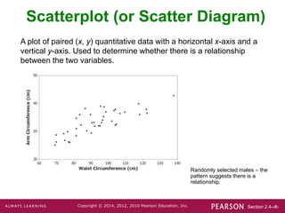
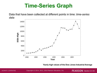
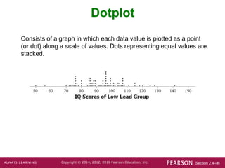
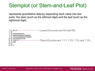
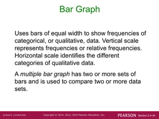
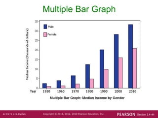
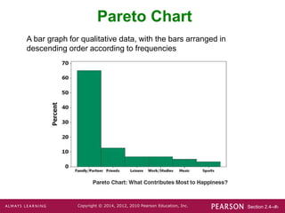
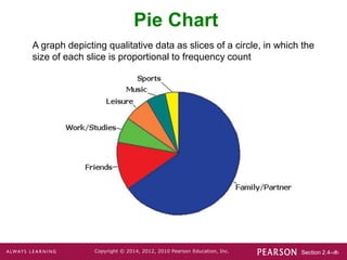
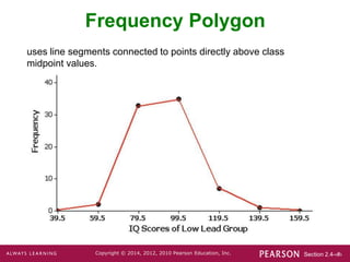
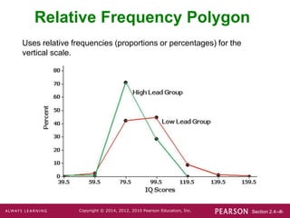
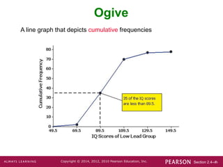
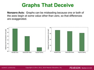
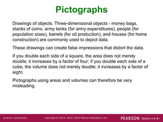
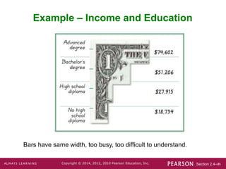
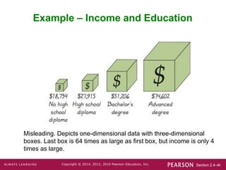
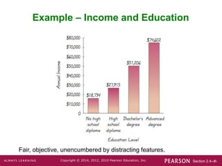
Section 2.4-‹#›
Copyright © 2014, 2012, 2010 Pearson Education, Inc.
Lecture Slides
Elementary Statistics
Twelfth Edition
and the Triola Statistics Series
by Mario F. Triola
Section 2.4-‹#›
Copyright © 2014, 2012, 2010 Pearson Education, Inc.
Chapter 2
Summarizing and Graphing Data
2-1 Review and Preview
2-2 Frequency Distributions
2-3 Histograms
2-4 Graphs that Enlighten and Graphs that
Deceive
Section 2.4-‹#›
Copyright © 2014, 2012, 2010 Pearson Education, Inc.
Key Concept
This section discusses other types of
statistical graphs.
Our objective is to identify a suitable graph
for representing the data set. The graph
should be effective in revealing the important
characteristics of the data.
Section 2.4-‹#›
Copyright © 2014, 2012, 2010 Pearson Education, Inc.
Key Concept
Some graphs are bad in the sense that they
contain errors.
Some are bad because they are technically
correct, but misleading.
It is important to develop the ability to
recognize bad graphs and identify exactly
how they are misleading.
Section 2.4-‹#›
Copyright © 2014, 2012, 2010 Pearson Education, Inc.
Scatterplot (or Scatter Diagram)
A plot of paired (x, y) quantitative data with a horizontal x-axis and a
vertical y-axis. Used to determine whether there is a relationship
between the two variables.
Randomly selected males – the
pattern suggests there is a
relationship.
Section 2.4-‹#›
Copyright © 2014, 2012, 2010 Pearson Education, Inc.
Time-Series Graph
Data that have been collected at different points in time: time-series
data
Yearly high values of the Dow Jones Industrial Average
Section 2.4-‹#›
Copyright © 2014, 2012, 2010 Pearson Education, Inc.
Dotplot
Consists of a graph in which each data value is plotted as a point
(or dot) along a scale of values. Dots representing equal values are
stacked.
Section 2.4-‹#›
Copyright © 2014, 2012, 2010 Pearson Education, Inc.
Stemplot (or Stem-and-Leaf Plot)
represents quantitative data by separating each value into two
parts: the stem (such as the leftmost digit) and the leaf (such as the
rightmost digit).
Section 2.4-‹#›
Copyright © 2014, 2012, 2010 Pearson Education, Inc.
Bar Graph
Uses bars of equal width to show frequencies of
categorical, or qualitative, data. Vertical scale
represents frequencies or relative frequencies.
Horizontal scale identifies the different
categories of qualitative data.
A multiple bar graph has two or more sets of
bars and is used to compare two or more data
sets.
Section 2.4-‹#›
Copyright © 2014, 2012, 2010 Pearson Education, Inc.
Multiple Bar Graph
Section 2.4-‹#›
Copyright © 2014, 2012, 2010 Pearson Education, Inc.
Pareto Chart
A bar graph for qualitative data, with the bars arranged in
descending order according to frequencies
Section 2.4-‹#›
Copyright © 2014, 2012, 2010 Pearson Education, Inc.
Pie Chart
A graph depicting qualitative data as slices of a circle, in which the
size of each slice is proportional to frequency count
Section 2.4-‹#›
Copyright © 2014, 2012, 2010 Pearson Education, Inc.
Frequency Polygon
uses line segments connected to points directly above class
midpoint values.
Section 2.4-‹#›
Copyright © 2014, 2012, 2010 Pearson Education, Inc.
Relative Frequency Polygon
Uses relative frequencies (proportions or percentages) for the
vertical scale.
Section 2.4-‹#›
Copyright © 2014, 2012, 2010 Pearson Education, Inc.
Ogive
A line graph that depicts cumulative frequencies
Section 2.4-‹#›
Copyright © 2014, 2012, 2010 Pearson Education, Inc.
Graphs That Deceive
Nonzero Axis: Graphs can be misleading because one or both of
the axes begin at some value other than zero, so that differences
are exaggerated.
Section 2.4-‹#›
Copyright © 2014, 2012, 2010 Pearson Education, Inc.
Pictographs
Drawings of objects. Three-dimensional objects - money bags,
stacks of coins, army tanks (for army expenditures), people (for
population sizes), barrels (for oil production), and houses (for home
construction) are commonly used to depict data.
These drawings can create false impressions that distort the data.
If you double each side of a square, the area does not merely
double; it increases by a factor of four; if you double each side of a
cube, the volume does not merely double; it increases by a factor of
eight.
Pictographs using areas and volumes can therefore be very
misleading.
Section 2.4-‹#›
Copyright © 2014, 2012, 2010 Pearson Education, Inc.
Example – Income and Education
Bars have same width, too busy, too difficult to understand.
Section 2.4-‹#›
Copyright © 2014, 2012, 2010 Pearson Education, Inc.
Example – Income and Education
Misleading. Depicts one-dimensional data with three-dimensional
boxes. Last box is 64 times as large as first box, but income is only 4
times as large.
Section 2.4-‹#›
Copyright © 2014, 2012, 2010 Pearson Education, Inc.
Example – Income and Education
Fair, objective, unencumbered by distracting features.
Section 2.4-‹#›
Copyright © 2014, 2012, 2010 Pearson Education, Inc.
Important Principles
Suggested by Edward Tufte
For small data sets of 20 values or fewer, use a table instead of a
graph.
A graph of data should make the viewer focus on the true nature of
the data, not on other elements, such as eye-catching but distracting
design features.
Do not distort data. Construct a graph to reveal the true nature of the
data.
Almost all of the ink in a graph should be used for the data, not for
the other design elements.

Chapter 2 Section 4.ppt

  • 1.
    Section 2.4-‹#› Copyright ©2014, 2012, 2010 Pearson Education, Inc. Lecture Slides Elementary Statistics Twelfth Edition and the Triola Statistics Series by Mario F. Triola
  • 2.
    Section 2.4-‹#› Copyright ©2014, 2012, 2010 Pearson Education, Inc. Chapter 2 Summarizing and Graphing Data 2-1 Review and Preview 2-2 Frequency Distributions 2-3 Histograms 2-4 Graphs that Enlighten and Graphs that Deceive
  • 3.
    Section 2.4-‹#› Copyright ©2014, 2012, 2010 Pearson Education, Inc. Key Concept This section discusses other types of statistical graphs. Our objective is to identify a suitable graph for representing the data set. The graph should be effective in revealing the important characteristics of the data.
  • 4.
    Section 2.4-‹#› Copyright ©2014, 2012, 2010 Pearson Education, Inc. Key Concept Some graphs are bad in the sense that they contain errors. Some are bad because they are technically correct, but misleading. It is important to develop the ability to recognize bad graphs and identify exactly how they are misleading.
  • 5.
    Section 2.4-‹#› Copyright ©2014, 2012, 2010 Pearson Education, Inc. Scatterplot (or Scatter Diagram) A plot of paired (x, y) quantitative data with a horizontal x-axis and a vertical y-axis. Used to determine whether there is a relationship between the two variables. Randomly selected males – the pattern suggests there is a relationship.
  • 6.
    Section 2.4-‹#› Copyright ©2014, 2012, 2010 Pearson Education, Inc. Time-Series Graph Data that have been collected at different points in time: time-series data Yearly high values of the Dow Jones Industrial Average
  • 7.
    Section 2.4-‹#› Copyright ©2014, 2012, 2010 Pearson Education, Inc. Dotplot Consists of a graph in which each data value is plotted as a point (or dot) along a scale of values. Dots representing equal values are stacked.
  • 8.
    Section 2.4-‹#› Copyright ©2014, 2012, 2010 Pearson Education, Inc. Stemplot (or Stem-and-Leaf Plot) represents quantitative data by separating each value into two parts: the stem (such as the leftmost digit) and the leaf (such as the rightmost digit).
  • 9.
    Section 2.4-‹#› Copyright ©2014, 2012, 2010 Pearson Education, Inc. Bar Graph Uses bars of equal width to show frequencies of categorical, or qualitative, data. Vertical scale represents frequencies or relative frequencies. Horizontal scale identifies the different categories of qualitative data. A multiple bar graph has two or more sets of bars and is used to compare two or more data sets.
  • 10.
    Section 2.4-‹#› Copyright ©2014, 2012, 2010 Pearson Education, Inc. Multiple Bar Graph
  • 11.
    Section 2.4-‹#› Copyright ©2014, 2012, 2010 Pearson Education, Inc. Pareto Chart A bar graph for qualitative data, with the bars arranged in descending order according to frequencies
  • 12.
    Section 2.4-‹#› Copyright ©2014, 2012, 2010 Pearson Education, Inc. Pie Chart A graph depicting qualitative data as slices of a circle, in which the size of each slice is proportional to frequency count
  • 13.
    Section 2.4-‹#› Copyright ©2014, 2012, 2010 Pearson Education, Inc. Frequency Polygon uses line segments connected to points directly above class midpoint values.
  • 14.
    Section 2.4-‹#› Copyright ©2014, 2012, 2010 Pearson Education, Inc. Relative Frequency Polygon Uses relative frequencies (proportions or percentages) for the vertical scale.
  • 15.
    Section 2.4-‹#› Copyright ©2014, 2012, 2010 Pearson Education, Inc. Ogive A line graph that depicts cumulative frequencies
  • 16.
    Section 2.4-‹#› Copyright ©2014, 2012, 2010 Pearson Education, Inc. Graphs That Deceive Nonzero Axis: Graphs can be misleading because one or both of the axes begin at some value other than zero, so that differences are exaggerated.
  • 17.
    Section 2.4-‹#› Copyright ©2014, 2012, 2010 Pearson Education, Inc. Pictographs Drawings of objects. Three-dimensional objects - money bags, stacks of coins, army tanks (for army expenditures), people (for population sizes), barrels (for oil production), and houses (for home construction) are commonly used to depict data. These drawings can create false impressions that distort the data. If you double each side of a square, the area does not merely double; it increases by a factor of four; if you double each side of a cube, the volume does not merely double; it increases by a factor of eight. Pictographs using areas and volumes can therefore be very misleading.
  • 18.
    Section 2.4-‹#› Copyright ©2014, 2012, 2010 Pearson Education, Inc. Example – Income and Education Bars have same width, too busy, too difficult to understand.
  • 19.
    Section 2.4-‹#› Copyright ©2014, 2012, 2010 Pearson Education, Inc. Example – Income and Education Misleading. Depicts one-dimensional data with three-dimensional boxes. Last box is 64 times as large as first box, but income is only 4 times as large.
  • 20.
    Section 2.4-‹#› Copyright ©2014, 2012, 2010 Pearson Education, Inc. Example – Income and Education Fair, objective, unencumbered by distracting features.
  • 21.
    Section 2.4-‹#› Copyright ©2014, 2012, 2010 Pearson Education, Inc. Important Principles Suggested by Edward Tufte For small data sets of 20 values or fewer, use a table instead of a graph. A graph of data should make the viewer focus on the true nature of the data, not on other elements, such as eye-catching but distracting design features. Do not distort data. Construct a graph to reveal the true nature of the data. Almost all of the ink in a graph should be used for the data, not for the other design elements.