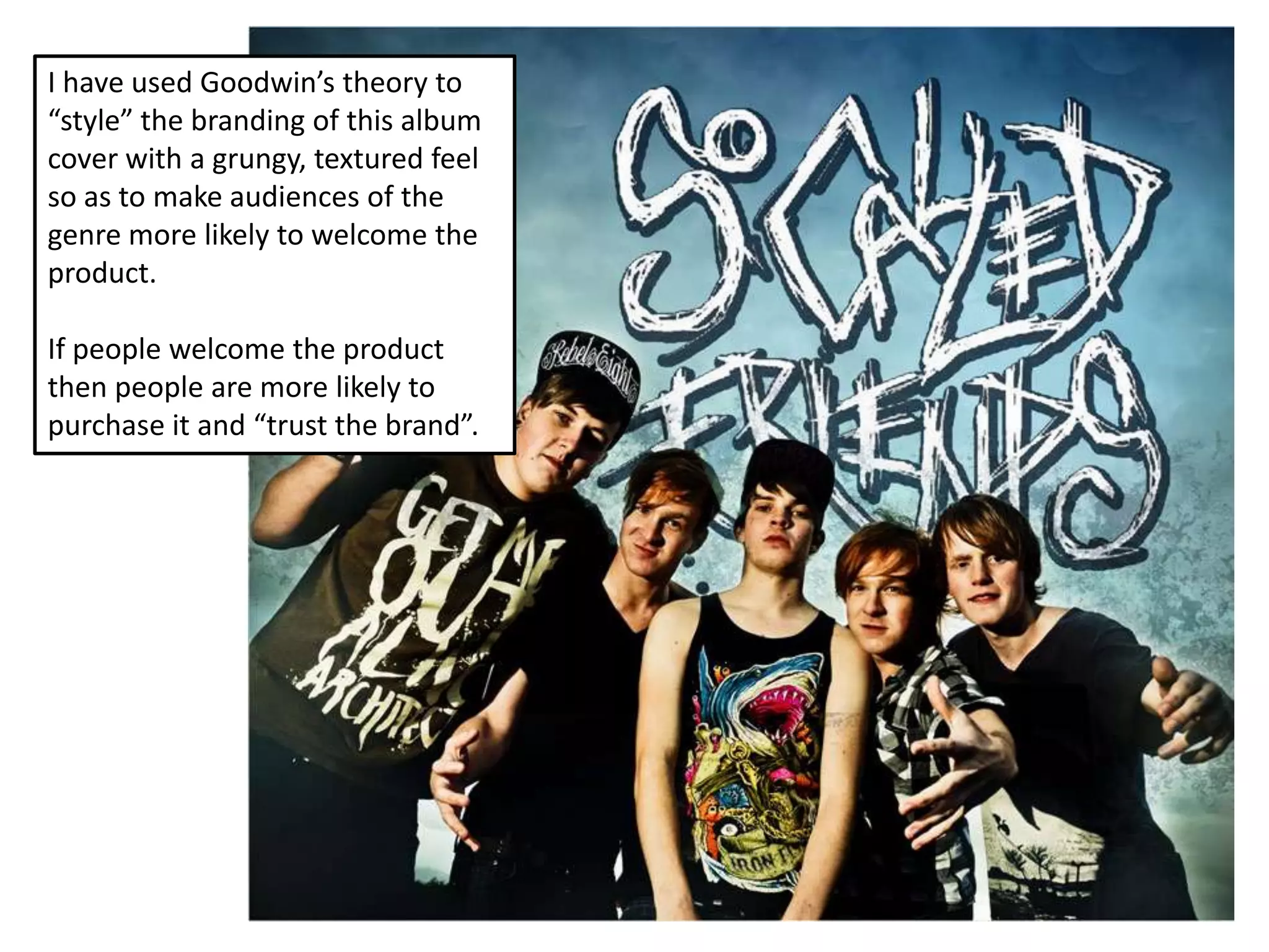
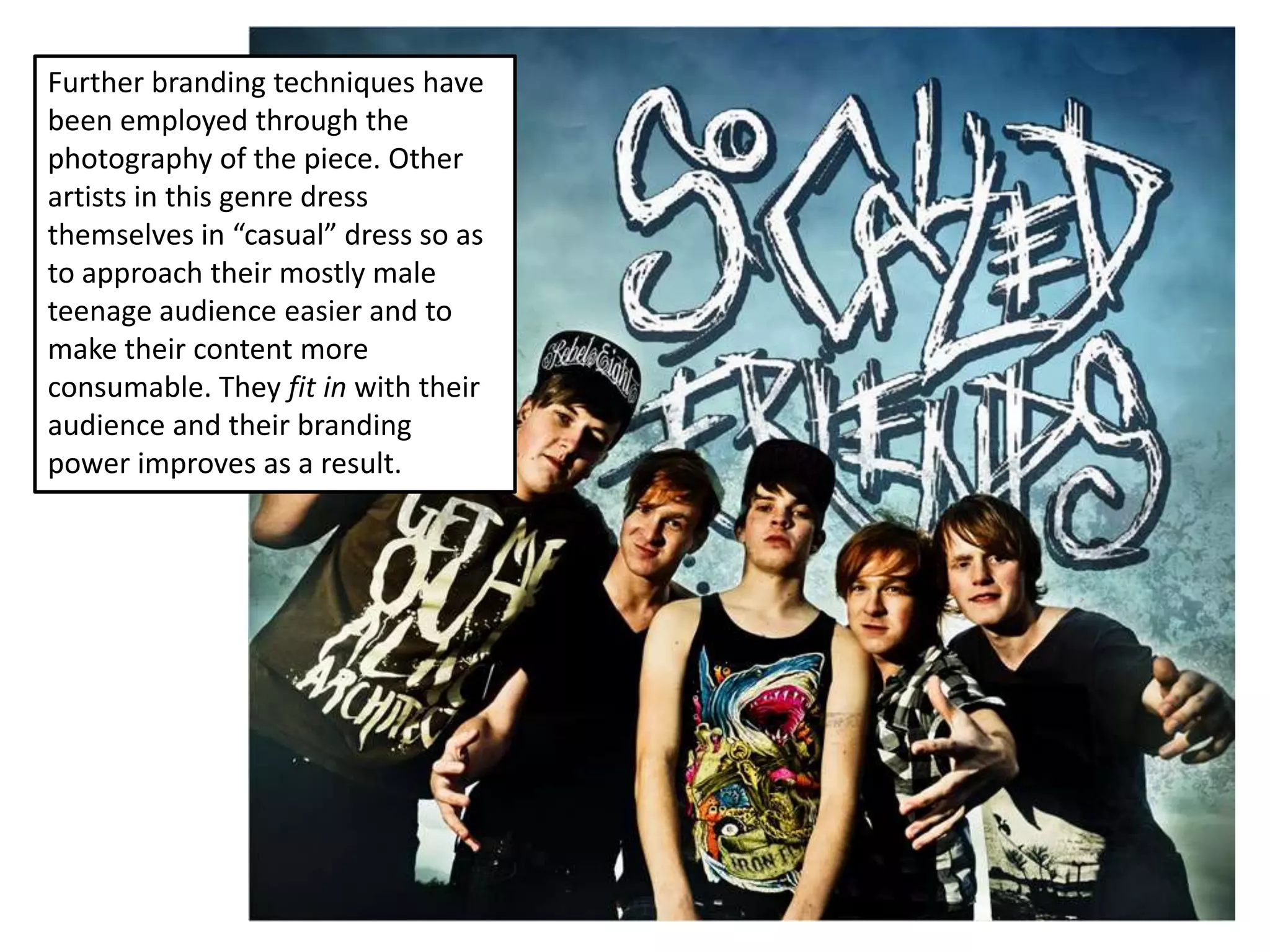
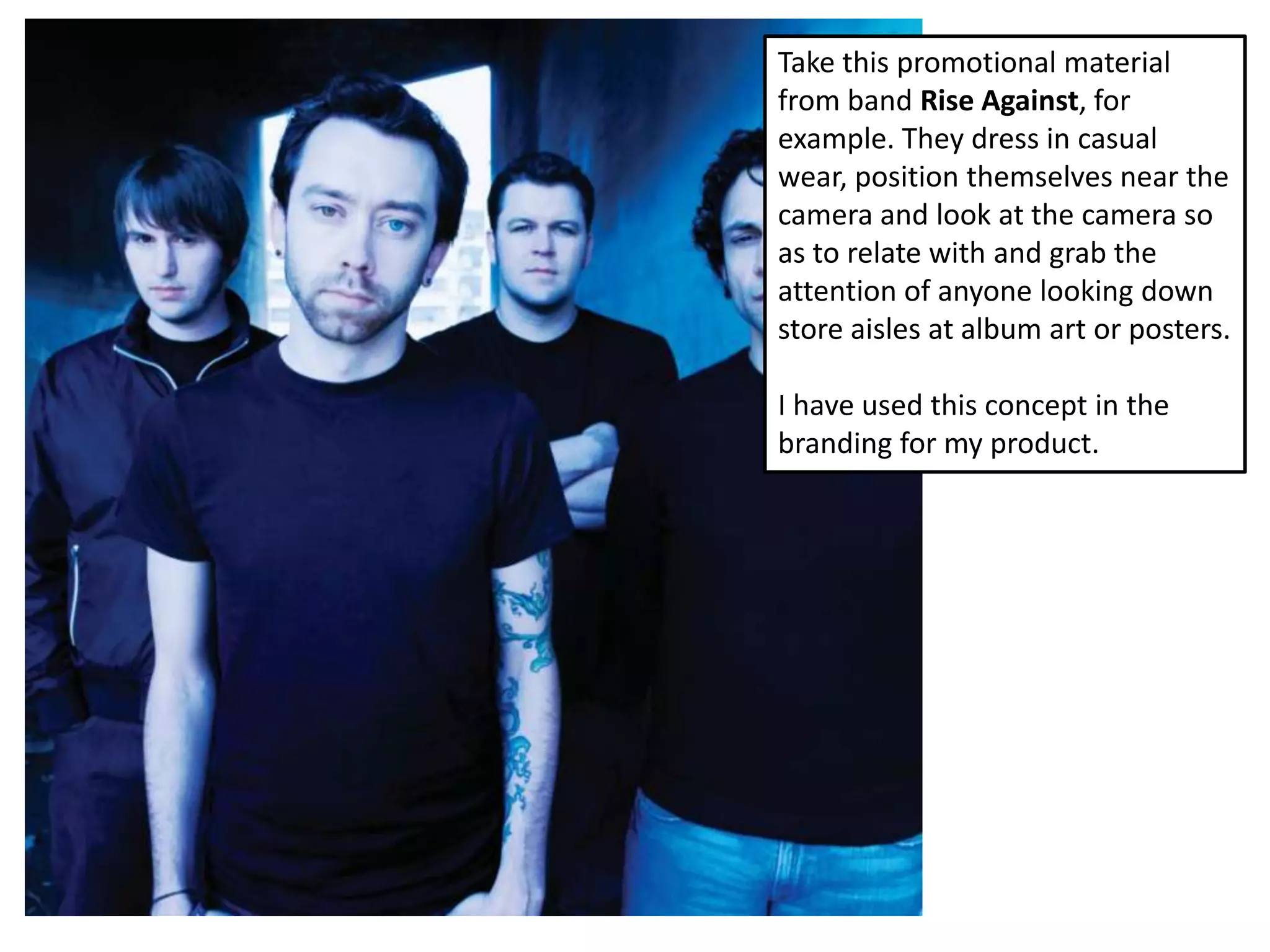
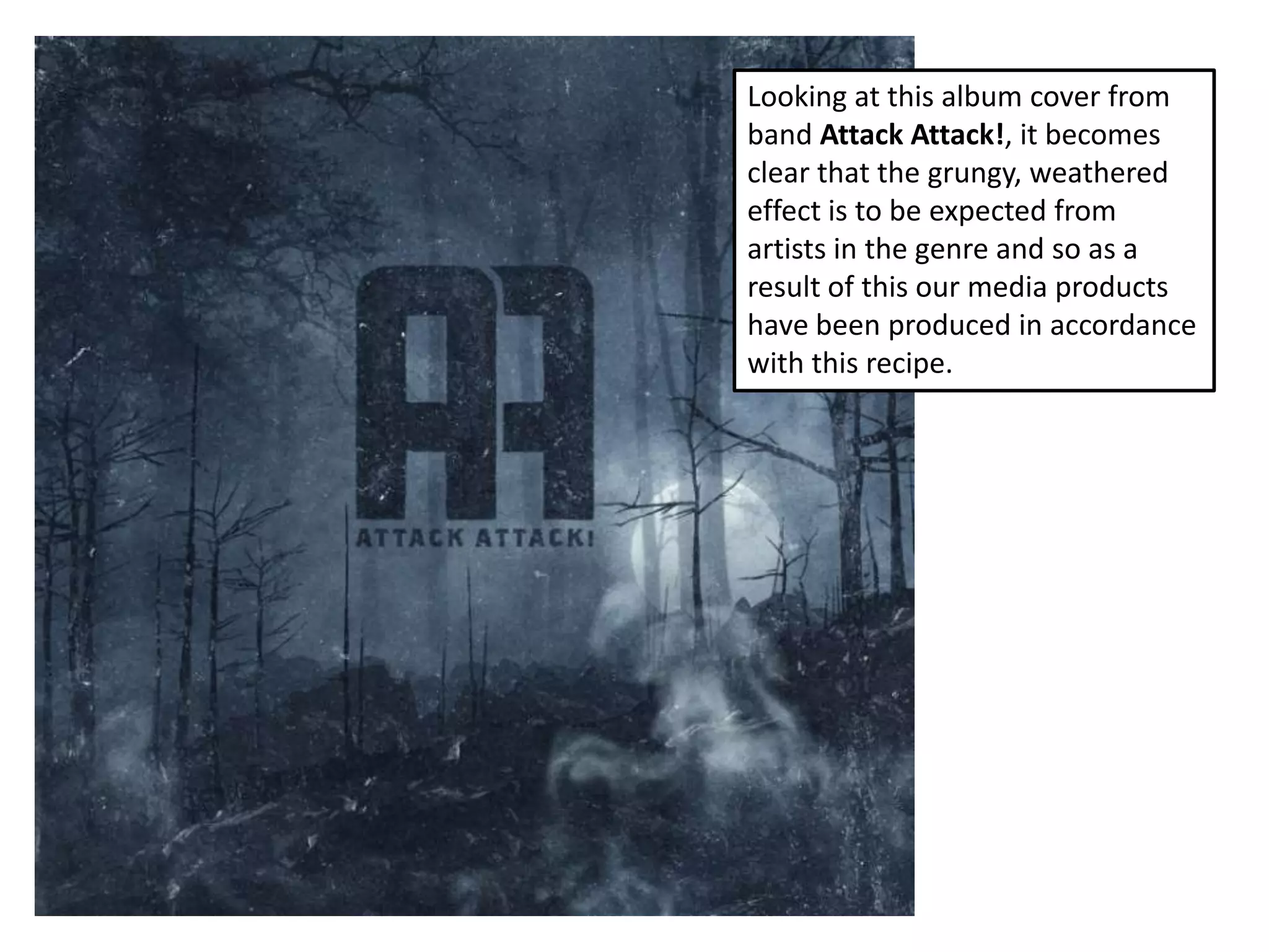
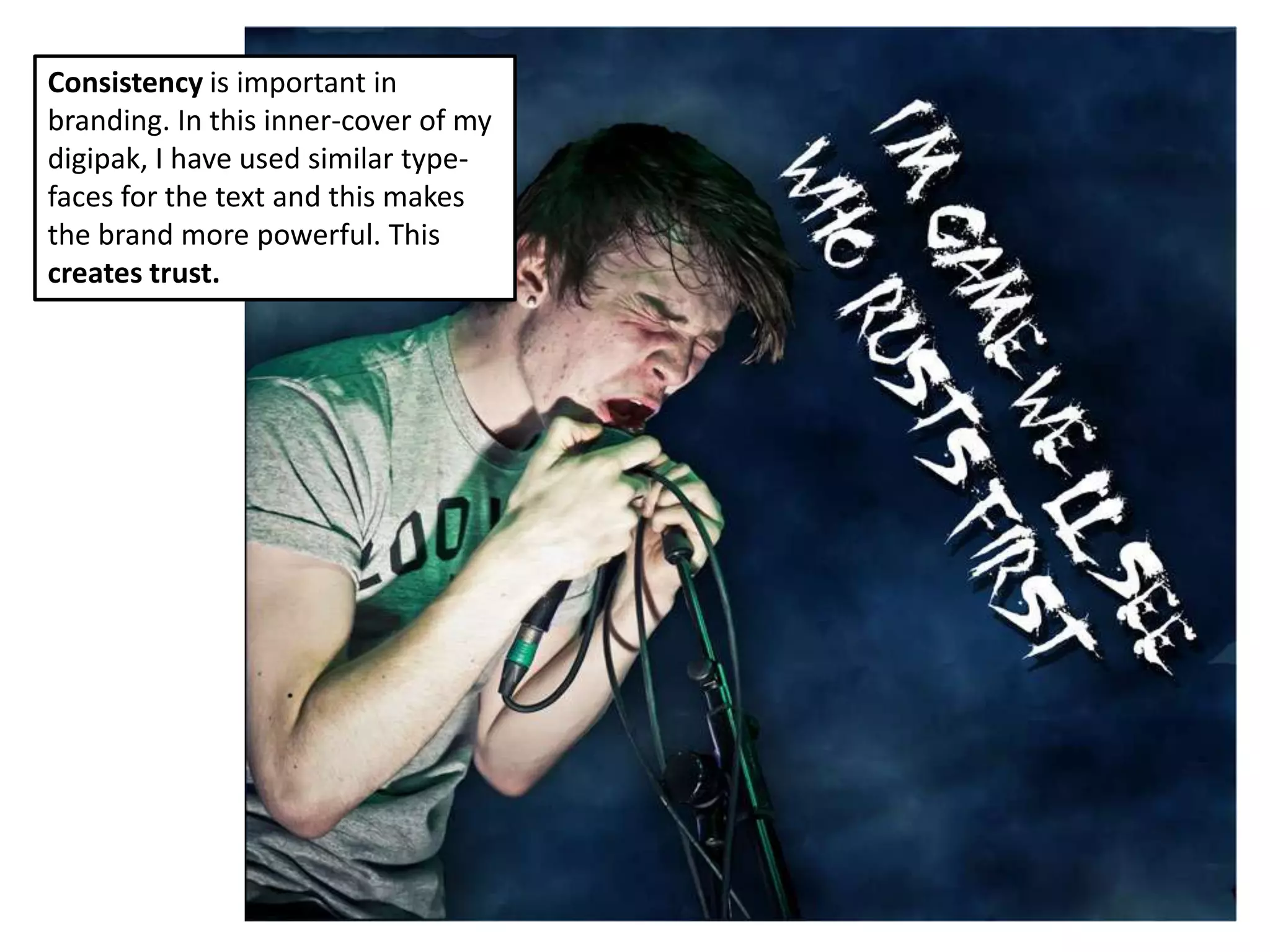
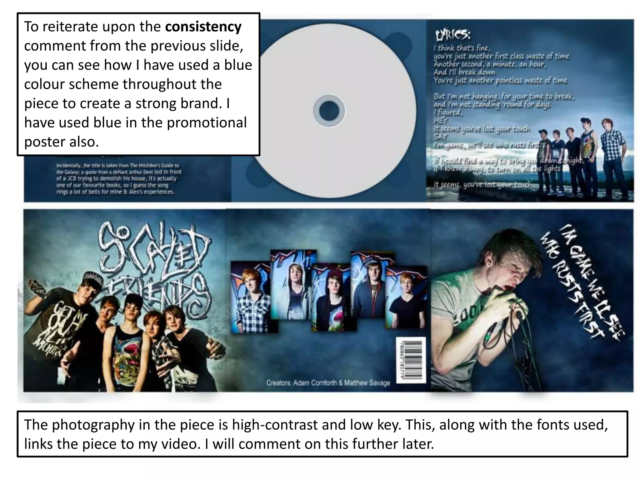
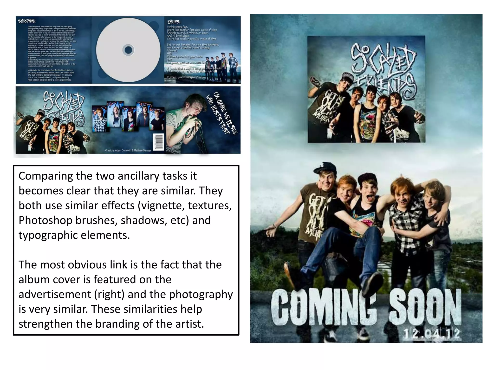
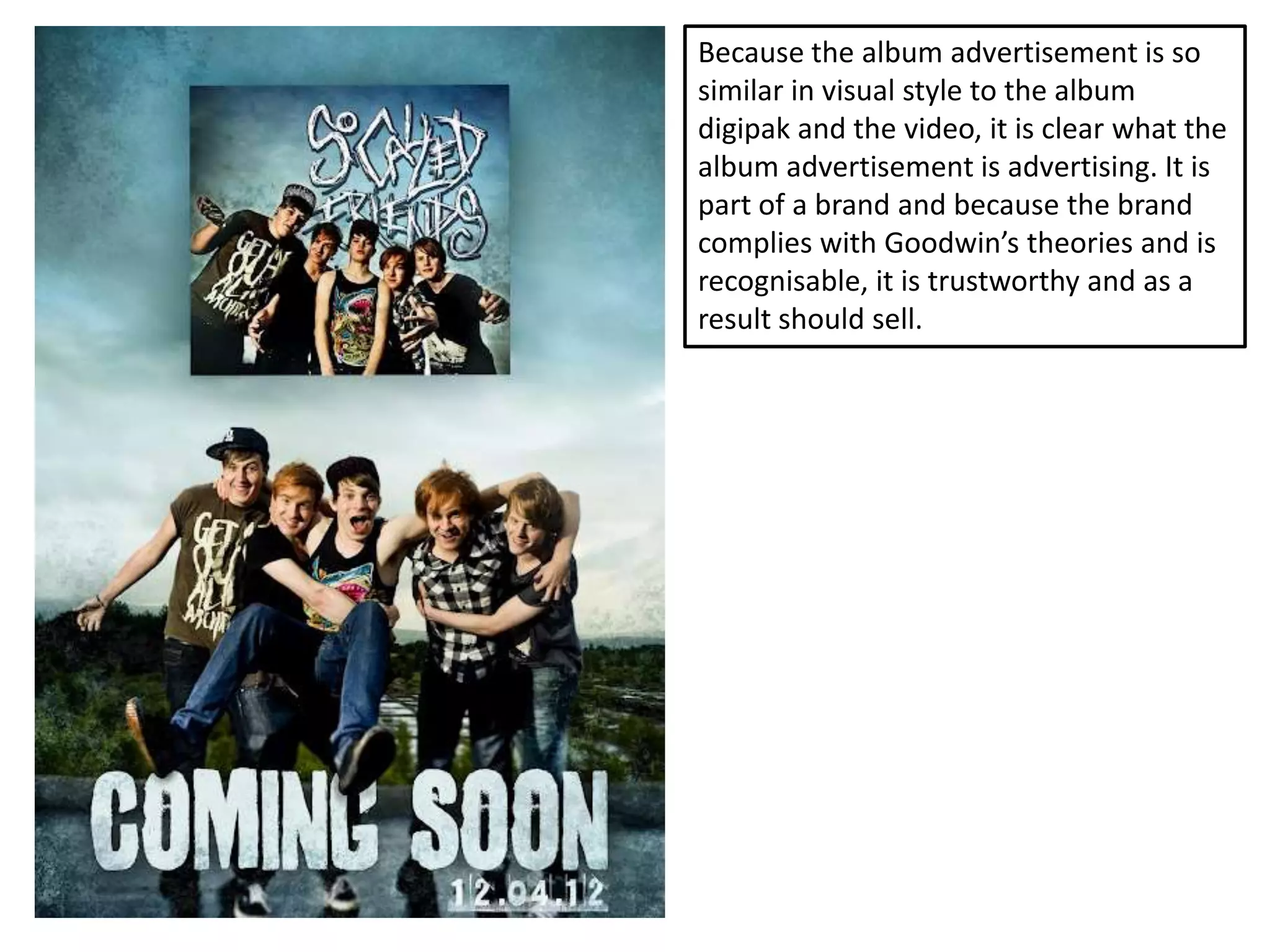
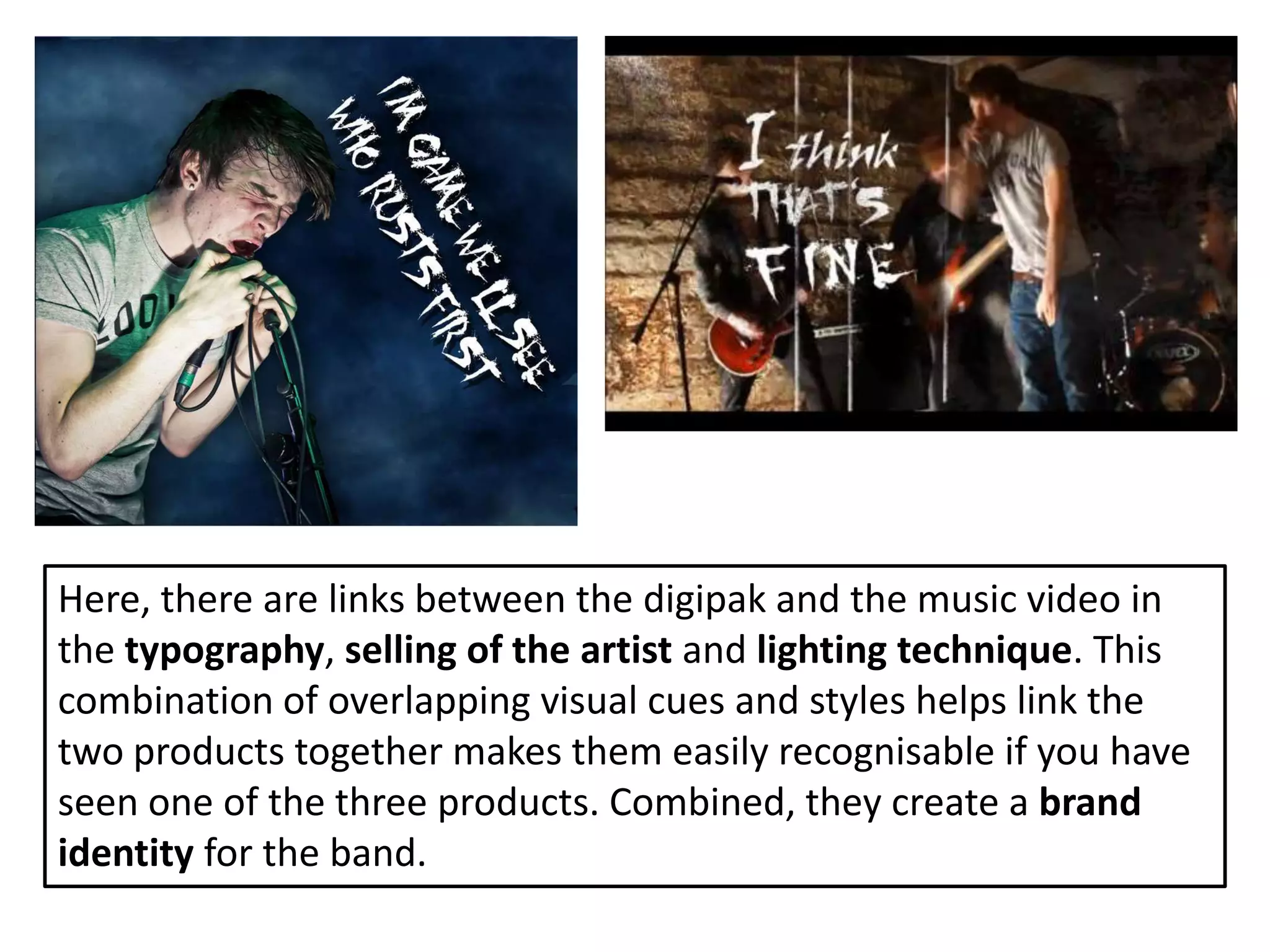
How effective is the combination
   of my main products and
        ancillary tasks?
Brand Image
Branding?
‘Branding’ refers to the link between the images
people know of products and the products
themselves.

A brand is something that we see constantly. We are
surrounded by brands and we recognise and
associate brands with all sorts of different
companies, organisations and in our case, media
products and bands.
Brand Image
A strong brand image is what causes a business, or in
our case, a media campaign to be successful.

People buy products based off the influence and
recognition of brand. If someone has seen and enjoyed
the presence of a brand (in our case a music video) and
see a product that is marketed at them with similar
connotations to the music video, they will be more
receptive and open to it and perhaps even be more
likely to make a purchase.
Brand Image
A brand can also reflect the “personality” that
identifies a product. For example, a brand can
allow a product to be seen as corporate, fun
or entertaining for example.

                     The ‘coca cola’ trademark has
                     perceptions attached to it. Most
                     people see it as a ‘fun’ company. It
                     can remind people of coca-cola
                     Christmas and these sorts of
                     connotations help coca-cola to sell
                     their products.
Brand Image
One could in theory (in accordance with
Goodwin’s media theory for example) create a
brand that relates with an audience by making
a brand easily identifiable as part of a genre.

This is what we have done and by doing this
we have created a product that is easy to
digest.
I have used Goodwin’s theory to
“style” the branding of this album
cover with a grungy, textured feel
so as to make audiences of the
genre more likely to welcome the
product.

If people welcome the product
then people are more likely to
purchase it and “trust the brand”.
Further branding techniques have
been employed through the
photography of the piece. Other
artists in this genre dress
themselves in “casual” dress so as
to approach their mostly male
teenage audience easier and to
make their content more
consumable. They fit in with their
audience and their branding
power improves as a result.
Take this promotional material
from band Rise Against, for
example. They dress in casual
wear, position themselves near the
camera and look at the camera so
as to relate with and grab the
attention of anyone looking down
store aisles at album art or posters.

I have used this concept in the
branding for my product.
Looking at this album cover from
band Attack Attack!, it becomes
clear that the grungy, weathered
effect is to be expected from
artists in the genre and so as a
result of this our media products
have been produced in accordance
with this recipe.
Consistency is important in
branding. In this inner-cover of my
digipak, I have used similar type-
faces for the text and this makes
the brand more powerful. This
creates trust.
To reiterate upon the consistency
comment from the previous slide,
you can see how I have used a blue
colour scheme throughout the
piece to create a strong brand. I
have used blue in the promotional
poster also.


The photography in the piece is high-contrast and low key. This, along with the fonts used,
links the piece to my video. I will comment on this further later.
Comparing the two ancillary tasks it
becomes clear that they are similar. They
both use similar effects (vignette, textures,
Photoshop brushes, shadows, etc) and
typographic elements.

The most obvious link is the fact that the
album cover is featured on the
advertisement (right) and the photography
is very similar. These similarities help
strengthen the branding of the artist.
Because the album advertisement is so
similar in visual style to the album
digipak and the video, it is clear what the
album advertisement is advertising. It is
part of a brand and because the brand
complies with Goodwin’s theories and is
recognisable, it is trustworthy and as a
result should sell.
Here, there are links between the digipak and the music video in
the typography, selling of the artist and lighting technique. This
combination of overlapping visual cues and styles helps link the
two products together makes them easily recognisable if you have
seen one of the three products. Combined, they create a brand
identity for the band.
More links between the lyrics
and the visuals help strengthen
the brand’s attachment to the
genre and to link the three
products.
Overall...
I believe the combination of products we have created has worked
very well in promoting a very consistent and believable, authentic
brand image that could be recognised and trusted as part of it’s
genre.

The products appear like they have been made together and the
audience feedback that we have collected (see video post on the
blog) highlights that there has been no confusion regarding this.
The album art features plenty of imagery of the artists and one of
the inner panels even features performance which is highly
indicative of a link to the music video.

In addition, the visual styles (rough textures, moody sky
background, dark colours, high contrast photography, grungy
typography) I believe all help the brand attach itself to a genre
which makes it far more marketable than a standalone product.

How effective is the combination of my main products and ancillary tasks?

  • 1.
    How effective isthe combination of my main products and ancillary tasks?
  • 2.
  • 3.
    Branding? ‘Branding’ refers tothe link between the images people know of products and the products themselves. A brand is something that we see constantly. We are surrounded by brands and we recognise and associate brands with all sorts of different companies, organisations and in our case, media products and bands.
  • 4.
    Brand Image A strongbrand image is what causes a business, or in our case, a media campaign to be successful. People buy products based off the influence and recognition of brand. If someone has seen and enjoyed the presence of a brand (in our case a music video) and see a product that is marketed at them with similar connotations to the music video, they will be more receptive and open to it and perhaps even be more likely to make a purchase.
  • 5.
    Brand Image A brandcan also reflect the “personality” that identifies a product. For example, a brand can allow a product to be seen as corporate, fun or entertaining for example. The ‘coca cola’ trademark has perceptions attached to it. Most people see it as a ‘fun’ company. It can remind people of coca-cola Christmas and these sorts of connotations help coca-cola to sell their products.
  • 6.
    Brand Image One couldin theory (in accordance with Goodwin’s media theory for example) create a brand that relates with an audience by making a brand easily identifiable as part of a genre. This is what we have done and by doing this we have created a product that is easy to digest.
  • 8.
    I have usedGoodwin’s theory to “style” the branding of this album cover with a grungy, textured feel so as to make audiences of the genre more likely to welcome the product. If people welcome the product then people are more likely to purchase it and “trust the brand”.
  • 9.
    Further branding techniqueshave been employed through the photography of the piece. Other artists in this genre dress themselves in “casual” dress so as to approach their mostly male teenage audience easier and to make their content more consumable. They fit in with their audience and their branding power improves as a result.
  • 10.
    Take this promotionalmaterial from band Rise Against, for example. They dress in casual wear, position themselves near the camera and look at the camera so as to relate with and grab the attention of anyone looking down store aisles at album art or posters. I have used this concept in the branding for my product.
  • 11.
    Looking at thisalbum cover from band Attack Attack!, it becomes clear that the grungy, weathered effect is to be expected from artists in the genre and so as a result of this our media products have been produced in accordance with this recipe.
  • 12.
    Consistency is importantin branding. In this inner-cover of my digipak, I have used similar type- faces for the text and this makes the brand more powerful. This creates trust.
  • 13.
    To reiterate uponthe consistency comment from the previous slide, you can see how I have used a blue colour scheme throughout the piece to create a strong brand. I have used blue in the promotional poster also. The photography in the piece is high-contrast and low key. This, along with the fonts used, links the piece to my video. I will comment on this further later.
  • 14.
    Comparing the twoancillary tasks it becomes clear that they are similar. They both use similar effects (vignette, textures, Photoshop brushes, shadows, etc) and typographic elements. The most obvious link is the fact that the album cover is featured on the advertisement (right) and the photography is very similar. These similarities help strengthen the branding of the artist.
  • 15.
    Because the albumadvertisement is so similar in visual style to the album digipak and the video, it is clear what the album advertisement is advertising. It is part of a brand and because the brand complies with Goodwin’s theories and is recognisable, it is trustworthy and as a result should sell.
  • 16.
    Here, there arelinks between the digipak and the music video in the typography, selling of the artist and lighting technique. This combination of overlapping visual cues and styles helps link the two products together makes them easily recognisable if you have seen one of the three products. Combined, they create a brand identity for the band.
  • 17.
    More links betweenthe lyrics and the visuals help strengthen the brand’s attachment to the genre and to link the three products.
  • 18.
    Overall... I believe thecombination of products we have created has worked very well in promoting a very consistent and believable, authentic brand image that could be recognised and trusted as part of it’s genre. The products appear like they have been made together and the audience feedback that we have collected (see video post on the blog) highlights that there has been no confusion regarding this. The album art features plenty of imagery of the artists and one of the inner panels even features performance which is highly indicative of a link to the music video. In addition, the visual styles (rough textures, moody sky background, dark colours, high contrast photography, grungy typography) I believe all help the brand attach itself to a genre which makes it far more marketable than a standalone product.