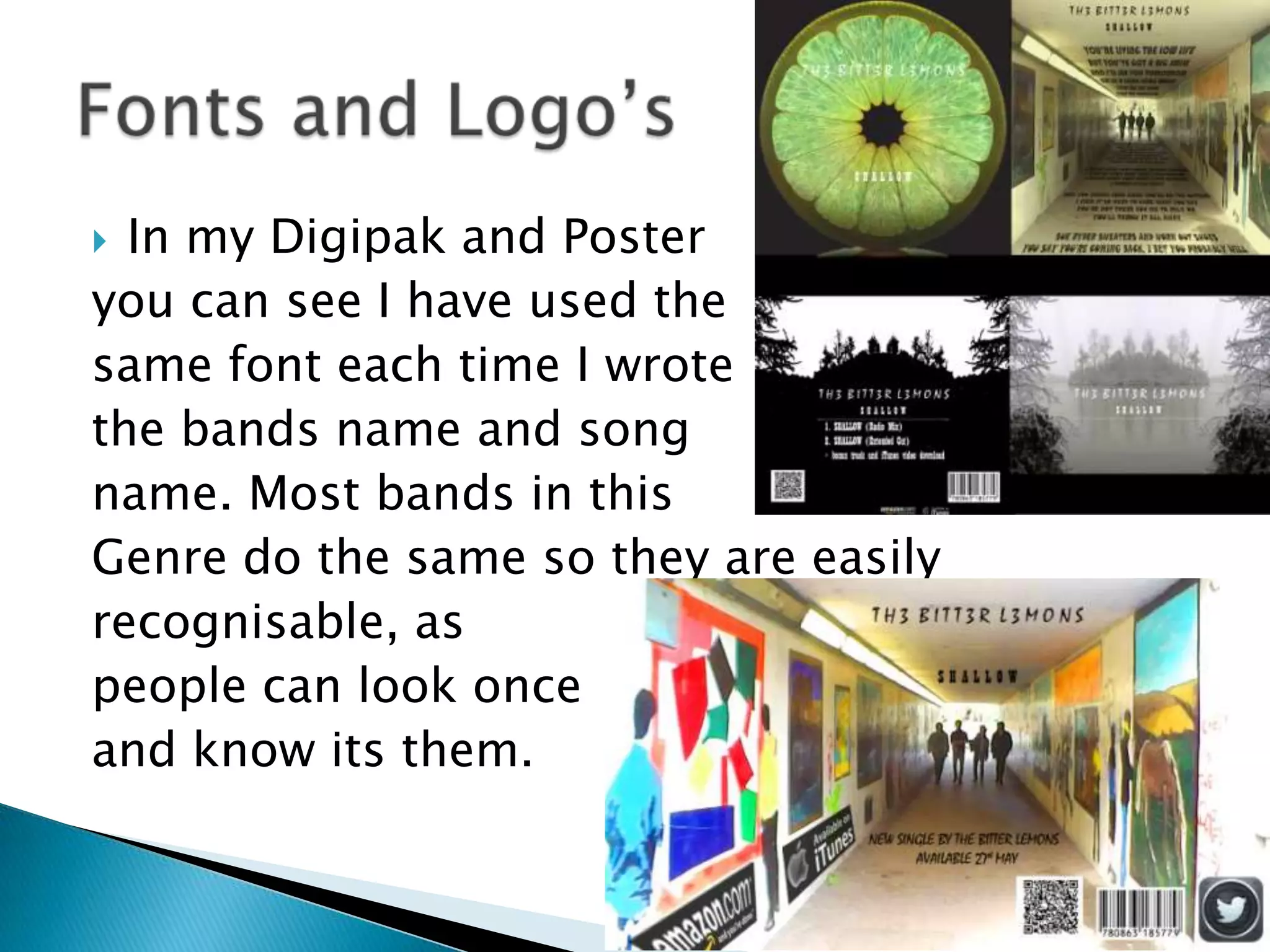
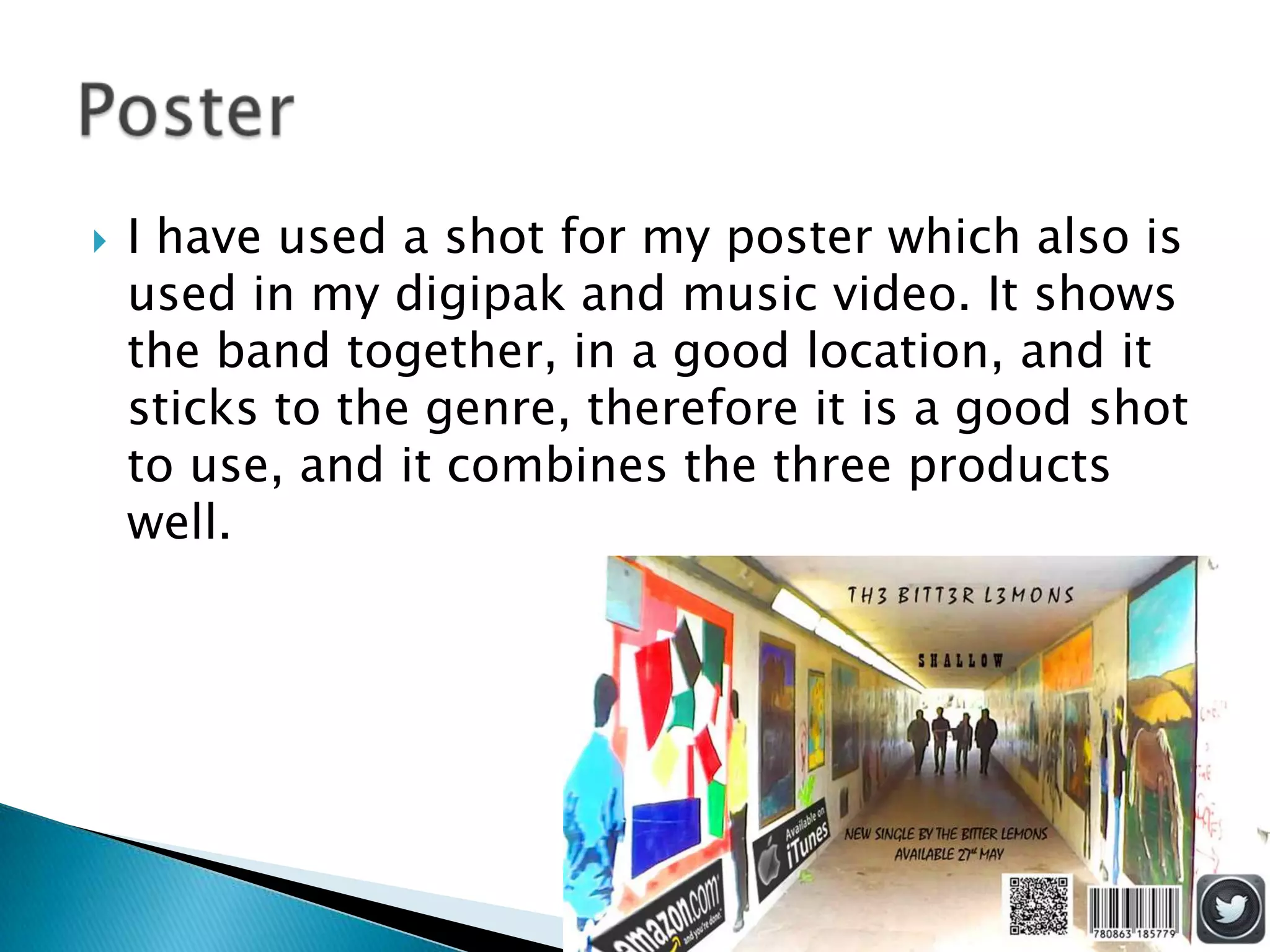
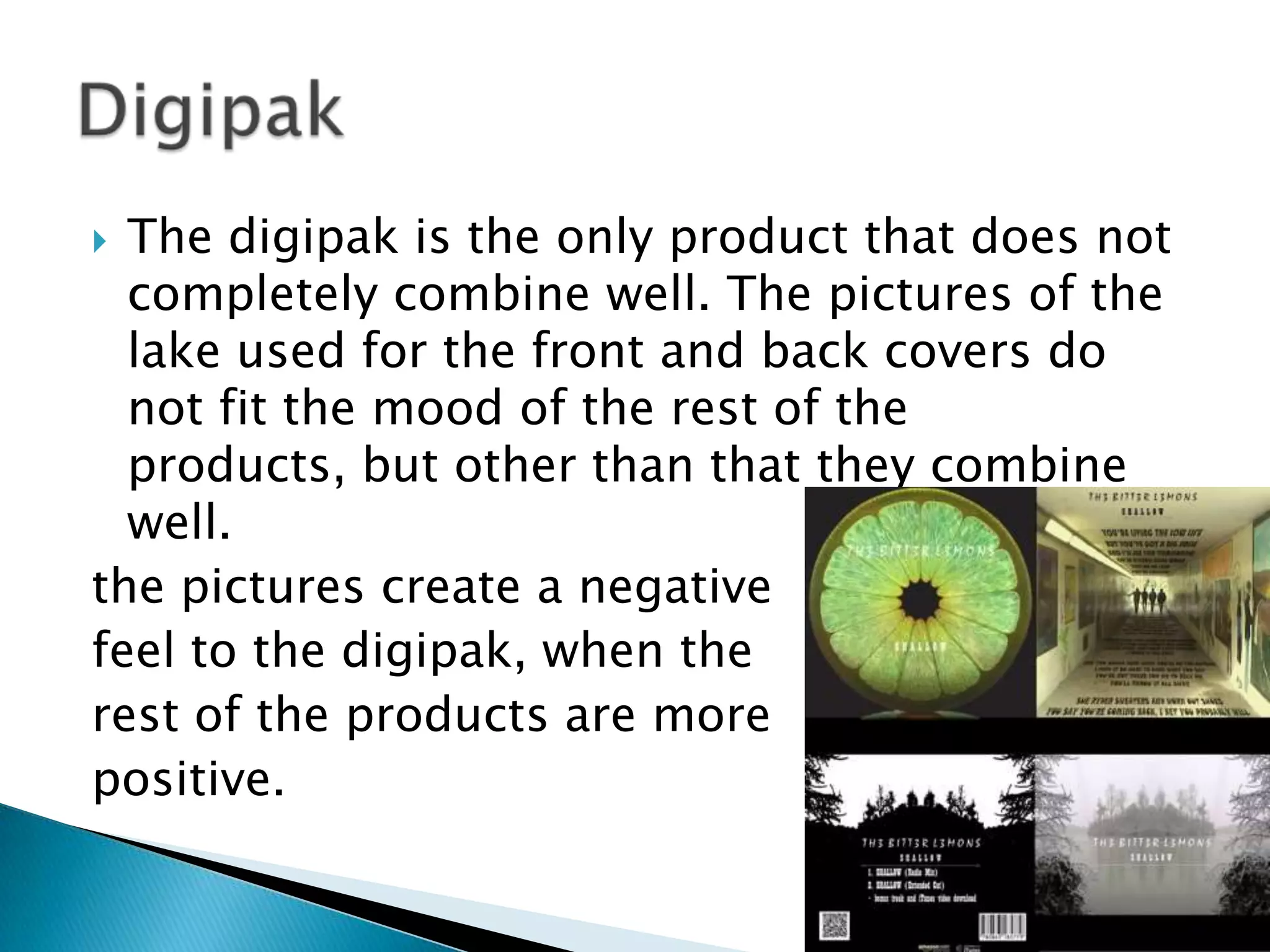
 Throughout my products I tried to make sure
I kept consistency throughout, so they looked
like they were the same band and genre.
 To do this I had to keep some things the
same, and stick to the conventions:
 In my Digipak and Poster
you can see I have used the
same font each time I wrote
the bands name and song
name. Most bands in this
Genre do the same so they are easily
recognisable, as
people can look once
and know its them.
 I have used a shot for my poster which also is
used in my digipak and music video. It shows
the band together, in a good location, and it
sticks to the genre, therefore it is a good shot
to use, and it combines the three products
well.
 Throughout my video, poster and digipak I
have tried to use locations that are low-
key, and stick to the genre. This creates a
good combination between the products, as
they all use similar locations, Making it seem
like the same product. They all look like the
same genre and combine well.
 The digipak is the only product that does not
completely combine well. The pictures of the
lake used for the front and back covers do
not fit the mood of the rest of the
products, but other than that they combine
well.
the pictures create a negative
feel to the digipak, when the
rest of the products are more
positive.

How effective is the combination of your main product and ancillary texts?

  • 2.
     Throughout myproducts I tried to make sure I kept consistency throughout, so they looked like they were the same band and genre.  To do this I had to keep some things the same, and stick to the conventions:
  • 3.
     In myDigipak and Poster you can see I have used the same font each time I wrote the bands name and song name. Most bands in this Genre do the same so they are easily recognisable, as people can look once and know its them.
  • 4.
     I haveused a shot for my poster which also is used in my digipak and music video. It shows the band together, in a good location, and it sticks to the genre, therefore it is a good shot to use, and it combines the three products well.
  • 5.
     Throughout myvideo, poster and digipak I have tried to use locations that are low- key, and stick to the genre. This creates a good combination between the products, as they all use similar locations, Making it seem like the same product. They all look like the same genre and combine well.
  • 6.
     The digipakis the only product that does not completely combine well. The pictures of the lake used for the front and back covers do not fit the mood of the rest of the products, but other than that they combine well. the pictures create a negative feel to the digipak, when the rest of the products are more positive.