Audience Research Into Digipak
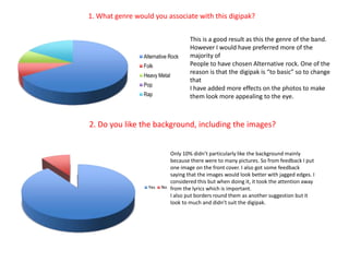
1. What genre would you associate with this digipak?This is a good result as this the genre of the band. However I would have preferred more of the majority ofPeople to have chosen Alternative rock. One of the reason is that the digipak is “to basic” so to change thatI have added more effects on the photos to make them look more appealing to the eye.2. Do you like the background, including the images?Only 10% didn’t particularly like the background mainly because there were to many pictures. So from feedback I put one image on the front cover. I also got some feedback saying that the images would look better with jagged edges. I considered this but when doing it, it took the attention away from the lyrics which is important. I also put borders round them as another suggestion but it look to much and didn’t suit the digipak.
What other effects do you think will be good on the images?The main effect people suggested was colour filters. I think this would be effective if I had more images on the front. However I have done some colour filers for the images which are behind the lyrics. Also there was the suggestion of having the images look like they were stuck down with selotape, I like this idea as it gives the effect of the scrapbook. However I thought the front cover image would look better if it looked like it was already placed in the scrapbook but photo holders. The selotape effect could be used for promoting there album.What other Information would you like to see on the digipak?The majority wanted to see more information of how they could find out more about the band such as; myspace, websites etc. This is very important as it is their first single.
Any other comments?The other comments were helpful as many people didn’t know where the CD was going to go.Also there was to many pictures, but I have edited it further so there isn’t. A smaller font for the lyrics, I did edit it so it did and was only on the left hand side, but I became to small you couldn’t read it.

Media

  • 1.
  • 2.
    1. What genrewould you associate with this digipak?This is a good result as this the genre of the band. However I would have preferred more of the majority ofPeople to have chosen Alternative rock. One of the reason is that the digipak is “to basic” so to change thatI have added more effects on the photos to make them look more appealing to the eye.2. Do you like the background, including the images?Only 10% didn’t particularly like the background mainly because there were to many pictures. So from feedback I put one image on the front cover. I also got some feedback saying that the images would look better with jagged edges. I considered this but when doing it, it took the attention away from the lyrics which is important. I also put borders round them as another suggestion but it look to much and didn’t suit the digipak.
  • 3.
    What other effectsdo you think will be good on the images?The main effect people suggested was colour filters. I think this would be effective if I had more images on the front. However I have done some colour filers for the images which are behind the lyrics. Also there was the suggestion of having the images look like they were stuck down with selotape, I like this idea as it gives the effect of the scrapbook. However I thought the front cover image would look better if it looked like it was already placed in the scrapbook but photo holders. The selotape effect could be used for promoting there album.What other Information would you like to see on the digipak?The majority wanted to see more information of how they could find out more about the band such as; myspace, websites etc. This is very important as it is their first single.
  • 4.
    Any other comments?Theother comments were helpful as many people didn’t know where the CD was going to go.Also there was to many pictures, but I have edited it further so there isn’t. A smaller font for the lyrics, I did edit it so it did and was only on the left hand side, but I became to small you couldn’t read it.