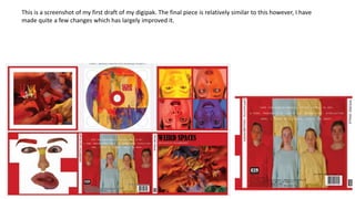
The document describes the process of creating a digipak, including various design iterations and comparisons of layout and design elements. Some key stages discussed are:
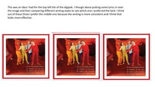
- Comparing designs for tiles on the left side, including images with and without red squares and different text styles over images.
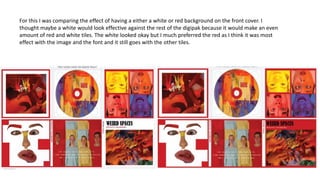
- Testing a white vs red background for the front cover and determining red was most effective.
- Considering different arrangements and designs for the CD information area.
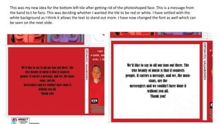
- Iterating the design of a bottom left tile with a band message, comparing white and red backgrounds.
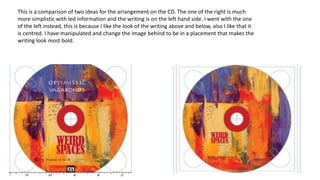
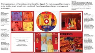
- The final version with consistent fonts throughout and changes to images and arrangements to improve cohesion.