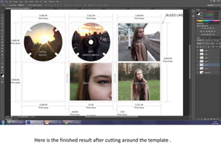
The document describes the steps taken to design a CD digipack template in a photo editing software. Key steps include:
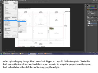
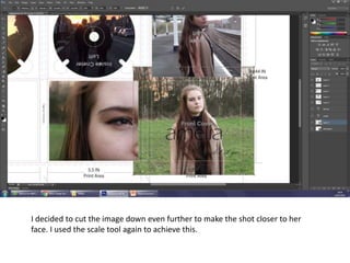
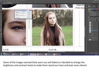
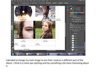
1. Resizing and transforming an uploaded photo to fit the template using shift to maintain proportions.
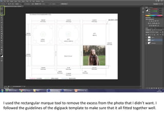
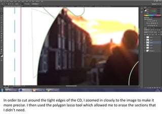
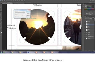
2. Using selection tools like rectangular marquee and polygon lasso to cut out excess areas and tightly cut around the CD shape.
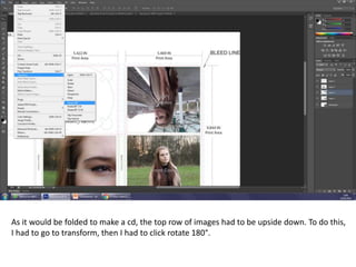
3. Rotating an image 180 degrees to have the top row appear upside down as the digipack would be folded.
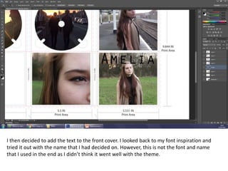
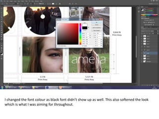
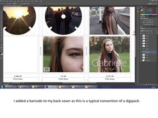
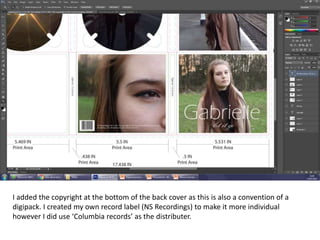
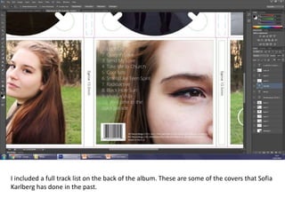
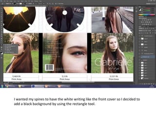
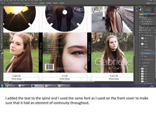
4. Adding text elements to the front cover and spine, and ensuring font consistency. Conventional elements like barcodes and copyright were also included.


![G324 advanced portfolio_in_media_evaluation[1]](https://cdn.slidesharecdn.com/ss_thumbnails/g324advancedportfolioinmediaevaluation1-110316070935-phpapp01-thumbnail.jpg?width=640&height=640&fit=bounds)


