This magazine analysis document provides details on the layout and design conventions of several magazines.
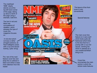
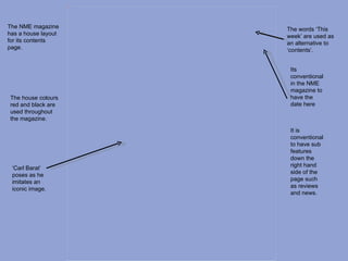
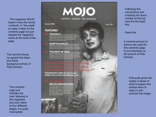
The NME magazine cover follows conventions like having celebrity images and eye-catching text and fonts. Details are given on the layout of contents pages, including use of colors, images and fonts to draw readers in.
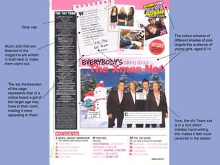
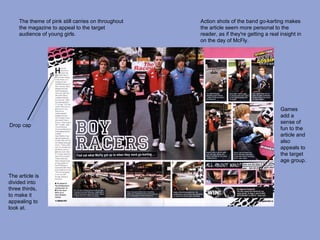
The magazine for young girls uses pink colors and designs inspired by a girl's bedroom to appeal to its target audience. Article formats include photos, games, and drop caps to make the content fun and accessible.
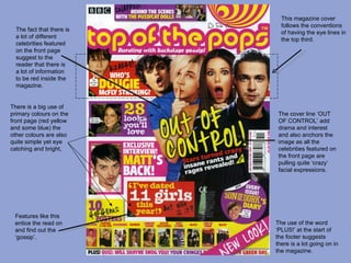
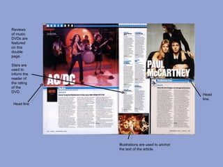
Magazine reviews feature star ratings and illustrations to complement music and DVD coverage. Conventions like headlines, credits and column designs are described.