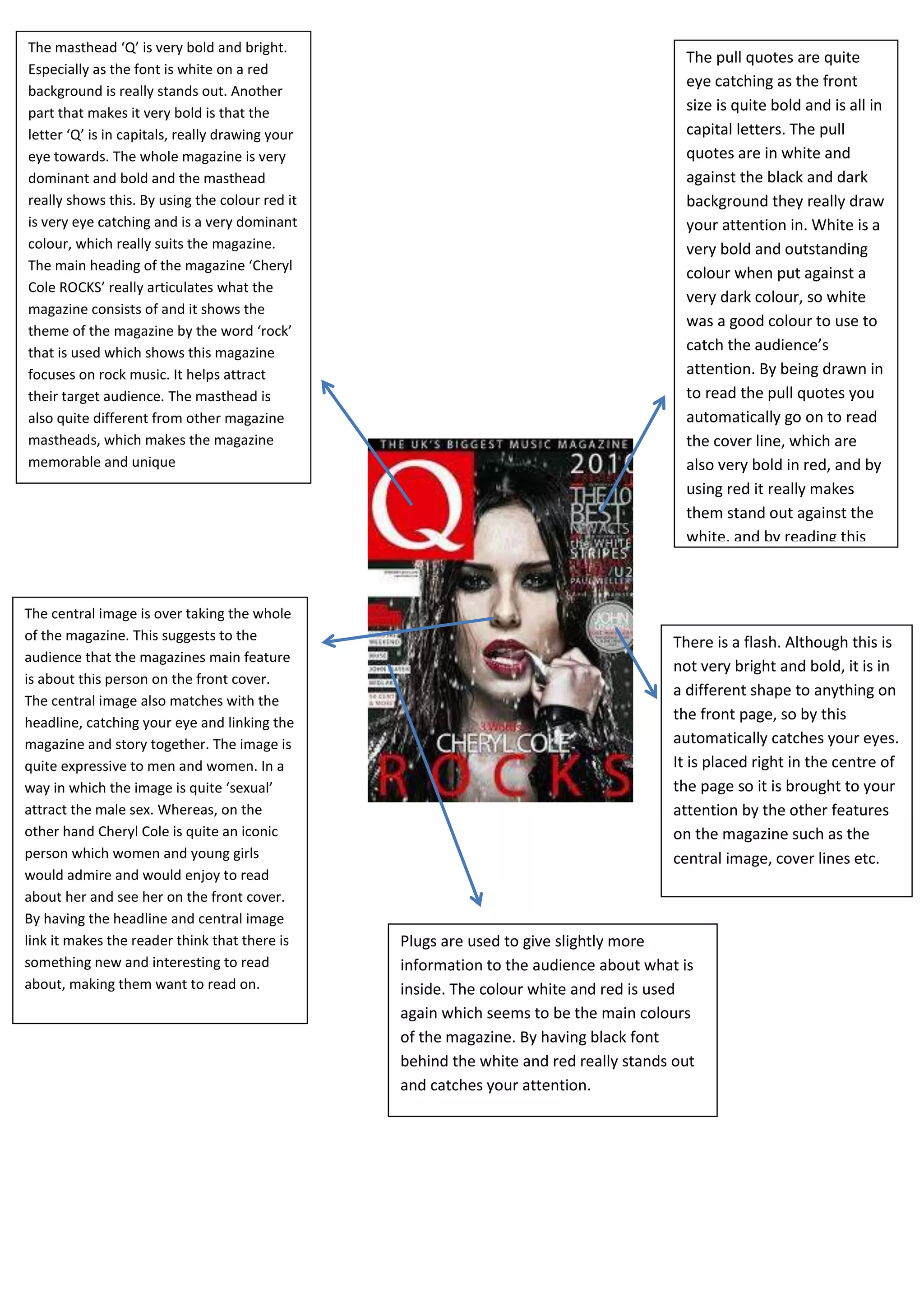
The masthead ‘Q’ is very bold and bright.
                                                                                         The pull quotes are quite
Especially as the font is white on a red
                                                                                         eye catching as the front
background is really stands out. Another
part that makes it very bold is that the                                                 size is quite bold and is all in
letter ‘Q’ is in capitals, really drawing your                                           capital letters. The pull
eye towards. The whole magazine is very                                                  quotes are in white and
dominant and bold and the masthead                                                       against the black and dark
really shows this. By using the colour red it                                            background they really draw
is very eye catching and is a very dominant                                              your attention in. White is a
colour, which really suits the magazine.                                                 very bold and outstanding
The main heading of the magazine ‘Cheryl
                                                                                         colour when put against a
Cole ROCKS’ really articulates what the
                                                                                         very dark colour, so white
magazine consists of and it shows the
                                                                                         was a good colour to use to
theme of the magazine by the word ‘rock’
that is used which shows this magazine                                                   catch the audience’s
focuses on rock music. It helps attract                                                  attention. By being drawn in
their target audience. The masthead is                                                   to read the pull quotes you
also quite different from other magazine                                                 automatically go on to read
mastheads, which makes the magazine                                                      the cover line, which are
memorable and unique                                                                     also very bold in red, and by
                                                                                         using red it really makes
                                                                                         them stand out against the
                                                                                         white, and by reading this
                                                                                         will make the audience want
                                                                                         to read on in the magazine.
The central image is over taking the whole
of the magazine. This suggests to the                                                  There is a flash. Although this is
audience that the magazines main feature
                                                                                       not very bright and bold, it is in
is about this person on the front cover.
                                                                                       a different shape to anything on
The central image also matches with the
headline, catching your eye and linking the
                                                                                       the front page, so by this
magazine and story together. The image is                                              automatically catches your eyes.
quite expressive to men and women. In a                                                It is placed right in the centre of
way in which the image is quite ‘sexual’                                               the page so it is brought to your
attract the male sex. Whereas, on the                                                  attention by the other features
other hand Cheryl Cole is quite an iconic                                              on the magazine such as the
person which women and young girls                                                     central image, cover lines etc.
would admire and would enjoy to read
about her and see her on the front cover.
By having the headline and central image
link it makes the reader think that there is     Plugs are used to give slightly more
something new and interesting to read            information to the audience about what is
about, making them want to read on.              inside. The colour white and red is used
                                                 again which seems to be the main colours
                                                 of the magazine. By having black font
                                                 behind the white and red really stands out
                                                 and catches your attention.

Front cover analysis. 1

  • 1.
    The masthead ‘Q’is very bold and bright. The pull quotes are quite Especially as the font is white on a red eye catching as the front background is really stands out. Another part that makes it very bold is that the size is quite bold and is all in letter ‘Q’ is in capitals, really drawing your capital letters. The pull eye towards. The whole magazine is very quotes are in white and dominant and bold and the masthead against the black and dark really shows this. By using the colour red it background they really draw is very eye catching and is a very dominant your attention in. White is a colour, which really suits the magazine. very bold and outstanding The main heading of the magazine ‘Cheryl colour when put against a Cole ROCKS’ really articulates what the very dark colour, so white magazine consists of and it shows the was a good colour to use to theme of the magazine by the word ‘rock’ that is used which shows this magazine catch the audience’s focuses on rock music. It helps attract attention. By being drawn in their target audience. The masthead is to read the pull quotes you also quite different from other magazine automatically go on to read mastheads, which makes the magazine the cover line, which are memorable and unique also very bold in red, and by using red it really makes them stand out against the white, and by reading this will make the audience want to read on in the magazine. The central image is over taking the whole of the magazine. This suggests to the There is a flash. Although this is audience that the magazines main feature not very bright and bold, it is in is about this person on the front cover. a different shape to anything on The central image also matches with the headline, catching your eye and linking the the front page, so by this magazine and story together. The image is automatically catches your eyes. quite expressive to men and women. In a It is placed right in the centre of way in which the image is quite ‘sexual’ the page so it is brought to your attract the male sex. Whereas, on the attention by the other features other hand Cheryl Cole is quite an iconic on the magazine such as the person which women and young girls central image, cover lines etc. would admire and would enjoy to read about her and see her on the front cover. By having the headline and central image link it makes the reader think that there is Plugs are used to give slightly more something new and interesting to read information to the audience about what is about, making them want to read on. inside. The colour white and red is used again which seems to be the main colours of the magazine. By having black font behind the white and red really stands out and catches your attention.