Front Cover Analysis                              I decided to call my magazine Unseen. The           I chose to include a skyline on my
                                                   reason for this is because; it represents the       magazine front cover. This is mainly due
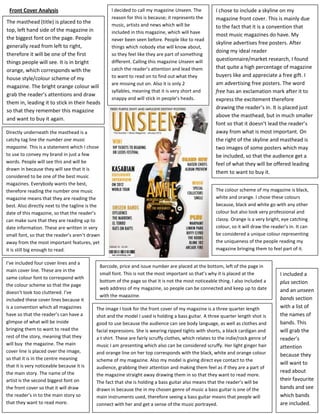
The masthead (title) is placed to the              music, artists and news which will be               to the fact that it is a convention that
top, left hand side of the magazine in             included in this magazine, which will have
                                                                                                       most music magazines do have. My
the biggest font on the page. People               never been seen before. People like to read
                                                                                                       skyline advertises free posters. After
generally read from left to right,                 things which nobody else will know about,
                                                                                                       doing my ideal reader
therefore it will be one of the first              so they feel like they are part of something
                                                   different. Calling this magazine Unseen will        questionnaire/market research, I found
things people will see. It is in bright
                                                   catch the reader’s attention and lead them          that quite a high percentage of magazine
orange, which corresponds with the
                                                   to want to read on to find out what they            buyers like and appreciate a free gift. I
house style/colour scheme of my
                                                   are missing out on. Also it is only 2               am advertising free posters. The word
magazine. The bright orange colour will
                                                   syllables, meaning that it is very short and        free has an exclamation mark after it to
grab the reader’s attentions and draw
                                                   snappy and will stick in people’s heads.            express the excitement therefore
them in, leading it to stick in their heads
                                                                                                       drawing the reader’s in. It is placed just
so that they remember this magazine
                                                                                                       above the masthead, but in much smaller
and want to buy it again.
                                                                                                       font so that it doesn’t lead the reader’s
Directly underneath the masthead is a                                                                  away from what is most important. On
catchy tag line the number one music                                                                   the right of the skyline and masthead is
magazine. This is a statement which I chose                                                            two images of some posters which may
to use to convey my brand in just a few                                                                be included, so that the audience get a
words. People will see this and will be                                                                feel of what they will be offered leading
drawn in because they will see that it is
                                                                                                       them to want to buy it.
considered to be one of the best music
magazines. Everybody wants the best,
therefore reading the number one music                                                                 The colour scheme of my magazine is black,
magazine means that they are reading the                                                               white and orange. I chose these colours
best. Also directly next to the tagline is the                                                         because, black and white go with any other
date of this magazine, so that the reader’s                                                            colour but also look very professional and
can make sure that they are reading up to                                                              classy. Orange is a very bright, eye catching
date information. These are written in very                                                            colour, so it will draw the reader’s in. It can
small font, so that the reader’s aren’t drawn                                                          be considered a unique colour representing
away from the most important features, yet                                                             the uniqueness of the people reading my
it is still big enough to read.                                                                        magazine bringing them to feel part of it.

I’ve included four cover lines and a
                                             Barcode, price and issue number are placed at the bottom, left of the page in
main cover line. These are in the
                                             small font. This is not the most important so that’s why it is placed at the              I included a
same colour font to correspond with
                                             bottom of the page so that it is not the most noticeable thing. I also included a         plus section
the colour scheme so that the page
                                             web address of my magazine, so people can be connected and keep up to date                and an unseen
doesn’t look too cluttered. I’ve
                                             with the magazine.
included these cover lines because it                                                                                                  bands section
is a convention which all magazines         The image I took for the front cover of my magazine is a three quarter length              with a list of
have so that the reader’s can have a        shot and the model I used is holding a bass guitar. A three quarter length shot is         the names of
glimpse of what will be inside              good to use because the audience can see body language, as well as clothes and             bands. This
bringing them to want to read the           facial expressions. She is wearing ripped tights with shorts, a black cardigan and         will grab the
rest of the story, meaning that they        a t shirt. These are fairly scruffy clothes, which relates to the indie/rock genre of      reader’s
will buy the magazine. The main             music I am presenting which also can be considered scruffy. Her light ginger hair          attention
cover line is placed over the image,        and orange line on her top corresponds with the black, white and orange colour             because they
so that it is in the centre meaning         scheme of my magazine. Also my model is giving direct eye contact to the
that it is very noticeable because it is
                                                                                                                                       will want to
                                            audience, grabbing their attention and making them feel as if they are a part of
the main story. The name of the                                                                                                        read about
                                            the magazine straight away drawing them in so that they want to read more.
artist is the second biggest font on                                                                                                   their favourite
                                            The fact that she is holding a bass guitar also means that the reader’s will be
the front cover so that it will draw        drawn in because the in my chosen genre of music a bass guitar is one of the               bands and see
the reader’s in to the main story so        main instruments used, therefore seeing a bass guitar means that people will               which bands
that they want to read more.                connect with her and get a sense of the music portrayed.                                   are included.

Front Cover Analysis

  • 1.
    Front Cover Analysis I decided to call my magazine Unseen. The I chose to include a skyline on my reason for this is because; it represents the magazine front cover. This is mainly due The masthead (title) is placed to the music, artists and news which will be to the fact that it is a convention that top, left hand side of the magazine in included in this magazine, which will have most music magazines do have. My the biggest font on the page. People never been seen before. People like to read skyline advertises free posters. After generally read from left to right, things which nobody else will know about, doing my ideal reader therefore it will be one of the first so they feel like they are part of something different. Calling this magazine Unseen will questionnaire/market research, I found things people will see. It is in bright catch the reader’s attention and lead them that quite a high percentage of magazine orange, which corresponds with the to want to read on to find out what they buyers like and appreciate a free gift. I house style/colour scheme of my are missing out on. Also it is only 2 am advertising free posters. The word magazine. The bright orange colour will syllables, meaning that it is very short and free has an exclamation mark after it to grab the reader’s attentions and draw snappy and will stick in people’s heads. express the excitement therefore them in, leading it to stick in their heads drawing the reader’s in. It is placed just so that they remember this magazine above the masthead, but in much smaller and want to buy it again. font so that it doesn’t lead the reader’s Directly underneath the masthead is a away from what is most important. On catchy tag line the number one music the right of the skyline and masthead is magazine. This is a statement which I chose two images of some posters which may to use to convey my brand in just a few be included, so that the audience get a words. People will see this and will be feel of what they will be offered leading drawn in because they will see that it is them to want to buy it. considered to be one of the best music magazines. Everybody wants the best, therefore reading the number one music The colour scheme of my magazine is black, magazine means that they are reading the white and orange. I chose these colours best. Also directly next to the tagline is the because, black and white go with any other date of this magazine, so that the reader’s colour but also look very professional and can make sure that they are reading up to classy. Orange is a very bright, eye catching date information. These are written in very colour, so it will draw the reader’s in. It can small font, so that the reader’s aren’t drawn be considered a unique colour representing away from the most important features, yet the uniqueness of the people reading my it is still big enough to read. magazine bringing them to feel part of it. I’ve included four cover lines and a Barcode, price and issue number are placed at the bottom, left of the page in main cover line. These are in the small font. This is not the most important so that’s why it is placed at the I included a same colour font to correspond with bottom of the page so that it is not the most noticeable thing. I also included a plus section the colour scheme so that the page web address of my magazine, so people can be connected and keep up to date and an unseen doesn’t look too cluttered. I’ve with the magazine. included these cover lines because it bands section is a convention which all magazines The image I took for the front cover of my magazine is a three quarter length with a list of have so that the reader’s can have a shot and the model I used is holding a bass guitar. A three quarter length shot is the names of glimpse of what will be inside good to use because the audience can see body language, as well as clothes and bands. This bringing them to want to read the facial expressions. She is wearing ripped tights with shorts, a black cardigan and will grab the rest of the story, meaning that they a t shirt. These are fairly scruffy clothes, which relates to the indie/rock genre of reader’s will buy the magazine. The main music I am presenting which also can be considered scruffy. Her light ginger hair attention cover line is placed over the image, and orange line on her top corresponds with the black, white and orange colour because they so that it is in the centre meaning scheme of my magazine. Also my model is giving direct eye contact to the that it is very noticeable because it is will want to audience, grabbing their attention and making them feel as if they are a part of the main story. The name of the read about the magazine straight away drawing them in so that they want to read more. artist is the second biggest font on their favourite The fact that she is holding a bass guitar also means that the reader’s will be the front cover so that it will draw drawn in because the in my chosen genre of music a bass guitar is one of the bands and see the reader’s in to the main story so main instruments used, therefore seeing a bass guitar means that people will which bands that they want to read more. connect with her and get a sense of the music portrayed. are included.