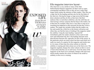
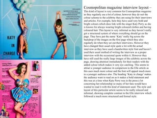
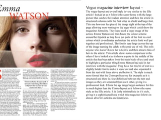
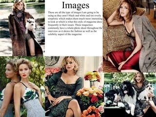
Magazines
Emily Monsey
Elle magazine interview layout –
This interview is very similar to many of the other
fashion/beauty/lifestyle magazines out there such as vogue,
cosmopolitan and Marie Claire as they all use a really large
image which catches the attention of their readers. They also use
a large font for the heading and then also for the first letter of
the interview. Having the image so large across half the page
draws attention and they do this as they know that their
audience likes to read about celebrities, also the celeb they are
interviewing is always someone that has been in the media a lot
at that time for example if they have a new film or song out or
something has happened in their personal life that they wish to
explain. The image also includes clothes that the readers can
buy and usually has a little box at the bottom with prices and
where they can find the items of clothing if the magazine styled
the celebrity. Using the main heading ‘exposed life’
immediately grabs the readers attention as they want to read
more and understand why this is the heading and learn more
about Kristen Stewarts life, especially for fans of the actress. In
this particular article not much colour has been used which isn’t
really too much of a surprise for this magazine and similar ones
to it as many of them base the colour scheme on what the
celebrity is wearing and what colours are on the front cover. The
magazine regularly changes the colour scheme as there is never
a fixed colour that they use on each issue. Even the name of the
magazine on the front cover constantly changes with each issue
which usually matches the colour of whatever the model or
celebrity on the cover is wearing.
Cosmopolitan magazine interview layout –
This kind of layout is very common for Cosmopolitan magazine
as they regularly use a lot of colour, however they do suit the
colour scheme to the celebrity they are using for their interviews
and articles. For example, here they have used very bold and
bright colours which does link with the singer Katy Perry as she
is known for always wearing bright coloured clothes and having
coloured hair. This layout is very informal as they haven’t really
got a structured system of where everything should go on the
page. They have put the name ‘Katy’ really big across the
backdrop of the images on the first page which they also
regularly do when they set out their interviews. However they
have changed their usual style quite a lot with the actual
interview as they have used a handwritten style font and haven’t
used their usual method of writing the interview as a proper
interview with the occasional quote within it. However they
have still used the really large images of the celebrity across the
page, drawing attention immediately for their readers with the
added colour which makes it very eye catching. This seems to
attract a younger audience in comparison to the Elle article as
this uses much more colour and the font will appeal much more
to a younger audience also. The heading ‘Katy in charge’ makes
the audience want to read on as it makes a bold statement and
this was at a time when Katy Perry was in the press a lot
concerning her relationship so many of her fans would have
wanted to read it with this kind of statement used. The style and
layout of this particular article seems to be really relaxed and
informal, showing complete contrast to the Elle interview which
followed a much more structured and formal style.
Vogue magazine interview layout –
The vogue layout and overall style is very similar to the Elle
article I looked at as it follows the same theme with the large
picture that catches the readers attention and then the article in
structured columns with the first letter in a bold and large font.
This one however has placed the image right at the top of the
page allowing more writing on the page which could show the
magazines formality. They have used a large image of the
actress Emma Watson and then based the colour scheme
around her lipstick as they have put parts of the font in a red
colour which co-ordinates and makes the article look well put
together and professional. The font is very large across the top
of the image naming the celeb, with some use of red. This tells
anyone who doesn’t know her who it is and then attracts fans of
hers to the article. This article shows some comparison to the
others I have looked at as it shows a quote in the middle of the
article that has been taken from the main body of text and used
to highlight a particular thing Emma Watson had said in her
interview with the magazine. They have but this bit of text in a
slightly bolder font to make it stand out and also separated it
from the rest with lines above and below it. The style is much
more formal that the Cosmopolitan one for example as it is
structured and there is clear definition between the text and
images as they are separated from each other, giving it a
professional look. I think the age range/target audience for this
is much higher than the Cosmo layout as it follows the same
style as the Elle article. It is fairly minimalistic in it’s style,
giving it a sophisticated look which this magazine follows in
almost all of it’s articles and interviews.
Overall Summary
I think that overall the selection of magazine articles and interviews I have looked at do show some contrast and differences
however they are mainly pretty similar to one another and have the same sort of target audience so it has given me a good
idea of what I should think about including in my own and what type of things are definitely not included. Each magazine
follows a specific structure and layout that they stick to in each of their issues so the structure is fairly easy to understand as
they rarely change it. I think that the only one that stuck out and looks really difference was the Cosmopolitan issue as this
one does change really often as it just depends who they have on the cover and they then base their style and colour scheme
around that. For example in the issue that I looked at they were using Katy Perry who they wanted to look strong and
independent so they used lots of bold, bright colours to represent this. However I have also seen the most recent issue for this
year featuring singer Taylor Swift and this is much more minimal and simplistic which they have based strongly around
winter as they have snow in the photos of her and the colour scheme is blues, greys and silvers so they do change it a lot in
each issue and it doesn’t really follow a specific style in each one. In the Taylor Swift interview they also set it out like the
Vogue and Elle copies I have been looking at as they wrote it out in an article style with some quotes embedded in to it. I
think that overall I definitely prefer the style of it being fairly minimal and structured as I find this more suited to the
magazine and the style of articles I have been writing. I also think that this style has a sophisticated and professional overall
look which I also really like and this is something I want to include in my own design. The fonts are the same kind of style
for both the Elle and Vogue issue as they are both really easy to read font that are bold for the heading and in a larger font and
then smaller for the main body of text. However in some issues they use a ‘calligraphy’ style font that it a little fancier in
each of the magazines. I also really like the style of having the persons name really big as they have done in Cosmopolitan as
this is something they do fairly regularly in each of their interview articles. This just draws attention and tells anyone who
isn’t sure who it is. It also highlights the person for fans along with a really picture along side it. The use of colour is really
varied in each of this, but I personally think that the third article I looked at (vogue) seemed to be the right mix of colour as I
felt Elle was a little too simple with no colour at all and the Cosmo was too bright and made it look like it was more
appropriate for a young audience even though the magazine actually aims at around the same age as Elle and Vogue.
FontsFor the first letter of the first word on
the article and possibly the heading
For the main body of text or maybe
the heading
Images
These are all the type of images I am going to be
using as they aren’t black and white and too overly
simplistic which makes them much more interesting
to look at which is what this style of magazine does
frequently in their issues. These magazines
commonly have a whole photo shoot throughout the
interview as it shows the fashion as well as the
celebrity aspect of the magazine.
Flat PlansHeading
Sub-Heading
Image
Image
Sub-Heading
Text
Text

Magazines 2

  • 1.
  • 2.
    Elle magazine interviewlayout – This interview is very similar to many of the other fashion/beauty/lifestyle magazines out there such as vogue, cosmopolitan and Marie Claire as they all use a really large image which catches the attention of their readers. They also use a large font for the heading and then also for the first letter of the interview. Having the image so large across half the page draws attention and they do this as they know that their audience likes to read about celebrities, also the celeb they are interviewing is always someone that has been in the media a lot at that time for example if they have a new film or song out or something has happened in their personal life that they wish to explain. The image also includes clothes that the readers can buy and usually has a little box at the bottom with prices and where they can find the items of clothing if the magazine styled the celebrity. Using the main heading ‘exposed life’ immediately grabs the readers attention as they want to read more and understand why this is the heading and learn more about Kristen Stewarts life, especially for fans of the actress. In this particular article not much colour has been used which isn’t really too much of a surprise for this magazine and similar ones to it as many of them base the colour scheme on what the celebrity is wearing and what colours are on the front cover. The magazine regularly changes the colour scheme as there is never a fixed colour that they use on each issue. Even the name of the magazine on the front cover constantly changes with each issue which usually matches the colour of whatever the model or celebrity on the cover is wearing.
  • 3.
    Cosmopolitan magazine interviewlayout – This kind of layout is very common for Cosmopolitan magazine as they regularly use a lot of colour, however they do suit the colour scheme to the celebrity they are using for their interviews and articles. For example, here they have used very bold and bright colours which does link with the singer Katy Perry as she is known for always wearing bright coloured clothes and having coloured hair. This layout is very informal as they haven’t really got a structured system of where everything should go on the page. They have put the name ‘Katy’ really big across the backdrop of the images on the first page which they also regularly do when they set out their interviews. However they have changed their usual style quite a lot with the actual interview as they have used a handwritten style font and haven’t used their usual method of writing the interview as a proper interview with the occasional quote within it. However they have still used the really large images of the celebrity across the page, drawing attention immediately for their readers with the added colour which makes it very eye catching. This seems to attract a younger audience in comparison to the Elle article as this uses much more colour and the font will appeal much more to a younger audience also. The heading ‘Katy in charge’ makes the audience want to read on as it makes a bold statement and this was at a time when Katy Perry was in the press a lot concerning her relationship so many of her fans would have wanted to read it with this kind of statement used. The style and layout of this particular article seems to be really relaxed and informal, showing complete contrast to the Elle interview which followed a much more structured and formal style.
  • 4.
    Vogue magazine interviewlayout – The vogue layout and overall style is very similar to the Elle article I looked at as it follows the same theme with the large picture that catches the readers attention and then the article in structured columns with the first letter in a bold and large font. This one however has placed the image right at the top of the page allowing more writing on the page which could show the magazines formality. They have used a large image of the actress Emma Watson and then based the colour scheme around her lipstick as they have put parts of the font in a red colour which co-ordinates and makes the article look well put together and professional. The font is very large across the top of the image naming the celeb, with some use of red. This tells anyone who doesn’t know her who it is and then attracts fans of hers to the article. This article shows some comparison to the others I have looked at as it shows a quote in the middle of the article that has been taken from the main body of text and used to highlight a particular thing Emma Watson had said in her interview with the magazine. They have but this bit of text in a slightly bolder font to make it stand out and also separated it from the rest with lines above and below it. The style is much more formal that the Cosmopolitan one for example as it is structured and there is clear definition between the text and images as they are separated from each other, giving it a professional look. I think the age range/target audience for this is much higher than the Cosmo layout as it follows the same style as the Elle article. It is fairly minimalistic in it’s style, giving it a sophisticated look which this magazine follows in almost all of it’s articles and interviews.
  • 5.
    Overall Summary I thinkthat overall the selection of magazine articles and interviews I have looked at do show some contrast and differences however they are mainly pretty similar to one another and have the same sort of target audience so it has given me a good idea of what I should think about including in my own and what type of things are definitely not included. Each magazine follows a specific structure and layout that they stick to in each of their issues so the structure is fairly easy to understand as they rarely change it. I think that the only one that stuck out and looks really difference was the Cosmopolitan issue as this one does change really often as it just depends who they have on the cover and they then base their style and colour scheme around that. For example in the issue that I looked at they were using Katy Perry who they wanted to look strong and independent so they used lots of bold, bright colours to represent this. However I have also seen the most recent issue for this year featuring singer Taylor Swift and this is much more minimal and simplistic which they have based strongly around winter as they have snow in the photos of her and the colour scheme is blues, greys and silvers so they do change it a lot in each issue and it doesn’t really follow a specific style in each one. In the Taylor Swift interview they also set it out like the Vogue and Elle copies I have been looking at as they wrote it out in an article style with some quotes embedded in to it. I think that overall I definitely prefer the style of it being fairly minimal and structured as I find this more suited to the magazine and the style of articles I have been writing. I also think that this style has a sophisticated and professional overall look which I also really like and this is something I want to include in my own design. The fonts are the same kind of style for both the Elle and Vogue issue as they are both really easy to read font that are bold for the heading and in a larger font and then smaller for the main body of text. However in some issues they use a ‘calligraphy’ style font that it a little fancier in each of the magazines. I also really like the style of having the persons name really big as they have done in Cosmopolitan as this is something they do fairly regularly in each of their interview articles. This just draws attention and tells anyone who isn’t sure who it is. It also highlights the person for fans along with a really picture along side it. The use of colour is really varied in each of this, but I personally think that the third article I looked at (vogue) seemed to be the right mix of colour as I felt Elle was a little too simple with no colour at all and the Cosmo was too bright and made it look like it was more appropriate for a young audience even though the magazine actually aims at around the same age as Elle and Vogue.
  • 6.
    FontsFor the firstletter of the first word on the article and possibly the heading For the main body of text or maybe the heading
  • 7.
    Images These are allthe type of images I am going to be using as they aren’t black and white and too overly simplistic which makes them much more interesting to look at which is what this style of magazine does frequently in their issues. These magazines commonly have a whole photo shoot throughout the interview as it shows the fashion as well as the celebrity aspect of the magazine.
  • 8.