Vogue (AUS) Front Cover
The needs are met for the audience of 15-30 middle class/working classpeople because of the font’s usedandthe portrait
image ofLana del Rey, everybodyknows whoshe is andshe isn’t a tackysinger she’s modest andelegant. Inthe primary
optical andstrong fallow area you can see the start andend ofthe title ‘vogue’ andwhenpeople are lookingfor a
magazine to read this is where theynormallylook to see the titles soit is inthe right place. In the axis oforientationyou
can see Lana del Reyand all ofher beautyso ofcourse that is anattraction, anda lot ofpeople are inspiredbyher so if
theysee her on the cover theywillexpect there to be an article/interviewinside about her although it doesjust sayshe’s
the cover girl. Inthe terminal area it says ‘fashionandmusic’ inbeautiful bright white writing, normallyvogue is directedat
fashionbut theyare involving music andthat willbe a connectionto Lana beingon the cover.
Close-upof Lana you cansee the details ofher makeup and accessories, it’s more personal, direct mode ofaddress, she’s
an attractive modelwhichis what youexpect in a vogue magazine. The font appeals more to womennot just because of
the font usedbut becauseof the words ‘cover girl’ ‘super spring style’ ‘girls club’ ‘beautyupdate’ alsoit’s more
sophisticatedthanother magazines yousee. It’s not onlyattractingvogue readers but it’s attractingher fanbase as well,
manyof her fans maynot readvogue but will readit because she’s onthe cover andwill know that there willbe an
interview inside from her. Goldconnotes rich, glamorous, sophisticated and that’s what vogue is but also what Lana Del
Reyis.
The font colour is gold,in a
way it matches Lana because
ofher accessories, gold
represents wealth,glamour
etc.
Some of the subheadings are in
bold to either show the
importance or to just grab the
audience’s attention.
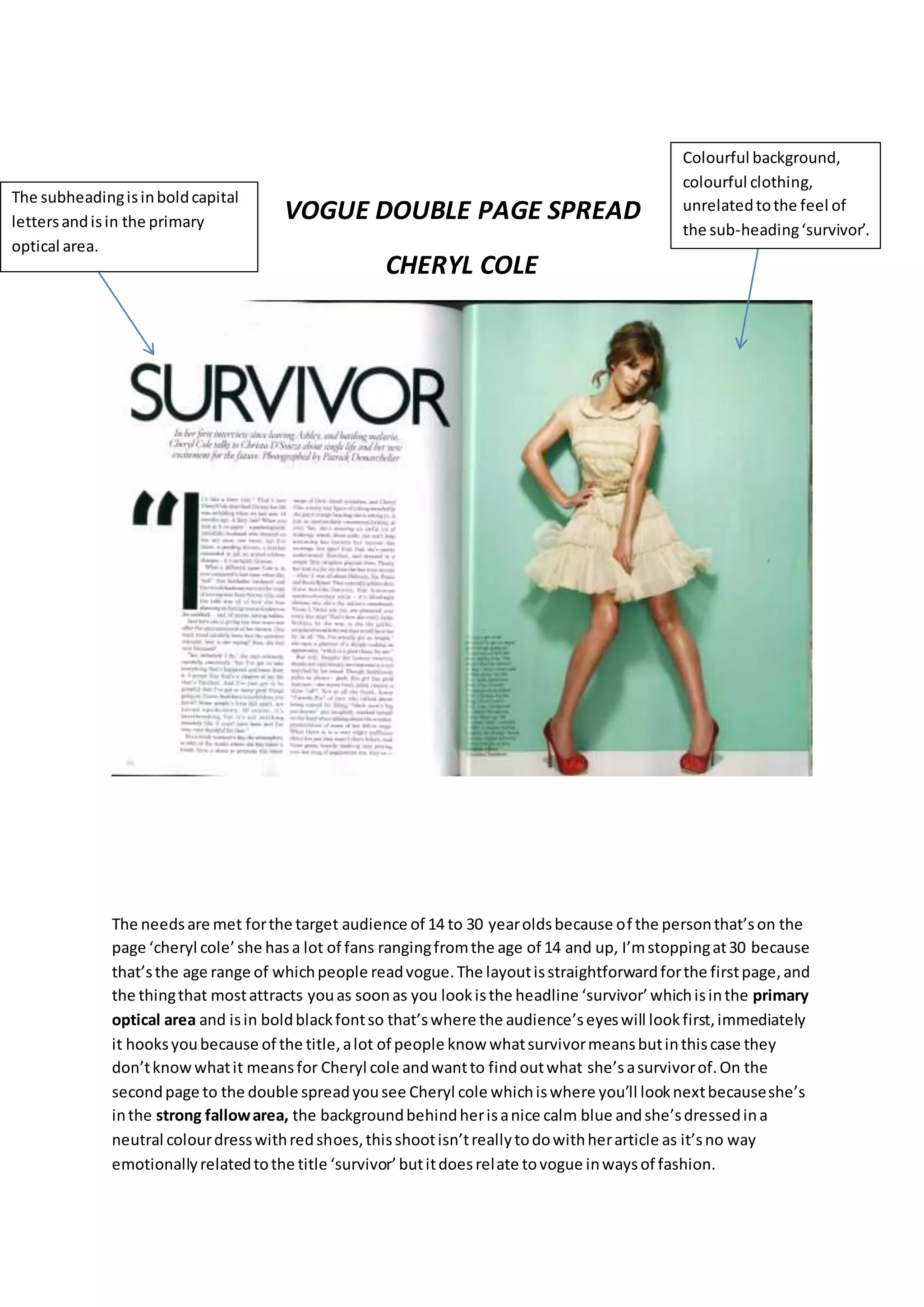
VOGUE DOUBLE PAGE SPREAD
CHERYL COLE
The needsare met forthe target audience of 14 to 30 yearoldsbecause of the personthat’son the
page ‘cheryl cole’she hasa lot of fans rangingfromthe age of 14 and up, I’mstoppingat30 because
that’sthe age range of whichpeople readvogue.The layoutisstraightforwardforthe firstpage,and
the thingthat mostattracts youas soonas you lookisthe headline ‘survivor’whichisinthe primary
optical area and isin boldblackfontso that’swhere the audience’seyeswill lookfirst,immediately
it hooksyoubecause of the title,alot of people know whatsurvivormeansbutinthiscase they
don’tknowwhatit meansfor Cheryl cole andwantto findoutwhat she’sasurvivorof.On the
secondpage to the double spreadyousee Cheryl cole whichiswhere you’ll looknextbecauseshe’s
inthe strong fallowarea, the backgroundbehindherisanice calm blue andshe’sdressedina
neutral colourdresswithredshoes,thisshootisn’treallytodowithherarticle as it’sno way
emotionallyrelatedtothe title ‘survivor’butitdoesrelate tovogue inwaysof fashion.
The subheadingisinboldcapital
lettersandisin the primary
optical area.
Colourful background,
colourful clothing,
unrelatedtothe feel of
the sub-heading‘survivor’.
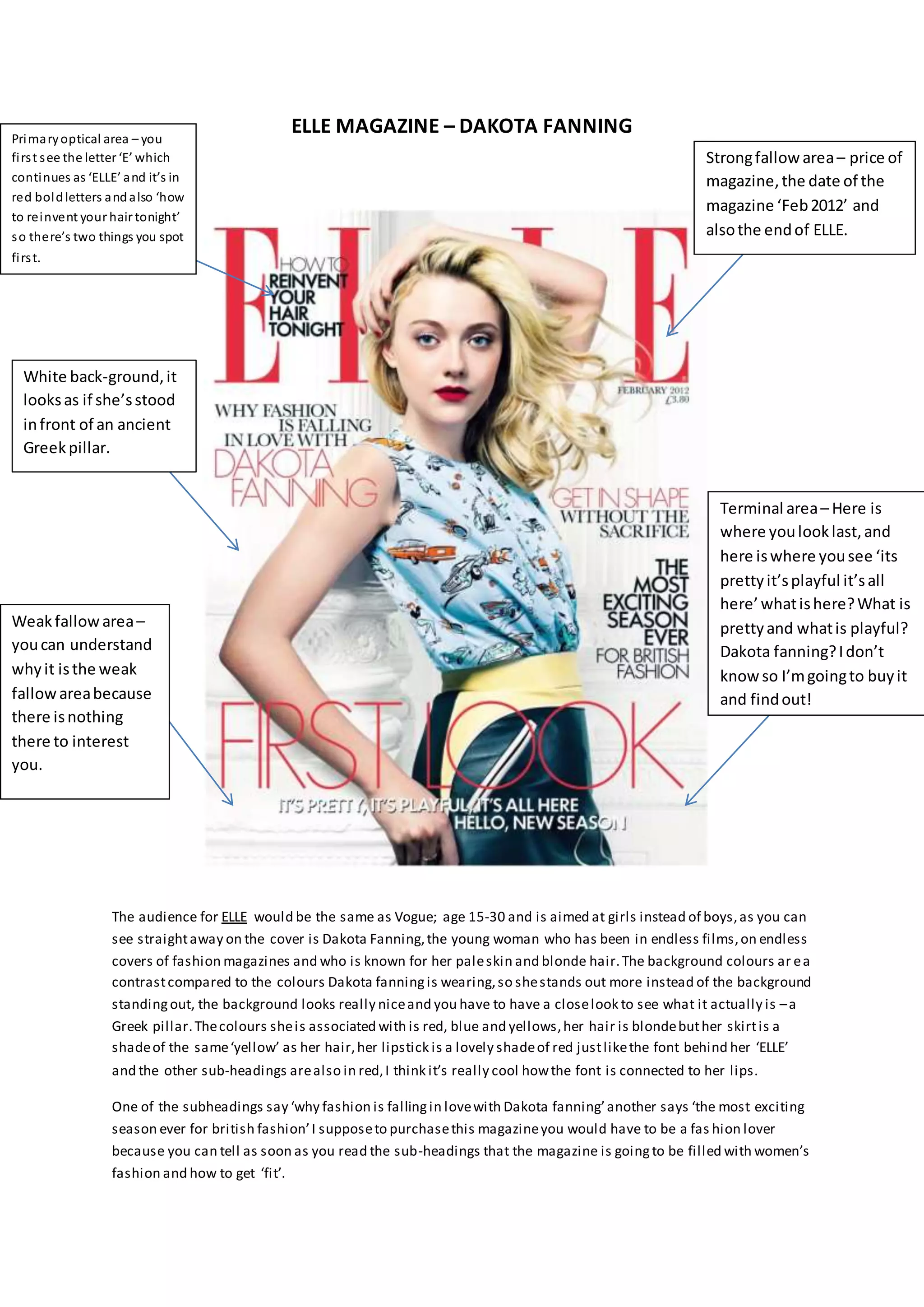
ELLE MAGAZINE – DAKOTA FANNING
The audience for ELLE would be the same as Vogue; age 15-30 and is aimed at girls instead of boys,as you can
see straightaway on the cover is Dakota Fanning,the young woman who has been in endless films,on endless
covers of fashion magazines and who is known for her paleskin and blonde hair.The background colours ar ea
contrastcompared to the colours Dakota fanningis wearing,so shestands out more instead of the background
standingout, the background looks really niceand you have to have a closelook to see what it actually is –a
Greek pillar.Thecolours sheis associated with is red, blue and yellows,her hair is blondebuther skirtis a
shadeof the same‘yellow’ as her hair,her lipstick is a lovely shadeof red justlikethe font behind her ‘ELLE’
and the other sub-headings arealso in red,I think it’s really cool howthe font is connected to her lips.
One of the subheadings say ‘why fashion is fallingin lovewith Dakota fanning’another says ‘the most exciting
season ever for british fashion’I supposeto purchasethis magazineyou would have to be a fas hion lover
because you can tell as soon as you read the sub-headings that the magazine is goingto be filled with women’s
fashion and how to get ‘fit’.
Primaryoptical area – you
first see the letter ‘E’ which
continues as ‘ELLE’ and it’s in
red boldletters andalso ‘how
to reinvent your hair tonight’
so there’s two things you spot
first.
Strongfallowarea– price of
magazine,the date of the
magazine ‘Feb2012’ and
alsothe endof ELLE.
Weakfallowarea–
youcan understand
whyit isthe weak
fallowareabecause
there isnothing
there to interest
you.
Terminal area– Here is
where youlooklast,and
here iswhere yousee ‘its
prettyit’splayful it’sall
here’whatishere?What is
prettyand whatis playful?
Dakota fanning?Idon’t
know so I’mgoingto buyit
and findout!
White back-ground,it
looksas if she’sstood
infront of an ancient
Greekpillar.
Q Magazine Double-Spread
S
Thisdouble page spreadshowsthe rapperJAY-Z.Therefore the Genre of the magazine isHipHop.
Howeverthe name of the magazine is'Q-magazine'andit'spublishedmonthlyinthe UK.The rapper
Jay-zisplacedon the leftpage andis photographedasa close up.On the rightside isthe article
aboutJay-zand the backgroundshowsa capital 'J' inred,I thinkthe use of a drop capital inthe
backgroundof the textiseffective becauseitimmediatelyallowsreaderstosee thatthe artist
featuredisJay-Z.Thiswouldappeal tothe targetaudience of peopleinterestedinRap/Hip-Hop
musicbecause of the layout. The textisquite small asit isan article and all of the informationneeds
to be in.The fontisa mature,plainfonttoappeal to the targetaudience,andmakingiteasyto read.
The vocabularyusedisa lotof quotesfromJay-Zand otherartists,relevanttothe article.The
language isformal andit useswide range of sentences - nopunsor colloquial language isused
because of theirtargetaudience. Ialsothinkthe colouringisveryeffectiveonJay-Z’sprofile because
it isn’tshowingjustone primarycolour,it’sshowingtwo –red and blue,Ithinkthe meaningof thisis
Primaryoptical area–
The lightingonthe left
side isredwhichis a
colouryou wouldspot
straightaway.
Strongfallow area–
Afterlookingatthe primary
optical area,your eyesthen
go to the strong fallow area
where yousee a heavenly
blue,abig contrastto red.
Extreme close
up of Jay-Z is
used, on the
left sideof the
double spread.
The big ‘J’further
suggeststhatJay-Zis a
bigartist,the colourred
alsosuggeststhathe is
currentlyina dark,evil
state of mind.
Thisstateshe hasa
splitpersonality –a
calm side (blue)anda
evil side (red)
splitpersonality;thathe hastwo personality’sandredishisangerand blue ishisserenitywhichhe
showsbothin hismusicand that is an excellentuse of aconnotation.
PR8: Product Research

PR8: Product Research

  • 1.
    Vogue (AUS) FrontCover The needs are met for the audience of 15-30 middle class/working classpeople because of the font’s usedandthe portrait image ofLana del Rey, everybodyknows whoshe is andshe isn’t a tackysinger she’s modest andelegant. Inthe primary optical andstrong fallow area you can see the start andend ofthe title ‘vogue’ andwhenpeople are lookingfor a magazine to read this is where theynormallylook to see the titles soit is inthe right place. In the axis oforientationyou can see Lana del Reyand all ofher beautyso ofcourse that is anattraction, anda lot ofpeople are inspiredbyher so if theysee her on the cover theywillexpect there to be an article/interviewinside about her although it doesjust sayshe’s the cover girl. Inthe terminal area it says ‘fashionandmusic’ inbeautiful bright white writing, normallyvogue is directedat fashionbut theyare involving music andthat willbe a connectionto Lana beingon the cover. Close-upof Lana you cansee the details ofher makeup and accessories, it’s more personal, direct mode ofaddress, she’s an attractive modelwhichis what youexpect in a vogue magazine. The font appeals more to womennot just because of the font usedbut becauseof the words ‘cover girl’ ‘super spring style’ ‘girls club’ ‘beautyupdate’ alsoit’s more sophisticatedthanother magazines yousee. It’s not onlyattractingvogue readers but it’s attractingher fanbase as well, manyof her fans maynot readvogue but will readit because she’s onthe cover andwill know that there willbe an interview inside from her. Goldconnotes rich, glamorous, sophisticated and that’s what vogue is but also what Lana Del Reyis. The font colour is gold,in a way it matches Lana because ofher accessories, gold represents wealth,glamour etc. Some of the subheadings are in bold to either show the importance or to just grab the audience’s attention.
  • 2.
    VOGUE DOUBLE PAGESPREAD CHERYL COLE The needsare met forthe target audience of 14 to 30 yearoldsbecause of the personthat’son the page ‘cheryl cole’she hasa lot of fans rangingfromthe age of 14 and up, I’mstoppingat30 because that’sthe age range of whichpeople readvogue.The layoutisstraightforwardforthe firstpage,and the thingthat mostattracts youas soonas you lookisthe headline ‘survivor’whichisinthe primary optical area and isin boldblackfontso that’swhere the audience’seyeswill lookfirst,immediately it hooksyoubecause of the title,alot of people know whatsurvivormeansbutinthiscase they don’tknowwhatit meansfor Cheryl cole andwantto findoutwhat she’sasurvivorof.On the secondpage to the double spreadyousee Cheryl cole whichiswhere you’ll looknextbecauseshe’s inthe strong fallowarea, the backgroundbehindherisanice calm blue andshe’sdressedina neutral colourdresswithredshoes,thisshootisn’treallytodowithherarticle as it’sno way emotionallyrelatedtothe title ‘survivor’butitdoesrelate tovogue inwaysof fashion. The subheadingisinboldcapital lettersandisin the primary optical area. Colourful background, colourful clothing, unrelatedtothe feel of the sub-heading‘survivor’.
  • 3.
    ELLE MAGAZINE –DAKOTA FANNING The audience for ELLE would be the same as Vogue; age 15-30 and is aimed at girls instead of boys,as you can see straightaway on the cover is Dakota Fanning,the young woman who has been in endless films,on endless covers of fashion magazines and who is known for her paleskin and blonde hair.The background colours ar ea contrastcompared to the colours Dakota fanningis wearing,so shestands out more instead of the background standingout, the background looks really niceand you have to have a closelook to see what it actually is –a Greek pillar.Thecolours sheis associated with is red, blue and yellows,her hair is blondebuther skirtis a shadeof the same‘yellow’ as her hair,her lipstick is a lovely shadeof red justlikethe font behind her ‘ELLE’ and the other sub-headings arealso in red,I think it’s really cool howthe font is connected to her lips. One of the subheadings say ‘why fashion is fallingin lovewith Dakota fanning’another says ‘the most exciting season ever for british fashion’I supposeto purchasethis magazineyou would have to be a fas hion lover because you can tell as soon as you read the sub-headings that the magazine is goingto be filled with women’s fashion and how to get ‘fit’. Primaryoptical area – you first see the letter ‘E’ which continues as ‘ELLE’ and it’s in red boldletters andalso ‘how to reinvent your hair tonight’ so there’s two things you spot first. Strongfallowarea– price of magazine,the date of the magazine ‘Feb2012’ and alsothe endof ELLE. Weakfallowarea– youcan understand whyit isthe weak fallowareabecause there isnothing there to interest you. Terminal area– Here is where youlooklast,and here iswhere yousee ‘its prettyit’splayful it’sall here’whatishere?What is prettyand whatis playful? Dakota fanning?Idon’t know so I’mgoingto buyit and findout! White back-ground,it looksas if she’sstood infront of an ancient Greekpillar.
  • 4.
    Q Magazine Double-Spread S Thisdoublepage spreadshowsthe rapperJAY-Z.Therefore the Genre of the magazine isHipHop. Howeverthe name of the magazine is'Q-magazine'andit'spublishedmonthlyinthe UK.The rapper Jay-zisplacedon the leftpage andis photographedasa close up.On the rightside isthe article aboutJay-zand the backgroundshowsa capital 'J' inred,I thinkthe use of a drop capital inthe backgroundof the textiseffective becauseitimmediatelyallowsreaderstosee thatthe artist featuredisJay-Z.Thiswouldappeal tothe targetaudience of peopleinterestedinRap/Hip-Hop musicbecause of the layout. The textisquite small asit isan article and all of the informationneeds to be in.The fontisa mature,plainfonttoappeal to the targetaudience,andmakingiteasyto read. The vocabularyusedisa lotof quotesfromJay-Zand otherartists,relevanttothe article.The language isformal andit useswide range of sentences - nopunsor colloquial language isused because of theirtargetaudience. Ialsothinkthe colouringisveryeffectiveonJay-Z’sprofile because it isn’tshowingjustone primarycolour,it’sshowingtwo –red and blue,Ithinkthe meaningof thisis Primaryoptical area– The lightingonthe left side isredwhichis a colouryou wouldspot straightaway. Strongfallow area– Afterlookingatthe primary optical area,your eyesthen go to the strong fallow area where yousee a heavenly blue,abig contrastto red. Extreme close up of Jay-Z is used, on the left sideof the double spread. The big ‘J’further suggeststhatJay-Zis a bigartist,the colourred alsosuggeststhathe is currentlyina dark,evil state of mind. Thisstateshe hasa splitpersonality –a calm side (blue)anda evil side (red)
  • 5.
    splitpersonality;thathe hastwo personality’sandredishisangerandblue ishisserenitywhichhe showsbothin hismusicand that is an excellentuse of aconnotation.