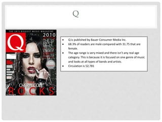
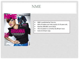
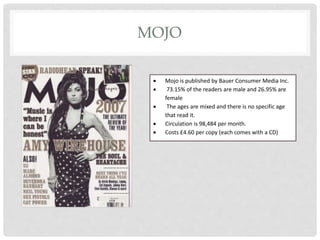
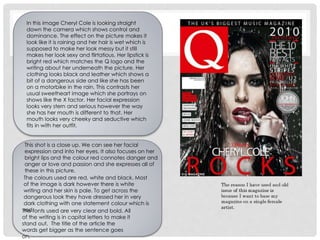
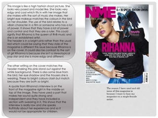
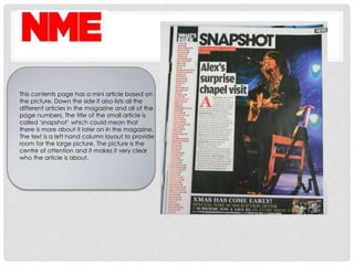
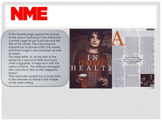
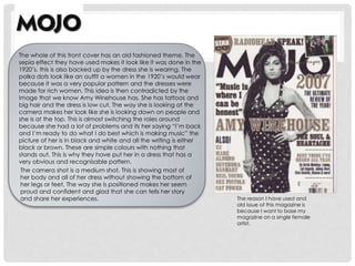
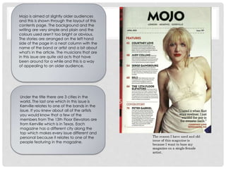
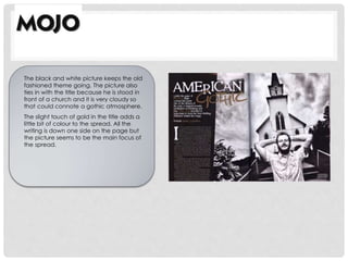
MUSIC MAGAZINES IN
THE UK
Q
 Q is published by Bauer Consumer Media Inc.
 68.3% of readers are male compared with 31.75 that are
female.
 The age range is very mixed and there isn’t any real age
category. This is because it is focused on one genre of music
and looks at all types of bands and artists.
 Circulation is 52,781
NME
 NME is published by Time Inc.
 66% of readers are male mostly 15-35 years old,
 Read by 289,000. (June 2012)
 The circulation is currently 18,184 per issue.
 Costs £2.50 per copy
MOJO
 Mojo is published by Bauer Consumer Media Inc.
 73.15% of the readers are male and 26.95% are
female
 The ages are mixed and there is no specific age
that read it.
 Circulation is 98,484 per month.
 Costs £4.60 per copy (each comes with a CD)
This shot is a close up. We can see her facial
expression and into her eyes. It also focuses on her
bright lips and the colour red connotes danger and
anger or love and passion and she expresses all of
these in this picture.
The colours used are red, white and black. Most
of the image is dark however there is white
writing and her skin is pale. To get across the
dangerous look they have dressed her in very
dark clothing with one statement colour which is
red.The fonts used are very clear and bold. All
of the writing is in capital letters to make it
stand out. The title of the article the
words get bigger as the sentence goes
on.
In this image Cheryl Cole is looking straight
down the camera which shows control and
dominance. The effect on the picture makes it
look like it is raining and her hair is wet which is
supposed to make her look messy but it still
makes her look sexy and flirtatious. Her lipstick is
bright red which matches the Q logo and the
writing about her underneath the picture. Her
clothing looks black and leather which shows a
bit of a dangerous side and like she has been
on a motorbike in the rain. This contrasts her
usual sweetheart image which she portrays on
shows like the X factor. Her facial expression
looks very stern and serious however the way
she has her mouth is different to that. Her
mouth looks very cheeky and seductive which
fits in with her outfit.
The main stories have the page number in a
larger font than the rest of the text. This make
it very clear where the main stories are and
which page to find them on.
The contents page for Q is very simplistic. The
story from the front cover has the most
coverage on the contents page which in this
issue is Cheryl Cole. There is only a small
amount on what is in the magazine because if
they included every single article the contents
would be pages long. This page only shows 5
of the stories that are in the magazine instead
of listing them all. The colours used are the
same as the ones on the cover which ties in
and keeps the theme running.
It is typical of Q to have a picture of the
artist on one page and the article on the
other page. The page is completely white
and has black writing but with a large C
across the text that is in the signature red.
The large C is then repeated in the article
but this time used to start a sentence. This
repetition makes it a classic trait of a Q
article. Because Cheryl Cole is very well
known for being an attractive woman and
that is one of the things that has helped her
become so famous they use two pictures
instead of one. This could be to exaggerate
the fact that her appearance is very
important and people want to see pictures
of her
This image is like a high fashion shoot picture. She
looks very posed and model like. She looks very
edgy and cool which fits in with her image that
she makes with the sort of music she makes. Her
bright eye makeup matches the colours in the bird
on her shoulder. The use of the bird relates to a
villain character in a film or someone who has a lot
of power. It shows that they have a lot of power
and control and that they are a ruler. This could
signify that Rihanna is the queen of RnB music and
she is an established artist.
The header is in a bright pink rather than the usual
red which could be saying that they style of the
magazine is different this issue because Rihanna is
on the cover. It could also be contrast to the sort
of girl Rihanna is because she isn't a stereotypical
pop star and she is more edgy and different.
The other writing on the cover matches the
header making this pink stand out against the
white background. There is also some blue from
the bird, her eye shadow and the trousers she is
wearing. These to bright colours clash but match
because they are both so bright.
A quote from Rihanna's interview is on the
front of the magazine right in the middle on
top of the image. They have used a part that
makes her sound quite strong and
independent and they have included a
section with swearing in it. This shows that the
interview is really raw and she speaks
truthfully about her experiences and so it
would not be appropriate for children.
This contents page has a mini article based on
the picture. Down the side it also lists all the
different articles in the magazine and all of the
page numbers. The title of the small article is
called ‘snapshot’ which could mean that
there is more about it later on in the magazine.
The text is a left hand column layout to provide
room for the large picture. The picture is the
centre of attention and it makes it very clear
who the article is about.
In this double page spread the picture
of the person featuring in the article has
a whole page for just a picture and the
title of the article. This is showing the
importance of picture within the media
and that image is very important as well
as talent.
The large letter ‘A’ at the start of the
sentence is typical of NME and many
other magazines. It helps tie in with the
colour scheme. The writing is arranged
into columns to stick to the magazine
layout.
They have also picked out a quote from
in the interview to frame in the middle
of the main writing.
The reason I have used and
old issue of this magazine is
because I want to base my
magazine on a single female
artist.
The whole of this front cover has an old fashioned theme. The
sepia effect they have used makes it look like it was done in the
1920’s. this is also backed up by the dress she is wearing. The
polka dots look like an outfit a women in the 1920’s would wear
because it was a very popular pattern and the dresses were
made for rich women. This idea is then contradicted by the
image that we know Amy Winehouse has. She has tattoos and
big hair and the dress is low cut. The way she is looking at the
camera makes her look like she is looking down on people and
she is at the top. This is almost switching the roles around
because she had a lot of problems and its her saying “I’m back
and I’m ready to do what I do best which is making music” the
picture of her is in black and white and all the writing is either
black or brown. These are simple colours with nothing that
stands out. This is why they have put her in a dress that has a
very obvious and recognisable pattern.
The camera shot is a medium shot. This is showing most of
her body and all of her dress without showing the bottom of
her legs or feet. The way she is positioned makes her seem
proud and confident and glad that she can tells her story
and share her experiences.
Mojo is aimed at slightly older audiences
and this is shown through the layout of this
contents page. The background and the
writing are very simple and plain and the
colours used aren't too bright or obvious.
The stories are arranged on the left hand
side of the page in a neat column with the
name of the band or artist and a bit about
what's in the article. The musicians that are
in this issue are quite old acts that have
been around for a while and this is a way
of appealing to an older audience.
Under the title there are 3 cities in the
world. The last one which in this issue is
Kerrville relates to one of the bands in the
issue. If you knew about all of the artists
you would know that a few of the
members from The 13th Floor Elevators are
from Kerrville which is in Texas. Each
magazine has a different city along the
top which makes every issue different and
personal because it relates to one of the
people featuring in the magazine.
The black and white picture keeps the old
fashioned theme going. The picture also
ties in with the title because he is stood in
front of a church and it is very cloudy so
that could connote a gothic atmosphere.
The slight touch of gold in the title adds a
little bit of colour to the spread. All the
writing is down one side on the page but
the picture seems to be the main focus of
the spread.

Music magazines in the uk

  • 1.
  • 2.
    Q  Q ispublished by Bauer Consumer Media Inc.  68.3% of readers are male compared with 31.75 that are female.  The age range is very mixed and there isn’t any real age category. This is because it is focused on one genre of music and looks at all types of bands and artists.  Circulation is 52,781
  • 3.
    NME  NME ispublished by Time Inc.  66% of readers are male mostly 15-35 years old,  Read by 289,000. (June 2012)  The circulation is currently 18,184 per issue.  Costs £2.50 per copy
  • 4.
    MOJO  Mojo ispublished by Bauer Consumer Media Inc.  73.15% of the readers are male and 26.95% are female  The ages are mixed and there is no specific age that read it.  Circulation is 98,484 per month.  Costs £4.60 per copy (each comes with a CD)
  • 5.
    This shot isa close up. We can see her facial expression and into her eyes. It also focuses on her bright lips and the colour red connotes danger and anger or love and passion and she expresses all of these in this picture. The colours used are red, white and black. Most of the image is dark however there is white writing and her skin is pale. To get across the dangerous look they have dressed her in very dark clothing with one statement colour which is red.The fonts used are very clear and bold. All of the writing is in capital letters to make it stand out. The title of the article the words get bigger as the sentence goes on. In this image Cheryl Cole is looking straight down the camera which shows control and dominance. The effect on the picture makes it look like it is raining and her hair is wet which is supposed to make her look messy but it still makes her look sexy and flirtatious. Her lipstick is bright red which matches the Q logo and the writing about her underneath the picture. Her clothing looks black and leather which shows a bit of a dangerous side and like she has been on a motorbike in the rain. This contrasts her usual sweetheart image which she portrays on shows like the X factor. Her facial expression looks very stern and serious however the way she has her mouth is different to that. Her mouth looks very cheeky and seductive which fits in with her outfit.
  • 6.
    The main storieshave the page number in a larger font than the rest of the text. This make it very clear where the main stories are and which page to find them on. The contents page for Q is very simplistic. The story from the front cover has the most coverage on the contents page which in this issue is Cheryl Cole. There is only a small amount on what is in the magazine because if they included every single article the contents would be pages long. This page only shows 5 of the stories that are in the magazine instead of listing them all. The colours used are the same as the ones on the cover which ties in and keeps the theme running.
  • 7.
    It is typicalof Q to have a picture of the artist on one page and the article on the other page. The page is completely white and has black writing but with a large C across the text that is in the signature red. The large C is then repeated in the article but this time used to start a sentence. This repetition makes it a classic trait of a Q article. Because Cheryl Cole is very well known for being an attractive woman and that is one of the things that has helped her become so famous they use two pictures instead of one. This could be to exaggerate the fact that her appearance is very important and people want to see pictures of her
  • 8.
    This image islike a high fashion shoot picture. She looks very posed and model like. She looks very edgy and cool which fits in with her image that she makes with the sort of music she makes. Her bright eye makeup matches the colours in the bird on her shoulder. The use of the bird relates to a villain character in a film or someone who has a lot of power. It shows that they have a lot of power and control and that they are a ruler. This could signify that Rihanna is the queen of RnB music and she is an established artist. The header is in a bright pink rather than the usual red which could be saying that they style of the magazine is different this issue because Rihanna is on the cover. It could also be contrast to the sort of girl Rihanna is because she isn't a stereotypical pop star and she is more edgy and different. The other writing on the cover matches the header making this pink stand out against the white background. There is also some blue from the bird, her eye shadow and the trousers she is wearing. These to bright colours clash but match because they are both so bright. A quote from Rihanna's interview is on the front of the magazine right in the middle on top of the image. They have used a part that makes her sound quite strong and independent and they have included a section with swearing in it. This shows that the interview is really raw and she speaks truthfully about her experiences and so it would not be appropriate for children.
  • 9.
    This contents pagehas a mini article based on the picture. Down the side it also lists all the different articles in the magazine and all of the page numbers. The title of the small article is called ‘snapshot’ which could mean that there is more about it later on in the magazine. The text is a left hand column layout to provide room for the large picture. The picture is the centre of attention and it makes it very clear who the article is about.
  • 10.
    In this doublepage spread the picture of the person featuring in the article has a whole page for just a picture and the title of the article. This is showing the importance of picture within the media and that image is very important as well as talent. The large letter ‘A’ at the start of the sentence is typical of NME and many other magazines. It helps tie in with the colour scheme. The writing is arranged into columns to stick to the magazine layout. They have also picked out a quote from in the interview to frame in the middle of the main writing.
  • 11.
    The reason Ihave used and old issue of this magazine is because I want to base my magazine on a single female artist. The whole of this front cover has an old fashioned theme. The sepia effect they have used makes it look like it was done in the 1920’s. this is also backed up by the dress she is wearing. The polka dots look like an outfit a women in the 1920’s would wear because it was a very popular pattern and the dresses were made for rich women. This idea is then contradicted by the image that we know Amy Winehouse has. She has tattoos and big hair and the dress is low cut. The way she is looking at the camera makes her look like she is looking down on people and she is at the top. This is almost switching the roles around because she had a lot of problems and its her saying “I’m back and I’m ready to do what I do best which is making music” the picture of her is in black and white and all the writing is either black or brown. These are simple colours with nothing that stands out. This is why they have put her in a dress that has a very obvious and recognisable pattern. The camera shot is a medium shot. This is showing most of her body and all of her dress without showing the bottom of her legs or feet. The way she is positioned makes her seem proud and confident and glad that she can tells her story and share her experiences.
  • 12.
    Mojo is aimedat slightly older audiences and this is shown through the layout of this contents page. The background and the writing are very simple and plain and the colours used aren't too bright or obvious. The stories are arranged on the left hand side of the page in a neat column with the name of the band or artist and a bit about what's in the article. The musicians that are in this issue are quite old acts that have been around for a while and this is a way of appealing to an older audience. Under the title there are 3 cities in the world. The last one which in this issue is Kerrville relates to one of the bands in the issue. If you knew about all of the artists you would know that a few of the members from The 13th Floor Elevators are from Kerrville which is in Texas. Each magazine has a different city along the top which makes every issue different and personal because it relates to one of the people featuring in the magazine.
  • 13.
    The black andwhite picture keeps the old fashioned theme going. The picture also ties in with the title because he is stood in front of a church and it is very cloudy so that could connote a gothic atmosphere. The slight touch of gold in the title adds a little bit of colour to the spread. All the writing is down one side on the page but the picture seems to be the main focus of the spread.