The double page spread features images of the band Architects on tour and performing. The warm colored images show the band's energetic live performances and behind-the-scenes tour activities. A block of text includes a quote from the lead singer stating that their fans feel a real connection to the band's music. The informal layout places the impactful images above the text, reflecting the band's casual style.
Palestra proferida pelo empresário David Soares aos alunos de Secretariado Executivo Trilíngue da Universidade do Estado do Pará. Disciplina Consultoria Organizacional ministrada pelo Prof Alexandre Gaia.
Grammarware engineering: un enfoque dirigido por modelosPatxi Gortázar
El objetivo de la tesis es proporcionar un enfoque up-down, en lugar de un enfoque down-up en la construcción de herramientas de soporte para lenguajes de programación.
La idea principal es definir el lenguaje partiendo de su sintaxis abstracta (un modelo orientado a objetos) y decorar posteriormente este modelo con la sintaxis concreta.
A partir de ahí, mediante técnicas de MDE, se pueden generar diferentes tipos de herramientas como editores, compiladores o parsers.
How to Make a Field invisible in Odoo 17Celine George
It is possible to hide or invisible some fields in odoo. Commonly using “invisible” attribute in the field definition to invisible the fields. This slide will show how to make a field invisible in odoo 17.
Welcome to TechSoup New Member Orientation and Q&A (May 2024).pdfTechSoup
In this webinar you will learn how your organization can access TechSoup's wide variety of product discount and donation programs. From hardware to software, we'll give you a tour of the tools available to help your nonprofit with productivity, collaboration, financial management, donor tracking, security, and more.
Introduction to AI for Nonprofits with Tapp NetworkTechSoup
Dive into the world of AI! Experts Jon Hill and Tareq Monaur will guide you through AI's role in enhancing nonprofit websites and basic marketing strategies, making it easy to understand and apply.
Synthetic Fiber Construction in lab .pptxPavel ( NSTU)
Synthetic fiber production is a fascinating and complex field that blends chemistry, engineering, and environmental science. By understanding these aspects, students can gain a comprehensive view of synthetic fiber production, its impact on society and the environment, and the potential for future innovations. Synthetic fibers play a crucial role in modern society, impacting various aspects of daily life, industry, and the environment. ynthetic fibers are integral to modern life, offering a range of benefits from cost-effectiveness and versatility to innovative applications and performance characteristics. While they pose environmental challenges, ongoing research and development aim to create more sustainable and eco-friendly alternatives. Understanding the importance of synthetic fibers helps in appreciating their role in the economy, industry, and daily life, while also emphasizing the need for sustainable practices and innovation.
Unit 8 - Information and Communication Technology (Paper I).pdfThiyagu K
This slides describes the basic concepts of ICT, basics of Email, Emerging Technology and Digital Initiatives in Education. This presentations aligns with the UGC Paper I syllabus.
Biological screening of herbal drugs: Introduction and Need for
Phyto-Pharmacological Screening, New Strategies for evaluating
Natural Products, In vitro evaluation techniques for Antioxidants, Antimicrobial and Anticancer drugs. In vivo evaluation techniques
for Anti-inflammatory, Antiulcer, Anticancer, Wound healing, Antidiabetic, Hepatoprotective, Cardio protective, Diuretics and
Antifertility, Toxicity studies as per OECD guidelines
Operation “Blue Star” is the only event in the history of Independent India where the state went into war with its own people. Even after about 40 years it is not clear if it was culmination of states anger over people of the region, a political game of power or start of dictatorial chapter in the democratic setup.
The people of Punjab felt alienated from main stream due to denial of their just demands during a long democratic struggle since independence. As it happen all over the word, it led to militant struggle with great loss of lives of military, police and civilian personnel. Killing of Indira Gandhi and massacre of innocent Sikhs in Delhi and other India cities was also associated with this movement.
Acetabularia Information For Class 9 .docxvaibhavrinwa19
Acetabularia acetabulum is a single-celled green alga that in its vegetative state is morphologically differentiated into a basal rhizoid and an axially elongated stalk, which bears whorls of branching hairs. The single diploid nucleus resides in the rhizoid.
Model Attribute Check Company Auto PropertyCeline George
In Odoo, the multi-company feature allows you to manage multiple companies within a single Odoo database instance. Each company can have its own configurations while still sharing common resources such as products, customers, and suppliers.
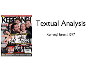
2. Colour
The main colours of this page are white, black and red. Black is usually used in Kerrang! As it is colour associated with the genre of
music the magazine represents. White is likely used to create a contrast to the black and therefore make the text visible and the
Front Page
red is likely used to draw attention to the most important bits of information on the page.
Layout and design
The large image of the band is layered above the title of the magazine, which might show that they have something featuring in this
issue which is more important and different from the usual magazine issue. The name of the band is also positioned with the image,
as the text is just under the faces of the band members. This shows the band itself for those who recognize them from the image,
and informs those who do not them that well. The bands showed on the bottom of the page shows the readers who is featured in
the magazine, however, because they are under the larger image and are much smaller in size, it suggests that they are not covered
in as much detail as the main band, who has a larger portion of the front cover than the rest.
Images
The images on the page show different bands that are featured in this issue of the magazine. The large image in the middle of the
page shows a band which is featured as a main article, likely because they are covered in greater detail. The other images on the
bottom show the rest of the artists in the magazine,
Pose, style, hair, makeup
The image of the band has them in a casual outfit and in a pose that was specifically for the image. This pose reflects the style of
the band; energetic, not caring and different. Their looks are no different from their usual, they just as they normally perform,
which might be deliberate, in order to show that they are genuine on stage and that this is how they dress every day.
Composition and Framing
As four out five of the models in the main image are looking at the camera, as well as the lead singer of the band reaching out
towards to the camera, it shows interaction with the audience. As the shot is a medium shot, it implies that the band is close to
their audience and they are an active band. The image draws the attention of the audience very well, and the images at the bottom
informs them about what is included in the magazine as well.
Written codes
The caption under the Architects title says “We don’t listen to heavy music!”, which should grab the attention of the readers, as
Theories they are a well known band in the heavy music genre. This would make the audience want to read on, as they would want to find
The theory Representation and Stereotypes by out why they would say such a thing, find out the whole story.
Branston G and Stafford R (2010) can be applied to Also, the caption saying “We’re here to conquer!” is attention grabbing, as it is a bit intimidating, and therefore makes the readers
this magazine cover. As the band shown on the want to find out about the whole story, what is happening with this band.
cover represents a certain stereotype of the people
who enjoy heavy music and similar, it could end up Language
in the evaluation of the said group. As the image There is only limited amounts of text on this page, but the overall language type used in Kerrang! is informal and casual, as it is
shows the band members acting in an immature aimed at teenagers and young adults, it is more suitable for the target market.
fashion, people might make an evaluation of the
stereotyped group as all of them would act the Overall impression
same way. The image works very well on the front page, as the artists show that they’re young, fun and energetic, which some audience will
relate to, and will draw the readers in. The colour selection is fitting as it fits the music genre and creates a great theme to the
magazine.
3. Colour
The main colours of this page are black, white and yellow. Once again, black and white are used to create a contrast in order to make text
visible and also to create a theme as well, as a black and white is used as well on the top of the page. Yellow is used to highlight the most
important bits of information once again.
Layout and design
As on the top of the page a large title says ‘Contents’, it gives us an idea of what is included in the magazine, however on the bottom half of
the page there’s ‘Kerrang! this week’ it gives us even more content information. As there is specific content placed above the larger chunk of
information, it suggests that that bit of information is more important than the rest, like it is special content. At the bottom, the different
type of content is divided and listed under separate titles, such as ‘news’, ‘albums’ and ‘gig guide’. This gives a good idea of what is included in
Contents page this release of the magazine, which is the aim of this page.
Images
The main image of this page is the performer at the top of the page. This image is in black and white, likely in order to create a colour
scheme for the page, which is black, white and yellow. All images on this page show different artist featured in the magazine except one.
These images help give the audience a better idea of what is included and it also sets a style and genre for the magazine by showing the type
of artists who appear in the magazine. As this is the content page of the magazine,
Pose, style, hair, makeup
The large image at the top shows an artist performing in their stage outfit, which is quite unique for the band, which means that people
would recognize them from only looking at their appearance. Their pose suggests that they are in middle of their performance, which shows
the audience their image while on stage, suggesting that they are still active.
A smaller image on the left shows an artist in an unusual pose for a magazine, which promotes rebellious behavior and difference from the
norm, which some of the readers would relate to.
Composition and Framing
The first thing the audience will look at when glancing at the page is the large image at the top, which is quite attention grabbing. After that,
the smaller images and the titles informing us of what is included in the issue and then the block of text will be noticed last. This is a great
design as through the use of images the audience will know straight away the content of the issue of the magazine.
Written codes
One of the content headings on the page says ‘Rock’s not dead!’ which would grab the attention of the audience as it is contradictive to a
common phrase which states ‘Rock is dead’. This suggests that this is type of music genre is still available and going, which would make the
fans of such music want to find out why this has been stated in the magazine.
Language
Informal and casual language is a feautre of Kerrang! as it makes the readers feel more comfortable reading the magazine as they can relate
more easily if the style of language is what they are used to on a daily basis. This is used by the creators of the magazine to relate to their
target audience more, therefore make the magazine more effective and therefore more successful.
Overall impression
This page has achieves its purpose of informing the audience of what is included in this issue of the magazine in a very effective way. The
images used inform the readers straight away of the list of things featured and the small amounts of text gives just enough information so
that the audience get a bit of context on the story and makes them want them want to read so they could find out the whole story.
4. Colour
Warm colours are common in the images on the page, which would be related to summer when festivals are usually happening.
This suggests that the band on these p[ages are active and are attending tours still, which is backed up by the context of the
images. Once again white and black are used to create a strong contrast for the text to be easily readable for the audience. A red
background for the quote from the lead artist of the band highlights it and shows the importance of it.
Layout and design
Double page As all of the images on the page are positioned above the chunk of text, it might be implying that activities, events and people
themselves are more important than what people have to say, or the common phrase a ‘a picture is worth a thousand words’.
The images are laid out across the page in an unorganised way, which might reflect the style of the band, meaning that they are
spread non caring and living the life in the moment (while on tour).
Images
The images show the band on tour, performing and showing them ‘behind the scenes’. It gives us an idea of what their life is like
and also sets the image and style of the band in our minds straight away. As these images are showing the band during their tour,
it is likely telling the readers that they are an active band and that they are still performing.
Pose, style, hair, makeup
One of the images capture the lead singer of the band mid-air during a performance, which shows the audience how they perform
at their gigs, which could also give them an idea of the genre of music they produce. This pose also shows that they are energetic
during their performances, which implies that they are great at live performances.
Composition and Framing
As all of the images are placed on top of the pages, the audience will look at the images first, and then the block of text on the
bottom of the page. As
Written codes
The caption saying ‘People feel a real connection to what we’re doing’ implies that the band is close to their fan base, knowing
Theories what they are expected to do and how they are expected to perform. It could also mean that their fan base is loyal and they
Maslow’s Hierarchy of Needs theory can be applied believe that their work is important for these people.
to this article by Abraham Maslow (1954). As the
article shows images of the band performing at a Language
concert, the fan base can be seen, who are seen As most of the page involves giving information about the band, the language is quite formal, however as it is Kerrang!, it still has
here as a group who have a common interest and that casual feel. Also, because some of the text involves quotes from the artists, it reflects the style of the band. The way they
therefore are considered ‘as one’ to a degree. As respond to the questions of the interview would show the readers how they talk and this would relate to their lifestyle.
the audience of this magazine are people who would
be interested in similar type of music, they would
Overall impression
want the be a part of such group in order to
This double page spread has quite a unique layout, however it works, as the visual information and the text is divided on the page.
partially fulfil the ‘belonging and affection needs’ of
The images give a great representation of the band’s genre and their lifestyle and the text gives the readers a detailed description
the hierarchy in the theory.
of the band. Although there is a lot of text on the page, the fans of the band would more than likely read through it, and those
who do not know the band would possibly be tempted to read at least some of the text in order to find out more about the band
which is shown in the pictures.