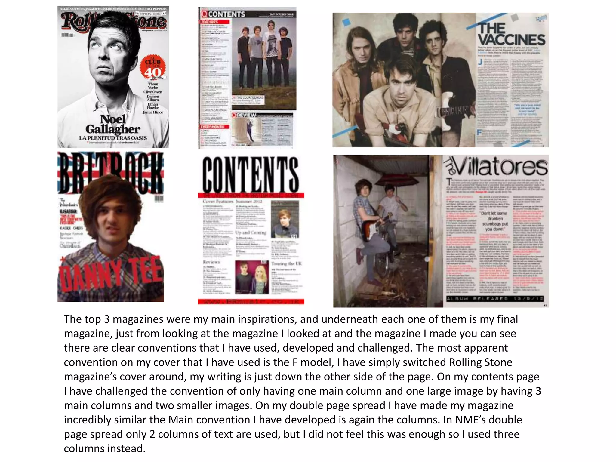
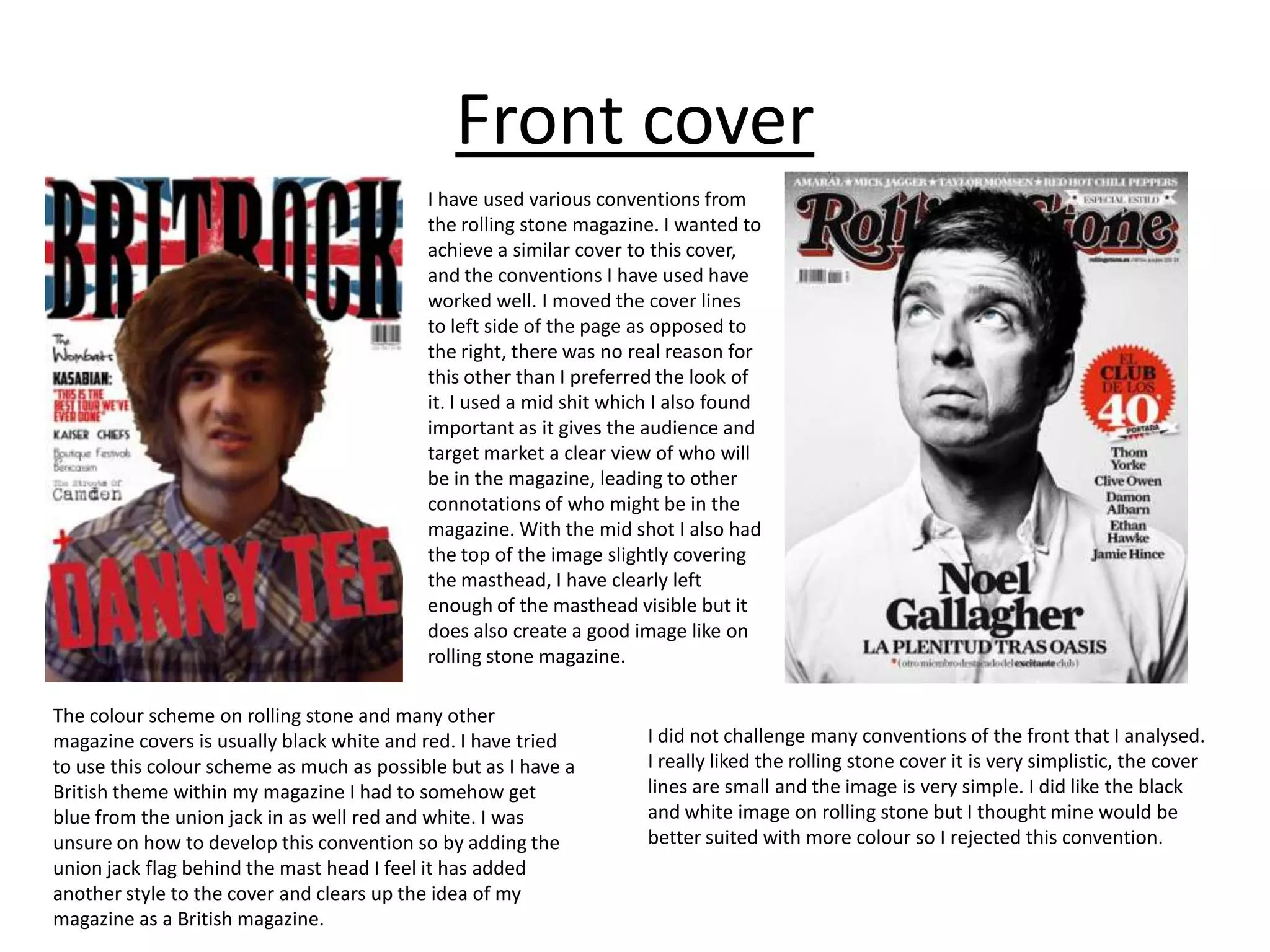
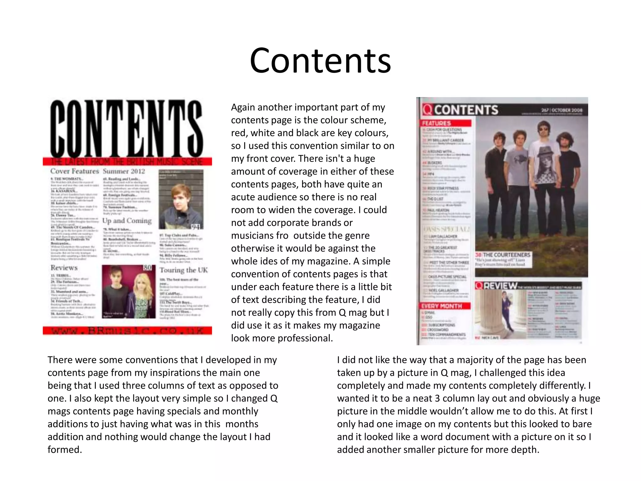
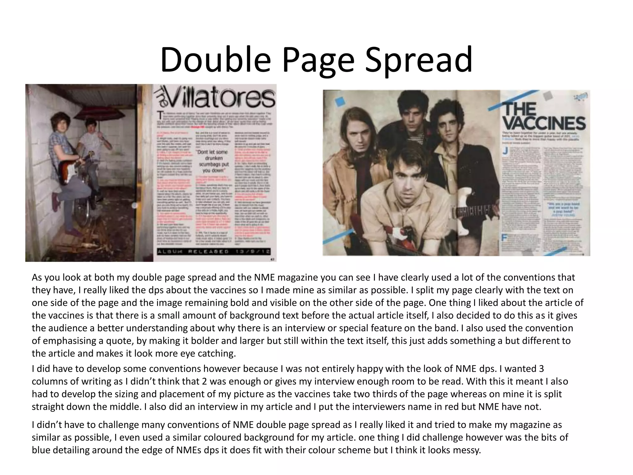
Evaluation Question 1

Q1) In what way does your media product,
  use, develop or challenge forms and
  conventions of real media products?
The top 3 magazines were my main inspirations, and underneath each one of them is my final
magazine, just from looking at the magazine I looked at and the magazine I made you can see
there are clear conventions that I have used, developed and challenged. The most apparent
convention on my cover that I have used is the F model, I have simply switched Rolling Stone
magazine’s cover around, my writing is just down the other side of the page. On my contents page
I have challenged the convention of only having one main column and one large image by having 3
main columns and two smaller images. On my double page spread I have made my magazine
incredibly similar the Main convention I have developed is again the columns. In NME’s double
page spread only 2 columns of text are used, but I did not feel this was enough so I used three
columns instead.
Front cover
                                           I have used various conventions from
                                           the rolling stone magazine. I wanted to
                                           achieve a similar cover to this cover,
                                           and the conventions I have used have
                                           worked well. I moved the cover lines
                                           to left side of the page as opposed to
                                           the right, there was no real reason for
                                           this other than I preferred the look of
                                           it. I used a mid shit which I also found
                                           important as it gives the audience and
                                           target market a clear view of who will
                                           be in the magazine, leading to other
                                           connotations of who might be in the
                                           magazine. With the mid shot I also had
                                           the top of the image slightly covering
                                           the masthead, I have clearly left
                                           enough of the masthead visible but it
                                           does also create a good image like on
                                           rolling stone magazine.

The colour scheme on rolling stone and many other
magazine covers is usually black white and red. I have tried         I did not challenge many conventions of the front that I analysed.
to use this colour scheme as much as possible but as I have a        I really liked the rolling stone cover it is very simplistic, the cover
British theme within my magazine I had to somehow get                lines are small and the image is very simple. I did like the black
blue from the union jack in as well red and white. I was             and white image on rolling stone but I thought mine would be
unsure on how to develop this convention so by adding the            better suited with more colour so I rejected this convention.
union jack flag behind the mast head I feel it has added
another style to the cover and clears up the idea of my
magazine as a British magazine.
Contents
                                          Again another important part of my
                                          contents page is the colour scheme,
                                          red, white and black are key colours,
                                          so I used this convention similar to on
                                          my front cover. There isn't a huge
                                          amount of coverage in either of these
                                          contents pages, both have quite an
                                          acute audience so there is no real
                                          room to widen the coverage. I could
                                          not add corporate brands or
                                          musicians fro outside the genre
                                          otherwise it would be against the
                                          whole ides of my magazine. A simple
                                          convention of contents pages is that
                                          under each feature there is a little bit
                                          of text describing the feature, I did
                                          not really copy this from Q mag but I
                                          did use it as it makes my magazine
                                          look more professional.

There were some conventions that I developed in my                 I did not like the way that a majority of the page has been
contents page from my inspirations the main one                    taken up by a picture in Q mag, I challenged this idea
being that I used three columns of text as opposed to              completely and made my contents completely differently. I
one. I also kept the layout very simple so I changed Q             wanted it to be a neat 3 column lay out and obviously a huge
mags contents page having specials and monthly                     picture in the middle wouldn’t allow me to do this. At first I
additions to just having what was in this months                   only had one image on my contents but this looked to bare
addition and nothing would change the layout I had                 and it looked like a word document with a picture on it so I
formed.                                                            added another smaller picture for more depth.
Double Page Spread


As you look at both my double page spread and the NME magazine you can see I have clearly used a lot of the conventions that
they have, I really liked the dps about the vaccines so I made mine as similar as possible. I split my page clearly with the text on
one side of the page and the image remaining bold and visible on the other side of the page. One thing I liked about the article of
the vaccines is that there is a small amount of background text before the actual article itself, I also decided to do this as it gives
the audience a better understanding about why there is an interview or special feature on the band. I also used the convention
of emphasising a quote, by making it bolder and larger but still within the text itself, this just adds something a but different to
the article and makes it look more eye catching.
I did have to develop some conventions however because I was not entirely happy with the look of NME dps. I wanted 3
columns of writing as I didn’t think that 2 was enough or gives my interview enough room to be read. With this it meant I also
had to develop the sizing and placement of my picture as the vaccines take two thirds of the page whereas on mine it is split
straight down the middle. I also did an interview in my article and I put the interviewers name in red but NME have not.
I didn’t have to challenge many conventions of NME double page spread as I really liked it and tried to make my magazine as
similar as possible, I even used a similar coloured background for my article. one thing I did challenge however was the bits of
blue detailing around the edge of NMEs dps it does fit with their colour scheme but I think it looks messy.

Formated media question 1

  • 1.
    Evaluation Question 1 Q1)In what way does your media product, use, develop or challenge forms and conventions of real media products?
  • 2.
    The top 3magazines were my main inspirations, and underneath each one of them is my final magazine, just from looking at the magazine I looked at and the magazine I made you can see there are clear conventions that I have used, developed and challenged. The most apparent convention on my cover that I have used is the F model, I have simply switched Rolling Stone magazine’s cover around, my writing is just down the other side of the page. On my contents page I have challenged the convention of only having one main column and one large image by having 3 main columns and two smaller images. On my double page spread I have made my magazine incredibly similar the Main convention I have developed is again the columns. In NME’s double page spread only 2 columns of text are used, but I did not feel this was enough so I used three columns instead.
  • 3.
    Front cover I have used various conventions from the rolling stone magazine. I wanted to achieve a similar cover to this cover, and the conventions I have used have worked well. I moved the cover lines to left side of the page as opposed to the right, there was no real reason for this other than I preferred the look of it. I used a mid shit which I also found important as it gives the audience and target market a clear view of who will be in the magazine, leading to other connotations of who might be in the magazine. With the mid shot I also had the top of the image slightly covering the masthead, I have clearly left enough of the masthead visible but it does also create a good image like on rolling stone magazine. The colour scheme on rolling stone and many other magazine covers is usually black white and red. I have tried I did not challenge many conventions of the front that I analysed. to use this colour scheme as much as possible but as I have a I really liked the rolling stone cover it is very simplistic, the cover British theme within my magazine I had to somehow get lines are small and the image is very simple. I did like the black blue from the union jack in as well red and white. I was and white image on rolling stone but I thought mine would be unsure on how to develop this convention so by adding the better suited with more colour so I rejected this convention. union jack flag behind the mast head I feel it has added another style to the cover and clears up the idea of my magazine as a British magazine.
  • 4.
    Contents Again another important part of my contents page is the colour scheme, red, white and black are key colours, so I used this convention similar to on my front cover. There isn't a huge amount of coverage in either of these contents pages, both have quite an acute audience so there is no real room to widen the coverage. I could not add corporate brands or musicians fro outside the genre otherwise it would be against the whole ides of my magazine. A simple convention of contents pages is that under each feature there is a little bit of text describing the feature, I did not really copy this from Q mag but I did use it as it makes my magazine look more professional. There were some conventions that I developed in my I did not like the way that a majority of the page has been contents page from my inspirations the main one taken up by a picture in Q mag, I challenged this idea being that I used three columns of text as opposed to completely and made my contents completely differently. I one. I also kept the layout very simple so I changed Q wanted it to be a neat 3 column lay out and obviously a huge mags contents page having specials and monthly picture in the middle wouldn’t allow me to do this. At first I additions to just having what was in this months only had one image on my contents but this looked to bare addition and nothing would change the layout I had and it looked like a word document with a picture on it so I formed. added another smaller picture for more depth.
  • 5.
    Double Page Spread Asyou look at both my double page spread and the NME magazine you can see I have clearly used a lot of the conventions that they have, I really liked the dps about the vaccines so I made mine as similar as possible. I split my page clearly with the text on one side of the page and the image remaining bold and visible on the other side of the page. One thing I liked about the article of the vaccines is that there is a small amount of background text before the actual article itself, I also decided to do this as it gives the audience a better understanding about why there is an interview or special feature on the band. I also used the convention of emphasising a quote, by making it bolder and larger but still within the text itself, this just adds something a but different to the article and makes it look more eye catching. I did have to develop some conventions however because I was not entirely happy with the look of NME dps. I wanted 3 columns of writing as I didn’t think that 2 was enough or gives my interview enough room to be read. With this it meant I also had to develop the sizing and placement of my picture as the vaccines take two thirds of the page whereas on mine it is split straight down the middle. I also did an interview in my article and I put the interviewers name in red but NME have not. I didn’t have to challenge many conventions of NME double page spread as I really liked it and tried to make my magazine as similar as possible, I even used a similar coloured background for my article. one thing I did challenge however was the bits of blue detailing around the edge of NMEs dps it does fit with their colour scheme but I think it looks messy.