Interactive Powerpoint_How to Master effective communication
Presentation1
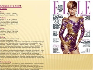
1. Analysis of a Front Cover Genre Women’s Fashion + Lifestyle, Music, Relationships (Love life) Audience Women 21 - 45. As it is a High Fashion magazine the audience could be on a high wage packet. It could also be used as an icon magazine. Colour The G old makes her look more Glamorous and rich. The purple could symbolise Feminity and richness. Styling The Masthead is stretched round her head so the full title is still readable. They have her name in the same colour as the Masthead making it stand ou t more despite it not being the largest fount on the page. The hair style is in 2 different colours and 2 different styles. This could _______ that she will be talking about 2 subjects in this magazine. It could also imply that she thinks of her life/family separately to her music and fashion career. This magazine could possible be used also to advertise the products. If there are details on the clothes that the model is wearing then the audience could purchase them. The younger part of the age group mig ht purchase the magazine to see what there idol is wearing. As the main article is Rihanna, someone who sees Rihanna as an idol would buy the magazine so that they can see what she’s wearing and if there is an interview what the star has been up to. Text and writing They have kept to 2 colours making the text stand out more. The Colours also go well with the plain background. The titles of each inner section are coloured the same as the title. The main article and the title use a much more bold colouring this draws the eye to that part of the cover. The left third also has more information on the starts that are featured in this magazine.
2.
3. The main image is in the left third. This is because it’s the first part of the magazine that you will see. The Main image is here rather than text as its trying to appeal to university students that are looking for jobs. The girl in the photo is well dressed like she's heading to an interview. This is the main things that are on inside the magazine. The main text and subheadings are too small for my liking. I will use the text much larger in mine. I don’t like the font of the maths head its too formal for my liking I believe that a college magazine should be a little informal as well as formal. Overall I think that this magazine would appeal to the formal, smarter, more focused, audience that’s in college. I would prefer to see a less formal magazine. This is just my personal preference. Good Points: Main picture – majority of the survey answers said that they would buy a magazine based on the picture rather than the information. Maybe having a huge picture is a better idea. Bad Points: the size of the font too small.
4. Despite the overall formal look for the magazine the girl does not seem to be very focused on her studies. She’s lying on her book listen to music. This could make formal and yet. In the left third is the year date this could be placed her for usual This magazine uses larger sized fonts. The Main heading – Class of 2009 is again too big it take most of the focus of the title and makes me think that the title is Class of 2009. There is no skyline or pull quote in this magazine. There is nothing really to make you read more other than the main heading. This magazine ahs tried to reach to the hole year group with different sections that would appeal to all groups at the college. Good Points: Size of the subheadings. The bullet points are a + this makes a list of what is in the magazine the + makes the list seem more in your face and I like that idea. Bad Points: The main heading is bigger/same size as the title this I don’t like as it confuses me on which is which.
5. A very traditional looking magazine when it comes to layout. It has the main image the pull quotes etc. In the left third is a famous player and some information about a review. Everything on this magazine follows the usual layout. This along with the fact that it’s sports specialised, everything is included to make the magazine a success This magazine has a skyline and goes over the title. This could be because they know the that garneted to sell the magazine. The main problem with College Sports is that it would only appeal to sports/ active students. It could however be a magazine with in a magazine so its only a small section is sports. Good Points: Everything is included Bad Points: the magazine did not really play with layers and overlays much. I think that overlays is something that I would possible.
6. Main image is in the centre with information around it. The colours are unusual but they go well. There are lost of subheadings and a a few don’t even relate to college lifestyle or studding. The subheadings also have a few lines to explain the heading Skyline again and the mathshead is covered by the mail image slightly this is the layers I was talking about. Formal and informal. This magazine ahs tried to reach to the hole year group with different sections that would appeal to all groups at the college. Good Points: Splat! - Lets Go Paintballing (Vouchers, Activites, Stands Out) Bad Points: There is one large image. I think 2 (medium and small) would work better with this magazine
10. Screen Grabs of the Cover First was the main magazine features the name and the skyline. Next went in the Flashes for main text. Finally all the text went in place.
11. Screen Grabs of the Contents Instead of Contents I decided to call it Features this enables there to be more organisation for the Front page to the other section. I then had to number the items on the front cover and put them in a way that encouraged/gave more away about th e topic . Next I thought that features was a good word to use so I looked on liveread for contents with Features the most common word to follow was Regulars Based on surveys that I asked people I used this to decide on what would be used for the regular sections.