Measures of Dispersion and Variability: Range, QD, AD and SD
evaluation of coursework 1
1. Agatino D’Agate 12R Media Studies Homework
Evaluating the first coursework task
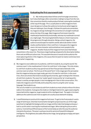
1) My media product does follow some front page conventions,
but it also challenges other conventions making it unique from the rest.
One convention that this media product follows is placing the masthead
at the top of the page. This is usually done on other magazine front
cover designs as it allows the audience to clearly see what magazine
they are looking at. Even though, it follows this particular convention,
my magazine design challenges the convention of a straight masthead
across the top of the page. Most magazine front covers have the
masthead printed directly horizontally, whereas my masthead is turned
at a slight angle. The meaning behind this feature is that it represents
the progression through education. Being a school magazine, the
audience would expect to read this and be able to do better in their
studies and feel better in their sixth form. It also gives the magazine
cover a bit more character and could attract more people to the
magazine. Another feature of the magazine front cover that follows
conventions is the cover line. They have a large heading compared to the description bellow
them and are different colours too. This was done because it reveals to the audience the
most capturing articles in the magazine, this causes them to want to read on and know more
about what’s happening.
2) My magazine cover addresses my audience, sixth form students, by using the words ‘the
common room’ in the masthead and ‘in form for sixth form’ in the slogan . This title relates
to sixth form students as they may spend most of their free periods and breaks in the
common room at school. The first use of the word ‘form’ in the slogan give the perception
that this magazine helps you to get ready, get into a fit state for sixth form. In the cover
lines, there are articles that relate to studying and university, again relating to the interests
of sixth form students. The cover line ‘Lookin’ good’ misses out the ‘g’ in looking as this
phrase is used by younger people in text messaging and in face to face conversation. This
makes the magazine seem friendly and trustworthy since its using the same ‘young
language’ that students use.
The use of a model in a suit relates to sixth form students as most schools enforce this dress
code on the students. It also gives the mode an intelligent look to him, again expressing the
reason behind the magazine, to get students to this intelligent level. The apple in his hand
addresses the audience even more as apples are usually associated with studying.
3) I used Photoshop to construct this magazine font cover. To get to the final product I used a
range of techniques. One that I learned when doing this project was the use of the magic
wand tool to highlight the background to an image and then take that background away. I
had to use this when inserting the masthead and slogan. When taking the picture with a
camera, I learned how different poses of the human body can alter the way the audience
interprets the picture. The pose I used was meant to perceive forward thinking and
intelligence. The brightness also adds effect to the image, being light give a happy and open
perspective.
2. Agatino D’Agate 12R Media Studies Homework
4) In evaluation of my final product there are some strengths and weaknesses that can be
picked out. The layout and photography of the magazine front cover are the main strengths
of the design. These aspects went well in the process of creation and the end product came
out well. The weaknesses of my product are the colour scheme. I used too many different
contrasting colours in the front cover giving the cover an odd appearance. I think I should
have used a colour scheme of only three colours, dark blue, light blue and white. Instead of
dark blue, light blue, white and yellow.
If I was to repeat the task, I would change the image. The model in the image seems too
‘proud of himself’ and ‘above other people’, which could put people off reading the
magazine as they don’t relate to the way the model is perceived. I would take an image with
several models happy at school, to relate to most people in sixth form a bit more.