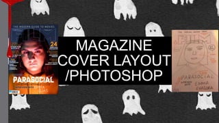
2. FINAL MAGAZINE COVER
The basis of the construction and
overall layout of our magazine was
based on the flat plan. We used
the flat plan as a starter but we
developed it as we gained more
information about house styles as
well as research current events
within the film industry.
3. The first thing that my group member
Lauren did when working in photoshop
is import the Masthead from TOTAL
FILM and this was found in Google ,
we had to ensure that the quality of the
image was of a good standard to
prevent the decrease in the overall
quality of our finish product. However
we could not find the font with the blue
outline and therefore my group
member had to use the magic wand to
remove the white background. She
also added individual lines to improve
the overall quality of the font as well as
adding blending options to create the
blue glow , this glow was based on the
colour tones in our chosen image. she
positioned the font above , at the very
top of the page as this followed the
stylistic choice made by TOTAL FILM.
However we do subvert as we placed
the font in front of the image and made
it transparent when it is typically a solid
colour ( white).
4. After my group member Lauren imported the
image into the template ,she then included
the information about the cover star article by
placing each individual phrase side by side
separating it with a graphic ( dot) this was an
addition that we saw on a real media text and
we believed that it worked well to separate
the text equally. As well as placing the phrase
exclusive above the parasocial font. She also
placed THE MODERN GUIDE TO MOVIES (
which was found online) so we had to ensure
that the font was of a good quality.
she then imported the parasocial font placing
it central to the image as well changing the
colour the of the font. It was placed centrally
as this was the common position of
the movie name on many of the TOTAL
FILM magazines we looked at. Due to the
fact that is central it is the first thing that a
reader's attention will be placed on which is
effective as we want to promote the release
of the movie.
5. Then my group member Lauren
placed the front cover magazine
features placing the text on either
the left of the page of the right
with equal spacing ; this
improves the overall finish of the
work as it is more pleasing to the
eyes of the readers. She also
ensured that length of each
feature was the same as we saw
that this was a similar format used
on magazine examples that we
looked at previously. Smaller
additions were also made to the
magazine such as adding the
date of the issue and the issue
number as well as the barcode
that stated the price as it makes
the magazine look like a real
media text.