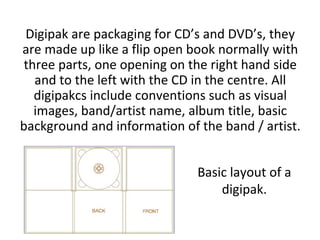
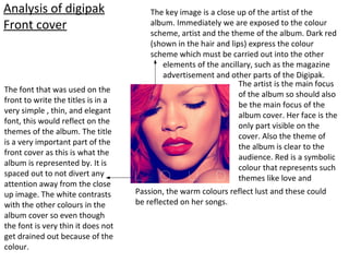
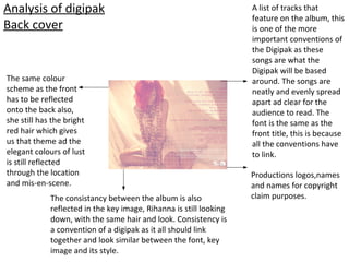
Ancillary task:
Research and planning
Digipak
Conventions and research into
Digipaks
Digipak are packaging for CD’s and DVD’s, they
are made up like a flip open book normally with
three parts, one opening on the right hand side
and to the left with the CD in the centre. All
digipakcs include conventions such as visual
images, band/artist name, album title, basic
background and information of the band / artist.
Basic layout of a
digipak.
Analysis of digipak
Front cover
The key image is a close up of the artist of the
album. Immediately we are exposed to the colour
scheme, artist and the theme of the album. Dark red
(shown in the hair and lips) express the colour
scheme which must be carried out into the other
elements of the ancillary, such as the magazine
advertisement and other parts of the Digipak.
The artist is the main focus
of the album so should also
be the main focus of the
album cover. Her face is the
only part visible on the
cover. Also the theme of
the album is clear to the
audience. Red is a symbolic
colour that represents such
themes like love and
Passion, the warm colours reflect lust and these could
be reflected on her songs.
The font that was used on the
front to write the titles is in a
very simple , thin, and elegant
font, this would reflect on the
themes of the album. The title
is a very important part of the
front cover as this is what the
album is represented by. It is
spaced out to not divert any
attention away from the close
up image. The white contrasts
with the other colours in the
album cover so even though
the font is very thin it does not
get drained out because of the
colour.
Analysis of digipak
Back cover
Productions logos,names
and names for copyright
claim purposes.
A list of tracks that
feature on the album, this
is one of the more
important conventions of
the Digipak as these
songs are what the
Digipak will be based
around. The songs are
neatly and evenly spread
apart ad clear for the
audience to read. The
font is the same as the
front title, this is because
all the conventions have
to link.
The same colour
scheme as the front
has to be reflected
onto the back also,
she still has the bright
red hair which gives
us that theme ad the
elegant colours of lust
is still reflected
through the location
and mis-en-scene.
The consistancy between the album is also
reflected in the key image, Rihanna is still looking
down, with the same hair and look. Consistency is
a convention of a digipak as it all should link
together and look similar between the font, key
image and its style.
Collection of digipaks within R&B
genre
Collection of digipaks within R&B
genre

Ancillary task Tayla Roche

  • 1.
    Ancillary task: Research andplanning Digipak Conventions and research into Digipaks
  • 2.
    Digipak are packagingfor CD’s and DVD’s, they are made up like a flip open book normally with three parts, one opening on the right hand side and to the left with the CD in the centre. All digipakcs include conventions such as visual images, band/artist name, album title, basic background and information of the band / artist. Basic layout of a digipak.
  • 3.
    Analysis of digipak Frontcover The key image is a close up of the artist of the album. Immediately we are exposed to the colour scheme, artist and the theme of the album. Dark red (shown in the hair and lips) express the colour scheme which must be carried out into the other elements of the ancillary, such as the magazine advertisement and other parts of the Digipak. The artist is the main focus of the album so should also be the main focus of the album cover. Her face is the only part visible on the cover. Also the theme of the album is clear to the audience. Red is a symbolic colour that represents such themes like love and Passion, the warm colours reflect lust and these could be reflected on her songs. The font that was used on the front to write the titles is in a very simple , thin, and elegant font, this would reflect on the themes of the album. The title is a very important part of the front cover as this is what the album is represented by. It is spaced out to not divert any attention away from the close up image. The white contrasts with the other colours in the album cover so even though the font is very thin it does not get drained out because of the colour.
  • 4.
    Analysis of digipak Backcover Productions logos,names and names for copyright claim purposes. A list of tracks that feature on the album, this is one of the more important conventions of the Digipak as these songs are what the Digipak will be based around. The songs are neatly and evenly spread apart ad clear for the audience to read. The font is the same as the front title, this is because all the conventions have to link. The same colour scheme as the front has to be reflected onto the back also, she still has the bright red hair which gives us that theme ad the elegant colours of lust is still reflected through the location and mis-en-scene. The consistancy between the album is also reflected in the key image, Rihanna is still looking down, with the same hair and look. Consistency is a convention of a digipak as it all should link together and look similar between the font, key image and its style.
  • 5.
    Collection of digipakswithin R&B genre
  • 6.
    Collection of digipakswithin R&B genre