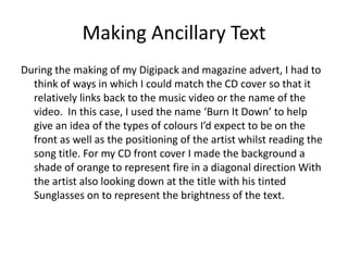
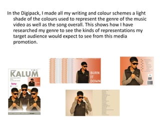
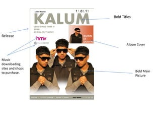
The document discusses the design process for ancillary materials to promote a music artist and single called "Burn It Down". Key points:
1) The CD cover, digital booklet, and magazine ad were designed to coordinate with the music video's theme of fire through an orange background and sunglasses to represent brightness.
2) Research was done on design trends in the electro-pop genre which informed bold text, plain images, and font sizes ordered by importance.
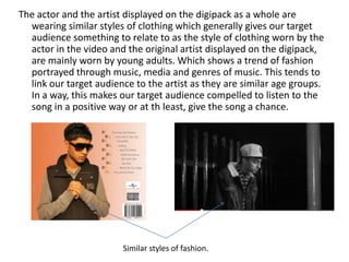
3) Similar styles of clothing on the artist and actor aim to relate to the target audience and compel them to listen through portrayed trends.
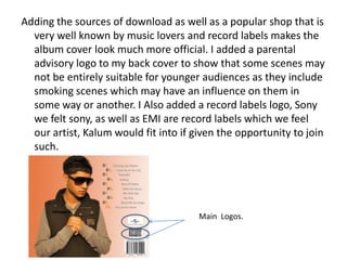
4) Sources for music downloads and a popular record shop make the cover look official, while log


![Stategi belajar mengajar]](https://cdn.slidesharecdn.com/ss_thumbnails/stategibelajarmengajar-130314091503-phpapp01-thumbnail.jpg?width=640&height=640&fit=bounds)


