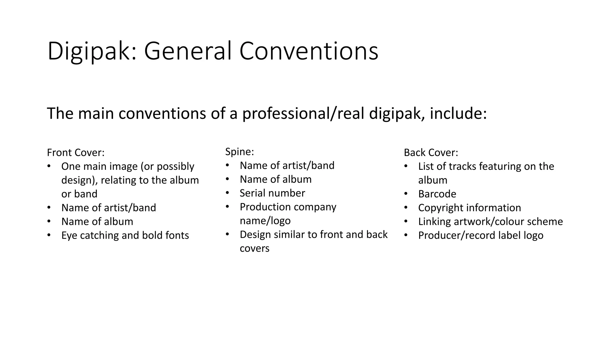
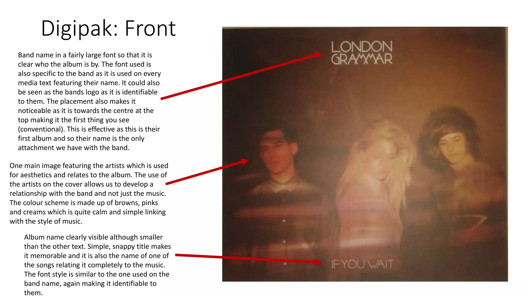
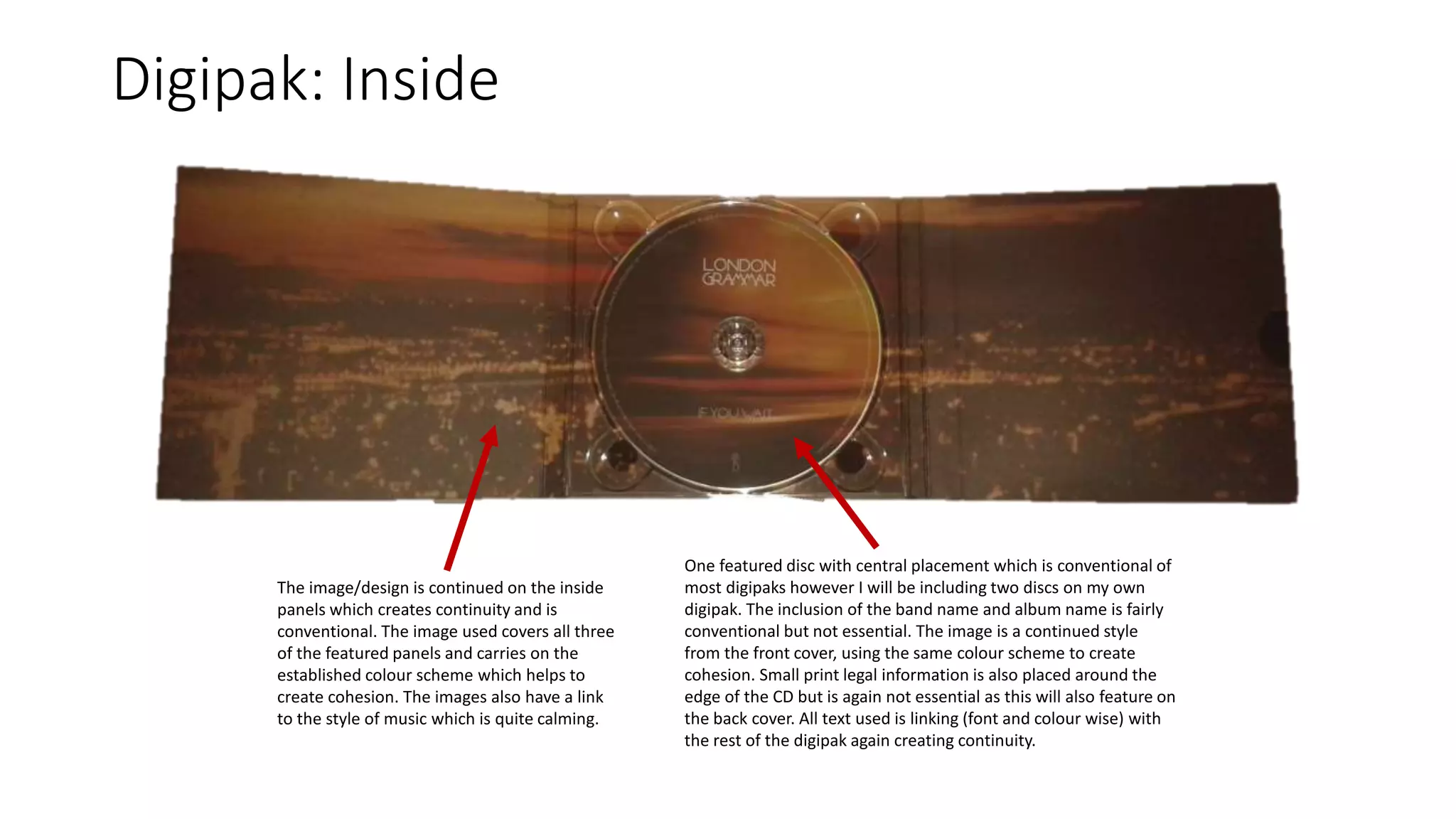
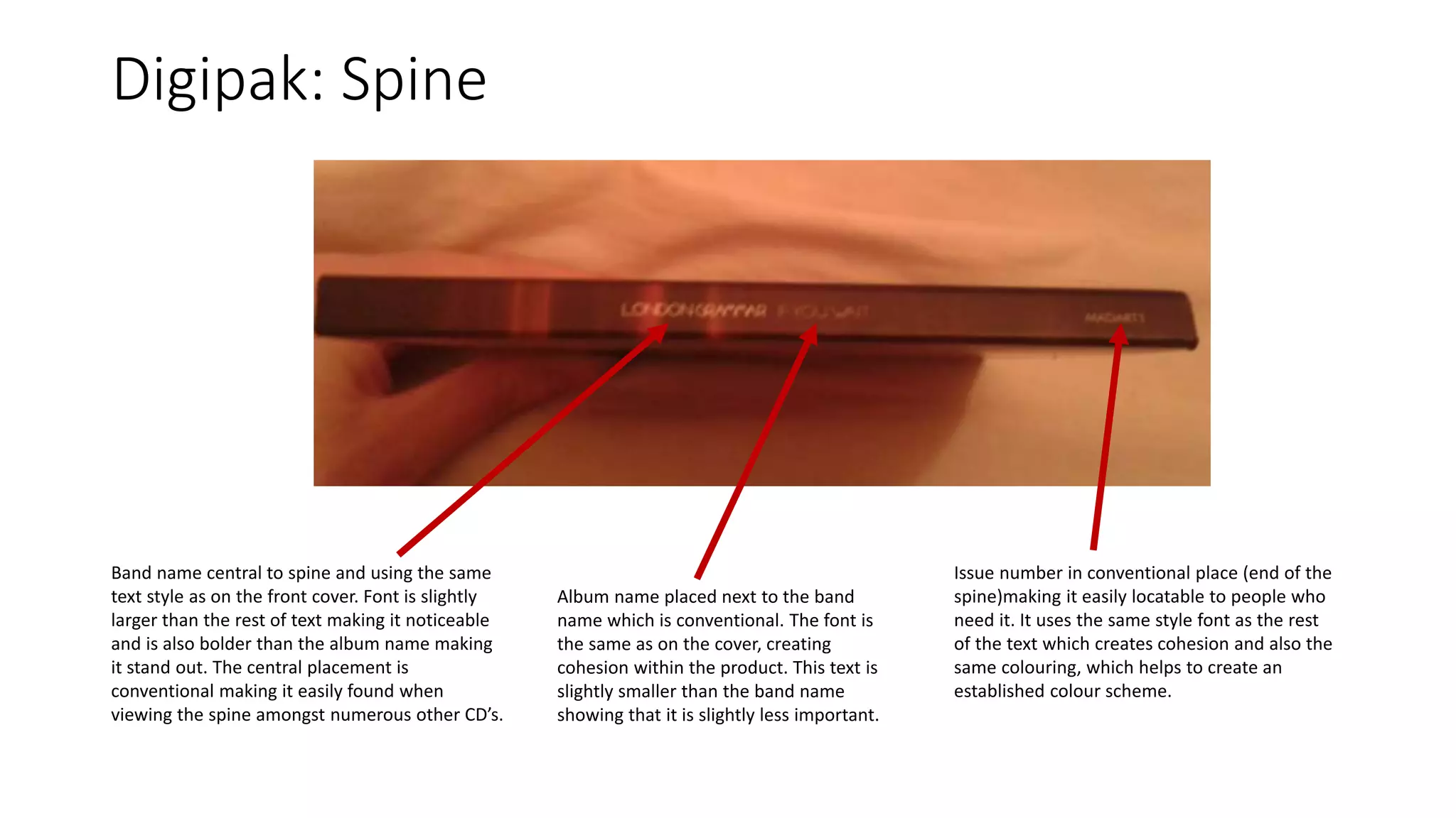
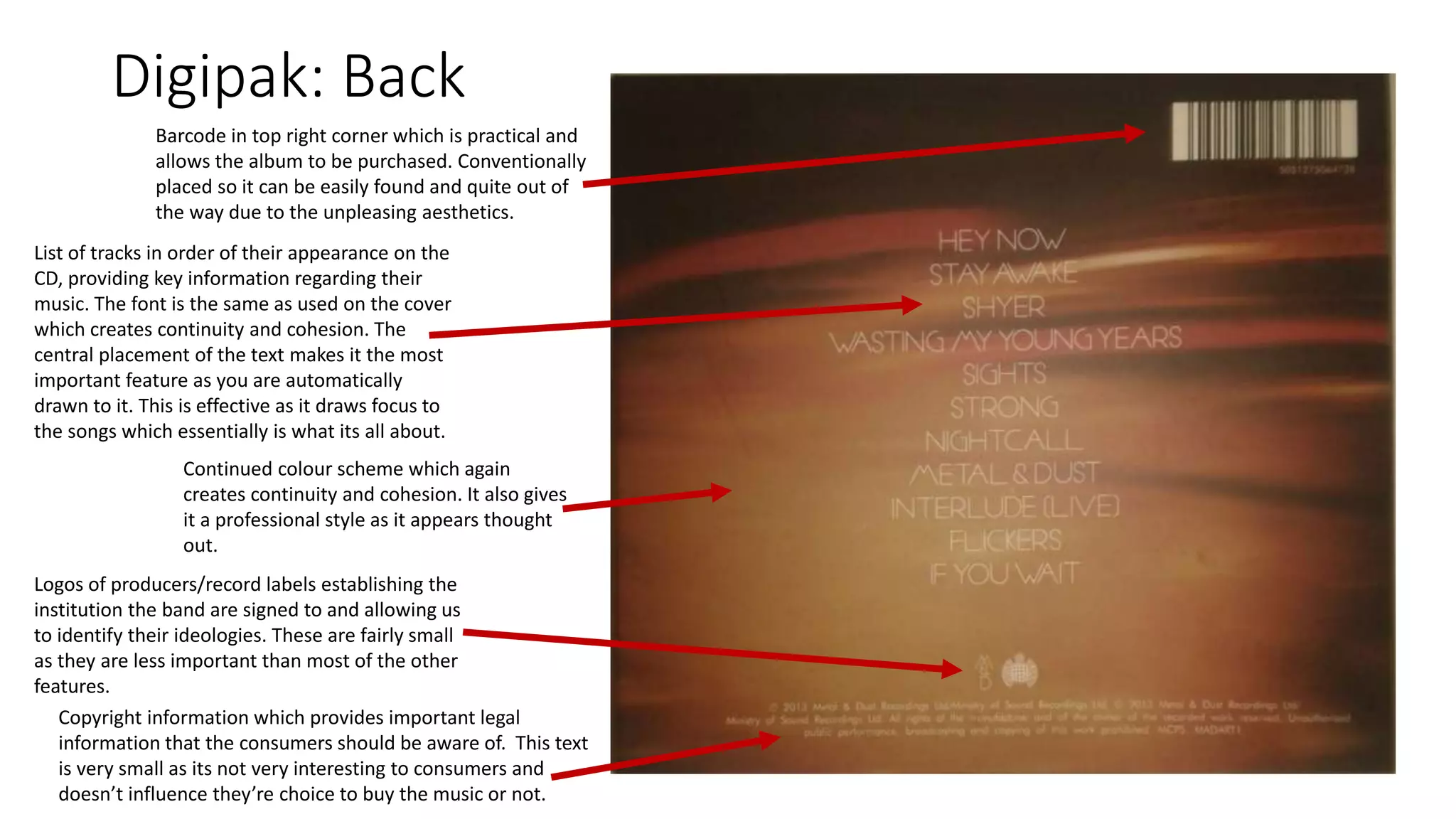
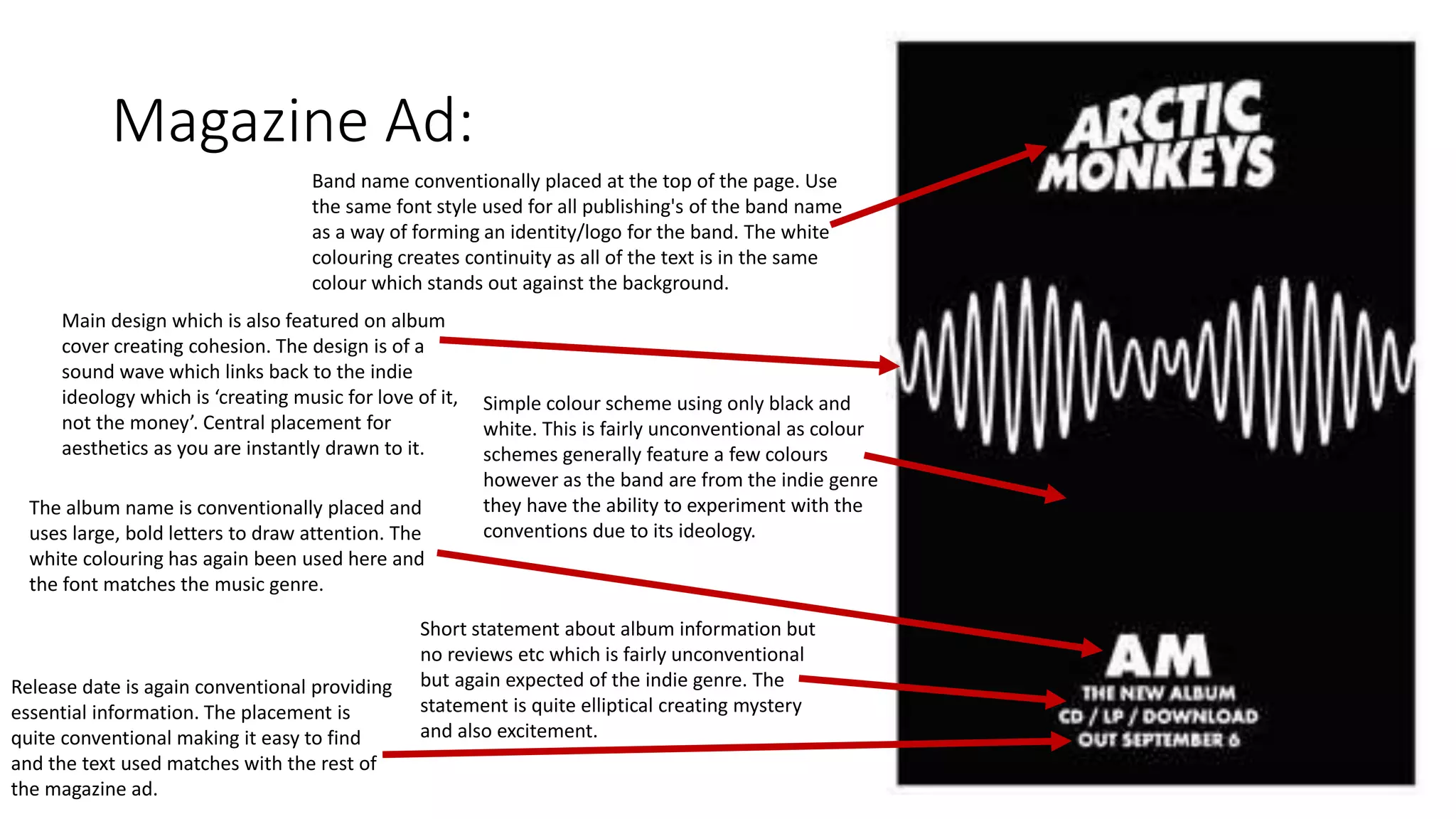
Conventions of Digipak and
Album Poster
Digipak: General Conventions
Front Cover:
• One main image (or possibly
design), relating to the album
or band
• Name of artist/band
• Name of album
• Eye catching and bold fonts
Spine:
• Name of artist/band
• Name of album
• Serial number
• Production company
name/logo
• Design similar to front and back
covers
Back Cover:
• List of tracks featuring on the
album
• Barcode
• Copyright information
• Linking artwork/colour scheme
• Producer/record label logo
The main conventions of a professional/real digipak, include:
Digipak: Front
Band name in a fairly large font so that it is
clear who the album is by. The font used is
also specific to the band as it is used on every
media text featuring their name. It could also
be seen as the bands logo as it is identifiable
to them. The placement also makes it
noticeable as it is towards the centre at the
top making it the first thing you see
(conventional). This is effective as this is their
first album and so their name is the only
attachment we have with the band.
One main image featuring the artists which is used
for aesthetics and relates to the album. The use of
the artists on the cover allows us to develop a
relationship with the band and not just the music.
The colour scheme is made up of browns, pinks
and creams which is quite calm and simple linking
with the style of music.
Album name clearly visible although smaller
than the other text. Simple, snappy title makes
it memorable and it is also the name of one of
the songs relating it completely to the music.
The font style is similar to the one used on the
band name, again making it identifiable to
them.
Digipak: Inside
The image/design is continued on the inside
panels which creates continuity and is
conventional. The image used covers all three
of the featured panels and carries on the
established colour scheme which helps to
create cohesion. The images also have a link
to the style of music which is quite calming.
One featured disc with central placement which is conventional of
most digipaks however I will be including two discs on my own
digipak. The inclusion of the band name and album name is fairly
conventional but not essential. The image is a continued style
from the front cover, using the same colour scheme to create
cohesion. Small print legal information is also placed around the
edge of the CD but is again not essential as this will also feature on
the back cover. All text used is linking (font and colour wise) with
the rest of the digipak again creating continuity.
Digipak: Spine
Band name central to spine and using the same
text style as on the front cover. Font is slightly
larger than the rest of text making it noticeable
and is also bolder than the album name making
it stand out. The central placement is
conventional making it easily found when
viewing the spine amongst numerous other CD’s.
Album name placed next to the band
name which is conventional. The font is
the same as on the cover, creating
cohesion within the product. This text is
slightly smaller than the band name
showing that it is slightly less important.
Issue number in conventional place (end of the
spine)making it easily locatable to people who
need it. It uses the same style font as the rest
of the text which creates cohesion and also the
same colouring, which helps to create an
established colour scheme.
Digipak: Back
List of tracks in order of their appearance on the
CD, providing key information regarding their
music. The font is the same as used on the cover
which creates continuity and cohesion. The
central placement of the text makes it the most
important feature as you are automatically
drawn to it. This is effective as it draws focus to
the songs which essentially is what its all about.
Barcode in top right corner which is practical and
allows the album to be purchased. Conventionally
placed so it can be easily found and quite out of
the way due to the unpleasing aesthetics.
Continued colour scheme which again
creates continuity and cohesion. It also gives
it a professional style as it appears thought
out.
Logos of producers/record labels establishing the
institution the band are signed to and allowing us
to identify their ideologies. These are fairly small
as they are less important than most of the other
features.
Copyright information which provides important legal
information that the consumers should be aware of. This text
is very small as its not very interesting to consumers and
doesn’t influence they’re choice to buy the music or not.
Magazine Ad: General Conventions
The relevant and necessary conventions of a professional/real
magazine ad are:
• One main image (or possibly design), relating to the album or band
• Name of artist/band
• Name of album
• Release date
• Reviews
• Website information
• Eye catching and bold fonts
Magazine Ad:
Main design which is also featured on album
cover creating cohesion. The design is of a
sound wave which links back to the indie
ideology which is ‘creating music for love of it,
not the money’. Central placement for
aesthetics as you are instantly drawn to it.
Band name conventionally placed at the top of the page. Use
the same font style used for all publishing's of the band name
as a way of forming an identity/logo for the band. The white
colouring creates continuity as all of the text is in the same
colour which stands out against the background.
Simple colour scheme using only black and
white. This is fairly unconventional as colour
schemes generally feature a few colours
however as the band are from the indie genre
they have the ability to experiment with the
conventions due to its ideology.
The album name is conventionally placed and
uses large, bold letters to draw attention. The
white colouring has again been used here and
the font matches the music genre.
Short statement about album information but
no reviews etc which is fairly unconventional
but again expected of the indie genre. The
statement is quite elliptical creating mystery
and also excitement.
Release date is again conventional providing
essential information. The placement is
quite conventional making it easy to find
and the text used matches with the rest of
the magazine ad.

Conventions of a digipak and magazine ad

  • 1.
    Conventions of Digipakand Album Poster
  • 2.
    Digipak: General Conventions FrontCover: • One main image (or possibly design), relating to the album or band • Name of artist/band • Name of album • Eye catching and bold fonts Spine: • Name of artist/band • Name of album • Serial number • Production company name/logo • Design similar to front and back covers Back Cover: • List of tracks featuring on the album • Barcode • Copyright information • Linking artwork/colour scheme • Producer/record label logo The main conventions of a professional/real digipak, include:
  • 3.
    Digipak: Front Band namein a fairly large font so that it is clear who the album is by. The font used is also specific to the band as it is used on every media text featuring their name. It could also be seen as the bands logo as it is identifiable to them. The placement also makes it noticeable as it is towards the centre at the top making it the first thing you see (conventional). This is effective as this is their first album and so their name is the only attachment we have with the band. One main image featuring the artists which is used for aesthetics and relates to the album. The use of the artists on the cover allows us to develop a relationship with the band and not just the music. The colour scheme is made up of browns, pinks and creams which is quite calm and simple linking with the style of music. Album name clearly visible although smaller than the other text. Simple, snappy title makes it memorable and it is also the name of one of the songs relating it completely to the music. The font style is similar to the one used on the band name, again making it identifiable to them.
  • 4.
    Digipak: Inside The image/designis continued on the inside panels which creates continuity and is conventional. The image used covers all three of the featured panels and carries on the established colour scheme which helps to create cohesion. The images also have a link to the style of music which is quite calming. One featured disc with central placement which is conventional of most digipaks however I will be including two discs on my own digipak. The inclusion of the band name and album name is fairly conventional but not essential. The image is a continued style from the front cover, using the same colour scheme to create cohesion. Small print legal information is also placed around the edge of the CD but is again not essential as this will also feature on the back cover. All text used is linking (font and colour wise) with the rest of the digipak again creating continuity.
  • 5.
    Digipak: Spine Band namecentral to spine and using the same text style as on the front cover. Font is slightly larger than the rest of text making it noticeable and is also bolder than the album name making it stand out. The central placement is conventional making it easily found when viewing the spine amongst numerous other CD’s. Album name placed next to the band name which is conventional. The font is the same as on the cover, creating cohesion within the product. This text is slightly smaller than the band name showing that it is slightly less important. Issue number in conventional place (end of the spine)making it easily locatable to people who need it. It uses the same style font as the rest of the text which creates cohesion and also the same colouring, which helps to create an established colour scheme.
  • 6.
    Digipak: Back List oftracks in order of their appearance on the CD, providing key information regarding their music. The font is the same as used on the cover which creates continuity and cohesion. The central placement of the text makes it the most important feature as you are automatically drawn to it. This is effective as it draws focus to the songs which essentially is what its all about. Barcode in top right corner which is practical and allows the album to be purchased. Conventionally placed so it can be easily found and quite out of the way due to the unpleasing aesthetics. Continued colour scheme which again creates continuity and cohesion. It also gives it a professional style as it appears thought out. Logos of producers/record labels establishing the institution the band are signed to and allowing us to identify their ideologies. These are fairly small as they are less important than most of the other features. Copyright information which provides important legal information that the consumers should be aware of. This text is very small as its not very interesting to consumers and doesn’t influence they’re choice to buy the music or not.
  • 7.
    Magazine Ad: GeneralConventions The relevant and necessary conventions of a professional/real magazine ad are: • One main image (or possibly design), relating to the album or band • Name of artist/band • Name of album • Release date • Reviews • Website information • Eye catching and bold fonts
  • 8.
    Magazine Ad: Main designwhich is also featured on album cover creating cohesion. The design is of a sound wave which links back to the indie ideology which is ‘creating music for love of it, not the money’. Central placement for aesthetics as you are instantly drawn to it. Band name conventionally placed at the top of the page. Use the same font style used for all publishing's of the band name as a way of forming an identity/logo for the band. The white colouring creates continuity as all of the text is in the same colour which stands out against the background. Simple colour scheme using only black and white. This is fairly unconventional as colour schemes generally feature a few colours however as the band are from the indie genre they have the ability to experiment with the conventions due to its ideology. The album name is conventionally placed and uses large, bold letters to draw attention. The white colouring has again been used here and the font matches the music genre. Short statement about album information but no reviews etc which is fairly unconventional but again expected of the indie genre. The statement is quite elliptical creating mystery and also excitement. Release date is again conventional providing essential information. The placement is quite conventional making it easy to find and the text used matches with the rest of the magazine ad.