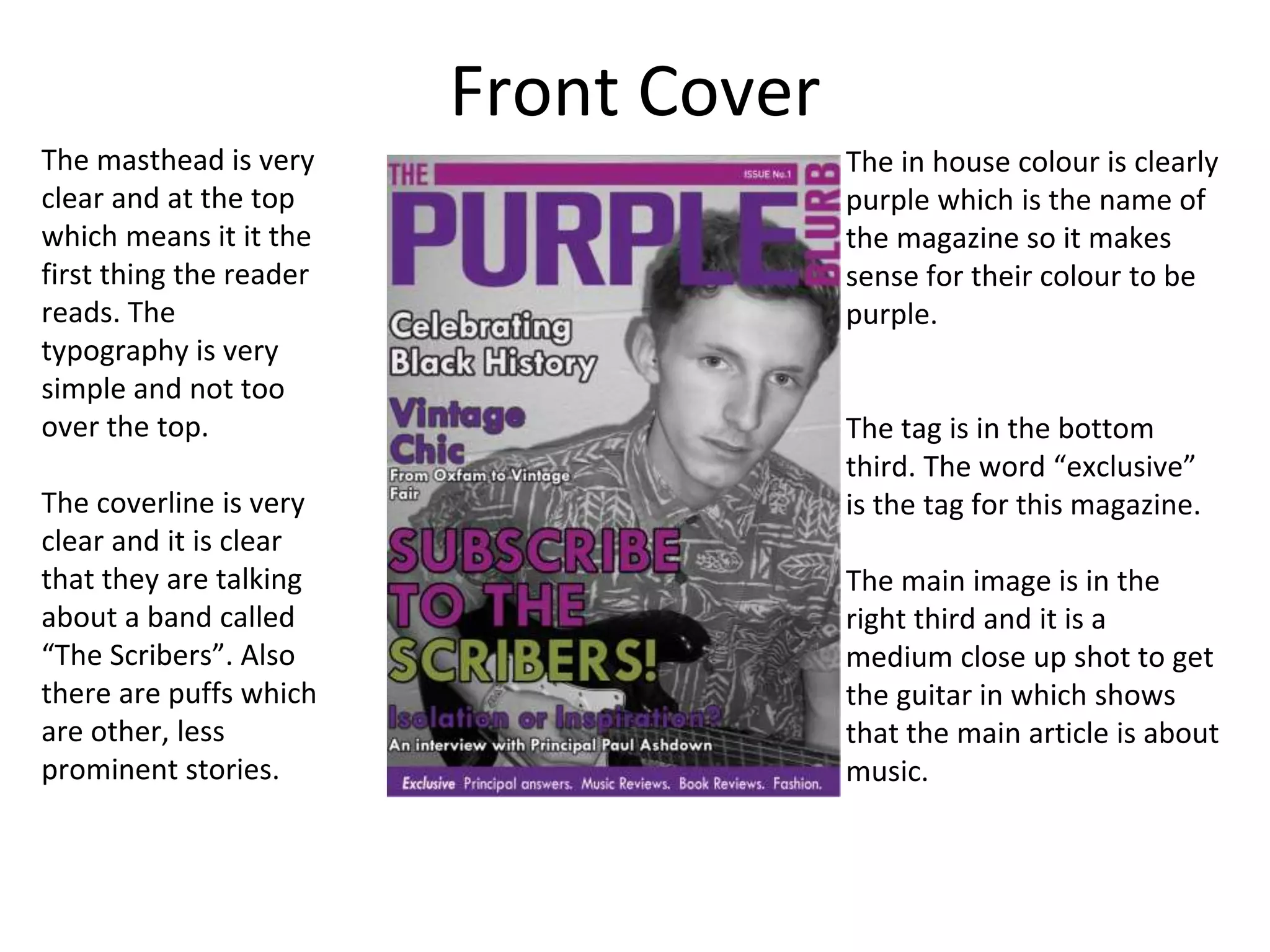
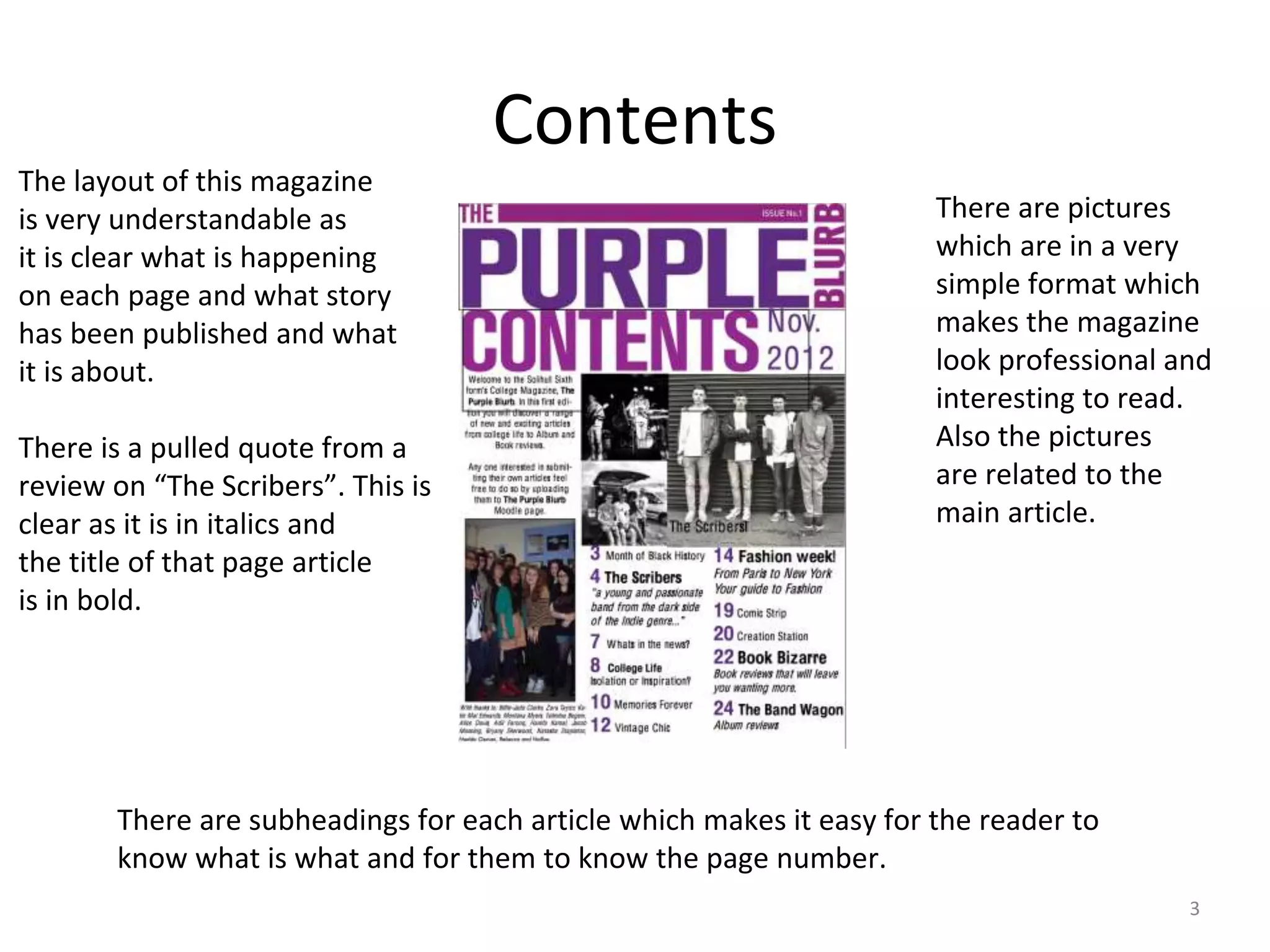
Sixth Form Magazine 3
Joe Reeves
Front Cover
The masthead is very
clear and at the top
which means it it the
first thing the reader
reads. The
typography is very
simple and not too
over the top.
The coverline is very
clear and it is clear
that they are talking
about a band called
“The Scribers”. Also
there are puffs which
are other, less
prominent stories.
The in house colour is clearly
purple which is the name of
the magazine so it makes
sense for their colour to be
purple.
The tag is in the bottom
third. The word “exclusive”
is the tag for this magazine.
The main image is in the
right third and it is a
medium close up shot to get
the guitar in which shows
that the main article is about
music.
Contents
3
The layout of this magazine
is very understandable as
it is clear what is happening
on each page and what story
has been published and what
it is about.
There is a pulled quote from a
review on “The Scribers”. This is
clear as it is in italics and
the title of that page article
is in bold.
There are pictures
which are in a very
simple format which
makes the magazine
look professional and
interesting to read.
Also the pictures
are related to the
main article.
There are subheadings for each article which makes it easy for the reader to
know what is what and for them to know the page number.

Sixth from magazine 3

  • 1.
    Sixth Form Magazine3 Joe Reeves
  • 2.
    Front Cover The mastheadis very clear and at the top which means it it the first thing the reader reads. The typography is very simple and not too over the top. The coverline is very clear and it is clear that they are talking about a band called “The Scribers”. Also there are puffs which are other, less prominent stories. The in house colour is clearly purple which is the name of the magazine so it makes sense for their colour to be purple. The tag is in the bottom third. The word “exclusive” is the tag for this magazine. The main image is in the right third and it is a medium close up shot to get the guitar in which shows that the main article is about music.
  • 3.
    Contents 3 The layout ofthis magazine is very understandable as it is clear what is happening on each page and what story has been published and what it is about. There is a pulled quote from a review on “The Scribers”. This is clear as it is in italics and the title of that page article is in bold. There are pictures which are in a very simple format which makes the magazine look professional and interesting to read. Also the pictures are related to the main article. There are subheadings for each article which makes it easy for the reader to know what is what and for them to know the page number.