Including Mental Health Support in Project Delivery, 14 May.pdf
LO4 - Final Poster annotations.pptx
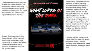
1. Title and tagline are bold and easy
to ready and clearly make out the
words used. Both are also using
colours that fit the horror genre
asked for within the brief and a font
that also does this via the sharp
edges and splattered like look.
Release date in a simplistic bold
font and bright colour making it
easy to read. Once again using
colours that fit to genre and a font
that while not as effective at
linking to genre as the title, still
has sharper edges.
Company logo big enough to be
clearly seen and made out who is
behind the product. Clearly
following what the brief has asked
for the inclusion of the logo in the
brief.
Image used is effective and draws
attention to the arcade using
shadows and photoshop tool to
make it darker, linking to the
commonly used darkness in the
horror genre. The cars and the
inclusion of the road and street
take away from the direct
attention and inclusion of the
arcade which was the purpose of
the image. Using an image with
more or mostly just the building in
it could have worked better at
keeping and drawing attention
purely to the arcade.
2. Title and tagline once again easy
to read and using colours and a
font that link to the horror
genre. However the taglines
change of colour to red and grey
wasn’t as effective as the red
and white as the colours do not
blend as well together and looks
more random.
Actors names in a clear and easy
to read font that uses a colour
and font that links back to the
horror genre. The names should
be brighter so they blend in less
and stand out more so that the
audience can get this
information more head on and
doesn’t need to look around as
much.
Billing block put in effective place as it is
out of the way and doesn’t interrupt
anything important like the release date.
It uses an official font that must be used
in posters of this kind so that the posters
fit with the ones already in the industry.
The colour of the billing block makes it
visible but brightening it up would make
it easier to see and ensure there is no
miss communication of its inclusion.
Release date and logo once again put in
appropriate spot and size that makes
them easily visible to the audience.
Release date using a font once again that
is easy to read and colour that links to
genre.
Once again the image in background can be seen
and made out what the focus should be,
however same as the teaser poster, the cars and
streets do take away from what the main focus
should be, picture still includes the darkness and
shadowed effect that links to the genre. The
actor/character images work well with using
people around the age of the target audience
and genre, their performance linking to the
genre and the use of different genders links once
again to the target audience and what was asked
of by the brief. The images of the actors are big
that they cover most of the background image
making it somewhat lost but slightly small as
they are somewhat hard to see and make out all
features due to the shadow and darkness of
them. Making both images larger and spanning
more of the poster would allow for less to be
covered up and more to be shown and easier to
see.
3. Once again the title and tagline
are easy to read and make out,
using colours and fonts that fit
the genre. Same as in the
theatrical poster the taglines
colours do not blend as well and
make it look more random and
out of place.
Actor names in simplistic and
easy to read font which fits the
genre. Colours that further link
to genre and fit with the poster.
These colours however do
make the names seem hidden
and out of the way which is not
the purpose of the inclusion so
using a brighter colour like in
the theatrical poster could have
make them stand out more and
made them easier to read.
Making the text bigger would
have also helped at making the
names stand out more and look
less lost.
Billing block same as in theatrical poster uses appropriate font
that ensures industry standard and uses a colour that links to
genre. Once again the colour should be brighter to make it
stand out more to ensure understanding of its inclusion.
Release date and company logo
once again in a appropriate place,
easy to read and make out.
Release date using a font and
colour that links to genre. Making
both bigger would have made
them stand out more and make
them less easily missed.
Images put in appropriate place
making them stand out and less
lost. Once again the use of
shadows and darkness make
them link to the genre, along
with the age of the
actors/characters that fit the age
of the targeted audience, the
performance that make them
link to genre and the use of
different genders that link to
what was asked for by the brief
and target the targeted
audience. Images once again
could both be bigger to stand
out more and make the poster
look less empty and make
aspects and features of both
pictures clearer. The background
picture having the same issues
as in both other posters.