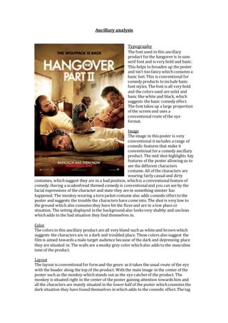
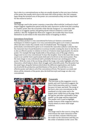
Ancillary analysis 
Typography 
The font used in this ancillary 
product for the hangover is in sans 
serif font and is very bold and basic. 
This helps to broaden up the poster 
and isn’t too fancy which connotes a 
basic feel. This is conventional for 
comedy products to include basic 
font styles. The font is all very bold 
and the colors used are solid and 
basic like white and black, which 
suggests the basic comedy effect. 
The font takes up a large proportion 
of the screen and uses a 
conventional route of the eye 
format. 
Image 
The image in this poster is very 
conventional it includes a range of 
comedic features that make it 
conventional for a comedy ancillary 
product. The mid shot highlights key 
features of the poster allowing us to 
see the different characters 
costume. All of the characters are 
wearing fairly casual and dirty 
costumes, which suggest they are in a bad position, which is a conventional feature of 
comedy. Having a scadenfreud themed comedy is conventional and you can see by the 
facial expressions of the character and state they are in something sinister has 
happened. The monkey wearing a torn jacket costume also adds comedic effect to the 
poster and suggests the trouble the characters have come into. The shot is very low to 
the ground which also connotes they have hit the floor and are in a low place or 
situation. The setting displayed in the background also looks very shabby and unclean 
which adds to the bad situation they find themselves in. 
Color 
The colors in this ancillary product are all very bland such as white and brown which 
suggests the characters are in a dark and troubled place. These colors also suggest the 
film is aimed towards a male target audience because of the dark and depressing place 
they are situated in. The walls are a musky grey color which also adds to the masculine 
tone of the product. 
Layout 
The layout is conventional for form and the genre as it takes the usual route of the eye 
with the header along the top of the product. With the main image in the center of the 
poster such as the monkey which stands out as the eye catcher of the product. The 
monkey is situated right in the center of the poster gaining attention towards him and 
all the characters are mainly situated in the lower half of the poster which connotes the 
dark situation they have found themselves in which adds to the comedic effect. The tag
line is also in a conventional area as they are usually situated at the very top or bottom 
of the poster but usually stick close to the main title of the product. Also the company 
logos along the terminal area of the poster are conventional as they are less important 
for the viewer to look at. 
Language 
The language used in the poster connotes a masculine effect with the ‘wolf pack is back’ 
slogan suggests togetherness paired with the male characters on the front and a monkey 
in a leather jacket. Also the actual title of the film the ‘hangover’ is a masculine title 
already as it suggests parties and getting drunk which is related to a more male 
audience. Also the ‘bangkok has them now’ suggests the trouble they have found 
themselves in and relates to the masculine humor of laughing at others. 
Conventions-Form/Genre 
This ancillary product is very conventional for form as it features conventional 
techniques in relation to genre. It is very conventional for genre as it creates a masculine 
effect and also creates the comedic tone of schadenfruede. The language is also 
particularly conventional for genre as it connotes the masculine audience and also that 
the characters have found themselves in serious trouble creating the story to the film. It 
is also an effective poster in relation to form as it features many typical parts of a movie 
poster. For example the large header/title at the primary area of the page which a 
slogan next to it is very conventional. To have the strapline close to the main title is very 
usual to see and the font is particularly bold and is forefront on the movie poster. Plus 
the main image is very centralized and is probably the most eye catching part of the 
poster. With the route of the eye being utilized the image very easily highlights all of the 
characters, which helps to shows their struggle and vulnerable point. Plus the poster has 
the small logos along the bottom which show the different organizations and studios 
involved with the production and distribution of the movie. Overall this is a very 
effective poster and takes in all of the conventions of form. The layout is accurate and 
shows all the elements of the poster plus the bold font style and image are also very 
conventional. 
Typography 
The font type on this magazine cover is 
mainly sans serif font which suggests the 
film is fairly masculine and is a comedy 
because it is basic and bold. The sizing of 
the font is also very conventional as the 
masthead is in the center and is the 
largest most visible font on the page. With 
the tag line and other sub headers being 
smaller on the page and less important. 
The smaller text is used to highlight 
smaller features of the magazine which is 
clearly aimed at a more male target 
audience. 
Image 
The image used in the cover is a long shot 
which shows the main characters of the 
cover and their costume which focuses 
the reader on the characters and they are 
the center of attention on the cover. The
costume they are all wearing is fairly classic and old style especially the furry coat the 
main character is wearing which is also humorous and used for comical effect as the 
costume are all over exaggerated. Such as the large moustache and big fur coat it all 
looks over the top and ridiculous. There are also other images of films at the top of the 
magazine which is conventional for form but the main focus is on the comedy characters 
who the audience can laugh at. 
Color 
The colors on the cover are all fairly bold and basic which suggests the magazine is 
aimed towards a masculine target audience. The bold yellow colors over the main image 
helps to take your eye towards that and adds to the over the top nature of the image and 
the characters. The text is mainly white and bold which adds to the basic masculine 
effect as it is easy to see and visually appealing on the cover. The characters costume is 
all fairly bland colors which suggest the old fashioned clothing they are wearing. 
Layout 
The layout is fairly conventional with the primary optical area featuring some basic 
information on posters and a sub heading which shows some of the information of the 
magazine. The masthead is in a conventional place in the top half of the screen which 
shows the title of the magazine and the cover story is situated in the center of the screen 
which is also conventional for the route of the eye to follow into the middle of the 
screen. The image is also in the center of the screen with the cover story which is a 
conventional layout and in the terminal area and across the bottom of the magazine 
there is some information about other films included in the magazine. 
Language 
The language on the cover is fairly basic and tries to boost the films credentials and just 
discusses the different reviews available to the film. The language is more based around 
being visually appealing so the audience can just glance and discover the information in 
the magazine. The magazine uses very different language to the poster because the 
poster is just based towards the film and can maybe use some more explicit themes and 
languages. Language like ‘ultimate tv and movie winter preview’. 
Conventions-Form/Genre 
The magazine is very conventional because of the typical layout and styles of font and 
color. Having the image in the center of the magazine is very conventional for form as it 
is very large in the center and stereotypical to draw the readers into the magazine. The 
use of basic language to suit the magazine and readers is also conventional for form and 
the costumes and characters in the image make the magazine conventional in terms of 
the comedy genre. The characters are wearing over the top clothes and look out of place 
which makes it conventional for genre. This poster is conventional for form in many 
ways, for example having the barcode situated in one of the bottom corners of the cover 
is conventional. Plus the layout is effective for form as it tries to use the route of the eye 
incorporating the different imagery and text. The magazine header is very bold but also 
covered by the main image and focus of the article which is very conventional for form. 
He magazine wants to show its brand but having the main actors dominating the cover 
is very conventional. Plus we have the main cover story in the center of the cover with 
its smaller cover stories and pull quote surrounding.

Ancillary analysis

  • 1.
    Ancillary analysis Typography The font used in this ancillary product for the hangover is in sans serif font and is very bold and basic. This helps to broaden up the poster and isn’t too fancy which connotes a basic feel. This is conventional for comedy products to include basic font styles. The font is all very bold and the colors used are solid and basic like white and black, which suggests the basic comedy effect. The font takes up a large proportion of the screen and uses a conventional route of the eye format. Image The image in this poster is very conventional it includes a range of comedic features that make it conventional for a comedy ancillary product. The mid shot highlights key features of the poster allowing us to see the different characters costume. All of the characters are wearing fairly casual and dirty costumes, which suggest they are in a bad position, which is a conventional feature of comedy. Having a scadenfreud themed comedy is conventional and you can see by the facial expressions of the character and state they are in something sinister has happened. The monkey wearing a torn jacket costume also adds comedic effect to the poster and suggests the trouble the characters have come into. The shot is very low to the ground which also connotes they have hit the floor and are in a low place or situation. The setting displayed in the background also looks very shabby and unclean which adds to the bad situation they find themselves in. Color The colors in this ancillary product are all very bland such as white and brown which suggests the characters are in a dark and troubled place. These colors also suggest the film is aimed towards a male target audience because of the dark and depressing place they are situated in. The walls are a musky grey color which also adds to the masculine tone of the product. Layout The layout is conventional for form and the genre as it takes the usual route of the eye with the header along the top of the product. With the main image in the center of the poster such as the monkey which stands out as the eye catcher of the product. The monkey is situated right in the center of the poster gaining attention towards him and all the characters are mainly situated in the lower half of the poster which connotes the dark situation they have found themselves in which adds to the comedic effect. The tag
  • 2.
    line is alsoin a conventional area as they are usually situated at the very top or bottom of the poster but usually stick close to the main title of the product. Also the company logos along the terminal area of the poster are conventional as they are less important for the viewer to look at. Language The language used in the poster connotes a masculine effect with the ‘wolf pack is back’ slogan suggests togetherness paired with the male characters on the front and a monkey in a leather jacket. Also the actual title of the film the ‘hangover’ is a masculine title already as it suggests parties and getting drunk which is related to a more male audience. Also the ‘bangkok has them now’ suggests the trouble they have found themselves in and relates to the masculine humor of laughing at others. Conventions-Form/Genre This ancillary product is very conventional for form as it features conventional techniques in relation to genre. It is very conventional for genre as it creates a masculine effect and also creates the comedic tone of schadenfruede. The language is also particularly conventional for genre as it connotes the masculine audience and also that the characters have found themselves in serious trouble creating the story to the film. It is also an effective poster in relation to form as it features many typical parts of a movie poster. For example the large header/title at the primary area of the page which a slogan next to it is very conventional. To have the strapline close to the main title is very usual to see and the font is particularly bold and is forefront on the movie poster. Plus the main image is very centralized and is probably the most eye catching part of the poster. With the route of the eye being utilized the image very easily highlights all of the characters, which helps to shows their struggle and vulnerable point. Plus the poster has the small logos along the bottom which show the different organizations and studios involved with the production and distribution of the movie. Overall this is a very effective poster and takes in all of the conventions of form. The layout is accurate and shows all the elements of the poster plus the bold font style and image are also very conventional. Typography The font type on this magazine cover is mainly sans serif font which suggests the film is fairly masculine and is a comedy because it is basic and bold. The sizing of the font is also very conventional as the masthead is in the center and is the largest most visible font on the page. With the tag line and other sub headers being smaller on the page and less important. The smaller text is used to highlight smaller features of the magazine which is clearly aimed at a more male target audience. Image The image used in the cover is a long shot which shows the main characters of the cover and their costume which focuses the reader on the characters and they are the center of attention on the cover. The
  • 3.
    costume they areall wearing is fairly classic and old style especially the furry coat the main character is wearing which is also humorous and used for comical effect as the costume are all over exaggerated. Such as the large moustache and big fur coat it all looks over the top and ridiculous. There are also other images of films at the top of the magazine which is conventional for form but the main focus is on the comedy characters who the audience can laugh at. Color The colors on the cover are all fairly bold and basic which suggests the magazine is aimed towards a masculine target audience. The bold yellow colors over the main image helps to take your eye towards that and adds to the over the top nature of the image and the characters. The text is mainly white and bold which adds to the basic masculine effect as it is easy to see and visually appealing on the cover. The characters costume is all fairly bland colors which suggest the old fashioned clothing they are wearing. Layout The layout is fairly conventional with the primary optical area featuring some basic information on posters and a sub heading which shows some of the information of the magazine. The masthead is in a conventional place in the top half of the screen which shows the title of the magazine and the cover story is situated in the center of the screen which is also conventional for the route of the eye to follow into the middle of the screen. The image is also in the center of the screen with the cover story which is a conventional layout and in the terminal area and across the bottom of the magazine there is some information about other films included in the magazine. Language The language on the cover is fairly basic and tries to boost the films credentials and just discusses the different reviews available to the film. The language is more based around being visually appealing so the audience can just glance and discover the information in the magazine. The magazine uses very different language to the poster because the poster is just based towards the film and can maybe use some more explicit themes and languages. Language like ‘ultimate tv and movie winter preview’. Conventions-Form/Genre The magazine is very conventional because of the typical layout and styles of font and color. Having the image in the center of the magazine is very conventional for form as it is very large in the center and stereotypical to draw the readers into the magazine. The use of basic language to suit the magazine and readers is also conventional for form and the costumes and characters in the image make the magazine conventional in terms of the comedy genre. The characters are wearing over the top clothes and look out of place which makes it conventional for genre. This poster is conventional for form in many ways, for example having the barcode situated in one of the bottom corners of the cover is conventional. Plus the layout is effective for form as it tries to use the route of the eye incorporating the different imagery and text. The magazine header is very bold but also covered by the main image and focus of the article which is very conventional for form. He magazine wants to show its brand but having the main actors dominating the cover is very conventional. Plus we have the main cover story in the center of the cover with its smaller cover stories and pull quote surrounding.