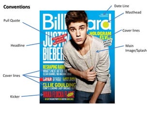
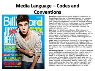
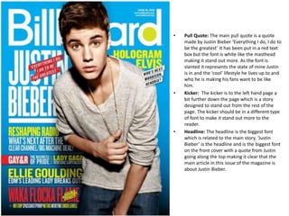
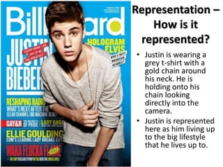
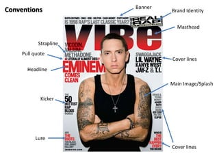
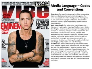
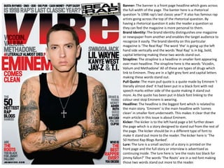
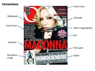
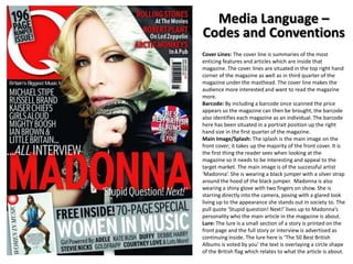
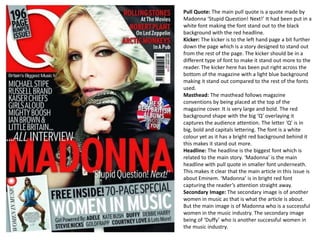
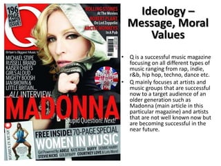
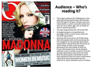
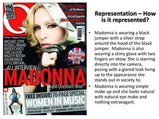
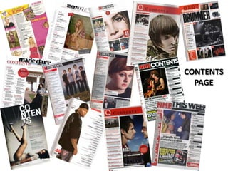
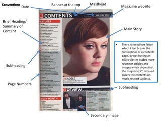
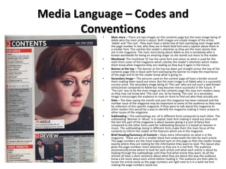
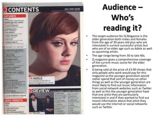
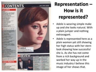
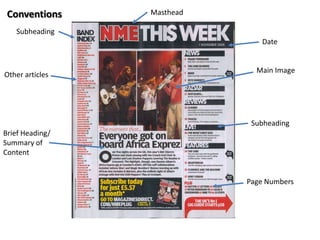
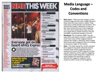
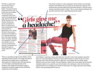
The document provides an analysis of the conventions used in a magazine cover and contents page. It discusses elements like the masthead, date line, cover lines, main image, pull quote, and kicker on the cover page. It also analyzes conventions for the contents page such as the banner, masthead, brief headings summarizing content, subheadings, and page numbers. The document notes that not having an editor's letter on the contents page breaks some conventions but allows more space for articles and content.
The document summarizes and analyzes various signs and signifiers used in magazine covers and contents pages for music magazines Billboard, Q, and Vibe. It examines the mastheads, skylines, main images, cover lines, and layouts on the front covers and contents pages, identifying whether they represent indexical, iconic, or symbolic signs. Across the magazines, different design elements aim to appeal to different target audiences, with Billboard appearing more formal and aimed at older readers, while Q and Vibe use more casual, youthful designs.
The document analyzes the design elements and conventions used across magazine front covers, contents pages, and article spreads. Key elements include large bold fonts and colors to draw attention, prominent placement of headlines and images, and column-based layouts with emphasized quotes. Conventions include credits and dates, page numbers, mastheads and barcodes, and alignment of copy and cover lines. Imagery and word choices are meant to represent subjects as powerful, wealthy, aggressive, or mysterious to appeal to audiences.
The two magazine contents pages both use iconic rap artists as their main images to identify the genre as rap. Both use dark backgrounds with bold red and white text for sections. HHR uses a smiling image of MASSI in nice clothes to appeal to younger readers, portraying rap success positively. The Source uses a close-up of Ice-T with a menacing look, creating a serious, hard feel reflecting rap's danger themes but also appealing due to his fame. Overall, both aim to attract readers through recognizable artists but portray rap culture somewhat differently.
The document provides a review of several magazine covers and contents pages. Some key points made:
- Magazine mastheads are designed to stand out from the background in order to catch viewers' eyes. Central images are often used to focus attention on a main topic.
- Snippets of text and quotes are used to entice readers to learn more by reading the full articles. Mentions of popular artists can also draw in fans.
- Color schemes, font sizes, and layouts are intentional choices to ensure readability and guide the eye to important elements like headlines or images. Contrasting colors in particular help elements stand out.
- Contents pages showcase article topics and brief descriptions to give readers a preview
The document provides information about the covers and contents of four different music magazines from different genres and time periods:
1) NME (punk rock/indie rock magazine from 1976) uses a limited color scheme and large images on the cover to attract readers. The contents page neatly lists articles and bands. Features use photos and distinct text formatting.
2) The Source (hip hop magazine from 1988) also prioritizes large cover images and uses minimal yet distinctive text. The contents are clearly laid out. Features contrast photos with brand advertisements.
3) Top of the Pops (pop magazine from 1995) employs varied colors and fonts on the cover to appeal to its young audience. It focuses more on photos
The document provides an analysis of magazine design elements for "The Source" magazine, including the front cover, content pages, and double page spreads. Some key points:
- "The Source" is a monthly hip-hop magazine founded in 1988 covering music, politics, and culture.
- The front cover features a large image of Jay-Z with the magazine masthead obscured, along with the issue date, price, and website below.
- Content pages typically feature a large artist image on the left with red text highlighting story titles on a white background.
- Double page spreads follow conventions like a large lead image on the left page with columns of text on the right.
- Design elements
The document discusses the design elements of a magazine cover and contents page. It analyzes the use of color, images, typography and other conventions. The magazine cover features Eminem and 50 Cent with the title "A conversation by brothers" in red, black and yellow. The contents page features Kanye West looking at the camera with the page split into feature sections in different fonts and colors. Overall the document examines how these elements establish the magazine's brand identity and style.
The document analyzes and compares the key features of three magazines - ELLE, Cbeebies, and Q - including their target audiences, publishers, and design elements. It finds that ELLE targets women aged 18-35 with feminine colors and celebrity images, while Cbeebies targets children aged 2-6 with bright colors, pictures, and less text. Q magazine targets adults interested in music with red/black/white colors and images of music artists.
- The masthead is located in the top left corner in bold sans-serif font to catch readers' attention.
- The cover uses vibrant colors that contrast each other and Florence Welch's red hair to attract different audiences.
- A close-up image of Florence Welch's face fills the cover to highlight her features and signal an intimate article.
- The target audience is fans of Florence and the Machines aged 16+ of both genders.
The contents page follows conventions with around 50% text and images. The images are of pop artists like George Shelly, Rita Ora, and Justin Bieber to attract the target audience. Words and images use slang like "fittest" and abbreviations to speak to readers informally. Sections include "On the Cover", "All About You", and "Celebs and Gossip". The layout, colors, and brand fonts/images maintain consistency to familiarize readers with each issue.
This document analyzes the conventions and codes used in pop magazine covers and contents pages. It discusses two main pop magazines, Top of the Pops and We Love Pop, and summarizes their typical mastheads, cover images, barcodes, competitions, quotes, and "what's inside" sections. The contents pages are also examined, noting common headers, main pieces, and posters listings. Double page spreads are summarized as including large quotes, questions and answers, and subject lines.
This document analyzes magazine covers and contents pages from different publications. It discusses design elements like colors, images, logos, and text placement and how they appeal to target audiences. Prima magazine uses feminine colors and celebrity images to attract women ages 20-55. Match! focuses on football content and language to engage teenage boys. Billboard features colorful logos and young celebrity images to appeal to music fans ages 16-26. I-D magazine employs minimalist designs and catchy text to seem modern and attract younger readers.
Class analysis of music magazine 1 nmeEllisHackett
1) The NME targets males aged 17-30 who are passionate about music. It attracts this audience by writing in-depth articles about current artists.
2) The magazine uses consistent design elements like red colors and an informal writing style. Articles are structured in a relaxed tone as if talking to friends.
3) Founded in 1952, NME was originally a newspaper and helped launch many famous artists. It transferred to a magazine format in 2000 while keeping its informative reporting.
- The masthead is located in the top right corner of the second page, which is unexpected, to draw attention.
- Lady Gaga's black and white close-up image shows her naked apart from chains, expressing vulnerability in her article and appealing to fans.
- Her facial expression is a slight pout, showing beauty that women aspire to, and eye contact makes the article feel personal.
- A vibrant red "L" is cleverly concealed within the article text to contrast the black and white photo.
The document analyzes the front covers of several music magazines, examining elements like cover images, mastheads, fonts, colors, lists of artists, freebies, and other stylistic choices. It finds that all the magazines follow conventions like placing the masthead, barcodes, and issue info in consistent locations. The cover designs aim to attract target audiences by featuring popular artists in poses and styles relating to the relevant genres. Text elements like quotes, lists of artists, and headlines work to draw readers in and give them a sense of what's inside. Color palettes, graphics, and language are tailored per magazine to match expected audience demographics.
The document analyzes the front covers of several music magazines, examining elements like cover images, mastheads, fonts, colors, lists of artists, freebies, and other stylistic elements. It finds that all the magazines follow typical conventions like placing the masthead, barcodes, and issue info in consistent locations. The covers are also designed to appeal to the magazines' target audiences through the choice of artists featured and stylistic cues related to different music genres.
The document analyzes the layout and design of magazine covers and contents pages. Key points discussed include:
- Magazine covers use large, centered images and mastheads to draw attention to the main artist or topic. Fonts, colors and photographic styles are chosen to represent and appeal to the target audience.
- Contents pages categorize articles clearly and include images and page references to highlight featured artists or topics. Formats are designed for readability and to interest and inform readers.
- Analyses consider visual elements like fonts, positioning, sizing and color contrasts that impact branding and audience. Discussions provide insights into designing for different age groups and styles of music coverage.
The masthead is a large red 'V' logo that identifies the magazine as Vibe. It is positioned at the top of the page in a monochromatic color scheme using grey, black, and white. Below the masthead is the word "contents" in three lines. The main image is a mid-shot of rapper Kanye West with an unknown woman's arm covering his shoulder and holding a red heart, implying his popularity with women. Additional images and text provide information on articles within the issue. Headings are used to identify sections and page numbers provide navigation to content.
This document discusses the codes and conventions used in magazine design. It provides examples of front covers, contents pages, and double page spreads and analyzes the typical design elements found in each section. These include using a consistent color scheme, medium close-up images that create direct address, mastheads and logos that are easy to recognize, and cover lines and headlines that draw attention and provide information about the magazine's contents. Across all sections, conventions like branding, typography, image placement and composition are used to engage readers and guide them through the magazine in an intuitive way.
The document analyzes the front cover and contents pages of a magazine about Jimi Hendrix.
The front cover features a photo of Hendrix making eye contact with the viewer. The analysis discusses various elements of the cover including the masthead, cover lines, main cover line about Hendrix, and barcode.
The contents pages are analyzed in detail. Key aspects covered include the layout with section headings and page numbers, use of different font sizes to denote importance, and a main image of a guitar and coat representing Hendrix's career and wealth.
Overall the document provides an in-depth semiotic analysis of the codes and conventions used in the magazine design to communicate information to the target audience of guitar enthusiasts and
The document provides an in-depth analysis of the layout, design elements, and branding of the front cover of the magazine NME. Key elements include the consistent placement of the masthead in the top left corner, use of bold red and white colors, and capitalized font to maintain a bold yet simple brand identity. Main sell lines are prominently placed and use attention-grabbing phrases and imagery to intrigue and inform readers about featured articles and bands. Color schemes, photographs, and other visual elements are designed to represent genres and appeal to target audiences. The overall layout aims to clearly promote content in an uncluttered manner.
This document deconstructs and analyzes several magazine covers and contents pages. It discusses design elements like layout, images, fonts, and color schemes. Key points made include that Billboard magazine targets a more sophisticated audience with neat text, while Top of the Pops aims for youth with bold, bright colors. Images are chosen to attract specific demographics and content is organized to guide the eye and highlight important information.
The document analyzes the typography, layout, color scheme, and images used in a rock music magazine called Kerrang. It notes that the magazine uses a serif font, bold text, and a dark color scheme of reds and blacks to appeal to its target audience of 16-25 year old men interested in rock music. Key elements like the masthead, cover artist, and stories about popular bands are prominently displayed using techniques like bolding, large text sizes, and high-contrast colors to draw readers' attention. The magazine's content and style aim to portray an image of anger and danger befitting the rock genre.
Task Two - Detailed Analysis of Music Magazinelouisangus
This document analyzes the cover and interior pages of a music magazine targeted at teenage girls. It discusses the typography, layout, color, images, language, and conventions used. For the cover, it notes the use of serif and sans serif fonts, bold text to draw attention, and a pink/white color scheme appealing to girls. The layout follows conventions like the "route of the eye" and crowded text gives an informal feel. Images of celebrities like Justin Bieber attract the target audience. Interior pages also use fonts, colors, images, and conventions appropriately targeted to teenage girls.
The document provides an analysis of the codes and conventions used in the front cover of a magazine about Justin Bieber. It discusses several elements of the cover including the masthead, date line, cover lines, main image, pull quote, kicker, and headline. It analyzes how each element follows magazine conventions and works to attract readers' attention. It also summarizes the purpose and representation of each convention.
The magazine cover features a close-up shot of Justin Bieber smirking which takes up the entire front page. The large pink masthead stands out against the white background. The word "FREE" is emphasized in a different font to attract readers. Additional information is provided in a clear but smaller "Lure" text. A barcode displays the price and issue number following industry conventions. The visuals and text are designed to attract the target audience of teenage girls interested in music, fashion and celebrities.
The magazine cover features a close-up shot of Justin Bieber smirking which attracts the target teenage female audience. Additional pictures and text on the cover inform readers that the magazine primarily focuses on Justin Bieber. Bold fonts are used for the masthead and main story text to stand out on the white background. A "FREE" banner and barcode with pricing also follow magazine cover conventions. The large central image and additional details are intended to appeal to the target readership interested in pop music, fashion, and boy bands.
This document analyzes the front cover of the April 2006 issue of Vibe magazine, which featured rapper Lil' Wayne. The summary is as follows:
The masthead is large and bold, standing out against the white background and identifying the magazine. The cover features Lil' Wayne looking intimidating, relating to the magazine's hip hop/rap genre. Additional lines advertise articles on Hollywood and other artists like T.I. and Justin Timberlake to attract readers. Overall, the layout and prominent images of popular musicians like Lil' Wayne align with Vibe's target audience of 18-34 year olds interested in hip hop, R&B, and rap music.
This document outlines the production process for a print-based media product. It includes annotations and deconstructions of magazine covers and spreads from Vibe and Q magazines. The target audience for these magazines is identified as males aged 18-34, as the magazines focus on hip hop and R&B music genres. The document also provides information on the publisher of Vibe magazine and notes that an email was not received in response to an inquiry about the production process.
Vibe is a music and entertainment magazine founded by producer Quincy Jones that predominantly features R&B and hip-hop artists. After shutting down in 2009, it was purchased by a private equity firm and now publishes every other month with a larger online presence. Its target audience is young, urban followers of hip-hop culture. Vibe Media also represents over 25 websites and other media platforms reaching over 19 million consumers per month focused on urban entertainment.
This document provides an analysis of the front covers of five music magazines: Billboard, NME, Vibe, Rolling Stone, and Q. For each magazine, it examines the layout, main image, masthead, date and price, feature headline, and quote preview. Some of the key points made include that magazine covers use color schemes, images, and text styles to attract target audiences. Prominent placement of the artist's name is meant to draw attention. Quotes and headlines are designed to intrigue readers and convince them to purchase the issue. Price is often de-emphasized so as not to discourage buyers. Overall formats aim to clearly identify the publication while showcasing the featured story.
This document provides an analysis of the front and inside pages of VIBE magazine. It summarizes that the front cover features Eminem and Dr. Dre to attract the target audience of 18-30 year olds interested in hip hop and R&B. The contents page focuses on more advertising than articles and features another photo of Eminem. The double page spread includes celebrity news, reader letters, and advertisements. Overall, the magazine uses celebrity images and bold fonts to grab attention and highlights advertising over content to keep costs low.
The document summarizes the codes and conventions used in magazine design. It discusses the typical placement of elements like the masthead, date, barcode, and lure and how they follow magazine conventions. Color schemes and buzz words are also discussed as conventions to attract audiences. The main image usually depicts the cover story but in this case shows a non-conventional long shot of Lana Del Rey.
The document summarizes the codes and conventions used in magazine design. It discusses elements like the masthead, main image, splash, barcode, lure, and date that typically appear on magazine covers and how they follow standard conventions. The color scheme and placement of these elements also adhere to customary magazine formats. Overall, the document outlines the typical structural components of magazines and how they are arranged consistently across publications.
LIIAR - Analysis Of 3 Music Magazine Coversnadia_eman
- The masthead "Q" is prominently displayed in the left corner to clearly identify the magazine. Adele is featured in a mid-close up shot on the majority of the front cover to draw attention to her success. Cover lines at the bottom provide information about stories inside the issue. The color scheme and exclusive tagline are designed to attract readers' attention and engagement.
This document provides information about planning and pitching a print-based media product for a music magazine called Vibe. It includes a deconstruction of Vibe's front cover and double page spread layout. It discusses Vibe's genre, frequency, content, purpose, target audience, form and style. It also provides details about Vibe's production process from setting a publication date to distribution. Similarly, it analyzes the front cover and layout of music magazine Q and discusses its genre, purpose, target audience and production process. The document aims to comprehensively analyze and plan for a print-based music magazine.
This document summarizes the codes and conventions used in magazine front covers. It discusses elements like the masthead, main image, date, barcode, buzz words, and color scheme. The masthead is typically in the top left corner. The main image dominates the center of the page. Dates and barcodes provide identifying information. Buzz words are used to attract attention. Color schemes follow conventions to make the magazines eye-catching. The document also provides examples of how different magazines apply these typical design elements.
Billboard is an American music magazine that was first published in 1894 and focuses on the music industry. It maintains several music charts that track popular songs and albums each week based on sales, streaming, and radio airplay data. Billboard's primary charts include the Billboard Hot 100 for songs and Billboard 200 for albums. The magazine targets music professionals and fans interested in the business of music.
This document contains analyses of 7 different magazine covers. For magazine cover #1, it discusses using different fonts to convey genre and a price tag to provide details. Cover #2 uses a large black masthead to catch the eye and targets classical rock fans aged 20-50. Cover #3 features tattoos on Eminem to show his character and personality, with him covering most of the cover to focus on him. Cover #4 uses a close-up image of Kanye West with direct eye contact and strict color scheme. Cover #5 has the magazine logo in the corner above the main image and uses red, black, and white colors consistently. Cover #6 discusses using Rihanna on the cover of Billboard magazine
Here are some key details about your urban music magazine:
Target Audience: Young urban teenagers aged 15+ interested in grime music
Frequency: Weekly to keep up with the fast-paced grime scene
Cover Price: £1.50 - Affordable for the target audience while signaling quality
Publisher: [Your Name] Presents
Unique Selling Point: Support for both established and up-and-coming grime artists through features and promotions
This captures the essential points about your magazine's intended readers, schedule, pricing, production, and niche appeal within the grime genre. Let me know if you need any part of the overview expanded on or have additional details to include.
This document analyzes the codes and conventions, institution, ideology, audience, and representation of three music magazine covers:
1) Billboard magazine with Drake on the cover is analyzed for its masthead, headline, main image, barcode, and splash codes. Its publisher is Prometheus Global Media and it aims to bring together people interested in music across genres.
2) Q Magazine with Adele on the cover is examined for its masthead, headline, main image, sub-story, and barcode elements. Its publisher is Bauer Media Group and it aims for higher production quality than other music magazines.
3) NME magazine featuring Rihanna uses codes like masthead, headline, splash, main image,
The document analyzes the front covers of three magazines - Billboard, Q Magazine, and NME. It examines the codes and conventions used on magazine covers such as the masthead, headline, main image, barcode, and splash. It then summarizes key details about the publisher/company behind each magazine, their overall message or ideology, their target audience, and how the main story is represented visually on the front cover through images and layout.
The magazine follows several conventions in its layout and design. The masthead is placed in the top left corner, and uses bright colors like red to attract attention. Buzz words, the main image, splash text and articles, barcode, and "lure" text at the bottom all provide key information about the contents in conventional ways. The date helps readers identify the issue. The color scheme of red, white, and black is eye-catching and conventional for magazines.
The document discusses four movie posters for the 2008 film "Taken" starring Liam Neeson. All four posters feature Neeson prominently as Bryan Mills. Posters one and two show Mills running or holding a gun, implying action. Poster three includes scenes and Mills' iconic quote. Poster four also shows scenes but emphasizes Mills' character more. The posters were designed to appeal to audiences aged 15+ by generating excitement and intrigue around Mills and his mission to rescue his daughter. Color schemes of black and red were used to connote mystery and danger. Different designs were employed to reach varied audience segments.
- The author surveyed 15 respondents aged 16-18 to inform the production of their coursework promoting an action thriller film.
- The survey found that the target audience is primarily young females who enjoy activities like going to the cinema and gym with friends.
- Key results that will influence the coursework include making the protagonist a 19-year-old male, setting part of the film at a party, using consistent branding across marketing materials, and focusing on the protagonist in the poster and magazine cover.
Tia Maletta has decided on her target audience, music genre, and research for her music magazine. Her target audience is male and female teenagers to middle aged people between ages 15-21. She chose this age range because she is 16 and wants her magazine to appeal to people her own age. She will focus the magazine on popular music genres like house, pop, R&B, drum and bass based on a survey that showed these genres are most interesting to her target demographic. Tia researched other successful music magazines, conducted a survey monkey questionnaire to identify target interests, and will take quality photos to feature an artist's full personality for readers.
Tia Maletta has decided on her target audience, music genre, and research for her music magazine. Her target audience is male and female teenagers to middle aged people between ages 15-21. She chose this age range because she is 16 and wants her magazine to appeal to people her own age. Her magazine will focus on house music, pop music, drum and bass, and R&B based on a survey that showed these genres are most popular, especially among her target demographic. Tia researched other successful music magazines, conducted a survey monkey questionnaire to identify target interests, and will take quality photos to feature artists' personalities for her magazine readers.
Tia Maletta's target audience for her music magazine is male and female teenagers and young adults aged 15-21. She chose this demographic because, as a 16 year old, it will be easiest for her to understand the interests of people close to her own age. The magazine will focus on genres like house music, pop, R&B, drum and bass based on a survey that found these are the most popular among her target audience. Tia conducted market research on existing successful music magazines and distributed a survey online to determine the interests of potential readers and identify the best music genres and target age range for her new publication.
The target audience for the magazine is male and female teenagers and young adults aged 15-21. This age range was chosen because the creator is 16 and wants to base the magazine on what their peers are interested in.
The magazine will focus on genres like house music, pop music, drum and bass, and R&B. These genres were the most popular based on a survey completed by questionnaire.
Research done includes looking at successful current music magazines, conducting a survey questionnaire to determine the target audience and genres of interest, and planning photo shoots and editing to feature artists in a way that conveys their personality to readers.
A Strategic Approach: GenAI in EducationPeter Windle
Artificial Intelligence (AI) technologies such as Generative AI, Image Generators and Large Language Models have had a dramatic impact on teaching, learning and assessment over the past 18 months. The most immediate threat AI posed was to Academic Integrity with Higher Education Institutes (HEIs) focusing their efforts on combating the use of GenAI in assessment. Guidelines were developed for staff and students, policies put in place too. Innovative educators have forged paths in the use of Generative AI for teaching, learning and assessments leading to pockets of transformation springing up across HEIs, often with little or no top-down guidance, support or direction.
This Gasta posits a strategic approach to integrating AI into HEIs to prepare staff, students and the curriculum for an evolving world and workplace. We will highlight the advantages of working with these technologies beyond the realm of teaching, learning and assessment by considering prompt engineering skills, industry impact, curriculum changes, and the need for staff upskilling. In contrast, not engaging strategically with Generative AI poses risks, including falling behind peers, missed opportunities and failing to ensure our graduates remain employable. The rapid evolution of AI technologies necessitates a proactive and strategic approach if we are to remain relevant.
Physiology and chemistry of skin and pigmentation, hairs, scalp, lips and nail, Cleansing cream, Lotions, Face powders, Face packs, Lipsticks, Bath products, soaps and baby product,
Preparation and standardization of the following : Tonic, Bleaches, Dentifrices and Mouth washes & Tooth Pastes, Cosmetics for Nails.
Macroeconomics- Movie Location
This will be used as part of your Personal Professional Portfolio once graded.
Objective:
Prepare a presentation or a paper using research, basic comparative analysis, data organization and application of economic information. You will make an informed assessment of an economic climate outside of the United States to accomplish an entertainment industry objective.
How to Fix the Import Error in the Odoo 17Celine George
An import error occurs when a program fails to import a module or library, disrupting its execution. In languages like Python, this issue arises when the specified module cannot be found or accessed, hindering the program's functionality. Resolving import errors is crucial for maintaining smooth software operation and uninterrupted development processes.
A review of the growth of the Israel Genealogy Research Association Database Collection for the last 12 months. Our collection is now passed the 3 million mark and still growing. See which archives have contributed the most. See the different types of records we have, and which years have had records added. You can also see what we have for the future.
Executive Directors Chat Leveraging AI for Diversity, Equity, and InclusionTechSoup
Let’s explore the intersection of technology and equity in the final session of our DEI series. Discover how AI tools, like ChatGPT, can be used to support and enhance your nonprofit's DEI initiatives. Participants will gain insights into practical AI applications and get tips for leveraging technology to advance their DEI goals.
Exploiting Artificial Intelligence for Empowering Researchers and Faculty, In...Dr. Vinod Kumar Kanvaria
Exploiting Artificial Intelligence for Empowering Researchers and Faculty,
International FDP on Fundamentals of Research in Social Sciences
at Integral University, Lucknow, 06.06.2024
By Dr. Vinod Kumar Kanvaria
A workshop hosted by the South African Journal of Science aimed at postgraduate students and early career researchers with little or no experience in writing and publishing journal articles.
How to Add Chatter in the odoo 17 ERP ModuleCeline George
In Odoo, the chatter is like a chat tool that helps you work together on records. You can leave notes and track things, making it easier to talk with your team and partners. Inside chatter, all communication history, activity, and changes will be displayed.
Assessment and Planning in Educational technology.pptxKavitha Krishnan
In an education system, it is understood that assessment is only for the students, but on the other hand, the Assessment of teachers is also an important aspect of the education system that ensures teachers are providing high-quality instruction to students. The assessment process can be used to provide feedback and support for professional development, to inform decisions about teacher retention or promotion, or to evaluate teacher effectiveness for accountability purposes.
This presentation includes basic of PCOS their pathology and treatment and also Ayurveda correlation of PCOS and Ayurvedic line of treatment mentioned in classics.
4. Media Language – Codes and
Conventions
•
•
•
•
Masthead: The masthead follows magazine conventions by
being placed at the top of the magazine cover. It is very large
and bold. The white font makes it stand out from the light
blue background therefore it captures the audience attention.
As well as this the ‘d’ in has a green coloured circle instead of
it just being plain making the masthead stand out more
compared to other fonts on the front cover capturing the
audience’s attention more.
Date Line: The date line identifies the different issues of
magazines and the release date of each magazine. This also
shows the time they vary in-between. By having a date line on
each magazine it makes each magazine unique so if other
readers want to talk about their interest in the magazine this
would be a way of doing so.
Cover Lines: The cover line is summaries of the most enticing
features and articles which are inside that magazine. The
cover lines are situated in the third quarter of the magazine as
well as one in the top right hand corner. The cover line makes
the audience more interested and want to read the magazine
more.
Main Image/Splash: The splash is the main image on the front
cover; it takes up the majority of the front cover. It is the first
thing the reader sees when looking at the magazine so it
needs to be interesting and appeal to the target market. The
main image is ‘Justin Bieber’ and as he is quite a big ‘star’ at
the moment he is well known so this would encourage a larger
target audience. Justin Bieber is wearing a great t-shirt, blue
jeans, gold chain and a silver chain bracelet making his ‘cool’
appearance stand out and this image lives up to who Justin
Bieber is making the pull quote link well with this image.
5. •
•
•
Pull Quote: The main pull quote is a quote
made by Justin Bieber ‘Everything I do, I do to
be the greatest’ It has been put in a red text
box but the font is white like the masthead
making it stand out more. As the font is
slanted it represents the state of mine Justin
is in and the ‘cool’ lifestyle he lives up to and
who he is making his fans want to be like
him.
Kicker: The kicker is to the left hand page a
bit further down the page which is a story
designed to stand out from the rest of the
page. The kicker should be in a different type
of font to make it stand out more to the
reader.
Headline: The headline is the biggest font
which is related to the main story. ‘Justin
Bieber’ is the headline and is the biggest font
on the front cover with a quote from Justin
going along the top making it clear that the
main article in this issue of the magazine is
about Justin Bieber.
6. Institution – Publisher, Company..?
•
•
•
•
Billboard is published by Tommy Page who
is the Publisher at
Billboard (tommy.page@billboard.com)
Tommy Page joined the Billboard
company in June of 2011 after spending
several years at Warner Bros./Reprise
Records, where he worked as a recording
artist, an A&R executive, and recently as
the Vice President of Top 40 Radio
Promotion.
During his time at Warner Bros./Reprise
Records, Tommy Page helped shape the
careers of many successful artists, such as
Michael Buble and Green Day. He also had
his own No. 1 Billboard Hot 100 hit in
April 1990 with "I'll Be Your Everything"
Billboard is an American music magazine,
headquartered in New York City, New York
and owned by Prometheus Global Media.
7. Ideology –
Message,
Moral Values
• Billboard is a music
magazine focusing on all
different types of music
ranging from rap, indie,
r&b, hip hop, techno,
dance etc.
• Billboard mainly focuses
at artists and music
groups that are
successful now such as
Justin Bieber (main
article in this particular
magazine), Drake,
Beyoncé, Katy Perry and
so on.
8. Audience –
Who’s
reading it?
• Billboard’s target audience
is both relevant to male
and female. However I
would say it is targeted at a
younger generation of male
and female, attracting
more female attention due
to the celebrities they base
the majority of the main
articles on.
• The age range being from
14 to late 20s.
• Billboard is intended for
music professionals so this
could widen the range of
the target audience they
are targeting.
9. Representation –
How is it
represented?
• Justin is wearing a
grey t-shirt with a
gold chain around
his neck. He is
holding onto his
chain looking
directly into the
camera.
• Justin is represented
here as him living up
to the big lifestyle
that he lives up to.
11. Media Language – Codes
and Conventions
Cover Lines: The cover line is summaries of the most enticing
features and articles which are inside that magazine. The
cover lines are situated in the third quarter of the magazine
as well as one in the top right hand corner. The cover line
makes the audience more interested and want to read the
magazine more.
Main Image/Splash: The splash is the main image on the
front cover; it takes up the majority of the front cover. It is the
first thing the reader sees when looking at the magazine so it
needs to be interesting and appeal to the target market. The
main image is of the successful rap star ‘Eminem’. He is
wearing a black vest top with a silver cross necklace around
his neck. Eminem has tattoos up both of his arms and the
position he is standing in with his arms cross making his
appearance stand out and this image lives up to who Eminem
is making the pull quote link well with this image.
Masthead: The masthead follows magazine conventions by
being placed at the top of the magazine cover. It is very large
and bold. The red font makes it stand out from the white
background therefore it captures the audience attention. The
word ‘vibe’ is in big, bold and capitals lettering. The font is
dark yet at the top of each letter going down to a bright red
at the bottom of each letter. The word ‘vibe’ links well with
this rap magazine as vibe meaning the right way of life like the
good side but in a sort of urban way with the target audience
can link to.
12. Banner: The banner is a front page headline which goes across
the full width of the page. The banter here is a rhetorical
question ‘Is 1998 rap’s last classic year?’ It also has famous rap
artists going across the top of the rhetorical question. By
having a rhetorical question it asks the reader a question so
they can feel the magazine is more personal to them.
Brand Identity: The brand identity distinguishes one magazine
or newspaper from another and enables the target audience to
recognize it easily. The brand identity on this particular
magazine is ‘The Real Rap’ The word ‘the’ is going up the left
hand side vertically and the words ‘Real Rap’ is in big, bold,
capital lettering making these two words stand out.
Strapline: The strapline is a headline in smaller font appearing
over main headline. The strapline here is the words ‘Vicodin,
Valium and Methadone’ All of these are types of drugs which
link to Eminem. They are in a light grey font and capital letters
making these words stand out.
Pull Quote: The main pull quote is a quote made by Eminem ‘I
literally almost died’ It had been put in a black font with red
speech marks either side of the quote making it stand out
more. As the quote has been put in black font linking to the
colour vest stop Eminem is wearing.
Headline: The headline is the biggest font which is related to
the main story. ‘Eminem’ is the main headline with ‘comes
clean’ in smaller font underneath. This makes it clear that the
main article in this issue is about Eminem.
Kicker: The kicker is to the left hand page a bit further down
the page which is a story designed to stand out from the rest of
the page. The kicker should be in a different type of font to
make it stand out more to the reader. The kicker here is ‘The
50 Hottest Rap Blogs Ranked’.
Lure: The lure is a small section of a story is printed on the
front page and the full story or interview is advertised as
continuing inside. The lure here is ‘are the roots too black for
jimmy fallon?’ The words ‘The Roots’ are in a red font making
those two words stand out more to the reader.
13. Institution – Publisher,
Company..?
•
•
•
Vibe is a music magazine founded by
Quincy Jones.
After shutting down production in
Summer 2009, Vibe was purchased by
the private equity investment fund
InterMedia Partners and is now issued
every-other month with double covers,
with a larger online presence.
As of April 2013 Vibe is currently owned
by Spin Media.
14. Ideology –
Message, Moral
Values
• Vibe magazine features the
genres R&B and hip-hop music
artists, actors and other
entertainers.
• The magazine's target audience
is predominantly young, urban
followers of hip-hop culture.
• Vibe magazine has a larger
online presence than actual
magazines being brought.
• Vibe magazine is a magazine
where it tells the stories and
news of artists that wouldn’t
normally be spoken about as
they aren’t usually well
represented role models.
15. Audience –
Who’s reading
it?
• Vibe’s target audience is both
relevant to male and female.
However I would say it is targeted at
a younger generation of male and
females attracting the attention of
those who are having a tougher
time growing up in society due to
the celebrities they base the
majority of the main articles on.
• The age range being from 14 to late
20s.
16. Representation –
How is it
represented?
• Eminem is wearing a black vest
top with a silver cross chain
necklace. He is also wearing a
silver watch. Eminem has
tattoos up both of his arms and
is giving a serious, scary look
directly into the camera.
18. Media Language –
Codes and Conventions
Cover Lines: The cover line is summaries of the most
enticing features and articles which are inside that
magazine. The cover lines are situated in the top right hand
corner of the magazine as well as in third quarter of the
magazine under the masthead. The cover line makes the
audience more interested and want to read the magazine
more.
Barcode: By including a barcode once scanned the price
appears so the magazine can then be brought, the barcode
also identifies each magazine as an individual. The barcode
here has been situated in a portrait position up the right
hand size in the first quarter of the magazine.
Main Image/Splash: The splash is the main image on the
front cover; it takes up the majority of the front cover. It is
the first thing the reader sees when looking at the
magazine so it needs to be interesting and appeal to the
target market. The main image is of the successful artist
‘Madonna’. She is wearing a black jumper with a silver strap
around the hood of the black jumper. Madonna is also
wearing a shiny glove with two fingers on show. She is
starring directly into the camera, posing with a glared look
living up to the appearance she stands out in society to. The
pull quote ‘Stupid question! Next!’ lives up to Madonna’s
personality who the main article in the magazine is about.
Lure: The lure is a small section of a story is printed on the
front page and the full story or interview is advertised as
continuing inside. The lure here is ‘The 50 Best British
Albums is voted by you’ the text is overlaying a circle shape
of the British flag which relates to what the article is about.
19. Pull Quote: The main pull quote is a quote made by
Madonna ‘Stupid Question! Next!’ It had been put in a
white font making the font stand out to the black
background with the red headline.
Kicker: The kicker is to the left hand page a bit further
down the page which is a story designed to stand out
from the rest of the page. The kicker should be in a
different type of font to make it stand out more to the
reader. The kicker here has been put right across the
bottom of the magazine with a light blue background
making it stand out compared to the rest of the fonts
used.
Masthead: The masthead follows magazine
conventions by being placed at the top of the
magazine cover. It is very large and bold. The red
background shape with the big ‘Q’ overlaying it
captures the audience attention. The letter ‘Q’ is in
big, bold and capitals lettering. The font is a white
colour yet as it has a bright red background behind it
this makes it stand out more.
Headline: The headline is the biggest font which is
related to the main story. ‘Madonna’ is the main
headline with pull quote in smaller font underneath.
This makes it clear that the main article in this issue is
about Eminem. ‘Madonna’ is in bright red font
capturing the reader’s attention straight away.
Secondary Image: The secondary image is of another
women in music as that is what the article is about.
But the main image is of Madonna who is a successful
women in the music industry. The secondary image
being of ‘Duffy’ who is another successful women in
the music industry.
20. Institution –
Publisher, Company..?
•
•
•
•
•
Q is a popular successful music magazine
published monthly in the UK.
Founders Mark Ellen and David Hepworth were
dismayed by the music press of the time, as they
felt they were ignoring a generation of older
music buyers who were buying CDs — then still
a new technology.
Q was first published by the EMAP media group
in October 1986, setting itself apart from much
of the other music press with monthly
production and higher standards of photography
and printing.
Bauer Media Group – Publishers now of Q.
Bauer Media Group is a multinational media
company headquartered in Hamburg, Germany
which operates in 16 countries worldwide. Since
the company was founded in 1875, it has been
privately owned and under management by the
Bauer family.
21. Ideology –
Message, Moral
Values
• Q is a successful music magazine
focusing on all different types of
music ranging from rap, indie,
r&b, hip hop, techno, dance etc.
• Q mainly focuses at artists and
music groups that are successful
now to a target audience of an
older generation such as
Madonna (main article in this
particular magazine) and artists
that are not well known now but
are becoming successful in the
near future.
22. Audience – Who’s
reading it?
•
•
•
•
The target audience for Q Magazine is the
older generation both males and females
from the age of 30 years old plus who are
interested in current successful artists but
who are of an elder age such as Adele as
well as upcoming artists.
The age range being from 30 to late 40s.
Q magazine gives a comprehensive
coverage of the current music scene for
the elder generation.
Q being sold at the price of £3.90 shows
that only people who work would pay for
this magazine as the younger generation
would rather spend that sort of money on
other things as well as the younger
generation are more likely to find out
music information from social network
websites such as Twitter as well as this the
younger generation have that one artist
they are particularly interested in and if
they wanted to find out recent information
about that artist they would use the
internet or social networks such as Twitter.
23. Representation – How
is it represented?
• Madonna is wearing a black
jumper with a silver strap
around the hood of the black
jumper. Madonna is also
wearing a shiny glove with two
fingers on show. She is starring
directly into the camera,
posing with a glared look living
up to the appearance she
stands out in society to.
• Madonna is wearing simple
make up and she looks natural
with natural eye make and
nothing extravagant.
25. Conventions
Date
Banner at the top
Masthead
Magazine website
Brief Heading/
Summary of
Content
Main Story
•
Subheading
Page Numbers
There is no editors letter
which I feel breaks the
conventions of a contents
page. By not having an
editors letter makes more
room for articles and
images which shows that
the magazine ‘Q’ is based
purely the contents on
music related subjects.
Subheading
Secondary Image
26. Media Language – Codes and
Conventions
•
•
•
•
•
•
•
Main story – There are two images on this contents page but the main image being of
Adele who the main article is about. Both images are simple images of the artists
‘Adele’ and ‘The Last’. They each have a white box of text overlaying each image with
the page number in red, who they are in black bold font and a caption about them in
a smaller font. This catches the reader’s attention as they are the main stories that
are in the magazine. The main story being about Adele as she is somebody who is
known worldwide for being an amazing singer so she stands out more to the reader.
Masthead- The masthead ‘Q’ has the same font and colour as what is used for the
main front cover of the magazine which catches the reader’s attention which makes
them know what magazine they are reading so they buy it again in the future.
Banner at the top – The banner at the top has been put straight across the top of the
contents page title in black with font overlaying the banner to imply the importance
of the page and to let the reader know what is going on.
Secondary Image – The pictures used on the context page all have a border around
them making them stand out more. But the main image is of Adele who is a successful
current artist. The secondary image being of ‘The Last’ who are not such a well known
artist/artists compared to Adele but may become more successful in the future. If
‘The Last’ was to be the main image on the contents page this may turn readers away
as they may not know who ‘The Last’ are. So by having ‘The Last’ as a secondary
image it encourages the audience to read on more to find out who they actually are.
Date – The date saying the month and year this magazine has been released and the
number issue of the magazine may be important to some of the audience as they may
be collectors of this specific magazine. If they were to talk about this magazine to
other readers this would be a way to identify the magazine making it more unique to
other issues of the magazine.
Subheading – The subheadings are all in different fonts compared to each other. The
subheading ‘Women In Music’ is in capital, italic font making it stand out more and
the fact this part of the magazine is about women giving it a sort of fancy font
compared to the other fonts used for subheading because it is based on women in
music. The subheadings being in different fonts make them the main focus of the
contents to inform the reader of the features which are in the magazine.
Brief Heading/Summary of Content – Gives extra information on what is in the
magazine. These are all in a smaller black font underneath the title for each article.
The page numbers are the most important part on this page as then the reader knows
exactly where they are looking for the information they want to read. This layout also
gives the page numbers more attention as they are in a red font. The audience
automatically know where to look for each article and what each article is about by
looking through the subheadings until they find what article they want. As all the
articles all have a short sentence about what they are about this way the audience
know a bit more about each article before reading it. The audience are then able to
locate the article easily as the page numbers are right next to it in a bold red font
making the page numbers stand out.
27. Institution –
Publisher,
Company..?
•
•
•
•
•
Q is a popular successful music magazine published
monthly in the UK.
Founders Mark Ellen and David Hepworth were
dismayed by the music press of the time, as they
felt they were ignoring a generation of older music
buyers who were buying CDs — then still a new
technology.
Q was first published by the EMAP media group in
October 1986, setting itself apart from much of the
other music press with monthly production and
higher standards of photography and printing.
Bauer Media Group – Publishers now of Q.
Bauer Media Group is a multinational media
company headquartered in Hamburg, Germany
which operates in 16 countries worldwide. Since
the company was founded in 1875, it has been
privately owned and under management by the
Bauer family.
28. Ideology –
Message,
Moral Values
• Q is a successful music magazine
focusing on all different types of
music ranging from rap, indie,
r&b, hip hop, techno, dance etc.
• Q mainly focuses at artists and
music groups that are successful
now to a target audience of an
older generation such as Adele
(main article in this particular
magazine) and artists that are
not well known now but are
becoming successful in the near
future.
29. Audience –
Who’s
reading it?
•
•
•
•
The target audience for Q Magazine is the
older generation both males and females
from the age of 30 years old plus who are
interested in current successful artists but
who are of an elder age such as Adele as well
as upcoming artists.
The age range being from 30 to late 40s.
Q magazine gives a comprehensive coverage
of the current music scene for the elder
generation.
Q being sold at the price of £3.90 shows that
only people who work would pay for this
magazine as the younger generation would
rather spend that sort of money on other
things as well as the younger generation are
more likely to find out music information
from social network websites such as Twitter
as well as this the younger generation have
that one artist they are particularly
interested in and if they wanted to find out
recent information about that artist they
would use the internet or social networks
such as Twitter.
30. Representation –
How is it
represented?
• Adele is wearing simple make
up and she looks natural. With
a plain jumper and nothing
extravagant.
• Adele is represented here as a
plain women yet still showing
her high status with her stern
look showing how successful
she is. As she has not come
from a rich background and
worked her way up in the
music industry I believe this
image of her shows that.
32. Media Language –
Codes and
Conventions
•
•
•
Main story – There are two images on this
contents page but the main images being of
Oasis who the main article is about. They
each have a white border around them. This
catches the reader’s attention as they are
the main stories that are in the magazine.
The main story being about Oasis as they
are a band who is known mainly in the UK
and NME is published weekly in the UK.
Masthead- The masthead ‘NME’ has the
same font and colour as what is used for the
main front cover of the magazine which
catches the reader’s attention which makes
them know what magazine they are reading
so they buy it again in the future.
Date – The date saying the month and year
this magazine has been released and the
number issue of the magazine may be
important to some of the audience as they
may be collectors of this specific magazine.
If they were to talk about this magazine to
other readers this would be a way to
identify the magazine making it more
unique to other issues of the magazine.
33. •
•
Subheading – The subheadings are all
in different fonts compared to each
other. The subheading ‘Band Index’
‘News’ ‘Radar’ ‘Reviews’ ‘Live’ and
‘Features’ are in capital letters making it
stand out more. The subheadings being
in different fonts make them the main
focus of the contents to inform the
reader of the features which are in the
magazine.
Brief Heading/Summary of Content –
Gives extra information on what is in
the magazine. The main summary of
content is about Oasis who is the band
the main article is featured on. The
page numbers are the most important
part on this page as then the reader
knows exactly where they are looking
for the information they want to read.
This layout also gives the page numbers
more attention as they are in a red font.
The audience automatically know
where to look for each article and what
each article is about by looking through
the subheadings until they find what
article they want. The audience are
then able to locate the article easily as
the page numbers are right next to it in
a bold red font making the page
numbers stand out.
34. Institution – Publisher,
Company..?
•
•
•
•
•
NME celebrates all old and new
rock and films monthly.
NME magazine is read by over
one million music fans every
week.
NME is published by IPC Media.
NME music magazine is
published weekly. IPC is the
leading consumer magazine
publisher.
Within IPC there are three
publishing sections including:
IPC Inspire, IPC Southbank and
IPC Connect.
35. Ideology – Message,
Moral Values
• NME is a weekly pop/rock
music journalism publication
in the UK being published
since March 1952.
• NME focuses on artists that
were successful in the past.
• As NME magazine mainly
focuses on past artists this
opens it up to an older
target audience.
• Therefore the artists that are
featured appeal to those in
that particular target
audience.
36. Audience – Who’s
reading it?
• NME is described to have a
target audience of 16-24
year-olds.
• Mainly males are reading
NME with maybe some
females but more of the male
population in the UK
interested in rock music.
• NME appeals to the elder
male generation more but
some male teenagers as well.
As fathers or other family or
friends would tell the
younger male generation
about rock music.
37. Representation –
How is it
represented?
• The two images are of
‘Oasis’ all band members
are wearing quite dull, tatty,
old clothes.
• Each member is playing an
instrument ranging from
guitars, trumpets to a
keyboard type instrument.
• Oasis are an
English rock band formed
in Manchester in 1991.
• Oasis were influenced by
The Beatles, an influence
that was labelled by the
British media as an
"obsession“.
39. The title is a quote from
the artist this article is
based on who is Ed
Sheeran. The quote has
been extracted from the
main article about Ed
Sheeran. The font stands
out compared to other
fonts used on this double
spread page. With letters
of different sizes and the
word ‘ginger’ being in red
represents Ed Sheeran as
he has ginger hair. This
type of text is used to
emphasise the state of
mind of Ed Sheeran and his
personality. The quote ‘I’m
bringing ginger back!’
relates to another
successful artist Justin
Timberlake’s song ‘I’m
bring sexy back’ relating
the two artists and how
successful they are.
This is a brief introduction to the article where the
name of the artist ‘Ed Sheeran’ has a red box
around it and Ed Sheeran’s name is written in
capital bold white font. By doing this it stands out
and catches the readers attention insuring they
know the exact name of who this double spread
article is about.
The article is written in a very simple font. The ‘I’ at the beginning of the
article is written in a white, bold font with a red box around it. Making
that particular letter stand out compared to other font used on this
article. That is a convention used to begin an article. The ‘I’ being in the
same font as ‘Ed Sheeran’ name for the brief introduction shows that this
is a personal article that Ed Sheeran has spoken about these topics in this
article.
Ed Sheeran is wearing a simple, plain, Ralph Lauren hoodie with a necklace around his neck. He
is also wearing plain jeans with a red belt as well as a watch and his guitar is placed next to him.
His guitar has an orange paw print on it which stands out on the guitar representing a tiger paw
print and as it is orange (ginger) like Ed Sheeran’s coloured hair. Ed Sheeran has his hands in his
pocket showing his personality that he has a calm personality and just goes with the flow of life.
This position reflects his personality. This image of Ed Sheeran has been taken from a long shot
as the background of London’s houses of parliament and Big Ben is shown in the background
representing that Ed Sheeran is from London and he wants the audience to know that.
40. Lady Gaga is not
wearing any
clothes apart
from a weird
short of metal
necklace around
her neck. Lady
Gaga is covering
her body with her
hands. She is
wearing make up
and her hair has
been back
combed and all
big. Lady Gaga is
looking directing
into the camera
with her mouth
slightly open
showing her top
teeth. This image
I think represents
Lady Gaga as she
has a weird
personality and to
me this is a weird
image. It is an
image that
doesn’t appeal to
me. Lady Gaga is
a unique artist
and likes to stand
out so this image
does represent
her personality.
There is no big headline title so this does not follow the conventions of a
magazine. Instead they have the name of the artist who this article is based on
‘Lady Gaga’ written in the top right hand corner of the page. It is then made clear
to the reader who the article is about if they don’t know who the image is of.
The article is written in
a very simple font. The
letters ‘S’ and ‘I’ at the
beginning of the
article are written in a
white, bold font.
Those two letters
stand out more
compared to other
font used on this
article. That is a
convention used to
begin an article.
There is a big letter ‘L’ in red font in the background taking up the whole right hand
A4 side of the magazine. By having the letter ‘L’ in red it makes it stand out to the
audience who the article is about. The ‘L’ links to ‘Lady Gaga’ as that is her first
initial in her name. Lady Gaga likes to stand out from the crowd so I believe this ‘L’
helps her represent who she is as it stands out from the rest of the text on this
double page spread.
41. The title is a quote from
the artist this article is
based on who Justin
Bieber. The quote has been
extracted from the main
article about Justin Bieber.
The font stands out
compared to other fonts
used on this double spread
page. With the first three
words ‘Girls give me’ in red
and then the last two
words ‘a headache!’ in
black. This quote starts
with an apostrophe in black
and ends with an
apostrophe in red. Having
the text in these colours
represents Justin Bieber as
he is wearing a black vest
top, red trousers and black
shoes. The quote ‘Girls give
me a headache!’ relates to
Justin Bieber as he is a
current successful artist
with girls running after him
wherever he goes no
matter where he is in the
world.
There is a secondary image of Justin Bieber and his
ex girlfriend Selena Gomez. This image links back to
the headline as maybe Justin is implying that
Selena gave him headache when they were going
out. The reader automatically looks at the
headline, main image and secondary image so
having the secondary image of Justin and Selena
implies this to the headline.
The article is written in a very simple font. As this article is an interview
between Justin Bieber and a journalist for this particular magazine. The
questions the journalist asked Justin have been written in red and Justin’s
answers have been written in black. This is a clear indication between the
journalist and Justin who is speaking towards the reader.
Justin Bieber is wearing a simple, plain black vest top with a silver chain necklace around his
neck. He is also wearing plain red jeans as well as black trainers to match his top. He is also
wearing a silver chain bracelet around his right wrist. Justin Bieber has one tattoo saying
‘Believe’ up his arm that is visible. The word ‘Believe’ relates to his music album he has recently
released as well as it is a word he uses for motivation. He is sitting on a chair but the chair is
opposite with his arm holding on to it whilst he leans back. This image represents Justin Bieber
and his ‘cool’ personality that he lives up.